There are plenty of simple things you can do on your website that can increase your signups, whether it’s for something like a free newsletter or a paid subscription service. Most don’t require any kind of technical or coding knowledge. And some can make a huge difference in the number of conversions you get.
The five simple actions here can all be done in a matter of minutes. When you break them down to their most basic ideas, it comes down to removing psychological barriers and offering better reasons to sign up. Keep those two ideas in mind whenever you’re working on a signup page:
- Does this make it easier to sign up?
- Does this give a better reason to sign up?
If the answer is yes, then you’re likely going to see an increase in your conversions.
1. Make Your Call to Action Obvious
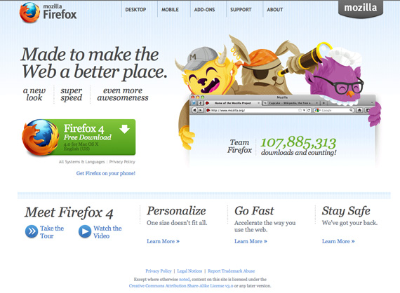
The call to action is the single most important element of any signup page. Without it, the page has no purpose. And yet so many sites make the call to action nearly invisible. It blends into the background, or it’s identical to other buttons on the page, or it otherwise just doesn’t stand out.
Make sure that your call to action is differentiated from the rest of your page. Use contrasting colors, a larger font, and prominent positioning for the best results.
Test your call to action, too. Some phrasing might work better than others, and one button color might work better than another. The only way to know this for sure is to test the possible combinations. (Check out our previous article on landing page testing for more information.)
2. Simplify Your Sign-Up Form
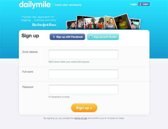
The last thing I want to do when I’m signing up for something is fill in a long form that doesn’t seem to have much point. The goal is to get someone to sign up, right? So make it as easy and as simple as possible for them to do so.
The best signup forms include no more than the absolute bare-minimum required information. If there’s no financial transaction involved, then it should be limited to email and maybe name. If money is involved, then make sure you only ask for the minimum amount of information required by your credit card processor. If you need a shipping address, make sure they can auto-fill that information from their billing address.
The key here is to lower the barrier to entry as much as possible. You don’t want your visitors to think about it once they’ve decided to sign up. Every additional field is an opportunity to change their mind.
3. Offer a Guarantee
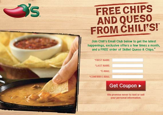
Guarantees are going to vary based on what your visitors are signing up for. If it’s a free newsletter or site updates, then guarantee you won’t sell or share their email address with other companies. If money is involved, make sure you offer some kind of satisfaction guarantee.
One tip: many companies offer a short-term money-back guarantee of only a few days, thinking it gives people less time to find something they don’t like about a product. But the problem there is that people are more likely to make a split-second decision to cancel. They don’t have much invested in your product or service after 7 or 14 days, so it’s not a big deal to cancel. If you give them a longer refund term, say 30 or 60 or even 90 days, then it gives them a chance to become invested in what you’re offering. If they’ve been using your product for two months, and have integrated it into their workflow or daily life, it takes a lot more for them to decide to change that.
4. Use Popup Forms for Signup
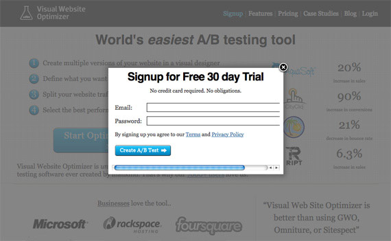
Psychologically, going to a separate signup page is a barrier. It’s just one more signal that this is some kind of commitment. By using a modal window for your signups, you’re removing one more barrier. It’s the equivalent of saying, “See, signing up isn’t a big deal, you don’t even have to leave the homepage to do it!”
When combined with a short form, using a modal window can increase signups by 50% or more (as it did for Visual Website Optimizer). The modal window also has the benefit of decreasing distractions on the signup page, as it shades out all content other than the form itself. This reduces the risk that your visitor will become distracted by another link or something else on the page and abandon your signup form before completing it.
5. Offer an Incentive
It doesn’t matter whether you’re offering a free signup or a paid subscription, offering some kind of incentive to sign up can really increase your conversions. Why not include a free ebook or whitepaper for subscribers? Or a phone or email consultation? If you’re selling a paid subscription, consider offering a free month when new users sign up, or a free upgrade to a better plan.
People like to get things for free. It makes us feel like we’re getting a better value. That’s why all those infomercials on TV double your order for free, or throw in free gifts. It makes something that might seem expensive to begin with seem like a bargain, because of all the “free” things you’re getting. Tap into that same psychological drive by offering an incentive to your customers.
If you’re offering a new product or service, consider offering an incentive to early adopters. This can be a great way to get customers for a product or service that might be unproven. The incentive doesn’t even have to be that big (even something like an “early adopter” or “founding member” badge on a social network can work wonders), depending on what the primary offer is. (Obviously, the more expensive the offer, the better the incentive should be.)
About the Author: Cameron Chapman is a freelance designer, blogger, and the author of Internet Famous: A Practical Guide to Becoming an Online Celebrity.


Comments (24)