
Most people think website design is what you see.
But Steve Jobs corrected us years ago when he reminded us that “design is how it works.”
The same principle applies to your website design.
Sure, it’s important that the website looks nice.
However, it’s even more important that your website works correctly — turning traffic into warm leads and brand new customers.
Unfortunately, that’s not always the case.
For example, many common design features that you see on some of the top websites have been shown to sabotage conversions.
Don’t believe me? Take a look at these seven data-backed examples below to see if you’re making any of the same potentially dangerous mistakes.
1. Stock Photos
Tell me if this sounds familiar.
You spot a beautiful new WordPress theme on Themeforest.
It’s the perfect mix of features you’re looking for. It’s clean. It has a contemporary design.
Plus, it’s only $50 bucks!
That’s thousands of dollars cheaper than even a basic custom design!
You buy it ASAP and start setting it up. Only for a few hours to go by and…well, it’s not exactly looking right.
You can’t put your finger on it, but something feels off.
So you go back to the original version to compare the two and see why yours doesn’t match the pristine copy that persuaded you to buy.
And that’s when it hits you: Images!
Today’s design trends are relatively minimal. Take a look at this one you’re reading right now, for example.
It has lots of whitespace with a few bold accent colors and clean typography.
Otherwise, the only other thing that sets it apart is the high-quality images.
They match perfectly as if someone thought this through before designing the site (which they did).
The best websites on the Internet typically have all had some professional photography and custom images designed to enhance the overall aesthetic.
When that doesn’t happen, it can be tough to try and go back to slap on photos from random different places.
So what’s the number one shortcut you take?
Fire up Pixabay to find some free, high-quality images.
Stock images are fine for a blog post like this one.
However, they can often backfire on conversion-driven pages of your site.
Here, I’ll show you.
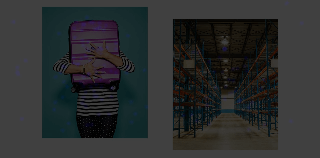
Visual Website Optimizer ran a simple split test that pitted a real photo against a stock one.
This was the only page variation because they wanted to see which drove more CTA clicks (for new registrations).
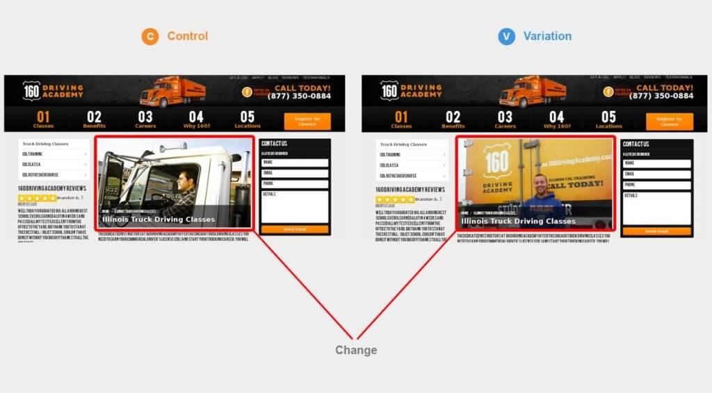
Initially, the real image outperformed the stock image by driving a 161% more CTA clicks. It also improved registrations, too, lifting those by 38.4%.
Stock photos don’t just detract from the overall experience and aesthetic. They can also damage a website’s credibility.
This happens a lot with small websites. Take a look at this example:
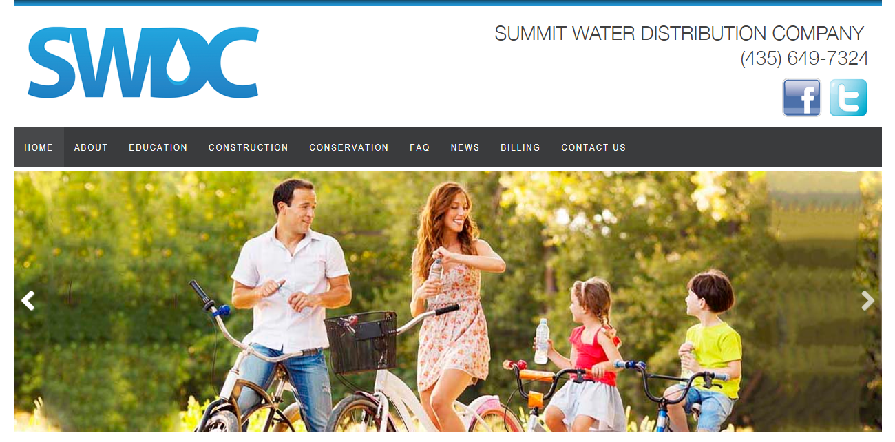
This looks bad enough to potentially hurt their credibility, but it’s especially bad if it’s bringing down conversions like we just saw.
Images are powerful because it only takes 13 milliseconds for people to subconsciously comprehend them.
Images also have the power to increase engagement by 94%, so they’re one of the best ways to drive action and conversions.
So should you always use the best, largest, and highest resolution photos?
Well, not exactly.
Here’s why.
2. Full Bleed, High Resolution, Mega Sized Images
As we just saw, stock photos on conversion-focused pages can reduce conversions by hurting credibility.
But that doesn’t necessarily mean massive, beautiful visuals are a perfect choice either.
For example, take a look at this nice, full-screen video background on one site:

Looks nice, right?!
It stretches across your large desktop monitor and looks pixel perfect.
So what could be bad about it?
This.
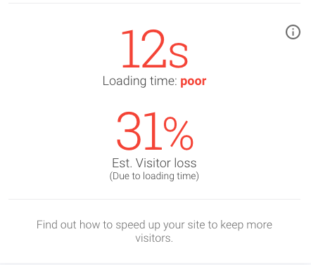
Unfortunately, it’s incredibly slow.
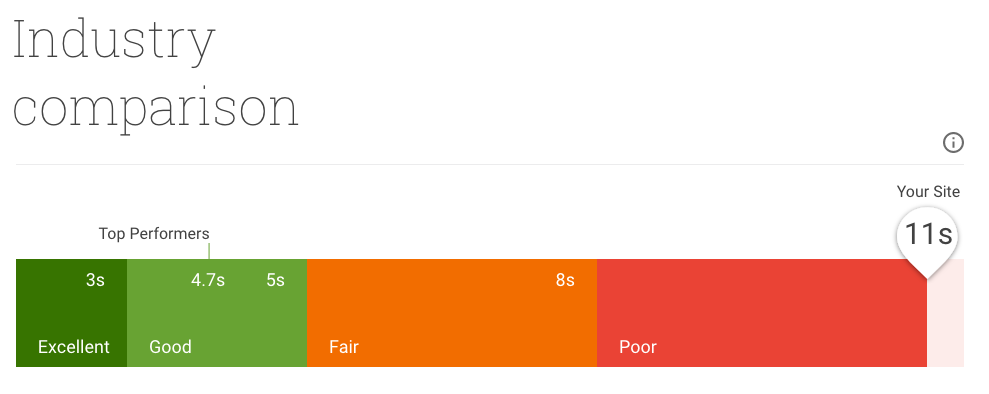
It takes 12 seconds to load, which means that it could lose 31% of its traffic!
People don’t like waiting around, no matter how good the website looks.
If that’s not bad enough, Google’s recent mobile page speed benchmark report found that “the probability of someone bouncing from your site increases by 113 percent if it takes seven seconds to load.”
The good news is that Google has recently given us a new and improved tool to use and test our progress — Test My Site.
I ran a test on the site mentioned above and saw that it’s performing towards the bottom of its industry.
Thankfully, the Test My Site report provides you with some recommendations to see which problems are dragging down your page loading times the most.
Take a look at what this site should do.
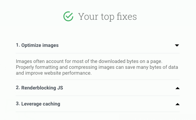
“Optimize images” is at the top of the list, which is unsurprising when you go back to reference that earlier visual.
But wait a second. Why are we talking about speed and not conversions?
Besides forcing your traffic to leave, slow speeds have also been proven to hurt SEO and conversions.
The same Google report we referenced earlier ago found, “as the number of elements—text, titles, images—on a page goes from 400 to 6,000, the probability of conversion drops 95 percent.”
Woah! 95 percent?!
Speeding up page loading times is a complex topic that deserves a post of its own, but here are three quick tips to keep in mind:
- If possible, crop and resize the images to fit specific dimensions on your site.
- Then compress the file size with something like WP Smush.it if possible.
- Last but not least, use a CDN (like CloudFlare) to host and deliver your images.
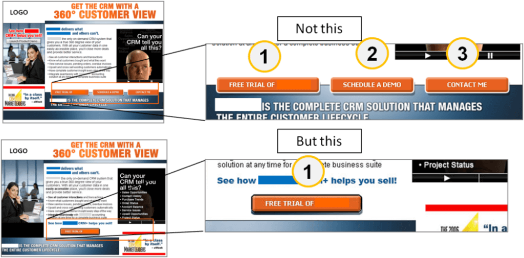
3. Equally Weighted CTAs
Question: Which of the two CTAs below would you click on first?

Your guess is as good as mine!
They’re both lousy.
The only possible saving grace here is that one CTA is located beneath the other one. However, otherwise, they look more or less the same.
Their overall size is the same and the “Click Here” copy, while a good effort, also features the same exact weight and background.
In other words, there’s no visual cue to the reader of which options are primary vs. secondary.
You’re not exactly sure at first glance which one you should click on.
That’s a problem, because “people need to be led,” says MarketingExperiments.com.
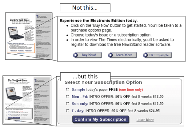
In one experiment, researchers took one page with three equally weighted CTAs and merged them into one primary one, like this.
The logic behind this decision was simple: “People need to know where they can get the most value. So, point them in a clear and decisive direction to the main call-to-action.”
To illustrate this point, Marketing Experiments ran a similar test which showed the immediate impact you could generate just by changing the design of your CTA buttons.
Take a look at the difference between these two.
This time, the test generated a 64% conversion increase by helping visitors make easier decisions.
4. Muddled Messaging
Here’s another big issue.
How clear is your website’s message?
Let’s take a look at an example.
See if you can figure out what’s wrong with this landing page.
For starters, nobody is reading through this entire wall of text.
Second, the jargon and sophisticated ‘corporate’ language make it almost illegible.
You should always keep the reading level of your website at less than a 7th or 8th-grade reading level.
Studies have shown that things which are easy to understand (words, names, etc.) are actually seen as more believable!
Management consulting company, McKinsey, refers to complicated writing as “talking past your customers.”
Essentially, you’re saying one thing, but customers care about something else entirely.
You don’t think ‘messaging’ has anything to do with design? Take a look at this next example, and tell me if you still think that.
This is a positive example. The page is simple and to-the-point.
The design emphasizes the white space around the header and calls attention to the blue-shaded CTA section.
It’s picture perfect.
5. Extremely Flat Design
Don’t Make Me Think is one of the best books on design and usability to drive conversions.
The premise of the book is pretty obvious from the title.
It says that websites should work exactly like people expect them to.
Have you ever seen a child pick up an iPad for the first time?
It usually takes only a few seconds for them figure out how to start using it.
Ideally, websites should be the same way. Unfortunately, they aren’t always.
For example, sometimes the flat design trend can be taken too far.
When done right (like the example below), it can simplify pages so they’re immediately understandable.
However, when not done well, they may lack the signals that inform users what to do next.
Here’s an example.
Take a look at this image, which is a heatmap from the software CrazyEgg.
The heatmap shows that nobody is clicking on those images, even though they’re supposed to!
The page itself looks great, but the flat design offers no indication to the user that they should click on those elements.
As a result, nobody is viewing those project case study pages. And therefore, nobody is hiring that company!
Even something simple like a headline, button, or hover effect would let users know they’re supposed to be clicking on those page elements.
For example, check out this example from HubSpot.
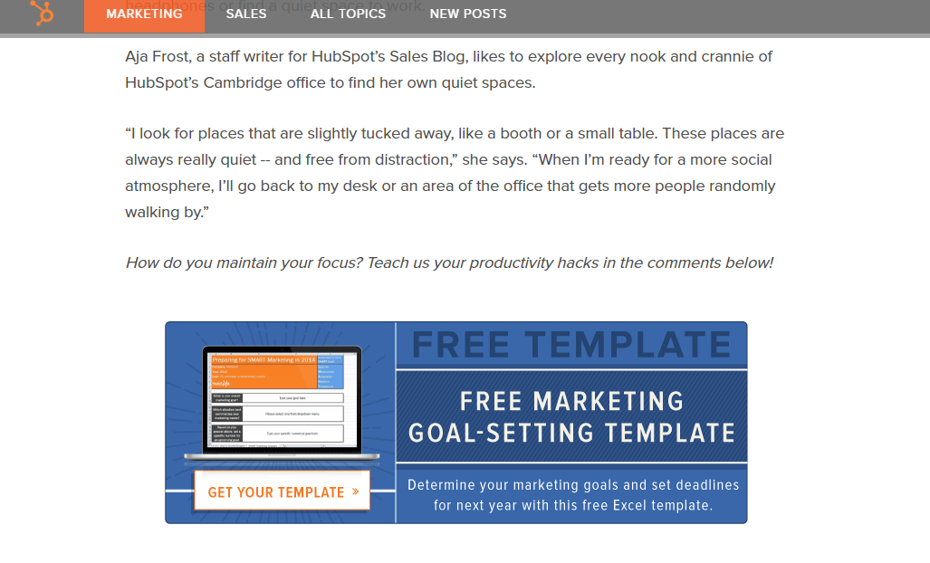
You can see that it’s an image CTA (like the previous example).
Instead of assuming you know what it is or why you should click, there are cues that should help you.
- Headline: “Free Template”
- Subhead: “Free Marketing Goal-Setting Template”
- Copy: “Determine your marketing goals and set deadlines for next year with this free Excel template.”
- Image: Mac laptop with an example of the goal-setting template.
- CTA: Button with the next “Get Your Template” and an arrow.
See the difference?
They leave nothing to chance.
You know exactly what to do when you see it. And the extra details also help you determine why you should click on it.
6. Clean, Logical Organization
It matters for conversions.
For example, your “About” page should just be called “About” as opposed to “Team” or “Leadership, “Unity,” or “Who We Are.”
While the other page titles might be clever, not everyone will immediately understand what each one is.
That’s why all of the pages in my navigation are really simple and commonly used.

Information Architecture (IA) is similar in that it deals with organizing your website’s information.
Certain pages should be organized similarly so that people would know exactly how to find a new product even if they’ve never visited your site before.
Here’s what I mean.
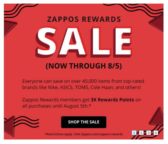
You go to Zappos.com to look for a new pair of shoes.
Up top, you see that they’re split by gender (Women and Men), then age (Kids), then Departments, Brands, and Sale.
That makes it incredibly easy to get started.
Then after you click on a drop-down (like “Women”), it expands to show you more options organized by the type of “Shoes” first, then “Clothing,” and “Accessories.”
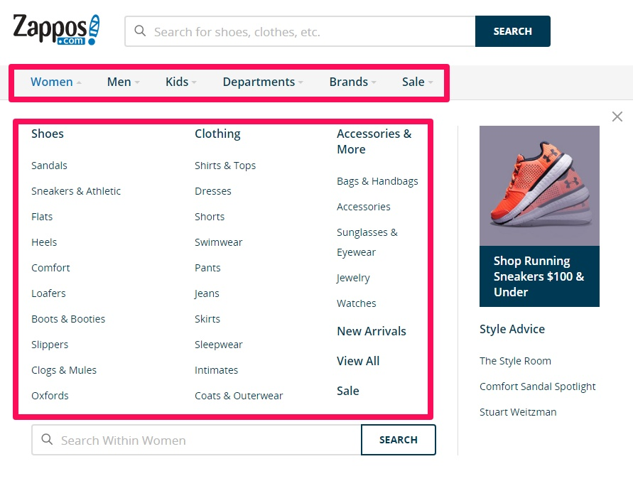
See? You may have never been to this site before. They have thousands of products. Yet it’s easy and logical to find what you’re looking for
Nordstrom does a similar thing on their website:
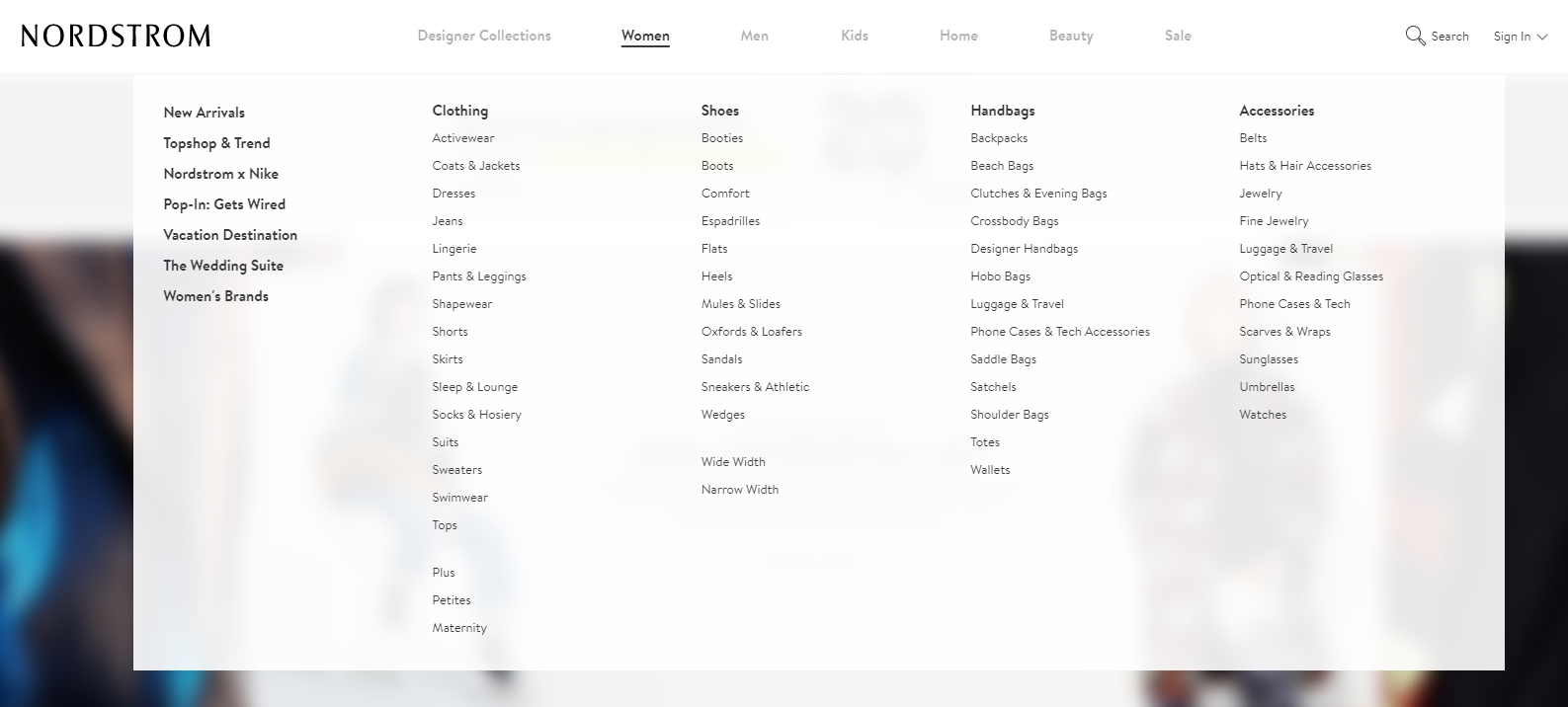
It starts with a similar breakdown between Women, Men, Kids, Home, Beauty, and Sale.
Then when you go one level deeper, it splits into ‘use cases’ (New Arrivals, Trends, Vacation, Wedding) and categories (Clothing, Shoes, Handbags, Accessories).
In other words, they’ve helped ‘surface’ some of the most common selections people have.
They are now much easier (and faster) to find. Plus, it keeps the top-level navigation as simple as possible so the user isn’t overwhelmed.
If these massive ecommerce websites can still organize their pages into a simple, streamlined hierarchy, so can we.
B2B audiences love long, in-depth content pages.
However, sometimes the user can get confused as to where they are or what other information is around this content. So they end up leaving.
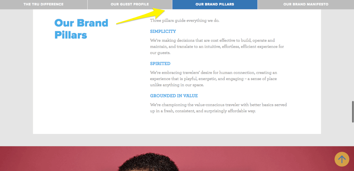
You can use little visual cues, however, like the sub navigation in the example below, to subtly let the user know exactly where they are.
As the user scrolls down far enough or jumps to a new page, the sub navigation hover will update to a new selection.
This immediately provides them with clues as to where they just left, where they are now, and where they should be going next.
7. Carousel Sliders
I’ve saved the best for last.
And by “best” I mean the worst.
Carousel sliders are used on almost all websites imaginable, from B2B to B2C and even ecommerce.
We were just praising Zappos.com a second ago, and yet here they are using a carousel slider that automatically scrolls through different options.
I don’t have some bias against them.
I’m just not a fan of carousels, because they’ve been shown (time and time again) to destroy conversions, not improve them.
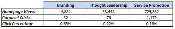
For example, Harrison Jones ran a study for Search Engine Land and found that nobody clicks on carousels!
Take a look at these carousel clickthrough rates. Not so hot, right?
Sure, I understand why you might want a carousel slider.
You want to show off all of the unique aspects of your company, product, or service.
The trick, though, is to only do that one at a time. Otherwise, you risk doing too much, too soon, and barely scratching a 0.16% click through rate as a result.
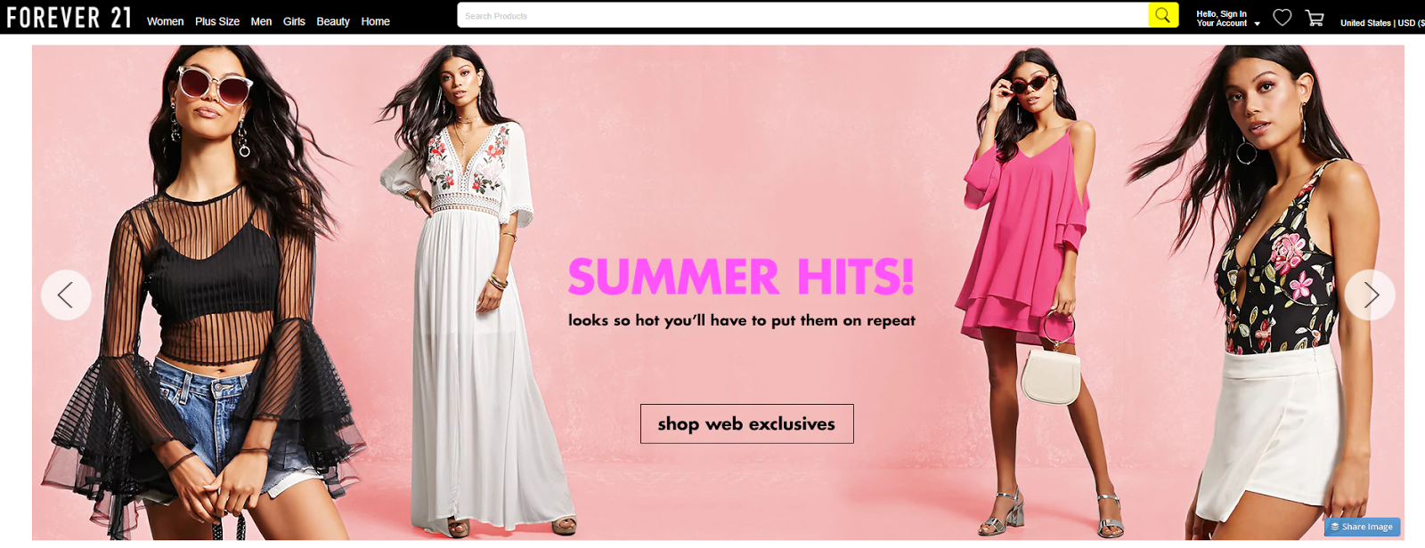
Carousels are pretty common for ecommerce companies that want to highlight or show off all of their new brands for a particular season.
For example, here’s Forever 21 using a slider:
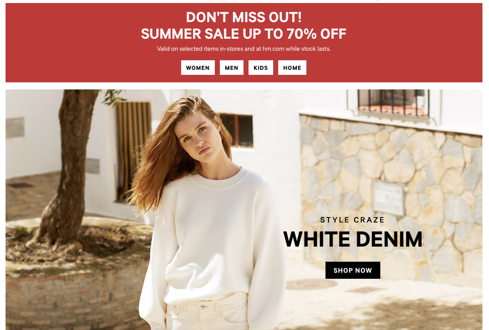
H&M, to their credit, does something a little bit different. They use two static sections to better focus a user’s attention.
There is a sale call out on the top and a single product on the bottom.
Conclusion
Your web design should look great. However, that doesn’t mean it can’t work well, too.
Ideally, you should always use real (appropriately sized) images that quickly resonate with visitors.
Doing so will buy enough time for your messaging and CTAs to sink in before the user bounces.
Next, your design features should be easy to understand.
That means a simple organization, regular naming conventions, and little visual cues that remind visitors what they should be doing on the page.
And whatever you do, ditch the carousel slider.
What web design features have you seen help or hurt conversions?
Grow your traffic