As an Internet marketer, conversion is our bread and butter. I can guarantee you spend a large part of your time pondering ways to optimize landing pages. Things like copy and design are the obvious features we all like to play around with.
But there is one element often underestimated in its affect on conversions.
I am talking about typography.
For most marketers, it is an unknown topic, but its importance in marketing has been scientifically proven. In this article, we are going to take an in-depth look at the world of typography and its ability to affect conversions.
So, consider your landing page. If, despite a powerful headline and a design structure that perfectly exemplifies all the important elements in your copy, you are failing to see any kind of substantial conversions, then please do read this article through to the end.
What is Typography?
Simply put, typography is where art meets text. It refers to the arrangement of type. It originated after the invention of movable type in the mid 15th century. Typography is a tool through which you can add personality and style to your text.
When visitors open your sales or landing page, the very first thing that happens is they look at the page as a whole. They scan how the information is presented, how the text looks, the size of the letters, the length of the lines etc., after which they unconsciously judge the likelihood of finding the solution to their problem on your website, based on the way the words appear on your page. It all happens within seconds. We all do it!
Understanding typography can help here. It is a tool that makes it easier for the reader to grasp and comprehend the information you are trying to convey.
Key Elements of Typography
There are several components that make up the art of typography. Let’s look at the primary elements:
- Typeface – Typeface is not the same thing as font. It refers to a group of characters, letters and numbers that share the same design. For example Garamond, Times, and Arial are typefaces, not fonts – a very common misconception.
- Fonts – A specific style of typeface with a set width, size, and weight. For example, Georgia is a typeface; 9pt Georgia Bold is a font. People in the type design community consider a font to be the delivery mechanism and a typeface to be the creative work.
- Line Length – This refers to the distance occupied by text that is present between the right and left margins in one line.
- Leading – It is the space between baselines (the lines upon which letters “sit”) and is expressed in points.
- Kerning – This term refers to the white space between individual characters or letters. Many fonts come with a default kerning value that is best suited to make the space between letters look more natural.
- Tracking – Also known as letter spacing, it is used to adjust the space uniformly over a range of characters. Tracking can affect the character density of the passage.
Why is Typography so Important?
If your copy is hard to read because the individual letters are too close together, the typeface size is too small, or the words are so close together that people find it hard to distinguish one word from the other, then your visitors will act in one of two ways.
They will either leave, causing your conversion rate to drop, or they will stay and struggle through the copy, most likely not reaching the end because it is exhausting. Afterward, what the visitor will remember is not the message you are trying to get across, but the effort it took to understand the copy.
Typography is crucial because it can make the whole process of understanding and comprehending information effortless. A typographically well-formatted copy ensures that the focus remains on the content and not on the effort required to read it.
If you study how humans read the web, a reading pattern is clearly evident. This pattern can be modified, but only with the help of a visual hierarchy. Typography can help you create a visual hierarchy by making the more important elements stand out through size, color, or style. For example, an excellent way to present benefits or product features is with bullets.
To truly master the art of creating the perfect visual hierarchy, we need to first understand how people organize and perceive information, and Gestalt’s Principles of Perception explain this very well.
As humans, we love to organize everything. This habit is as ingrained in our human psyche as perceiving faces in inanimate objects. Gestalts theory states that humans organize visual elements into groups based on five contexts:
- Similarity
- Continuation
- Closure
- Proximity
- Figure and Ground
Now, for example, if you want to apply Gestalt’s theory in your copy, you could use the principle of similarity and make all of the elements on a page visually similar, except the call to action, which you could make different, causing it to stand out.
When organizing text, your goal should be to make the cognitive process of retaining information easier. You want to make sure that the “parts” which need the most attention are prominent.
What Does the Research Show?
In July 2012, Errol Morris ran an experiment in The New York Times titled “Are You an Optimist or a Pessimist?” Readers were presented with a passage from David Deutsch’s book The Beginning of Infinity. The passage was followed by two yes-or-no questions asking readers whether they supported Deutsch’s claim and how confident they were in their answer.
Here is the interesting part. Morris was not interested in what people thought about Deutsch’s claim or whether they were optimists or pessimists. He actually was interested in knowing if a typeface could influence how people perceived the presented information. In other words, can a typeface affect the credibility of written text?
What the 40,000 participants didn’t realize was that, while they were all presented with the same passage, it was in different typefaces. Six typefaces were utilized in this experiment: Baskerville, Helvetica, Comic Sans, Computer Modern, Georgia, and Trebuchet.
The results showed that statements in Comic Sans inspired the highest amount of disagreement. Helvetica was not far behind. They failed to ignite the believability factor with the readers.
The results showed that people were more likely to agree with the statement when presented in Baskerville.
Lesson for Internet Marketers
Here is what David Dunning, the psychologist who helped construct the aforementioned quiz, had to say about why Baskerville won:
“Fonts have different personalities. It seems to me that one thing you can say about Baskerville is that it feels more formal or looks more formal.”
Now take a look at your sales page. Does your font correctly reflect the message you are trying to portray? Think about your niche. Does your audience require a formal tone, and, if so, how well is your font setting that tone?
Does Font Size Matter?
To find out whether font size matters, Michael Bernard of Usability News (produced by the Software Usability Research Laboratory at Wichita State University) conducted a study comparing 8 popular online typefaces: Courier New, Georgia, Arial, Century Schoolbook, Times New Roman, Comic Sans, Tahoma, and Verdana. They were analyzed at 10, 12, and 14 point sizes. There were a total of 60 participants in this study.
Here is what they found: Verdana, Arial, and Comic Sans were the most preferred fonts at 10, 12, and 14 point sizes, respectively.
Texts in Times New Roman and Arial were read the fastest; and, even though the data showed that larger typefaces were more readable, the result was not statistically significant.
The study also showed Arial and Courier were the most legible typefaces, and Comic Sans was the most illegible one. Furthermore, Tahoma was found to be most legible at 10 point size, Courier at 12, and Arial at 14.
Serif vs. Sans Serif Debate
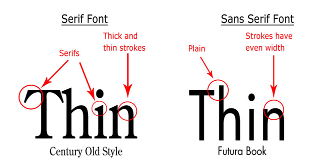
As far as research goes, there is no ironclad answer as to whether serif or sans serif is better. But, as far as general consensus goes, when it comes to reading online, sans serif typefaces are easier to read because they are simple and legible even in small sizes. This means people can spend more time focusing on the message than deciphering the typeface.
Sans serifs are recommended for the body of the copy and serifs for the title and subtitles.
Affect on Mood and Cognitive Performance of Readers
A study conducted by Dr. Kevin Larson of Microsoft and Dr. Rosalind Picard of MIT looked at whether typography can affect mood and cognitive performance. The study was divided into two parts, and three different measurements were taken: relative subject duration, Likert scale, and a cognitive task.
There were 20 participants in this study, out of which half got text with good typography and half got text with poor typography. In the first part of the study, for relative subject duration, it was found that participants who got text with good typography underestimated the time they spent reading it by 3 minutes. In the second part of the study, when participants were interrupted 17 minutes into their reading session, they underestimated their time by 5 minutes and 21 seconds.
This showed that when the passage was typographically well formatted, people were so engrossed in the subject, that they underestimated the time they spent reading it.
Next, they were given a Likert scale with statements about their experience reading the passage. In the first part of the study, the Likert scale did not produce any statistically significant result, but in the second part of the study, the scale was found to favor good typography.
Last was the cognitive task, which was different for the two parts of the study. In the first part, the participants were given the candle problem, and in the second part, they were given the remote associates test.
In the candle problem, 4 of the participants in the good typography group successfully completed the test, while 0 participants in the poor typography group completed the task.
In the remote associates task, participants in the good typography group completed 52% of the task at an average speed of 6395 ms, and the participants in the poor typography group completed 48% of the task at 6715 ms.
The success of the good typography group in the cognitive task can be attributed to the people being in a good mood, which made them better problem solvers.
How to Pick the Right Typeface for Better Conversions
- Don’t let expressiveness affect usefulness. Clicking on that “font” option, we are presented with so many varieties that it is almost like being in a candy story. However, it is important to remember that intricate typefaces are not always the easiest to read. Yes, they may look pretty, but pretty does not always equal sales.
- Remember that the typeface you choose should complement the text, instead of overpower it. After reading your copy, people should remember your message or call to action, not the typeface.
- When it comes to pairing typefaces, you can do it through two principles – correspondence and contrast.
With the principle of correspondence, you pair two typefaces that, while different, are similar enough to prevent readers from subconsciously comparing the two fonts, thereby distracting them from their primary purpose, which is to consume information. For example, Helvetica and Arial.
With the principle of contrast, you pair two typefaces that are different and contrast in most aspects but still complement each other by sharing at least one common trait.
- Variety is good, but don’t go overboard. Your copy should not be a display of your favorite typefaces. Simplicity is key.
- To find the perfect typeface, study your niche and your audience. Does the typeface need to be formal or informal? Does it need to be larger? The answers can be found by performing simple market research, if necessary. But, if you are selling a product that will give people 20/20 vision, most likely your target audience will consist of people who are visually impaired in some form. So, in this case, using a simple large-size typeface is a no-brainer.
- Choose a typeface that keeps your text both legible and readable. One way to do it is by picking a typeface that has large counters (the areas of the letters that are entirely or partially enclosed).
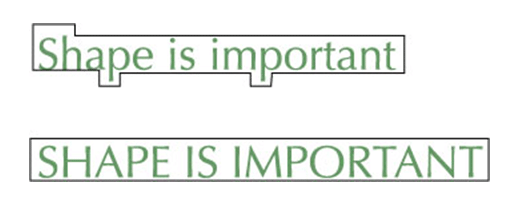
- Do not capitalize every word or the first letter of every word in your copy. Ninety percent of the text that people read online is in lowercase.
- When it comes to line length, don’t keep it too short because the need to constantly shift the eyes will make reading difficult. On the other hand, lines that are too long sometimes can make it difficult for readers to find the next line.
- Make sure to optimize the letter spacing for the right density so that the words don’t look cramped and crowded, which can leave your reader frustrated and confused.
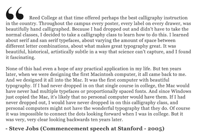
Typography is Important. Even Steve Jobs thought so!
And how can I end this article without talking about Steve Jobs, the person who is the reason we have the option to choose fonts today. Here is a section from his famous speech at Stanford in 2005:
Summary
For Internet marketers, the most important thing to remember is to use typography to complement and enhance your copy. When done right, it can trigger the right emotion, mood, and even action required to get a visitor to convert.
Of course, a great way to test the effectiveness of typography is to A/B test! If you already have a landing page which converts well, try taking optimization to the next level by testing between different typefaces. Testing is the way to go!
About the Author: Ankit Oberoi is a co-founder at AdPushup, a startup focused on helping publishers and bloggers optimize their ad revenues. You can reach him on Twitter @oberoiankit.


Comments (48)