Stephen R. Covey was a brilliant author and self-help visionary, but he never worked in online marketing. So, what can he teach us about managing overlay (pop-up) marketing campaigns?
Apparently, quite a bit.
It just so happens that Mr. Covey’s famed “7 Habits” apply directly to what makes an effective pop-up.
But first, I fully understand the reservations many SaaS and e-commerce site owners have about pop-ups. In 2004, pop-ups were the most hated online advertising technique, and much of that residual hate lingers today.
That said, today’s pop-ups are very different from the pop-ups of 15 years ago.
This is mainly because browsers have become much more sophisticated. They prevent the majority of pop-ups from opening in new windows. Instead, most pop-ups now are modal overlays that open within the same window.
So, since they’re not really “pop-ups” in the traditional sense anymore, I will refer to them as marketing overlays in this article.
The way marketing overlays are controlled has changed, too. Instead of being run by outside media companies, they’re now executed by site owners who can take their on-site user experience, audience loyalty, and long-term brand into consideration.
As for execution, technology now permits site owners to be very selective about who is shown marketing overlays and who isn’t. And, personalized messages can be served on a dynamic basis. Also, the timing/activation now is much more sophisticated.
All this has led to marketing overlays generating some impressive results for site owners.
Of course, they’re not suitable for every site. They’re not for every audience. And, what works for one brand won’t necessarily work for another. You may hate them, and that’s fine.
But let’s get back on track.
As Mr. Covey often said, two people with the same abilities, backgrounds, education, and opportunities can find themselves in vastly different life circumstances. And, the reason for the difference usually lies in the habits they incorporate in day-to-day life.
The same is true with marketing overlays.
When done right, marketing overlays are a great way to engage your visitors, drive sales, build massive email subscriber lists, and generate scores of new sales leads.
When done wrong, they annoy visitors, compromise the user experience, and fail to convert people into paying customers.
All campaigns start with great intentions, but it’s the details that separate truly successful campaigns from the pack. Let’s discuss the details:
Habit #1: “Seek first to understand, then to be understood.”
Translation: Before launching your marketing overlay, you need to figure out what your audience values.
Do you know which products are most popular on your site? Did you write a blog post that generated a ton of traffic? Do you have a popular promo? Perfect, because your marketing overlay should include messaging crafted around what’s already popular with your visitors.
Before writing your offer, you need to understand what your audience is interested in. Google Analytics (or whatever analytics system you use) is an excellent resource for determining what your users want to read, buy, or subscribe to.
That covers the “Seek first to understand” half, but you still need to be understood.
Your messaging should meet these three standards: It must be clear to the user. It must be concise. And, it must convey maximum value.
In other words, “Please give us your email address” isn’t going to cut the mustard. You need to tell users what they’ll get out of it.
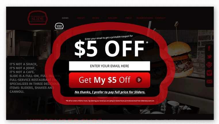
Here’s a good example of an overlay with lean, value-laden copy:
Note that the CTA button focuses on the value of submitting your email address, not the function of submitting (e.g., Join Now, Subscribe, Submit). “Get My $5 Off” conveys a clear benefit. Also, there’s barely 20 words of text.
Additionally, it’s a good idea to explain what the visitor is going to continue to get after they enter their email. What can they expect to receive from your future emails?
Habit #2: “Put first things first.”
Translation: Effective marketing overlays don’t overthink the task and don’t ask too much from a user. Customer relationships have stages that need to be built upon.
If you’re serving a “buy now” offer to first-time visitors, you may need to take a step back and put first things first.
The majority of web users don’t buy on their first visit, but there are huge opportunities with return visits.
That means you need to be flexible with your offer and serve different messaging to different user segments. With first-time visitors, you may need to “buy them a drink” before trying to close the sale.
A first-time visitor is better suited to an email signup. Once you have their email address, you can use that to provide valuable information as you build the customer relationship.
The principle of “first things first” also applies to your design and copy. Don’t get too cute or overthink the task at hand. Effective overlays grab attention by conveying value – plainly stated – without distractions.
Habit #3: “Think win-win.”
Translation: If your “$5 Off” offer isn’t converting, change your “ask” to an email signup in exchange for something valuable to your users.
There are all types of “wins” to be gained from adding a marketing overlay to your site: You can generate immediate gains to your bottom line. You can fill your funnel with new leads. And, you can build valuable lists of subscribers for your content marketing efforts.
The trick is finding out what type of offer works best for your traffic. Sometimes, it’s just not feasible to grab quick sales.
Here’s an example from Gr8fires.co.uk, an online retailer of gas and wood-burning stoves. With a long sales cycle, they decided against trying to grab quick sales with a marketing overlay. Instead, they offered users something truly valuable – an installation calculator.
In exchange for an email address, Gr8fires’s calculator tells visitors exactly how much their stove installation will cost.
Also, given the value placed on email subscribers these days, building your email list may be just as valuable as grabbing discounted sales.
Be flexible about how you get value. Small wins are still wins.
Habit #4: “Begin with the End in Mind.”
Translation: Since your end-goal is to generate leads, sales, and signups, you must target pages with the potential to generate results.
This one seems pretty simple, but you’d be surprised how many websites are getting it wrong.
Your marketing overlay can’t appear on just any page or be associated with just any offer. It needs to be placed on high-traffic pages, and it needs to promote high-value items to your users.
To find out which pages get the most traffic, open up your Google Analytics and run a traffic report for the last 12 months.
This will show the pages the majority of your users visit, which likely will be your homepage, landing pages, and main product pages.
Next, you need to determine which of these pages sell your high-value items. What are you looking to sell? What’s popular with your users? Promote the items that people are there for and the items that move the needle for you.
Habit #5: “Synergize.”
Translation: Your goals must align with the user’s goals.
Back in 2014, Bryan Harris of Videofruit published a great article on using analytics to construct marketing overlays around high-traffic events.
That post ties in directly with this habit: synergizing your goals with the user’s goals.
Simply put, your marketing overlay will generate the best results when users want to do the same thing you want them to do. And, analytics is the best way to find out what they want to do.
Once you know what your users want, it’s time to ask yourself whether your goals line up. Is this a product you want to promote? Is it an email list that’s valuable for you to build?
If your users value products that don’t have strong margins for you or subscribe to mailing lists you can’t monetize, your goals are not synergized.
Effective marketing overlays find synergy between your goals and the user’s goals.
Habit #6: “Sharpen the Saw.”
Translation: You must optimize and refresh your offer over time.
All online marketing tactics require a certain measure of optimization to be effective, and marketing overlays are no different.
A/B testing is a great place to start. That’s a given.
But there’s more to optimizing marketing overlays than conducting tests. Are you paying attention to trends and making sure your offer is current? Are you watching your competitors and borrowing ideas?
All offers eventually go stale, so periodically refreshing and updating your offer (and presentation) is key to maintaining effectiveness.
Habit #7: “Be proactive.”
Translation: You need to get your marketing overlay in front of visitors before they leave, but without disrupting their user experience.
When you launch your overlay is just as important as the contents of your offer.
If you launch too early, you may interrupt users on the path toward your desired action. Launch too late, and a good chunk of users will leave before they see it.
There are 5 ways I know of to activate your marketing overlay:
- Upon entry
- Upon exit
- After “x” number of page views
- Scroll-activated
- Time-activated
Which one will work best for you? Only your tests will tell.
Takeaway
If you’re planning to launch a marketing overlay on your site, remember that the details are what separate successful campaigns from those that fail to generate returns.
When done wrong, marketing overlays do little more than annoy visitors.
But, when done right, they engage visitors, drive sales, and build massive subscriber lists without compromising the user experience.
About the Author: Angus Lynch is a writer and conversion strategist at Crowdvert, an award-winning conversion rate optimization agency.


Comments (0)