An AdWords text ad looks exactly the same on mobile as it does on desktop.
You don’t have to worry about the difference. And besides, it only takes a few characters anyway. There’s little room for error.
Now contrast that with a Facebook ad creative, where you’re juggling different headline, image, text and CTA options for different placements, across different devices.
What looks great for one will almost certainly not work for another.
Fortunately, there are a few general rules of thumb to start with that can make your life a lot easier (and not to mention, save you a bunch of money).
Here’s a cheat sheet to creating your own high-converting Facebook ad creative.
How to Decide Between Facebook’s Three Major Ad Placements
An image that’s perfect for the Desktop News Feed won’t cut it on a tiny mobile ad.
And therein lies the dilemma.
Facebook ads are a delicate balance, where you have to weigh up so many different objectives, ad types, placements, and sizes in order to get the creative just right.
One of the first places to start, well before considering an image or headline, is the platform and device placement.
Here’s how to choose between the three options.
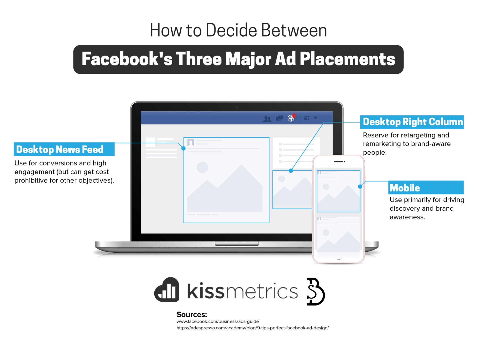
Placement #1. Desktop News Feed
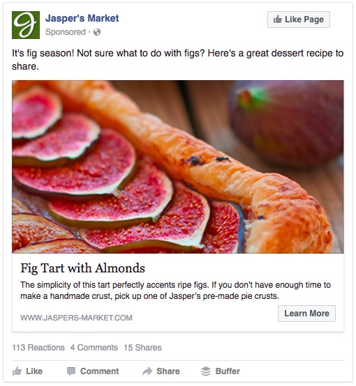
As a general rule, the priority placement here gets you better-than-average conversion odds.
And you get more room to make your case, with a larger image, longer copy, and additional link description area.
The only problem?
It’s competitive. And it’s expensive (relatively speaking).
You’re paying for the extra emphasis. So while that’s great if your goals include engagement or generating leads and sales, it’s not-so-great for discovery and brand awareness.
Placement #2. Desktop Right Column

Not to mention, your ability to captivate with a smaller image and little-to-no text area becomes a little diluted.
But…
If someone already knows who you are and what you have to offer (i.e. you’re retargeting previous website visitors or past customers with custom audiences), your ads can grab their attention at a more cost-effective price point (per impression or click).
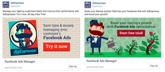
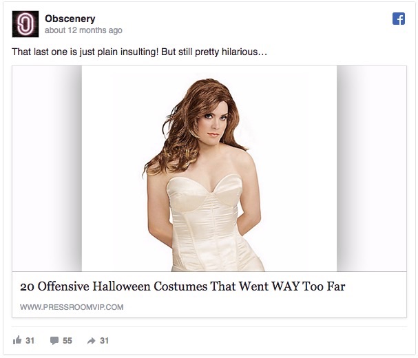
Just make sure you’re creating ads specifically for the Right Column placement, and not simply regurgitating and force-feeding News Feed ads into the smaller placement. Otherwise, this will happen:
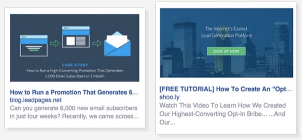
So good try, but wrong placement.
That means the design objects and copy in the image are too small to be legible. And their ad text headlines and descriptions get truncated, too.
Which then means they end paying more for this ad, overspending and wasting precious ad dollars because they got only one of the variables wrong.
Placement #3. Mobile
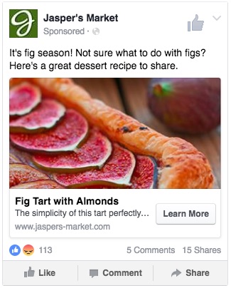
Similarly, you can start audience-building on Facebook by specifically targeting mobile devices, where discovery and initial engagement can often be had for much cheaper (than desktop).
According to Massimo from AdEspresso, “Users will discover your product on their phones… then buy it the next day on their desktop.”
Perfect. That’s what we want. Use mobile, awareness-building campaigns to create an audience that we can later target based on previous website visits or Facebook page engagement.
(There is one caveat, however. Facebook’s Lead Ads, which integrate with most major email marketing services, can deliver great conversions on mobile. As always, test for yourself.)
TL;DR?
- Desktop News Feed: Use for conversions (but can be cost prohibitive for other objectives).
- Desktop Right Column: Reserve for retargeting & remarketing to brand-aware people.
- Mobile: Use primarily for driving discovery and brand awareness.
Perfect. Now on to the creative and design portion.
Let’s kick things off easy with the single image ad creative.
Three Major Steps to Nail a Single-Image Ad Creative
An AdWords ad might take you all of five minutes to create. Throw in a ~25 character headline, add another line or two, and call it a day. Time for happy hour.
Unfortunately, creating Facebook ads might make you miss that golden social hour.
‘Cause you’ve got longer headlines and text to create. Not to mention, selecting the picture-perfect image that will jump off the page for viewers.
It ain’t easy. But it can be easier if you start here.
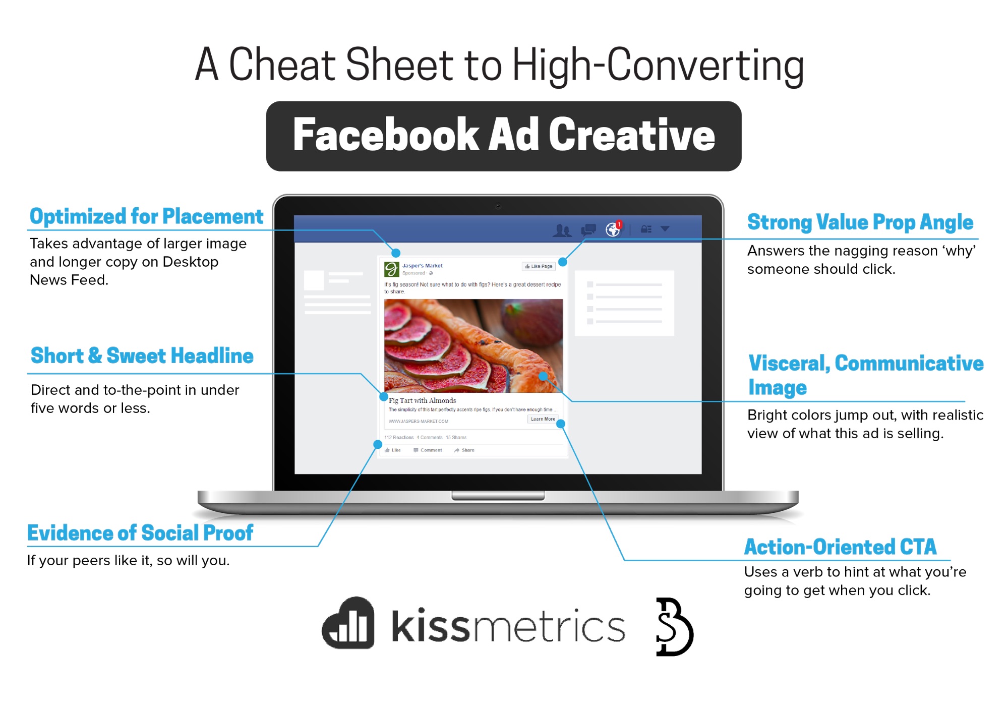
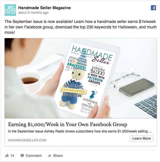
- Optimized for Placement: Takes advantage of larger image and longer copy on Desktop News Feed.
- Strong Value Prop Angle: Answers the nagging question ‘why’ someone should click.
- Short & Sweet Headline: Direct and to-the-point in under five words or less.
- Visceral, Communicative Image: Bright colors jump out, with realistic view of what this ad is selling.
- Evidence of Social Proof: If your peers like it, so will you.
- Action-Oriented CTA: Uses a verb to hint at what you’re going to get when you click.
Step #1. Start with a Strong Value Prop Angle
Your Facebook ad creative all starts with the value proposition.
But not for the reason you might think.
Sure, the objective is critical. If you’re going for discovery, something attention-worthy is critical. While if you’re looking for conversions, subtlety and understatement are key.
However there’s something else to consider first.
On Facebook, audience targeting is more important than ad creative.
In other words, better audience targeting with an average ad will almost always outperform an amazing ad creative with average audience targeting.
The reason comes down to Facebook’s Relevance Score, which acts a lot like the AdWords Quality Score; determining, filtering, and suppressing ads with little-to-no relevance to a particular group of people (based largely on their interests).
So your ad’s value prop construction should begin with those oft-mentioned and equally oft-ignored buyer personas.
If you’re gonna waste time A/B testing anything, it should be macro-elements like which messaging appeals to which audiences (and not the stuff you’d immediately rush to, like CTA-copy).
For example, your app, tool, product, or service probably caters to at least two or three different buyer personas. And chances are, they buy or hire for very different reasons.
That’s where you start. Even though your widget offers the same solution (more-or-less), it should come across very differently in both. Startups are obsessed with growth, while agencies care more about saving hands-on management time.
From there, the rest of the ad should begin taking care of itself.
Starting with your angle. If facts tell and stories sell, your angle is the compelling narrative.
The simplest place to start is the old Problem-Agitate-Solution (‘PAS’) copywriting formula. For example:
- Problem: Facebook ad creative design is difficult and time consuming.
- Agitate: Making simple mistakes can waste hours of prep work and thousands of ad spend.
- Solution: This cheat sheet will cut your time in half AND double your ROI.
(Sound familiar?!)
Here’s how that fits into the hierarchy of a successful ad messaging:
- Headline: The big, bold promise you solve for customers.
- Supporting Copy: The benefits that add context to your offer, explaining how quickly, how easy, or how effective it is.
- CTA: The action (or verb) someone takes to attain the value you’re promising.
Just remember: keep thing short. No one came to read on Facebook. They came to browse, look, and procrastinate.
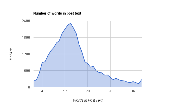
The Right Column and Mobile placements barely give you a line or two. While the News Feed gives you a little room to work with. The median ad post text is only 14 words long, while the link description is around 18 words, according to one study of 37,000+ Facebook ads.
Step #2. Images
5,000 images are shared every second across Facebook and its properties.
It should be obvious why.
Images can increase a piece of content’s visibility by 94%. And they can increase someone’s willingness to actually read the content associated by 80%.
That’s pretty impressive, considering people don’t read anymore. Thankfully, it takes our simple, little brains 13 milliseconds to process images. So they’re like a shorthand translation for whatever it is we’re trying to get across.
And on Facebook, they’re everything.
After your audience targeting and value prop, they’re the most important single aspect of a Facebook ad.
The problem?
Historically there was that whole 20% rule, that said that words can’t take over 20% of an image. That stance has since been softened a bit. But it still creates an issue. Use too much text, and your image’s reach and performance will be tainted.
Instead, your Facebook images need to tell the entire stories themselves – without relying on extra words or context to tell the story for you.
Here’s a few tricks:
No, not their crazy OCD policies. But their ad creative that showcases beautiful products on stark backgrounds.
Turns out, that stimulating contrast is “very important” to 67% of consumers according to MDG Advertising, which outranked supplementing ad photos with additional information, descriptions, or ratings.
Tip #2. Authenticity Reigns Supreme
Believe it or not, authentic images are preferable to overly polished, cold, ‘professional’ ones.
That’s especially true for ‘hero images’, where you’re attempting to showcase the ‘thing’ that someone gets. This is the end result and outcome of the product or service you’re providing.
If possible, heighten realism with cultural elements that can evoke emotional connection, or sensory currency that shows people doing something with their hands.
Tip #3. Showcase Microexpressions
Microexpressions are those fraction-of-a-second expressions that sweep across our face as an involuntary, subconscious response to something. The seven strongest of which, according to Science of People, include:
- Disgust
- Anger
- Feat
- Sadness
- Happiness
- Surprise
- Contempt
Substituting these onto the faces of your ‘hero images’ can immediately translate an emotion to people – instantly – without using a single line of copy or text.
Step #3. Headlines
Want to increase conversions? Like… instantly?
Change the headline, which has the power to deliver a 10% conversion lift with little-to-no mental taxation.
The other good thing about headlines? The best ones follow tried-and-true formulas. No need to reinvent the wheel. Especially when you combine it with a solid value prop angle and image, too.
Case in point:
If you were advertising a tool to an audience that already knows all about you, simple and direct might be the best headline approach (e.g. “Get a Free XXX Now”). But otherwise, your ads are going to need to grab attention away from all the pictures of people’s families, friends, and competition’s content.
One study, recounted in Made to Stick, showed that 89% of the most successful ads could be placed into six specific categories.
The same is true for headlines, where ready-made templates are already proven.
Fortunately there are already a few proven formulas to lean on.
1. Value Proposition: Highlight how you uniquely solve a difficult customer pain point.
The relatively straight-forward ‘value prop’ headline highlights the primary benefit along with evidence of what they’re gonna get (or save).
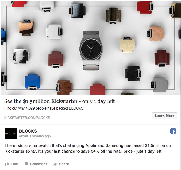
Incorporating a number, like the example above, can help set this headline apart; instantly communicating the value it delivers.
One PPC multivariate test performed by Marketing Experiments showed that the winning headline incorporated a specific, too-good-to-be-true number (“Dental Plans for $8.33 a month. Acceptance Guaranteed.”).
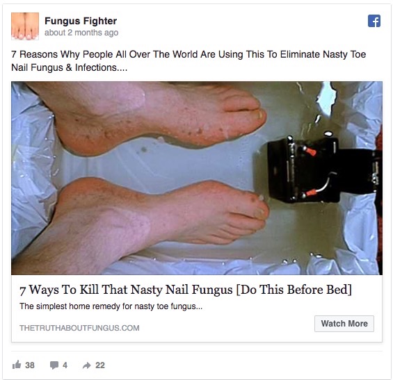
2. Listicle: ‘Hacks’ or ‘secrets’ promise simplicity in a chaotic world.
List posts are among the most prefered headlines on the ‘net. For a reason.
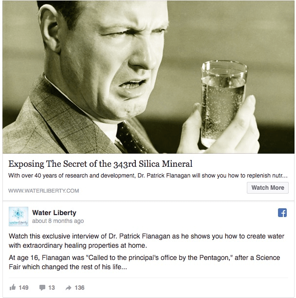
They offer the promise of quick results. Whether it’s a huge list to reference, a funny distraction, or – as the image above shows – specific, step-by-step shortcuts to solve a painful (and disgusting) problem.
When it comes to grabbing attention (for discovery and other top of the funnel campaigns), list posts reign supreme in almost all tests of headline effectiveness.
3. Cliffhanger: Give them a teaser, but hold back the rest to get them to click.
The most popular phrase that appears in the best performing headlines is kind of surprising.
It is, “This is”, according to Buffer’s analysis.
The reason? It hints at something too interesting to not click. It teases you just enough, revealing something surprising or funny or shocking, but then holds back and forces you to take action if you want to see more.
This is like a BuzzFeed headline at its finest; using clickbaity techniques like pattern interruption to get viewers to stop in their tracks and pay attention.
One final reminder though…
No matter which headline approach you choose, keep it short and sweet.
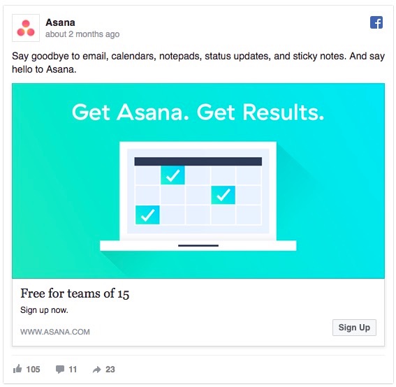
Concise and pithy wins, like this Asana add that gets everything communicated with the fewest headline words possible:
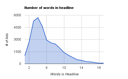
The median length for headlines on Facebook ads are only 5 words. Which means you need to get your point across fast, and get out of the way.
Conclusion
Facebook ad creative is difficult to pull off.
There’s so many different variables that a lot of time can be wasted (and money spent) on trial-and-error before you ever get to conversions.
Start with your ideal placement, which is driven largely by your campaign’s objectives.
From there, you can start thinking through the right value prop’s that will appeal to specific buyer personas, combining both logic and emotion to sell the value behind whatever it is you’re advertising.
Images should be visceral and evocative, communicating almost everything that needs to be said so it can stand on it’s own without a lot of supporting text.
Headlines can the be straight-to-the-point. They can translate your entire message into just a few simple words.
The best Facebook ad creatives then, aren’t just a bunch of isolated pieces. But a sum greater than its parts.
About the Author: Brad Smith is the founder of Codeless, a B2B content creation company. Frequent contributor to Kissmetrics, Unbounce, WordStream, AdEspresso, Search Engine Journal, Autopilot, and more.
Comments (3)