Maximizing your conversion funnels can only happen when you experiment with each element of customer interaction, dig deep into the analytics and then optimize the design.
Fortunately, you don’t have to test everything at once. But where should you start?
In this article I’ll tell you:
- Where you should start
- The most important interaction points to test
- The essential elements at those interaction points to test
- And different tests you can run.
Let’s get started.
1. Create Google Analytics Funnels
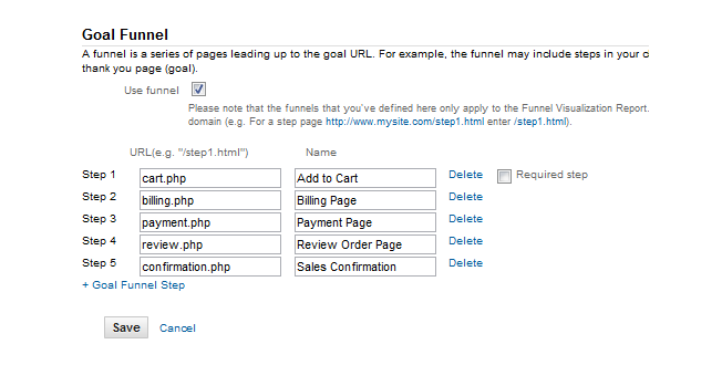
Your first step to building a well-built online conversion funnel is to set up a funnel visualization in Google Analytics.
If you don’t have this set up…stop right now and go set it up. The data you will collect will reveal where your users are abandoning the conversion funnel.
The requirements are simple:
- Goal Name – Give the goal a name that will help you recognize when looking at your data reports. For example, “white paper A download” or “free trial subscription.”
- Define The Funnel – Google Analytics allows you to add up to ten pages in a conversion funnel. This is where you will find out where users are dropping off before completing the “goal”…so get this path right.
- Give The Goal A Value – To calculate ROI and other metrics in Google Analytics, you need to figure out what a completed goal is worth. For example, if 10% of people who download a report spend $500 with you, the download value might be $50 (10% of $500).
This tracking will help you discover when and where people are leaving your site during the conversion funnel.
For example, you may see that visitors are bouncing off of one page in the conversion path. You discover this page is where you have the price listed. Can you improve conversions by moving the price further down the sales path? Would adding trust elements on that page help?
If you ask these kinds of questions as you work through the data you’ll be able to fix the leakiest parts of your online conversion funnel.
To learn more about how to set up funnels in Google Analytics, please read our articled called How to Get Actionable Data Out of Google Analytics.
2. Analyze Your Landing Pages
Once you’ve got funnel visualization set up, your first round of testing should focus on your landing page. Here are the elements you should test:
- Headlines – Test different headlines to see which ones attract and keep the most visitors.
- Copy – The copy should be full of benefits to the reader…leading off with the most promising. The PAS copywriting formula is the best way I’ve found to write sales copy.
- Color – Test different background and text color to improve conversion. I’ve done extensive testing of color on my own blog to come up with the current color scheme.
- Font Size – Try different font sizes to see which size keeps readers on the page longer. Also test different font styles to see how they impact conversion.
- Purchase Path – Test the path to purchase to eliminate any friction you uncover. Tip: lowering the page loading speed may be your biggest culprit when it comes to abandonment rates. Use Google’s Page Speed Report to test your conversion funnel. You can also uncover the impact slow page load has on conversion during a usability test. Use both in combination to get the optimal purchase path.
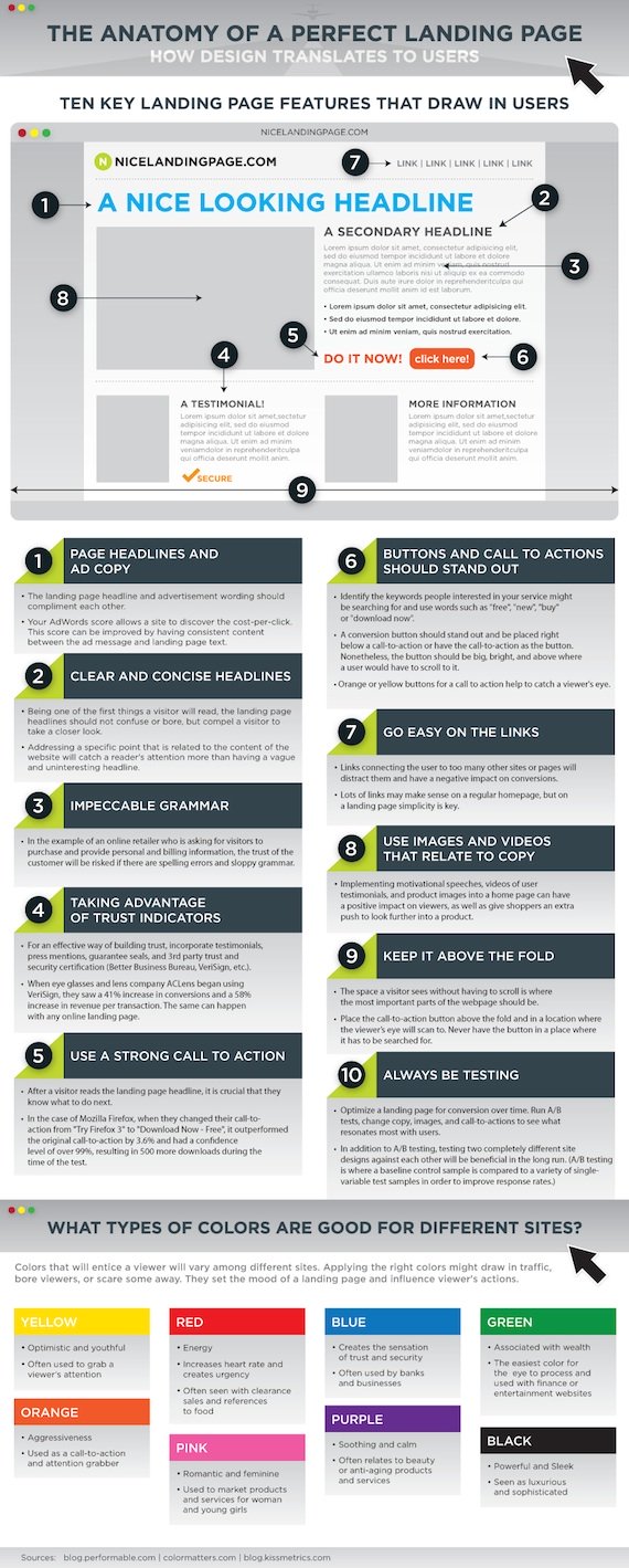
Click on this image below to get an even better understanding of what elements you can test on your landing pages:
The one final piece to creating a high-converting landing page is to limit distractions. Anything that is unrelated to the focus of that page should be cut immediately.
3. Analyze Your Sign Up Forms
The next interaction step to test is your sign up forms. The common elements to test are as follow:
- Headlines – Try out different headlines on your sign-up form and test their effect on sign up pages. Don’t take this lightly. You can boost conversion rates by 29% alone by testing different call-to-action headlines.
- Text Box Words – Make sure the words you use are not confusing…otherwise you could drive away visitors.
- Text Box Placement – Test how you position the text boxes on the form to see which arrangement produces the best conversion.
- Text Boxes Per Page – Analyze your completion rate to see if fewer boxes will boost conversion rates. Keep in mind, fewer text boxes don’t necessarily mean more conversions. You can actually increase back-end conversion by collecting more information.
- Captcha – These filters are great for keeping spammers out, but when they are too difficult to read…conversions can drop.
4. Test Your Trust Elements
Trust on the web is huge…especially when you are trying to get people to give you their money. This is why you have to build trust into your landing page and throughout your online conversion funnel.
At minimum, you need these elements:
- Guarantee – Will you give them their money back if they are not satisfied? Will you do this in 30 days? 60 days? 90 days? Test different variations to see which pulls the best.
- Better Business Bureau Logo – Applying for a BBB logo for your site is pretty straight forward. You have to be a member of your local chapter and pay somewhere around $400/year…but that’s inexpensive when it comes to putting your customer at ease.
- VeriSign Logo – The VeriSign logo is an internationally-recognized symbol that your online check-out process is safe and secure. That’s huge. Try to do business without that seal and your online conversion rates will plummet. You can get a VeriSign seal for less than $300 a year.
I think for the best results you should use all three of those trust elements above, but that doesn’t mean you shouldn’t do a few rounds of A/B testing, experimenting to find out which logo is the most effective. You’ll especially want to find out the best position of each trust element on the page.
Zappos is a company that uses trust symbols and guarantees really well. On every page they have what we call “The Extreme Guarantee”:
The Zappos footer also has all the relevant trust symbols:
Be sure to read our article 10 Ways to “Guarantee” More Sales and Conversions for more information and examples on this topic.
5. Test Your Email Conversion
Building an email newsletter list is an essential part of your online conversion funnel. Test these elements in your emails:
- Open Rates – Your email newsletter will live or die based upon your subject lines. Make sure you are using the most compelling copy. Test different variations constantly to raise conversion rates.
- Copy – Test short or long copy in the email, preferably finding out if the bulk of your audience wants to click through and read everything on your site.
- Click Throughs – Open rates alone won’t tell you the whole story. Embed links throughout the copy to see if more or less links drives people to click. And test different anchor text copy.
- Plain Text vs. HTML – Find out if your audience prefers email in plain text or HTML based. A great way to find out is to use a simple survey.
- CTA – Test different calls to action to see which drives more traffic to your site. Also test the position of these CTAs on the page.
By the way, check out my article 5 Reasons Why You Can’t Make Your Email Marketing Work for more advice on this topic.
Let’s shift gears now and talk about how you can test these different conversion funnel elements.
6. Combine Usability And A/B Test Results
Talk to most people about metrics and they’ll either talk about user testing or A/B testing…but never both. That’s unfortunate because they work together perfectly.
Let me explain.
- Get qualitative feedback from users during a usability test – Your first step should be a usability test. This user test can be casual, but tightly-focused…as in just have them focus on the page where conversions matter the most (sign up form). You would be surprised how much insight you can get from feedback from a very small group.
- Analyze your user testing results – This user feedback should help guide your design of the page in question. You should walk away with three or more design alternatives.
- Run your A/B testing – Once you have those alternatives and insights from user testing, start you’re A/B testing. Your A/B testing should help you narrow down your choices between design alternatives and on-page elements, eventually landing on the most optimum performing page.
In the end, A/B testing will confirm your usability test insights…giving you more effective results than if either were used alone.
If you’re new to usability testing, here are some resources to check out:
- Usability 101: Introduction to Usability – By Jakob Neilson, godfather of usability.
- Seven Common Usability Testing Mistakes – By Jared Spool, easily one of the smartest guys doing usability work.
- Usertesting.com – For $39 you get a video of a user talking about your site as they work through it, and written summary of problems they encountered.
And if you’re new to A/B testing, check out our A/B testing guide.
7. Run A Mom Test
Okay, so it doesn’t have to be your mom…but make sure it isn’t one of your internet savvy friends. In other words, it should be a normal web user.
Call this person and ask them to find your site on Google and complete the conversion process. Make sure you tell them what you expect users to do at your site.
Stay on the phone and ask them to talk out loud as they do their search. Record the phone call and take notes until they are finished.
Make tweaks to your conversion process and repeat the process until people can work through the process without abandoning the process.
8. Run An Online 5-Second Test
Finally, when it comes to creating a well-built conversion funnel, you need to keep things simple. Eliminate all distractions.
I’ve found that by running a simple visual presentation you can learn a lot about the simplicity of your funnel.
This is where the five-second test comes in.
Vinod Khosla originally created this test to show executives and VCs that slides thick with information would fail. The test involved nothing more than putting a slide in front of someone and then pulling it after 5 seconds. Khosla would then ask the tester to tell him what he remembered.
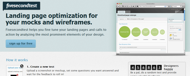
The lesson was always the same…less is more. The 5-second test has been adapted online to help you test web designs with a tool like fivesecondtest.com.
You can use this to test wire-frames, mock ups and call to actions. And it’s easy to get started:
- Get a free account.
- Upload a screenshot of the web page you want to test.
- Let members test your web page.
- See your results.
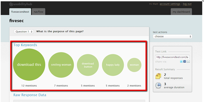
You can see in the red outline that in a quick glance what most users were seeing as the most important goal of the web page. In this case it was “download this.”
Is that what you want to be the main goal?
If not, then you need to change the design and re-test. The tool is free so you can do this as many times as you want!
Conclusion
When it comes to creating a well-built conversion funnel, you should be testing all the time. You’ll get plenty of actionable data that will help you improve your conversion rates.
Listen, if you’re not testing, you’re leaving money on the table. And as I shared above, there are so many easy and inexpensive ways to test that you really don’t have any excuse. Besides, who wants to lose money? Not me!
What other elements in a conversion funnel should you be testing? And what other tools do you know about?


Comments (6)