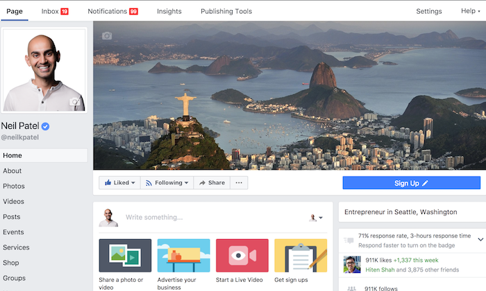
What’s the first thing people notice when they see your Facebook page?
Visually, it takes up nearly a quarter of the screen on your desktop browser.
This is not a trick question. It’s your cover photo.
Facebook has transformed drastically throughout the years. What started as a platform to connect college students has turned into an essential marketing tool.
For starters, if you are not using Facebook to promote, advertise, and represent your company – you should be.
You can take a look at my guide where I explain the importance of advertising on Facebook.
If you’re under the impression that Facebook is a fad from the past, think again.
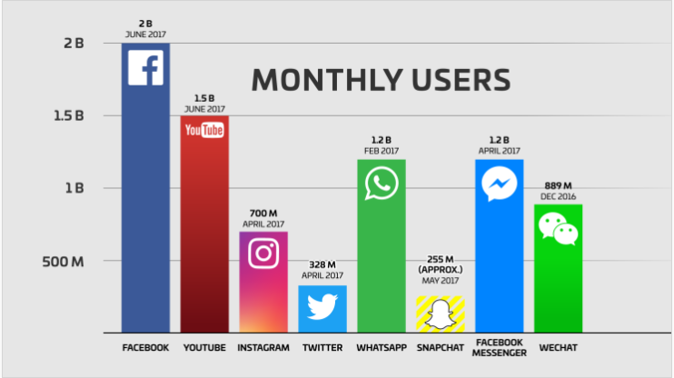
According to Tech Crunch, Facebook has more active users than Instagram, Twitter, and Snapcat combined.
That’s right. Facebook has over 2 billion monthly users.
This is a number that we simply cannot ignore.
You might be wondering if these numbers are plateauing or potentially even declining.
Well, it’s neither.
In fact, the number of active Facebook users is on the rise.
Tech Crunch continues explaining that Facebook’s user count is growing at about 17% each year.
Furthermore, 66% of users are active daily. That number is 11% higher than it was in 2013 when Facebook hit the 1 billion mark.
Despite popular opinions about Facebook, these numbers don’t lie.
Your current and prospective customers or subscribers will visit your Facebook page.
Since the first thing they’ll see is your cover, I’ll explain how to create a highly effective Facebook cover photo.
Creating an Effective Facebook Cover Photo
For Facebook cover photos (or “Facebook banners” as some call them) use an image that attracts appropriate attention.
Among others cover photo best practices, consider the demographics of your customers and subscribers.
Let’s say your company sells products for babies up to two years old. Your target demographic might be a new mother between the ages of 25 and 40.
Some timeline covers of college girls in bikinis will certainly draw attention, but it does not draw appropriate attention.
Try to come up with something that relates to your customers.
Use powerful emotion as a tool to communicate with your subscribers.
A mother holding her infant baby is an emotional cover photo example that the demographic in the above case can relate to.
What’s the demographic of your current Facebook following?
Did you know that this information is available to you from your business page?
Here’s how you find out.
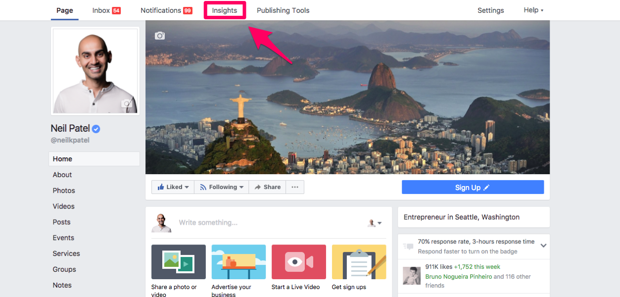
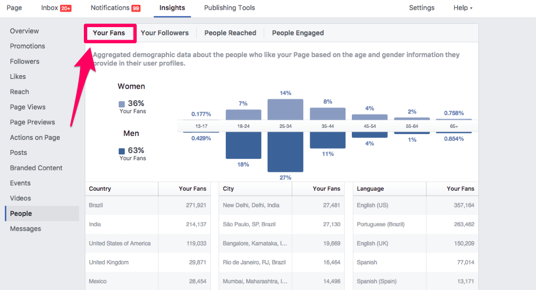
Step #1: Select “Insights” at the top of your homepage.
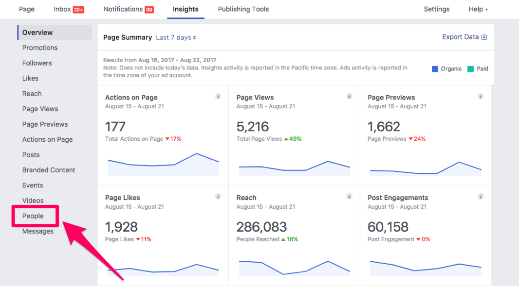
Step #2: Click “People” on the left side of the screen.
Step #3: Select “Your Fans”
From here, you can see who likes your page.
It will show you the percentages of your subscribers by:
- Age
- Gender
- Country
- City
- Language
This is an important tool for you to utilize.
Not only will you gain valuable information about your subscribers, but you can also use this information as a resource when you’re creating the perfect Facebook cover photo.
Here’s an example:
Let’s say you discover that 80% of the people who follow your Facebook page are males.
75% of these subscribers speak Spanish as their primary language.
We’ll also say 90% of your followers are between the ages of 18 and 25.
Based on this information, it may not be a bad idea to include a cover photo that has a young man and some text written in Spanish.
Chances are good that your numbers may not be as black and white as this example, but it’s still valuable information.
Here’s something else to keep in mind when you look at this data. It may not be 100% accurate.
The information is based on what people put in their profile. So if someone is in the United States, but their profile says they live in Japan, your numbers will be slightly off.
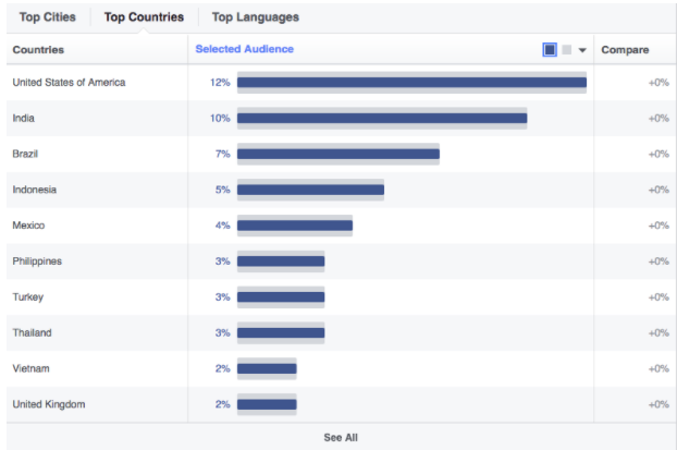
Here’s some information from Sprout Social about some general demographics of all Facebook users.
The graph shows that 12% of Facebook users are from the United States.
With that in mind, research from the Pew Research Center states that 68% of adults in America use Facebook.
So as a whole, the United States has the largest percentage of Facebook users compared to other countries, and over 2/3 of American adults use Facebook.
The point I’m trying to make is that you can use all of this data to help you find an image that attracts appropriate attention.
Know your audience – your cover image, as well as your facebook timeline, should represent this group.
Keep it simple.
Don’t go crazy trying to fit as much information as possible trying to obtain the perfect cover photo.
The image should have a clear focal point to draw the visitor’s attention.
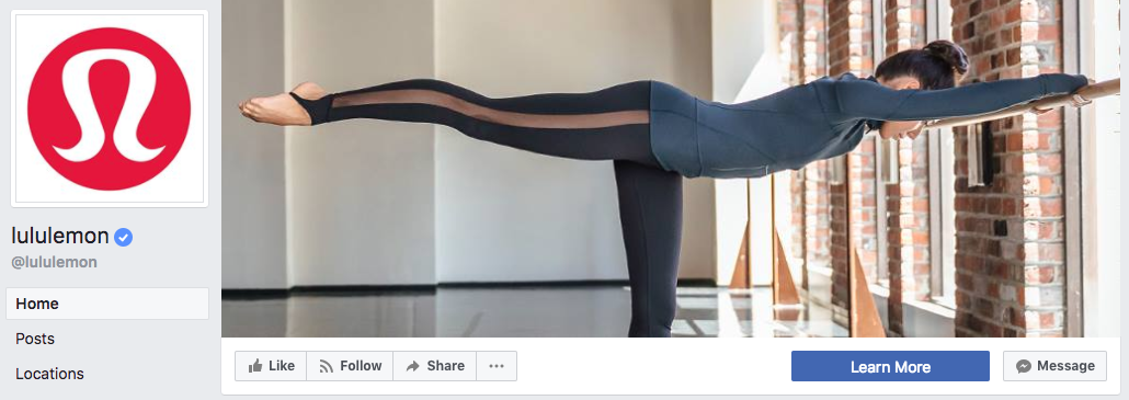
See how simple this cover photo is from Lululemon?
According to Laurent Potdevin, the company’s CEO, about 80% of the company’s customers are female.
What do they sell? Yoga clothing.
Their cover photo hits their demographic right on the mark while keeping it simple.
Notice how they don’t even include their company logo on the cover photo.
Instead, they put their logo as the Facebook profile picture.
Use your profile picture to complement your cover photo.
If Lululemon had another woman doing a yoga pose as their profile picture, it would have been redundant and not as effective.
Overall, their page has a nice graphic design, a visually appealing theme because they kept things simple.
Just because Lululemon didn’t put any text in their cover photo, it does not mean that’s the only option.
Let’s take a look at another example on the complete opposite side of the spectrum.
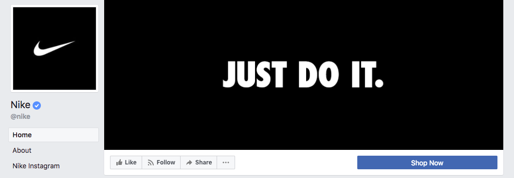
3 words, 8 letters, and 11 characters –you don’t need a photo description as it doesn’t get simpler than that.
This method is extremely effective for a global brand like Nike.
They make athletic clothing and equipment for nearly every sport and for people of all ages and genders.
According to Statista, Nike is the largest supplier of athletic shoes, apparel, and sports equipment in the world.
Their global revenue is over 34 billion USD annually.
Nike could have gone a few different directions with this image, but ultimately they chose the right one.
They could have used an image of an athlete from one particular sport, but it would have alienated the rest of their clientele.
On the other hand, they could have tried to incorporate a collage with a mixture of sports, ages, genders, and geographic locations.
But that’s too messy – not simple.
Instead, Nike decided to use their iconic slogan in white lettering on a simple black background.
Notice that they took the same approach as Lululemon and used their company logo as the profile picture.
Both of these companies used their Facebook cover photo to build their personal brand.
Watch my video where I explain this concept in a little more detail.
You can also use your Facebook cover photo or your cover video as a promotional tool.
If your company is trying to push a new product launch or get your subscribers to make a purchase, you can use your cover photo as an advertisement.
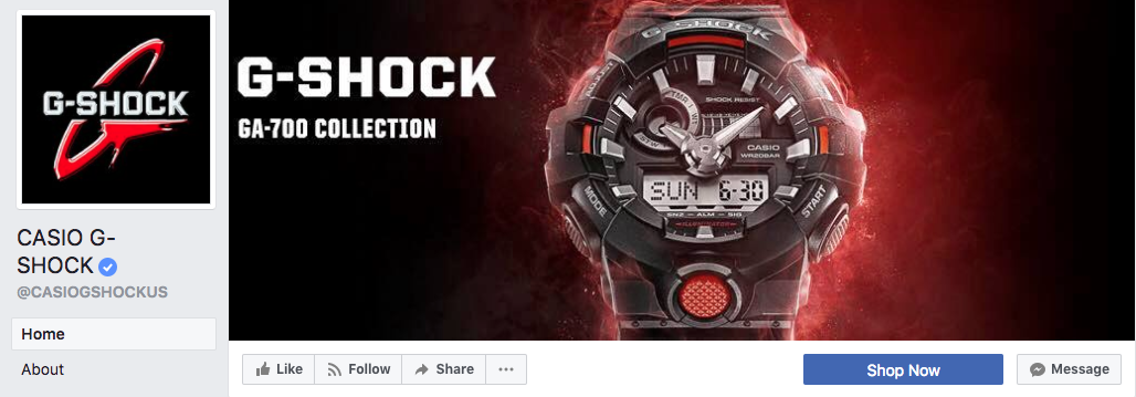
Take a look at this example from a popular watch company.
G-Shock is clearly promoting their GA-700 series with this cover photo.
While this example may look significantly different than the others we’ve discussed, it still meets all the criteria that we outlined earlier.
G-Shock’s cover photo:
- Attracts appropriate attention
- Uses a simple design
- Incorporates little text
- Uses a profile picture that complements the cover photo.
Following this strategy is just one step in an in-depth process that leads to social media marketing success.
Let’s analyze the Discovery Channel cover photo.
This cover is by far the most text-heavy of all the examples we’ve seen.
With that said, it’s still an effective approach.
Discovery Channel is promoting two things in one image.
- A television show on their network.
- Their mobile app.
They were able to get all of this information on one image while keeping a simple design in mind.
There isn’t too much clutter, and all the text flows smoothly.
Notice the background. The gray background of the cover photo is the same as the profile picture.
This Facebook marketing trick keeps a uniform and pleasing look for their page.
Facebook guidelines
You also need to make sure your cover photo adheres to the Facebook guidelines.
Here are some quick takeaways and points you should know about your Facebook cover photo:
- Your cover photo is public.
- Cover photos cannot infringe on someone else’s copyright.
- You cannot be deceptive or misleading with your cover photo.
- You are not allowed to encourage other people to upload your cover photo to their own personal timelines.
If your cover photo violates any of these terms, Facebook can suspend or terminate your account.
Make sure your Facebook cover photo size is correct.
Once you select a photo, you need to make sure that your Facebook cover photo dimensions are correct.
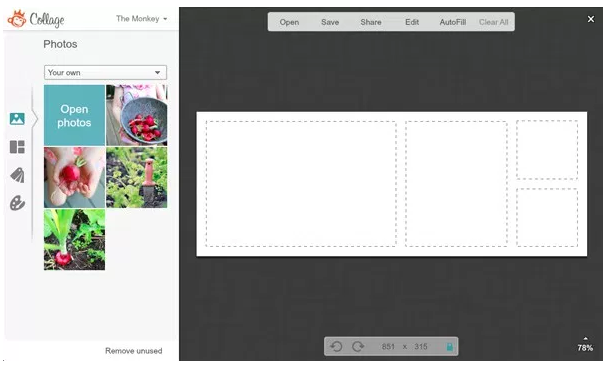
On a desktop, the perfect Facebook cover photo size has to be optimized for 851 pixels wide and 315 pixels tall.
For mobile optimization, implicitly Facebook mobile app, the image size should be 640 pixels wide by 360 pixels tall.
Desktop vs mobile: do you need to focus on desktop and mobile optimization?
Absolutely.
Take a look at this graph from Venture Beat.
Nearly 900 million people used Facebook on their mobile device in the first quarter of 2016. That number continues to climb.
If you upload a cover photo size that’s smaller than the dimensions mentioned above, Facebook will automatically stretch it to a minimum of 399 pixels wide and 150 pixels tall.
With that said, a top and bottom stretched image won’t look very professional.
Before you waste time designing a Facebook cover photo template that’s not optimized properly, I’ll show you how to make sure your photo sizes are the correct ones.
You can use a service like PicMonkey to design and size your Facebook cover photo.
Step #1: Visit picmonkey.com and create an account.
If you aren’t ready to commit to their service, they offer a seven-day free trial with premium access to all of their features.
See if you’re comfortable with their software and take full advantage of the trial period before committing to a monthly or annual subscription.
Step #2: Import your photos.
You can import photos from your computer, your stock photos database, Facebook, Dropbox, or Flickr account.
It’s easier to just upload all of your images at once. That way, you’ll have everything in front of you while you’re working to create a cover photo.
If you keep going back to import new images, it’s not an efficient use of your time.
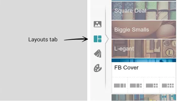
Step #3: Select the “FB Cover” option from the layouts tab.
On the left side of your screen, you’ll see the layouts tab, as pictured above.
For this purpose, we’re obviously going to select the “FB Cover” option.
However, you can take advantage of the other layouts for different aspects of your Facebook page.
Sometimes, it’s best to include an image of your team. Optimizing your Facebook page can go along way toward conversions as it can act as a CTA button.
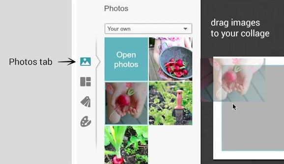
Step #4: Drag photos to the template.
Now that you’re in the Facebook covers layout, go back to the photos tab on the left side of your screen.
From here, you can simply drag the photos you uploaded earlier directly to the template.
Mix and match these photos to see what looks best.
Step #5: Edit the images.
If you move your cursor over an image in the template, you’ll see an “Edit” button pop up in the top left corner of the picture.
Click on the edit button to adjust the size or exposure of the image.
You can also flip and rotate the image if it didn’t import properly.
Drag the image around in the cell until you’re happy with size and position.
Step #6: Adjust the layout.
If you’re using multiple images to create your cover photo, place your mouse between each photo in the template.
Two blue lines will appear between the images. Your mouse will turn into a double-headed arrow.
Use the mouse to rearrange the layout of these images.
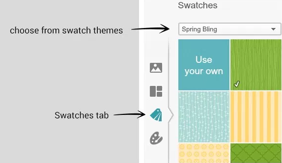
Step #7: Insert a swatch for adding text.
Before you can write text, you need to add a swatch.
Select the swatches tab on the left side of your screen.
From the swatches menu, you can select a swatch theme that fits well with your photos.
Use one of their existing swatches or create one of your own.
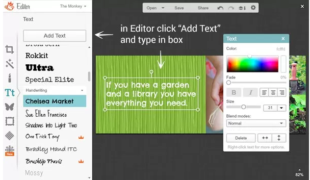
Step #8: Add text and make the final edits.
Add a simple cover photo description.
Keep it short.
You don’t want the text to be the primary focus of your cover photo. Instead, let your words compliment the image.
Facebook used to have regulations in place that prevented users from having more than 20% text in their cover photo.
However, that rule was lifted in July 2013.
Just because Facebook changed their rules about the text on cover photos does not mean that you need to include lots of words.
Again, just be concise.
You can adjust the font, colors, and borders from this page, as well.
Step #9: Verify your dimensions.
Before you save your image and upload it to Facebook, you need to make sure that the cover photo designed by you has the dimensions well optimized.
If you selected the “FB Cover” option back in step #3, then this should already be correct.
However, it’s always best to double-check. It will save you time in the long run.
You don’t want to save your image and upload it to Facebook only to discover that the dimensions got changed while you were working.
Then you’d have to rush to replace the image before too many people notice the error.
PicMonkey is just one of the many platforms that offer this service.
You can also try:
- Canva (It’s free)
- HubSpot (Download free social media cover photo templates for Facebook, Twitter, Google+, LinkedIn, and YouTube.
- Pic Stitch (For iOS or Android)
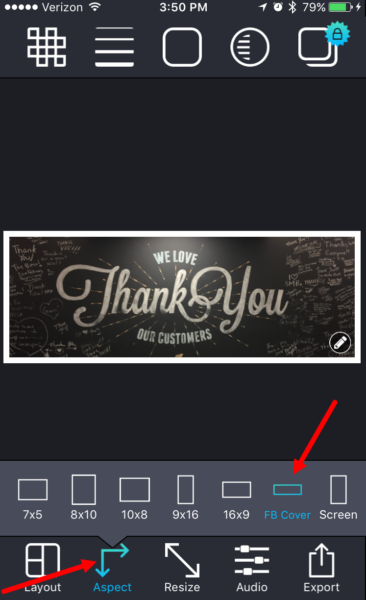
You can use Pic Stitch on your mobile device to optimize the size for your cover photo.
Simply go to the “Aspect” tab at the bottom of your screen and select the “FB Cover” option.
Now that you’ve created an image that’s properly sized with the optimal dimensions, it’s time to upload it to your page.
How?
I’ll show you.
Uploading your cover photo to Facebook
Here’s a quick step-by-step tutorial to upload your photo.
Step #1: Go to your company’s home page.
Click on your name or company’s name on the top toolbar on Facebook.
You can also click on your existing profile picture.
Both of these options will bring you to the home page.
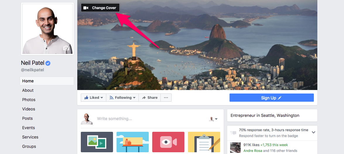
Step #2: Click “Update Cover Photo.”
Position your mouse over your existing cover photo. You’ll see “Update Cover Photo” appear in the top left corner of your screen.
If you don’t have a current cover photo, the prompt will read “Add Cover Photo” instead.
Step #3: Select your new photo.
Now all you need to do is select the photo that you created earlier.
That photo has already been optimized with the proper dimensions, so you won’t need to worry about resizing or adjusting anything.
If you want to make slight alterations, you can click “Reposition” and drag the photo so it lines up exactly how you want it to look on your page.
Once you’re finished, click “Save” and your new cover photo is all set. Somewhat similar steps apply if you want to use a Facebook cover video instead.
To make an amazing Facebook cover video, head over to InVideo today. There tool is easy to use for anyone, not just people with video editing experience. Once there, you can get as creative as possible while making your cover video.
Conclusion
Facebook photos are an important part of your brand’s image.
How important?
Compared to your posts without photos, there is a significant difference.
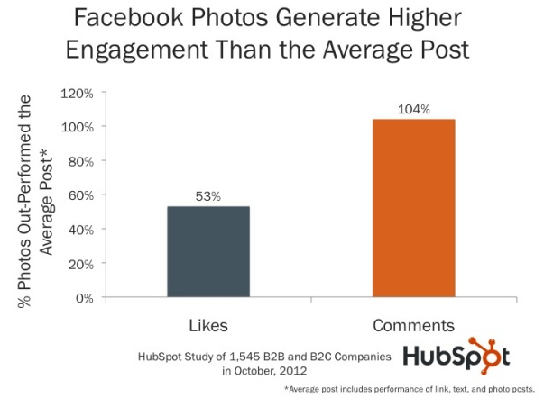
The graphic above shows the data from a HubSpot study.
Their research concluded that photos generate 53% more likes and 104% more comments than posts without photos.
With subscribers putting such an emphasis on the images on your page, it makes sense that the most important photo on your page is the first one that everyone sees.
Your cover photo is the most significant.
As we discussed, it’s really not complicated to create an effective Facebook cover photo.
Make sure you use an image that attracts appropriate attention.
Use the information about the demographics of your subscribers to your advantage.
As I outlined earlier, you can find this information in a few quick steps.
You can also refer to my guide for creating a profitable Facebook advertising campaign.
Make sure your photo is simple and that the size is optimized properly.
It’s OK to include text on your cover photo, but keep it short. Also, refer to the Facebook guidelines to make sure your photo isn’t violating any of their terms.
If you follow the tips in this guide, you can easily create a highly effective Facebook cover photo.
What image will you use to represent your company?







Comments (4)