Politics is a subject that often gets a lot of people riled up… Fortunately, we’re here to talk about email marketing!
President Barack Obama has been noted as one of the most “connected” politicians of his age, embracing social media and email marketing like few before him. While he and Mitt Romney seem to email their subscribers at a similar volume, the President’s team has taken its email marketing efforts to the next level.
Today, we’re going to take a look at some insightful lessons from President Barack Obama’s email marketing efforts. And we’ll even showcase some things that he does wrong! (Sorry, Mr. President.)
Let’s begin…
1. Using Personalized Landing Pages
One of the most interesting strategies I’ve seen the Obama campaign team use is the implementation of personalized landing pages for different promotions.
You might have heard about the incredibly popular Barack Obama “Ask Me Anything” thread on Reddit.com, where President Obama took about 30 minutes to answer questions from Reddit users.
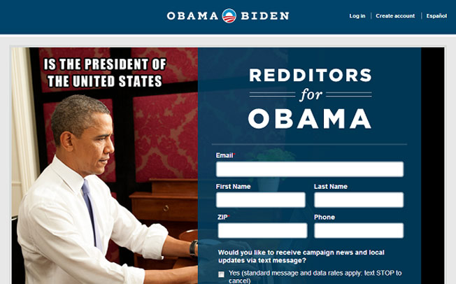
What you may not have noticed was that the link he left in the thread led directly to a Reddit inspired landing page, which you can see below:
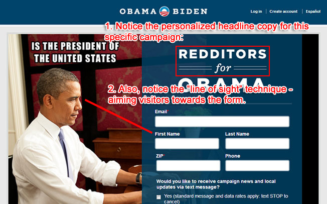
Even though he is the President, that’s still very much a landing page! Best of all, the personalized aspect probably led to some phenomenal conversion rates.
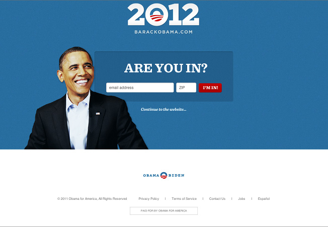
You may also detect the marketing team using “line of sight” here (with another example later on). If you follow Obama’s gaze, it leads right to the sign-up form; and it’s been proven that we have a tendency to follow the gazes of others (as well as arrows).
2. Made-to-Click Subject Lines
All experienced email marketers know that subject lines drastically affect open rates, so making your subject lines clickable (and tailored to your audience) is of paramount importance.
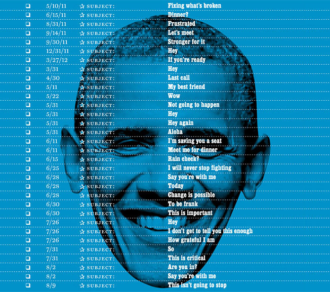
Here’s a great graphic from NYMag that shows the subject lines the Obama campaign has used over the past months:
Check out some of these…
- If you’re ready
- I’m saving you a seat
- This is critical
Very personal, and they rely heavily on the “information gap” theory of curiosity, proposed by neuroeconomics expert, George Loewenstein.
Here’s where things can go wrong… (Hey, don’t steal that one, Obama! ;))
President Obama can get away with these sorts of subject lines because we know exactly who he is, and political races often inspire incredibly loyal followers.
Now, I have some great open rates for some of my sites (over 60% for my personal site), but I could never get away with these subject lines. That’s okay, though, because the lesson here is to use subject lines that work for your readers. And always be sure to test for improvements.
3. Great Use of Opt-in Forms
One thing you’ll notice about Barack Obama’s website is that the campaign team is all about collecting more email leads.
When first entering the site, you’ll see that a splash page pops up for all new visitors:
Despite the fact that many folks voice strong opinions about pop-up forms and splash pages, the numbers tell the most honest tale.
According to research by Dan Zarrella on his own site, even a pop-up form did not increase bounce rate or incur any hateful emails; and it actually increased email sign ups by a large margin.
Not only that, in the actual content of President Obama’s site, there are numerous opt-in forms that encourage supporters to join his email list.
In one of my previous posts concerning where to put your opt-in forms, I noted that the above-the-fold locations of a “Feature Box” (popularized by Derek Halpern) and the top of the sidebar convert quite well across all industries… And you’ll observe that BarackObama.com uses both!
Here’s the above-the-fold form on the home page (past the splash page):
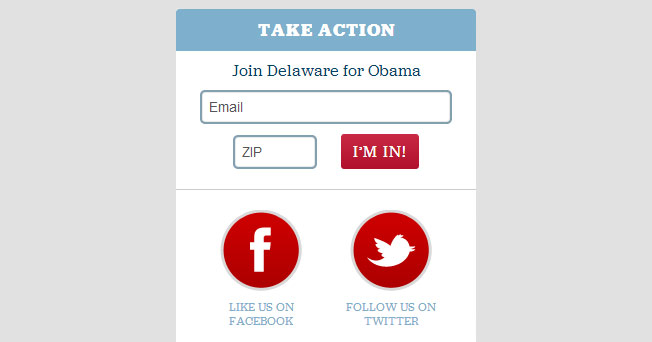
And here is the sidebar opt in, which is featured prominently in the BarackObama.com content pages:
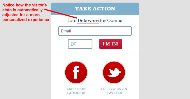
By the way, the form adjusts for the state that you’re in!
Now that’s smart use of personalization to increase sign ups. Also, the form promotes action, using the copy of “Take Action” and “I’m In!” for the text.
4. Smart Follow Ups
Successful marketers know that smart follow-up messages are crucial for optimizing the results you get from new email sign ups.
While sending new subscribers to a donation page (or a sales page) right after they’ve signed up is a bit too aggressive for most situations, during campaign time it’s almost a given that politicians will ask you to donate.
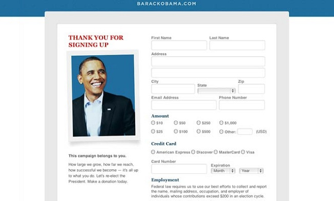
That in mind, BarackObama.com uses this follow-up/thank-you page for new subscribers, encouraging them to donate and support the campaign:
Since people have already taken a small step to support Obama (by signing up for his email list), it’s actually a great time to ask for another action.
It’s a classic example of the foot-in-the-door technique, since asking for a small favor has been proven to be a great way to move people along to another, bigger request.
5. Split Testing of Key Pages
With the traffic that BarackObama.com receives, even a small improvement in email conversions can result in hundreds of thousands of new sign ups.
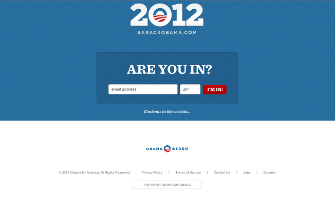
No surprise then, that for its sign-up forms, the Obama team members split test almost everything: buttons, text, and even the home page opt in.
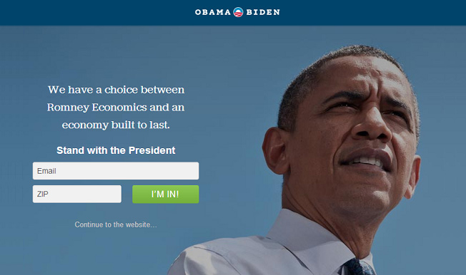
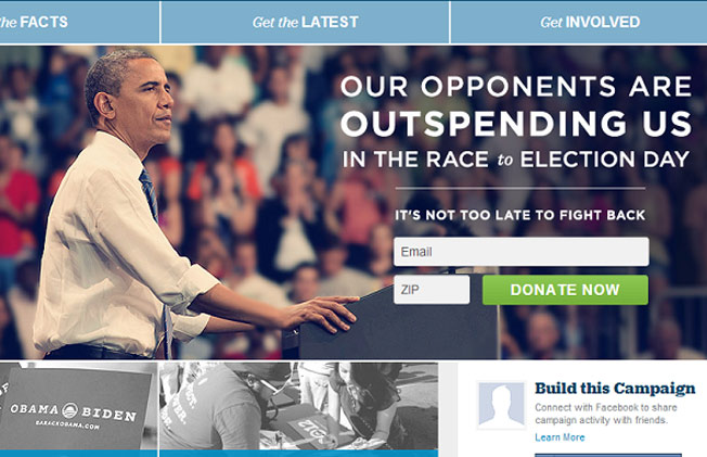
Here’s one version of the home page that I ran into a while back:
On another visit, the team implemented the “line of sight” technique (again!) and included Obama himself, looking at the opt-in form.
You can see that version here:
Learning to split test your web forms is crucial if you are getting a substantial amount of traffic (worry about getting around 800+ uniques a day first), because those small tweaks can have a massive impact.
Showing no signs of stopping, I regularly see new changes to many aspects of BarackObama.com, and it’s not hard to see why: some of the results have been phenomenal.
But Wait… Is He Doing Anything Wrong?
Sorry, Mr. President.
A lot of people have criticized some of the President’s email marketing tactics, and today I’ll go through some of the main problems being pointed out.
In a pretty hilarious segment of the Daily Show, even Jon Stewart took a few shots at Obama’s emails by pointing out how much they resemble spam emails (the vague, mysterious subject lines being one aspect).
The other big complaint seems to be where the emails take you. I’ve noticed that quite a few folks point out certain emails (notably his Mother’s Day email) often lead to donation pages for the campaign – even if the content of the email had nothing to do with donating.
This has frustrated a lot of people, and there’s a big lesson to be learned: in general, people like clarity in their emails. While they don’t mind a hard sell every once in a while, if they feel tricked, they feel betrayed.
Now, President Obama isn’t going to have to worry about his email list flat-lining any time soon, but there definitely are some mistakes being made that marketers can learn from.
Your Turn
What did you think about some of President Obama’s email marketing tactics? Leave a comment below with your thoughts…
Thanks for reading, and I’ll see you in the comments!
About the Author: Gregory Ciotti is the content strategist for Help Scout, the invisible help desk software that makes email support a breeze for you and your customers. Get more from Greg on the Help Scout blog.
Comments (26)