Compared to other metrics, site search usually gets passed over as one of those things you’ll improve “soon.” It’s not a high priority like landing pages and personalized email.
But taking steps to improve your site search can improve conversion rates; and it also can lead to happier shoppers – shoppers who come back and order again, and then share their experience with others.
So how can you improve your site’s search to do more than just return results? Take a look at how these retailers are making search more user centered, customizable, and interactive:
1. Focusing on the Search Bar
FootSmart makes its search bar more noticeable by making it a different color to offset it from the rest of the site’s color scheme
The search bar itself is the start of the journey, and an often neglected piece of the conversion puzzle. Offsetting it in a different color from your site’s color scheme is one method of drawing attention to it. Putting text inside the box, such as “Enter keyword,” lets visitors know at a glance what is expected (and differentiates it from a newsletter opt-in form). Top it off with a button that reads “Search” or “Find” and include some stylized arrows (indicating motion), and you’re off to a great start.
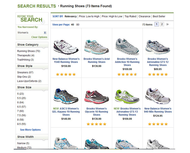
The FootSmart search results page includes each product in its own individual cell for easier browsing and shopping
Notice how the results page of a search on FootSmart segments each product into its own individual cell, along with its name, price, and ratings. Sorting options appear on the left for further refinement. This method is ideal for displaying ecommerce products but could be improved even further by allowing the user to view a close-up of the product (or different product angles) without having to click.
Using analytics, FootSmart was able to identify underperforming search terms and act accordingly. By improving their site search and making relevant adjustments, they saw an 82% improvement in conversion rates.
Key Takeaway: Look for ways to make your site search stand out from your color scheme. Follow best practices to ensure that the search box and button make it push-button simple (literally) to conduct a search and get results.
2. Filtering the Results Page
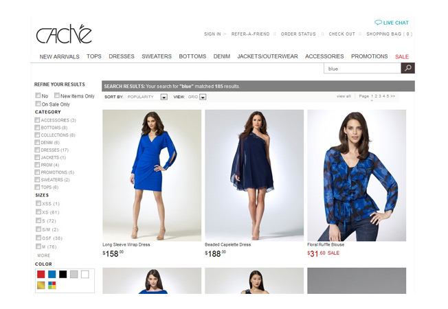
The search results page is at the heart of whether a user clicks or leaves. And with a good site search engine, you can (and should) customize it a great deal, depending on what your target audience is looking for. For example, as women’s clothing and accessories retailer Caché shows with its site search, you can type in broad phrases like “blue” and get a range of products, which you then can sort by article of clothing, size, popularity/price, and other features. Shoppers also can refine items based on whether they’re on sale or they’re new arrivals.
Caché’s search stands out by letting users sort by sale items or new items, among other filters
Key Takeaway: People expect their product searches to return filterable options, so allowing them to sort by size/color/style is no longer enough. Look for ways to raise the bar by allowing shoppers to optionally include (or exclude) sale/clearance items, new items, and other popular categories.
3. Handling Long Tail Semantic Searches
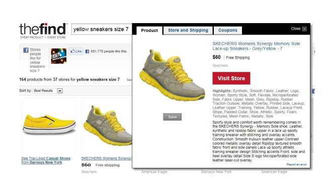
Long tail semantic searches push a search engine further by making it understand the intent behind the user’s search. For example, someone searching for “women’s long sleeve black tee size M” is much more likely to convert than someone just browsing “women’s tees.” According to a study in Retail Integration Online, sites with a semantic-based search engine have a low 2% rate in shopping cart abandonment, compared to as much as 40% on sites with plain text search.
TheFind incorporates long-tail semantic searches in its results
Key Takeaway: Shoppers are demanding improved search results; and, when it comes to relevancy, a semantic-friendly site search will beat plain text competitors every time.
4. Using Intelligent Autocomplete
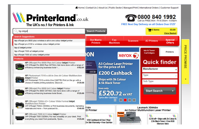
Autocomplete is another great site search time saver for shoppers, and it’s getting smarter. Printerland, a U.K. printer and accessory retailer, recently worked with site search provider SLI Systems to add smarter search (including autocomplete features) to their site. As a result, they increased their overall conversion rate and now enjoy a per visitor value that’s four times greater than previous sales. In addition, customers who land on an autocomplete page suggestion are six times more likely to convert than those who don’t.
Printerland’s rich autocomplete search shows intelligent results and product pages
Key Takeaway: Autocomplete for site searches (to help customers find what they want visually) is especially worth considering if you have numerous products (or multiple products under the same brand). And including product photos and pricing is icing on the site search cake!
5. Including Smarter Breadcrumbs
Few things are more irritating than a site search that displays unhelpful breadcrumbs, such as Home > Search > Your Search Result. Allowing people to filter their results via breadcrumbs lets them pick and choose which features they want, without clearing their search entirely and starting over from the beginning.
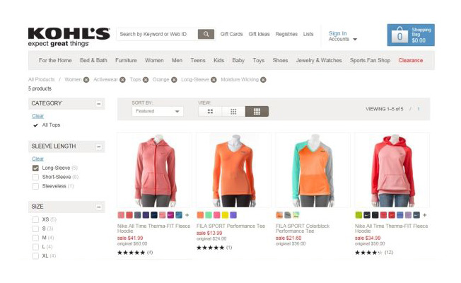
Kohl’s automatically updates search results based on checkboxes the user clicks in the sidebar. And it goes a step further by also letting them take away options by clicking on the breadcrumbs, so they get more precise results without voiding their entire search.
Kohl’s uses smart breadcrumbs to let users filter and change search parameters and have the results show instantly
Key Takeaway: Don’t force users into a tunnel of limited search results. Let them check, uncheck, clear, and refine their results for a more perfect (and thus higher converting) search.
Currently, there are only a handful of semantic search providers that license their technology out to site owners (to incorporate into their site). However, with users demanding more from their search engine results, it’s easy to see that the smarter search will easily become a top conversion booster, and thereby worthy of more attention in the near future.
The Site Search vs. On Page Navigation Showdown
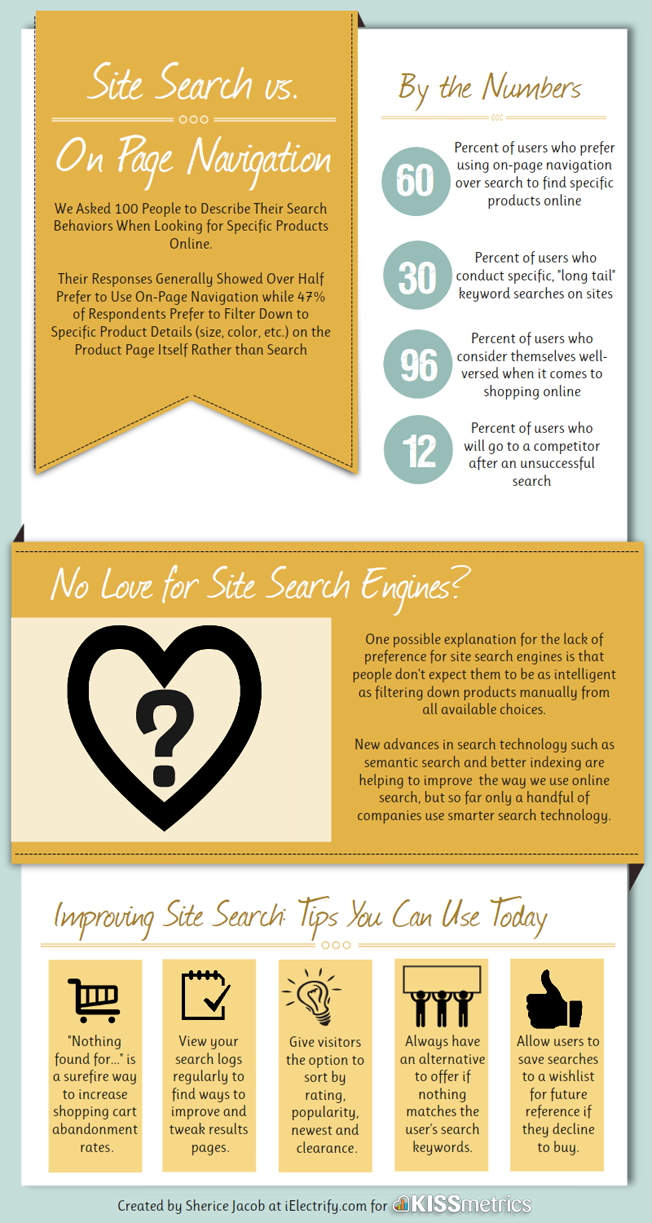
We asked 100 people to describe their search behaviors when looking for specific products online.
Their responses generally showed over half prefer to use on-page navigation, while 47% of respondents prefer to filter down to specific product details (size, color, etc.) on the product page itself. Check out their responses in the graphic below:
About the Author: Sherice Jacob helps website owners improve conversion rates through custom web design, copywriting, and intelligent optimization.

Comments (24)