I want to let you in on a little secret. Your e-commerce site is just one in a sea of 47 billion websites currently swimming around the Internet.
Billion. With a ‘b.’
This includes roughly 1.3 million e-commerce sites. And that’s just in the United States.
Sites like yours that are trying to get product and content in front of the right people, to get people to opt-in, engage, or buy.
Out of those e-commerce sites, just a little more than 650,000 earn less than $1 million from web sales.
I know, “less than $1 million” is an overly broad measure.
Given that average conversion rates are between 2-3%, I believe it.
So if you want to compete, you need to stand out.
These 17 e-commerce conversion hacks will help you double your conversion rates and have you fist-pumping with your sales department in no time.
1. The need for speed
Two seconds.
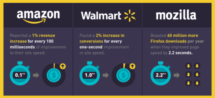
If your site takes longer than two seconds to load, 53% of your customers lose interest.
Even a delay of a single second can result in a 7% reduction in conversions. For an e-commerce site making $5,000 per day, a 1-second delay could potentially cost you $125,000 in lost revenue.
It’s true. There are few things more frustrating than waiting for a website to load in today’s age of instant gratification.
Here are a few things you can do to make sure that you’re not leaving money on the table because of your site’s performance.
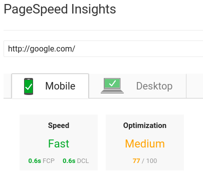
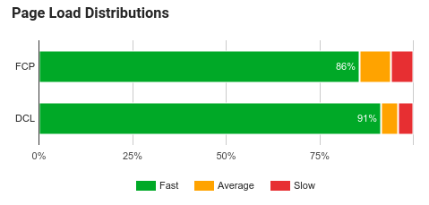
1. Test your speed. Use Google PageSpeed or even something like Pingdom to figure out your site’s baseline speed.
If you don’t know where you are, you can’t go where you need to go.
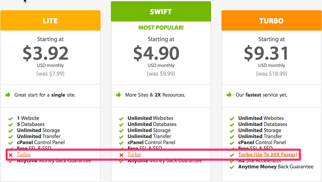
2. Check your hosting plan. If your site host offers different hosting levels, make sure that you’re using a higher performing version.
The extra money it may cost will be worth it if you drop the load time and increase conversions, right?
3. Optimize images. There are so many tools out there – both free and paid – that can be used to optimize your images for web and mobile.
Kraken has plans that start at $5/month. TinyPNG is free.
If you’re not into online tools, you can download RIOT for a free desktop option.
No excuses. You have to make sure that your images aren’t killing your site’s performance.
2. Make SEO and CRO your friends
Keyword optimization does so much more than drive traffic to your page.
When you use SEO and CRO together, you can increase both traffic and conversions.
This is ideal for an e-commerce site. And you don’t have to sacrifice one for the other.
SEO (search engine optimization) optimizes content for search engines to get your site ranked higher.
CRO (conversion rate optimization) optimizes content for users and customers with the goal of driving them to complete the call-to-action.
But marrying the two isn’t always easy.
I’m sure you’ve seen some content that’s nearly unreadable due to SEO attempts. The sole purpose of sites like this is to drive traffic, forget user experience.
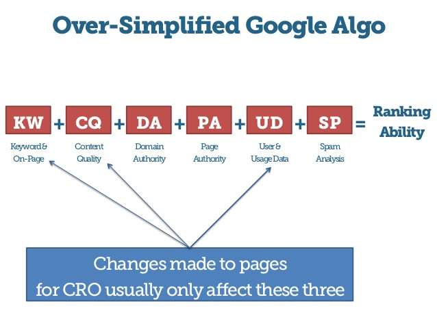
To optimize for both SEO and CRO you really only need to change three things that impact Google’s ranking algorithm – keywords and on-page SEO, content quality, and user and usage data.
There are a ton of keyword research tools available to help improve your SEO and get visitors to your site. Here are just a few:
And now that you have more visitors making it to your site, you need to use these CRO tools to make sure that your on-page copy is built for conversion:
Take the time to craft the best copy you can – you’ll be rewarded with conversions.
3. Go responsive
Responsive design means that your site will automatically “respond” to fit the device a visitor is using.
If done right this will enhance the user experience by minimizing the need to resize, scroll, or pan.
Pages need to load quickly, and visitors need to be able to do what they want to do on your site on their mobile.
Adopting a “mobile-first” site design strategy for your e-commerce site is key.
And, since Google is moving to mobile-first indexing, your site will have to take a mobile-first design strategy or be lost in the rankings.
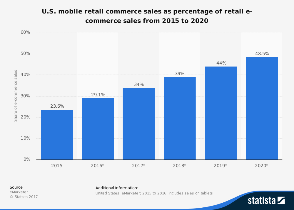
In fact, it’s estimated that mobile e-commerce will account for 50% of the market by 2020. You simply can’t afford to ignore mobile users.
Despite this, conversion rates lag behind desktop conversion rates.
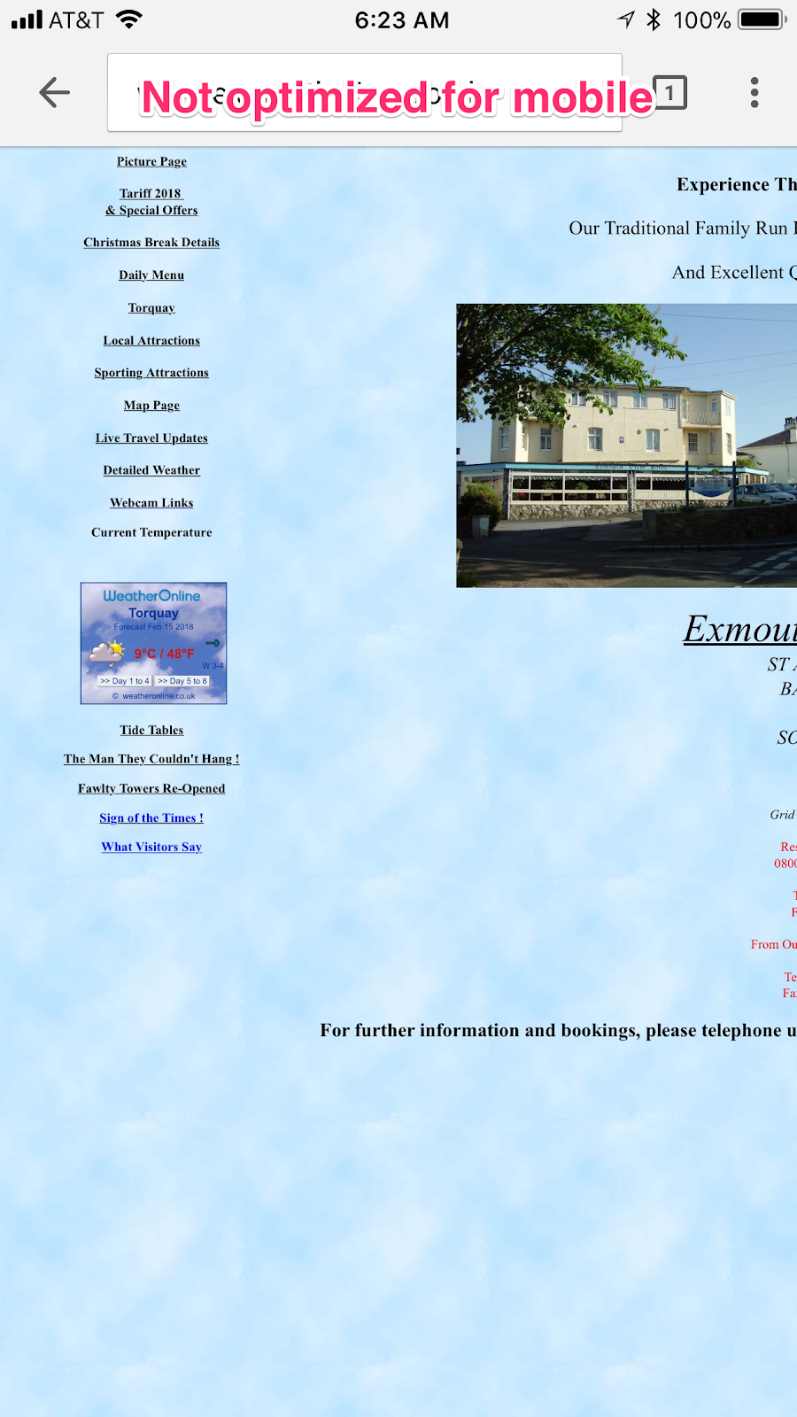
Why? Sites aren’t optimized for mobile e-commerce.
Check out the difference:
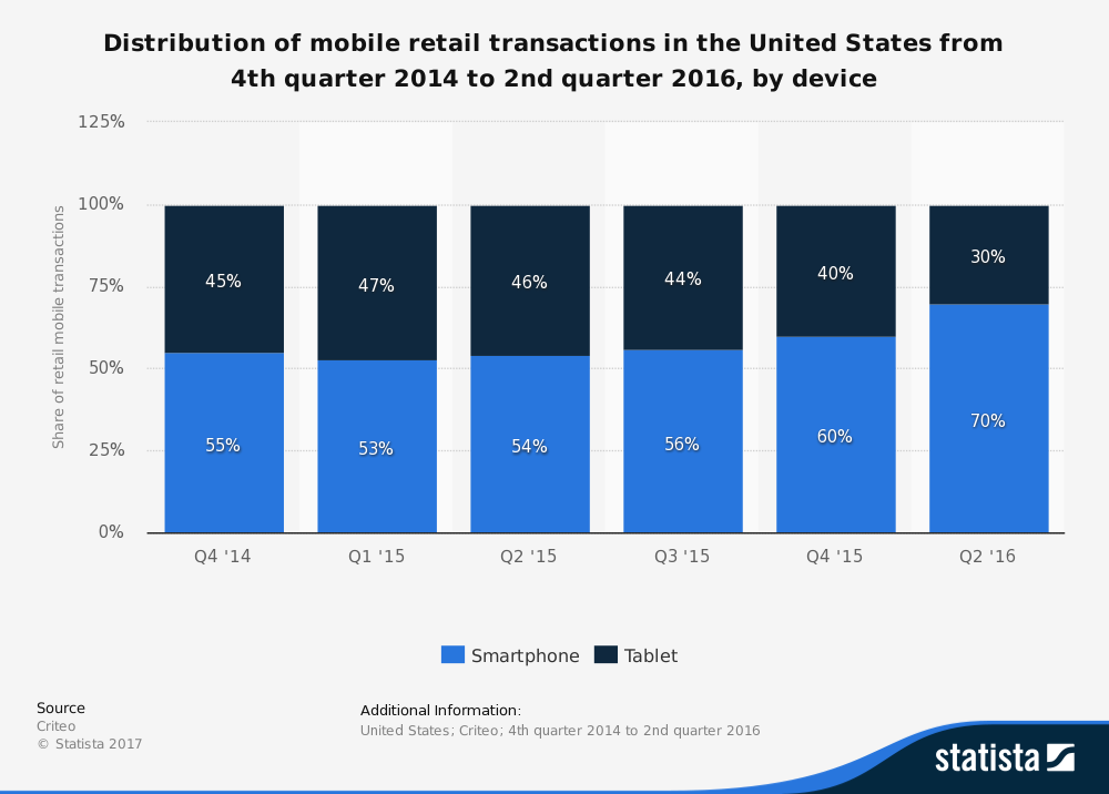
Start by targeting smartphone users over tablet users. Smartphones are the preferred device for mobile shopping and account for nearly 70% of all mobile transactions.
If you reach a crossroads where you have to choose between smartphone optimization versus tablet optimization – target those smartphone users.
If there are still tablet users who aren’t picked up in your mobile optimization for smartphones, you can get them later.
Don’t lose a customer to another site because they embraced mobile e-commerce and you didn’t.
4. Improve your copy
The Internet is a visual place.
But you still need to create some stellar copy.
Copy tackles three of the biggest challenges faced by an e-commerce site: informing visitors, driving action, and fostering relationships.
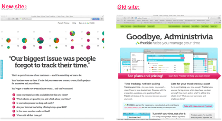
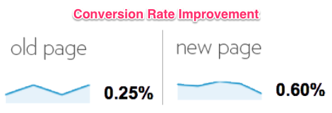
FreckleTime increased conversions 2.4x through stronger copywriting.
Of course, you need people to actually read your copy, which is apparently no small feat.
Based on an eye-tracking study by Neilsen Norman Group, it’s likely that the vast majority of your visitors will scan your site, and not actually read it.
The typical scanning pattern is an ‘F’ shape.
Your copy should be engaging and formatted in a way that will capture the scanners.
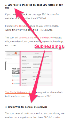
Keep pertinent information towards the top of your piece and use subheadings that allow your scanners to easily identify the sections that are important to them.
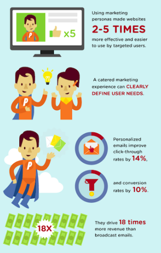
Another easy way to improve your copy is to write with your target customer in mind.
And if you haven’t created customer personas, you need to stop everything and do that right now.
You can also make some updates to your word choices for a quick copy improvement.
Use words that evoke a strong response and invite action from your visitors. Words like “stunning” or “mind-blowing” are much stronger than using a word like “cool.”
5. Go visual
Yes, I realize that I just told you to improve your copy, but I also said that the Internet is a visual place.
Include several high-quality images of your products. These images will provide perspective to visitors and so include shots of your product solo and in use.
If you really want to make an impact on potential customers, include video.
Kelty is outstanding at using videos in their product marketing and they double as product guides, provide useful information on how to set up tents, camp furniture, and other outdoorsy items.
A short product video gives customers a chance to see the way your product moves.
It also gives you a chance to use voice to convey genuine excitement and passion about the product without relying on exclamation points.
6. Smooth navigation
Do not reinvent the wheel when designing navigation for your e-commerce site.
You want your visitors to have a smooth, seamless experience on your site, and you want them to be able to find what they’re looking for.
Your search bar must be prominent.
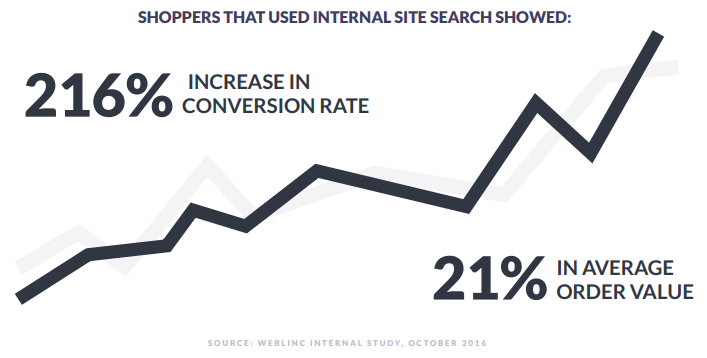
On average, 30% of e-commerce site visitors will use the site’s search functionality. And, more importantly, visitors who find what they’re looking for become customers.
Site navigation is most commonly located along the top or along the left side of desktop sites.
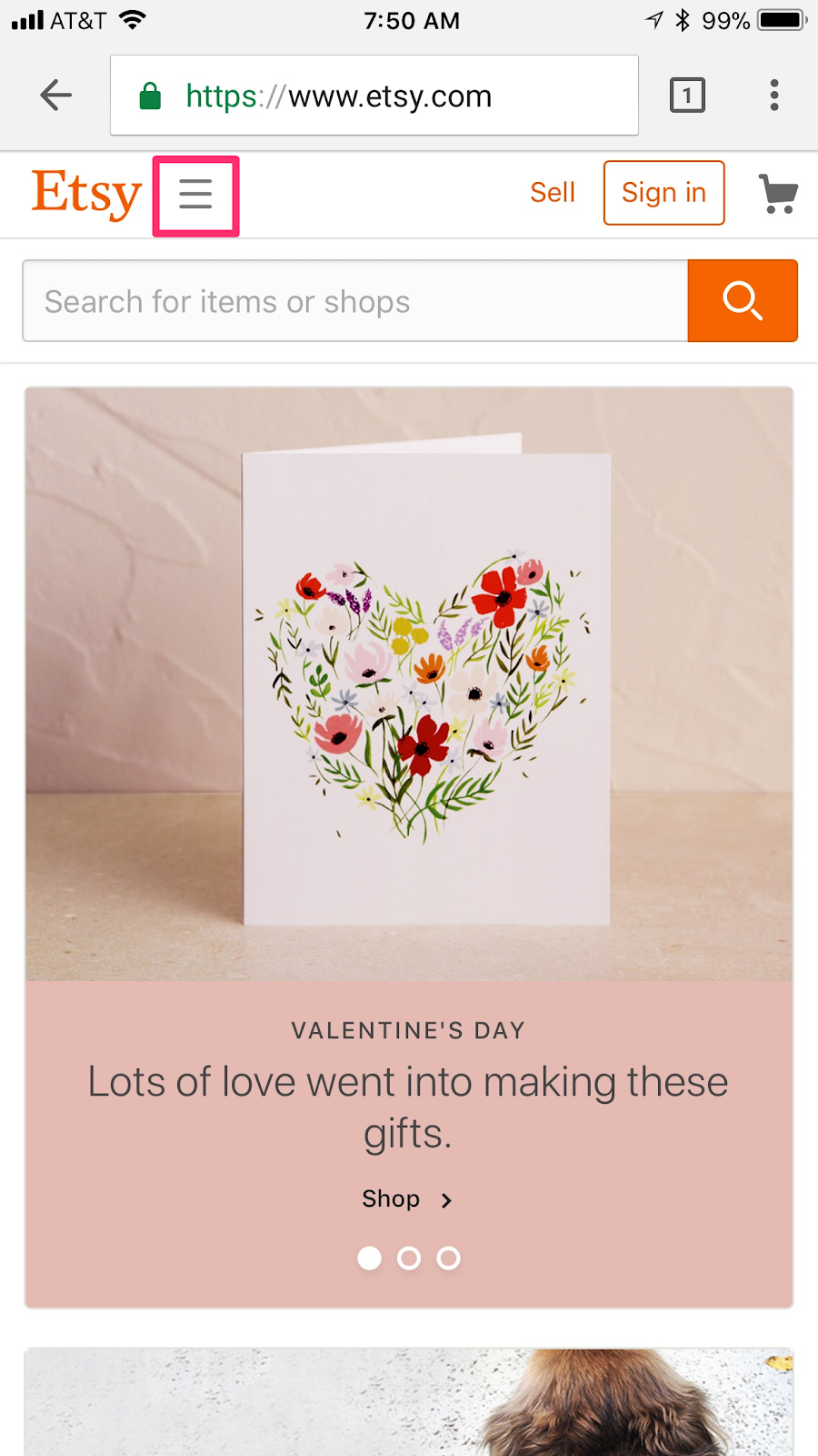
For mobile sites, it’s common to see a “hamburger” menu (the icon with three lines) in the top left corner.
But let’s talk categories for a minute.
There shouldn’t be a single place to find a product that can fit into multiple subcategories.
If a visitor is looking for a Fitbit in “wearable technology,” but you only have it listed in “fitness trackers” then the visitor may assume that you don’t carry the product.
And, then they might leave and never come back.
Your e-commerce site builder or plugin should offer relatively painless ways to do this.
WooCommerce provides information about managing product taxonomies in their product documentation.
Different e-commerce site builders and plugins have different analytics included, so check out the documentation for the specific tool you’re using.
And always, always check your site’s internal search data.
This can provide invaluable information about what visitors are searching for and how they’re navigating your site. Of course, you also have to make site improvements based on the data.
7. Provide social proof
If people are buying your products, let everyone else know. People want to buy products that others are using and enjoying.
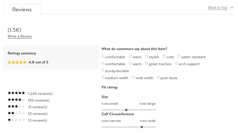
People read and trust online reviews and testimonials. 92% read online reviews and testimonials when considering a purchase.
And 88% trust online reviews as much as personal recommendations.
You can also tap into a potential customer’s “fear of missing out” by including them.
Each of these will lend credibility to your site and your products.
Social share buttons with a counter are another way to show social proof. These encourage likes and shares.
A word of caution, though. If people aren’t liking and sharing, do not include a count showing that.
Showing off too few likes and shares can have a negative impact (it’s considered negative social proof).
The purpose of social proof is to show that your products are being purchased, used, and enjoyed. Low like/share numbers could make potential customers bolt.
8. Simplify the checkout process
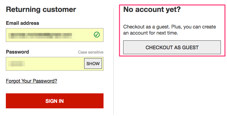
First and foremost, offer a guest checkout option.
I know it’s great to get registered customers on your site, but with more and more people using smartphones to make purchases it sometimes just isn’t feasible to register.
Sometimes all they want is to buy some leggings.
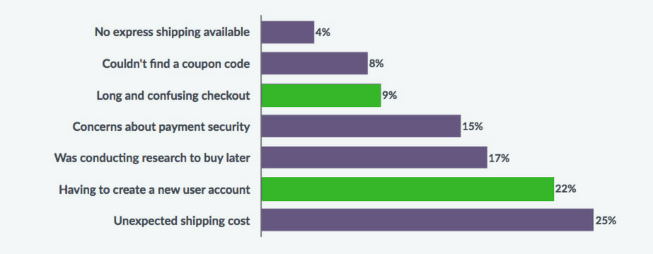
Over a third of the people who abandoned carts in 2016 did so because they didn’t want to create an account or had other issues with a complicated checkout process.
Making customers register to buy from you should be avoided.
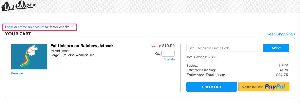
Sites like Threadless and Macy’s have embraced guest checkout to streamline their checkout process.
Both offer the option to create an account for faster checkouts but don’t require it.
If the thought of completely doing away with requiring registration makes you nervous, you can always do some testing to see how guest checkout impacts your bottom line.
Research over the past several years consistently shows that guest checkouts could mean the difference between a sale and an abandoned cart.
9. Follow up on abandoned carts
Speaking of abandoned carts, pay attention to your abandoned cart rates to figure out why these sales aren’t completed.
Make sure that your site design isn’t contributing to abandoned carts. Something as simple as outbound links on a sales page could be the culprit.
Abandoned carts are an enormous opportunity to increase conversion.
Roughly 35% of the abandoned merchandise is potentially recoverable through some combination of checkout process improvements, site optimization, or better product copy.
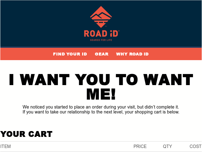
If your newly streamlined checkout process isn’t enough to complete the sale, then be sure to follow up on abandoned carts via email a few hours after abandonment.
Road ID does this really well. Sometimes they even throw in a discount to lure the customer back to complete the purchase.
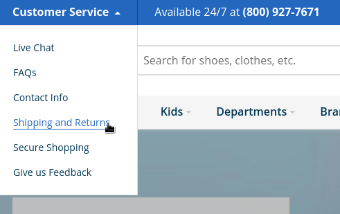
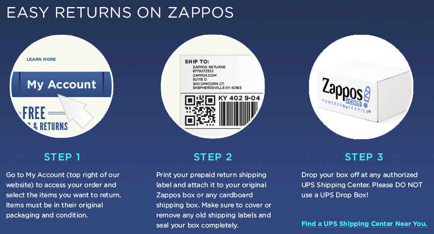
10. Highlight your return or guarantee policy
Your return and guarantee policies should be front and center. Many e-commerce stores don’t offer them (but you should).
More than 50% of customers will read the return policy before buying, so make sure that yours is clear, concise, and honest.
One of the biggest drawbacks of buying online is losing the ability to touch or try on the item you’re buying.
Your customers want to know that you’ll take care of them if the product isn’t what they were expecting.
When you’re upfront with your return and guarantee policies, customers are more comfortable and confident. And, more likely to complete a purchase.
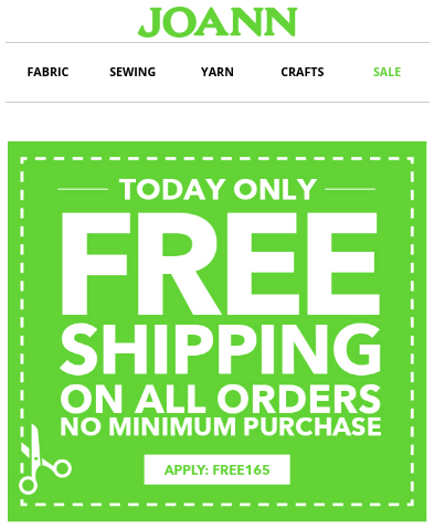
11. Offer free shipping
People want free shipping, and roughly half of the e-commerce sites out there are happy to oblige.
If unconditional free shipping just isn’t something you can do, think about the price point you would need to reach to make shipping free and market that.
2BigFeet began offering free shipping on orders over $100 and increased their conversions by 50% overnight.
2BigFeet isn’t an anomaly either.
TrailCamPro increased their sales by 20% just by adding free shipping for orders over $99 and free returns for 90 days.
Absolutely have to charge for shipping? Mention it up front. Don’t just add it on during checkout — that’s a surefire way to lose a sale.
12. Use scarcity and value
Scarcity and value are powerful motivators.
And both can be used to evoke a sense of urgency in a potential customer to close a sale.
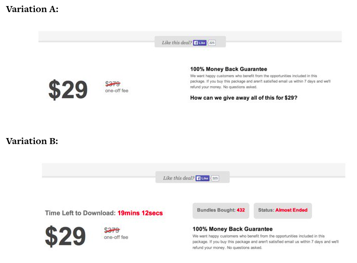
Through A/B testing, The Musician’s Guide wanted to see if there was a difference in conversion rates between two identical packages: one that included the number of packages purchased with a countdown to the end of the offer, and one that didn’t.
The conversion rate of variation B was almost 3x that of variation A.
Here are a few options for creating urgency on an e-commerce site:
- Limited time offers
- Stock or size scarcity (“3 more left in stock.”)
- Time-bound shipping (“free shipping if you purchase before midnight.”)
But use these tactics in moderation, or you run the risk of coming off as manipulative.
13. Highlight security
Cybersecurity has been in the news a lot lately. In 2017 alone Equifax, Verizon, and Kmart all revealed data breaches. In Kmart’s case, malware was found on store payment systems.
The average cost of a data breach per record is $172. That’s how much it can cost you to lose control of your data for each credit card compromised.
How many customers have already trusted you with their data? Keep it safe.
Hacks and data breaches don’t inspire confidence to online shoppers who are asked to enter their credit card information.
Get yourself set up with a reputable site security provider and clearly show their seal on your site.
SSL certificates provide immediate security and ease the minds of your customers because the encryption method ensures that their data is kept safe at all times.
Over half of consumers only use sites with SSL security when shopping online.
Plus, making the shift from HTTP to HTTPS will provide a small boost to your Google rankings.
14. Accept multiple payment options
Some people just don’t want to enter their credit card information online.
While you’re never going to make everyone happy, it’s important to offer more than just a “pay by credit card” option.
PayPal seems to be a popular option with 44% of consumers saying they use it for payment as a fraud-prevention measure.
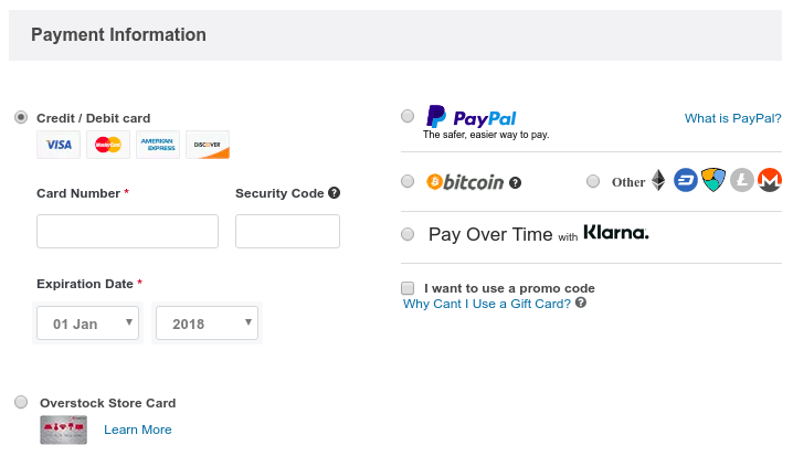
Consider adding payment options like PayPal or Amazon Payments. Or if your customers are more the tech/geek persuasion, maybe even consider adding a cryptocurrency option.
Overstock.com offers the standard credit card/PayPal payment options but goes further by also offering the ability to pay with digital currency like bitcoin, dash, nem, litecoin, and monero.
Whatever you choose, your website should be flexible enough to accommodate a broad range of shoppers.
If not, you risk alienating the 50% of consumers who will go somewhere else if their preferred payment method isn’t offered.
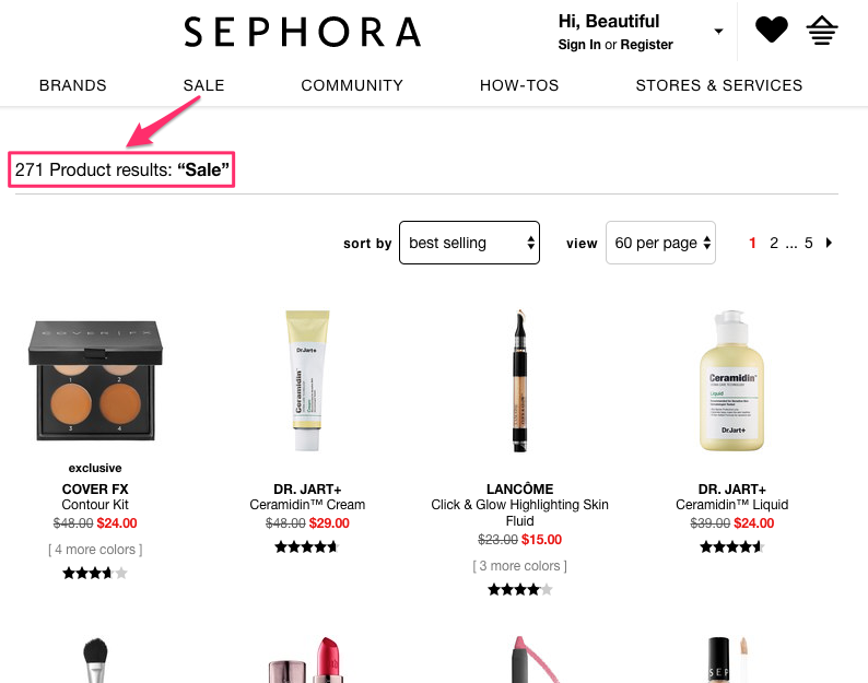
15. Promote your sales section
Who doesn’t love a good sale? Some people will buy things they don’t even want or need simply because they’re on sale.
Appeal to them and make sure that your deal seekers are able to find what they’re looking for right away.
This is especially important when you consider that 45% of shoppers will only buy discounted products.
16. Make your site search and recommendations robust
A mobile e-commerce study by Baymard discovered that site search was the preferred method for finding products.
However, 70% of the searches were unable to return relevant products to the user.
Robust search functionality is crucial to conversion.
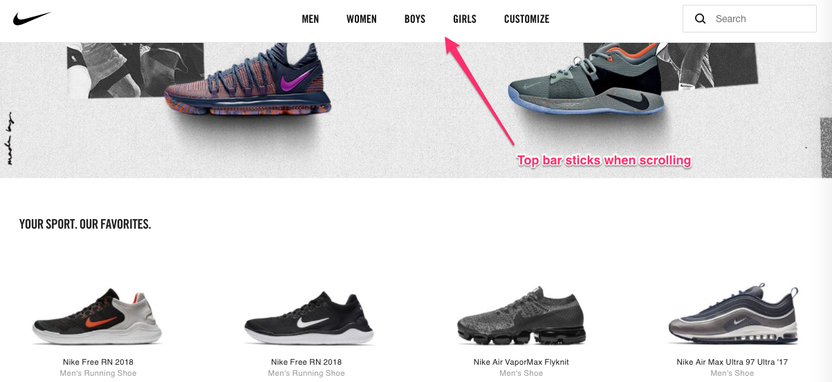
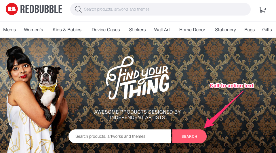
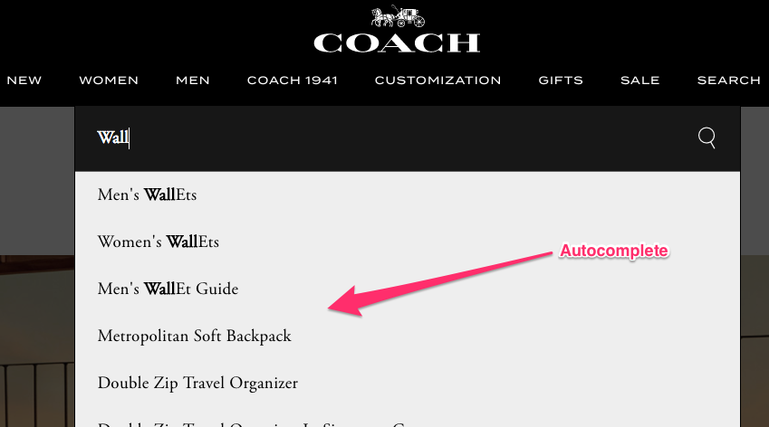
You can make design changes to draw more attention to your search function:
- Make your search box sticky, so it scrolls as the visitor scrolls.
2. Use call-to-action text: “search” or “find” instead of an icon that users may not recognize.
3. Use autocomplete to offer suggestions.
Filters can also be added to complement your site’s search functionality. They can help with the “indecision paralysis” that can come from having too many choices.
Where your search bar is great for customers who know exactly what they’re looking for, filters are perfect for customers who have a general idea but need a bit more guidance.
In addition to search and filter functionality, e-commerce sites can use recommendations to increase sales or, if the recommendations are really good, increase customer trust.
Crate & Barrel uses recommendations when at check out.
They’re placed lower on the checkout page so as not to be obtrusive, sort of like a friend saying, “I saw this and thought of you!”
Searches and recommendations can provide an opportunity to show your customers similar things they may like and as a result, boost your sales, but you need to be strategic.
Your results page should never come up with nothing.
If the search term isn’t found, your search functionality needs to be able to show customers items similar to what they searched. Or, give them the option to reach out:
“Not finding what you’re looking for? I’m sure we can help. Give us a call at … or email us.”
Never let a customer walk away with nothing.
17. Make your CTA bold and clear
Your e-commerce site will have several calls-to-action (CTA).
These are the elements on your site that direct visitor attention and tell them where to go and what to do. You can use text, but colorful buttons will definitely serve you better.
Placement
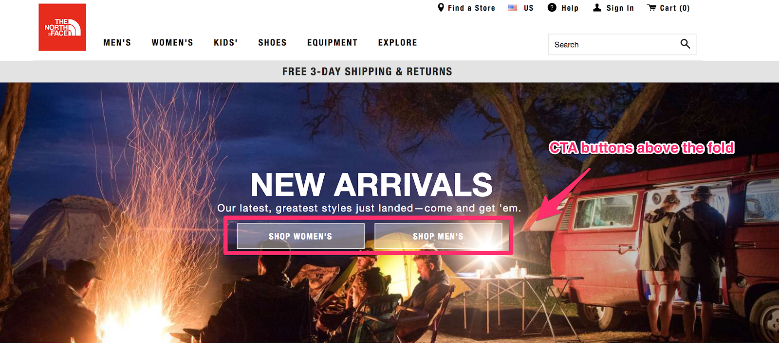
As much as possible, you’ll want your CTAs to appear above the fold.
Like this:
This is the part of your site that visitors see first, so it’s important that they immediately know what to do, and how to interact with your site.
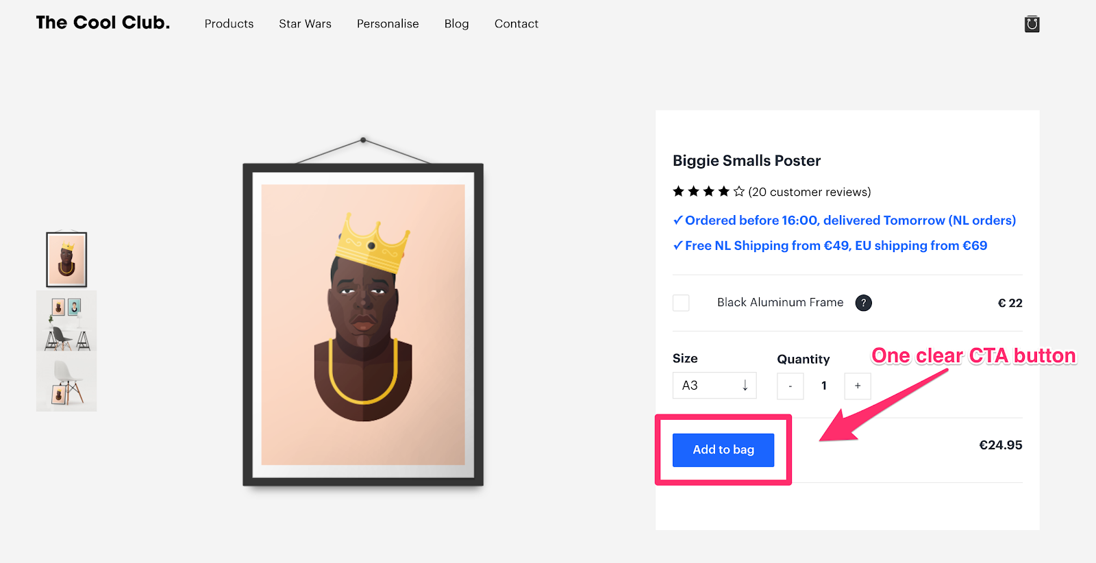
When it comes to CTAs for your product pages, you should only include a couple of options for CTAs. A visitor should be able to “Learn More” or “Add to Cart/Basket.”
The Cool Club gives buyers a clear action with one CTA button.
Once the customer adds a product to their basket, your primary goal is to get them to checkout without confusing them or derailing their progress.
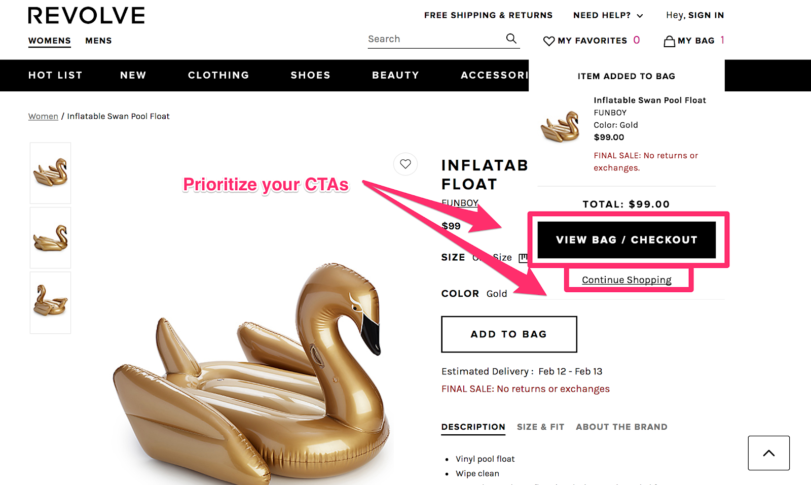
You want to guide your buyers down the sales funnel so Your “Checkout” CTA should be prioritized over a “Continue Shopping” CTA.
Revolve is a good example of how to do this right.
Yes, I know that you want larger sales, but getting the customer converted is likely to result in repeat business.
Getting the conversion turns a shopper into a customer. A necessary step before turning a customer into an advocate.
Design
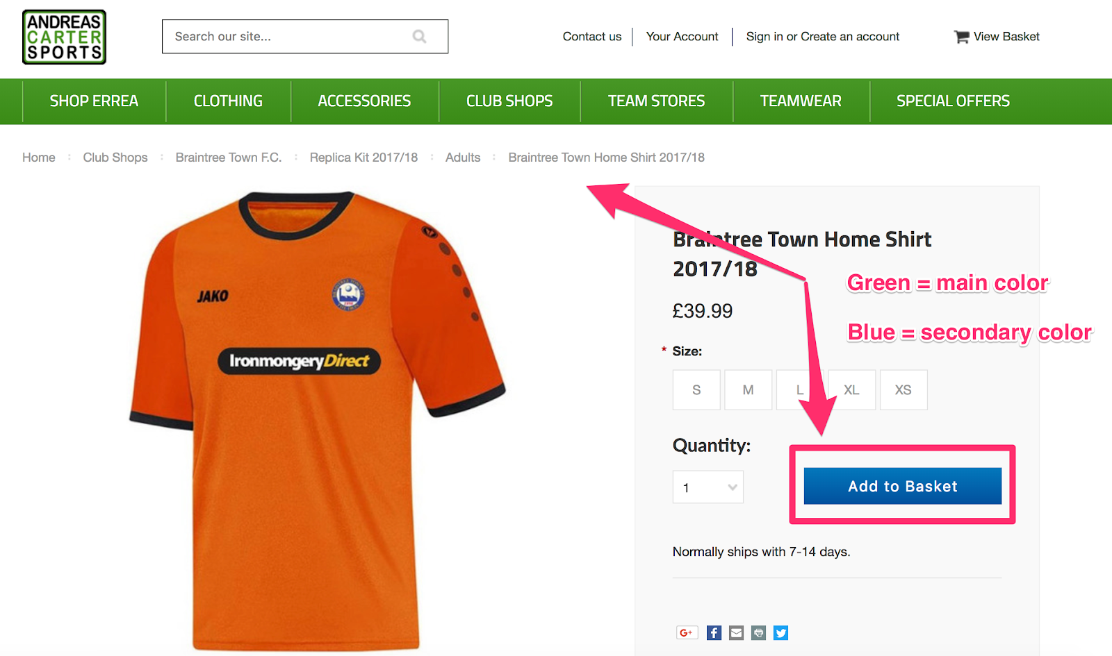
Your CTA buttons should draw attention without being obnoxious. Even the button color for a CTA can impact its effectiveness.
Andreas Carter Sports changed their “Add to Basket” button color from green to blue and reduced abandoned cart rates by 50%.
But how do you know what’s going to play well with your visitors?
For starters, you can set up UTM codes to track where users are clicking. Or, you can use Google Analytics to track conversions when testing a specific button color.
Subscribe CTA
A “Subscribe” CTA is a great way to collect email addresses from customers who may not be ready to buy.
Your homepage is a great location for this particular CTA. You can also include it in the site footer, so it shows up on every page.
And, Chubbies does just that.
Once you have a customer’s email address, you don’t have to pay to lure them back to your site. You can create optimized email marketing nurture campaigns based on your contact list.
These, in turn, make your e-commerce site marketing more effective.
Conclusion
There are so many things that you can do to improve your conversion rate that you may not know where to begin.
That’s okay.
If you act on just a few of these e-commerce conversion hacks you’ll see a positive return on investment.
Start with something simple like improving your site’s speed before moving on to revamping your copy and visuals.
Ultimately, making one change every week or every month will make a difference in your e-commerce conversion rates.
And, it’s a more manageable way to address the areas that need improvement rather than trying to make multiple sweeping changes at once.
You’ll also have a chance to analyze your site data to see what impact your changes have had.
Your e-commerce business lives and dies by the effectiveness of your website.
Your site’s data will be able to tell you how your site is performing and if it’s meeting the expectations of potential customers.
You have the power to raise your site above the 1.3 million other e-commerce sites clamoring for attention. Use it.
How do you improve the conversion rate on your e-commerce site?


















Comments (16)