Making it as easy as possible for your customers to pay is essential for increasing conversions and sales.
This is why your checkout page is critical. It’s the final stop for people shopping on your website. It’s the place where they hand over their credit card information and finally part with their hard-earned cash.
Your checkout page is where window shoppers become paying customers.
It’s easy to slap PayPal on your site and call it a day – but if you’re serious about making it easier for your customers to pay and increasing sales for your business, you will want to have full control over the entire checkout process.
Following, are 9 tips that will help you do this:
1. Provide a Number of Payment Methods
It sounds obvious, but there are websites that offer only one payment method. However, data highlighted in an infographic from Milo shows that 56% of respondents expect a variety of payment options on the checkout page.
While it’s not necessary – nor practical for that matter – to offer every conceivable payment method available, you’ll want to take a look at your target audience to see which payment methods they use.
Then, you’ll be able to capture the majority of people visiting your website.
For instance, a good combination would be to allow direct bank transfers and payments from all major credit cards. In the end, it all depends on who you’re catering to.
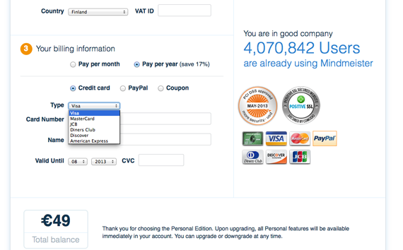
From the screenshot below, you’ll see that MindMeister allows users to pay with several credit cards, PayPal, or a coupon.
2. Allow Payments without Requiring an Account
Honestly, do we really need another username and password to remember? I doubt it! And why would anyone want to put up a wall like that preventing people from paying.
Forcing people to sign up for an account is just too intrusive for first-time customers, and it’s a major conversion killer.
A usability study by Smashing Magazine found that the main reason users hate setting up an account is they expect to be flooded with promotional emails.
It also pointed out that many customers don’t understand why they need to sign up to buy a product when brick and mortar stores don’t require an account to buy from them.
Another disadvantage is that it adds more fields for people to fill out and prolongs the payment process.
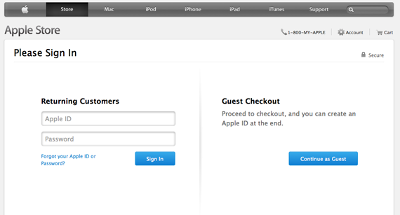
To make life easier for potential customers and ensure you get paid, follow Apple’s lead and let them check out as a guest.
As you’ll notice from the screenshot above, Apple gives customers the option to sign up at the end of the checkout process instead of forcing them to hand over their data at the beginning.
3. Deliver a Seamless Design
From a branding perspective, you’ll want to keep everything as consistent as possible. This means using the same colors, fonts, and design on your checkout page as on the rest of your website, so you can raise brand recognition for your business.
Sure, certain online payment providers deliver the frontend ready-made for you, but you give up control over the look and feel of your checkout page.
And with all of the online scams and horror stories out there, it’s perfectly reasonable for folks to be skeptical when faced with a checkout page that’s different from the website they were shopping on.
In order to help raise brand awareness, keep your design consistent across all channels, especially your checkout page!
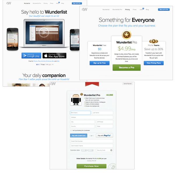
From the screenshots above, you’ll notice that 6Wunderkinder’s payments page matches the theme of their entire website.
4. Don’t Redirect People
You worked so hard to get people to your website. Why send them away to another website to pay?
This is the main disadvantage of using a service like PayPal that redirects people away from your website to a checkout page.
Since you have no control over the design of the checkout page, customers end up feeling as if they are giving their money to a business other than the one they are buying from.
Checking out and paying will be the last thing people do, which is why you want your business’s name to be the last thing on their minds!
5. Make Errors Easy to Fix
It’s a given that people make mistakes. Sometimes a zip code gets overlooked or someone forgets the “@” in their email address. In any case, your task here is to point out the error and get folks to correct it.
Some checkout pages display an error message at the top of the page, but people don’t realize they need to scroll all the way up to find out what went wrong. Ideally, you want an error message to appear in the field in which it occurred.
Another handy tip for making it easier for people to pay is to save the information they submit.
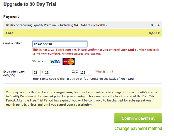
Below, you’ll notice Spotify doesn’t clear the data that was already submitted and clearly displays the error message in red, which also explains the reason for the error.
For longer forms, there’s nothing more annoying than having to resubmit all of your information again just because you made one silly mistake.
And in an infographic by Invesp, losing customers due to submission errors ranked in the top 10 of conversion problems during checkout.
6. Ask for Essential Information Only
Similar to when you’re building an email list, you want to limit the amount of information you request to the essentials!
Nothing kills a conversion more than having to fill out a form with information that’s not necessary for making a purchase. And adding a long list of fields to fill out adds more hurdles for people to jump over in order to pay you.
This isn’t the 400m hurdles; it’s a sprint where you want folks to run through the checkout quickly and smoothly!
What’s more, a report published by Forrester found that 11% of U.S. adults abandoned an online purchase because they either didn’t want to register or the site was asking for too much information.
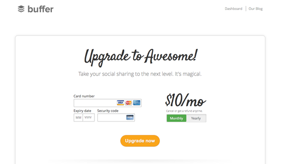
To make sure you don’t lose customers because you’re asking for too much, follow Buffer’s example with their payment form.
And if you absolutely need the extra information, such as a phone number, make sure to include an explanation for why it’s required.
7. Provide Reassurances on Security and Privacy
Whenever personal information is involved, always go out of your way to showcase the security measures you have in place.
A survey by eConsultancy found that 58% of respondents dropped out of the checkout page due to concerns about payment security.
As pointed out earlier, delivering a consistent design and not redirecting people to a third party checkout page are important steps in building trust with potential customers. However, you need to do more to reassure folks their data is safe from the hands of hackers.
Typically, you’ll want to have a Secure Sockets Layer (SSL) certificate for your website in order to provide a secure connection and encrypt credit card information.
Additionally, you’ll want to comply with the standards of the PCI Security Standards Council (PCI SSC). PCI compliance is enforced by payment card companies, while the council itself manages the security standards for anyone who stores, transmits, or processes cardholder data.
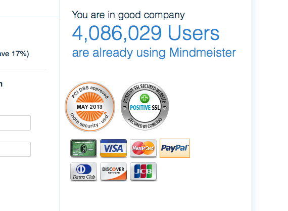
Be sure to display your security credentials with SSL and PCI badges, just like MindMeister does in the screenshot below.
As you can see, they show the number of users they have to reassure people that others are using their service, too.
8. Keep Distractions to a Minimum
It probably goes without saying, but your checkout page is the end of the sales cycle. It’s the final step. And in an era when people have the attention span of a gold fish, you don’t want anything to distract them from completing the checkout process.
And that means, under no circumstances, should you put up any advertisements.
Your objective here is to see people through to making the final payment.
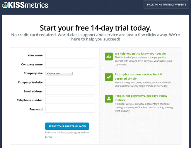
For a good example, you need look no further than KISSmetrics’s old checkout page. They keep people focused by eliminating the navigation bar at the top and requesting only essential information.
9. Have Clear Calls to Action
Don’t leave people guessing what to do next!
When someone adds an item to their basket, make it crystal clear they can “Continue to checkout” or “Continue Shopping.” The trick is to make it specific and avoid being ambiguous with CTAs like “Continue,” “Checkout,” or “Apply.”
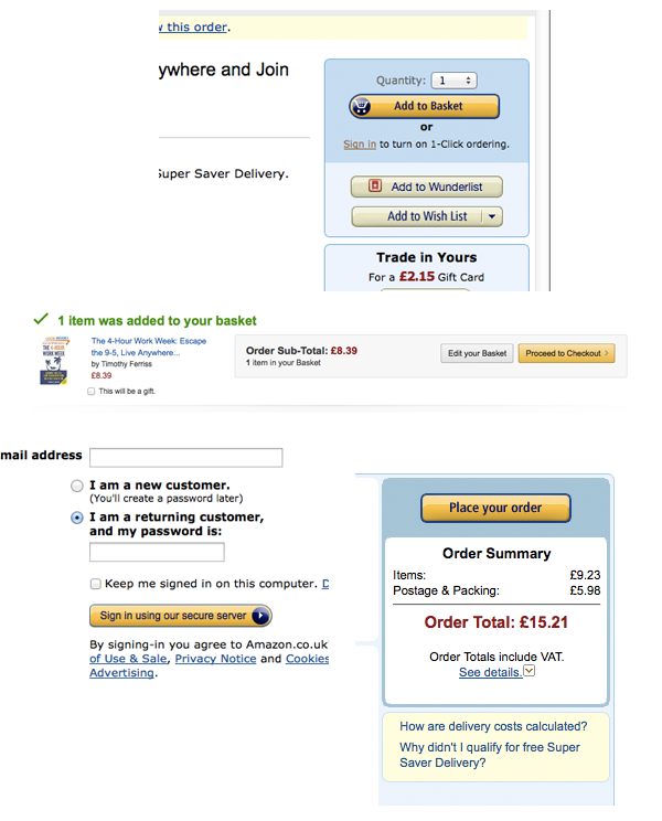
Below, you’ll see how Amazon guides people through to their checkout page from the shopping cart.
You’ll notice how the online retail giant uses clear and specific calls to action such as “Add to Basket,” “Proceed to checkout,” and “Place your order.”
Conclusion…
While these tips are sure to decrease shopping cart abandonment and make it easier for people to pay, it’s always a good idea to A/B test different designs to find out what works best. As mentioned earlier, your checkout page is where window shoppers turn into paying customers.
Follow the tips mentioned above and you’ll not only increase sales, but also create an enjoyable experience that people will come back to.
About the Author: Kostas Papageorgiou is a professional blogger. He is responsible for content marketing at PAYMILL, a young startup that offers the fastest and easiest way to integrate credit and debit card payments on websites and mobile applications. Papageorgiou also has worked with startups from Finland, Germany, and the Netherlands to help them use valuable content to grow and engage their audiences. You can connect with him on Google+ at +Kostas Papageorgiou.
Comments (33)