If you run a Software as a Service (SaaS) company, then the sign up page is generally the most important barrier to conquer. If you can get it right, you’re on your way to growing your business at a much more accelerated rate. If you get it wrong,…well you’ll have to keep chipping away at it.
In this post we’re going to look at 8 sign up pages that are a breeze to fill out. Hopefully, after reading this post you’ll be inspired to rethink your sign up process.
The Idea Behind Keeping Sign Up Forms Easy And Breezy
The first thing you need to ask yourself is: “Do we need to make sign up difficult?” Remember, if you’re not doing lead generation, where qualifying the lead is important (i.e. the more fields, the better) – do you really need to make the sign up process a barrier to increased conversions?
Generally, you want visitors to ease into your product with as little resistance as possible. More importantly you want to catapult them into enjoying their experience quickly. This tends to be the fastest way to grow your SaaS business.
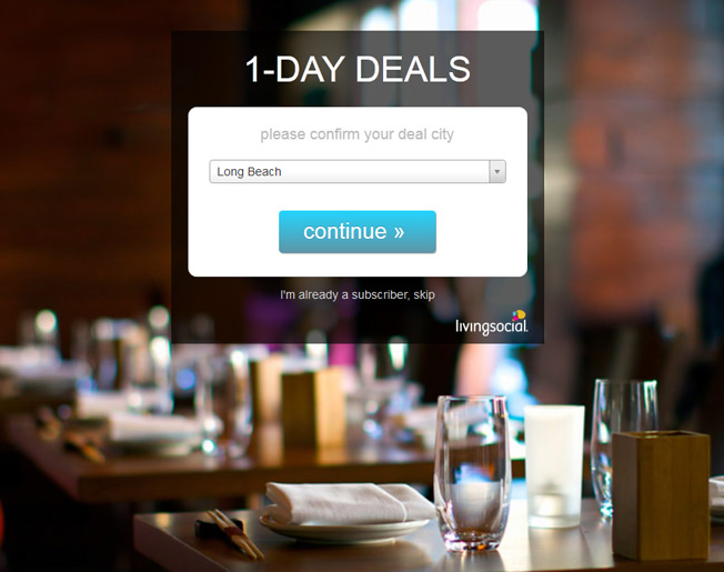
Ask yourself: “What’s the bare minimum number of fields we need to have?” The Living Social example above hopefully stirs some inspiration..
I would go so far as to say that in most cases you only really need to ask for the visitor’s email and password. Here are a few more questions to ask yourself when designing your sign up form:
- Why make the user enter their desired password twice?
- Will an OAuth social media login (like Facebook or Twitter) be enough? Will that work in your situation?
- Can you remove the need for a username? Will a simple email address and password combination be sufficient?
- Why not simply require only an email address the first time around? You can always require the user to finalize sign up via email once they have experienced your service.
The 8 Second Rule For Sign Up Form Design
There is an old internet adage that says “You have 8 seconds to get your internet visitor’s attention”. Some say that duration is now down to only 3 seconds these days. Regardless, I say you should still apply this 8 second rule to sign up forms. Here are some design tips to help make your sign up forms extra breezy:
- Make your form field dimensions really big. Some people might not tab through the fields when entering their information, they may use a mouse to point and click on each field. In this case making the fields bigger is much easier for them.
- Make sure your visitors don’t have to delete any input text to enter their information. This wastes their time and becomes an inhibitor to the sign up process.
- Two column forms can be confusing to visitors when tabbing. Consider using a single column design.
- Make sure your sign up button is big, with a clear call to action. Make it big and easy to hit – and don’t forget to tell them what to do with an appropriate call to action.
- TEST! Be sure to A/B test your sign up forms. You have several, if not hundreds of iterations of improvements to work on. So get cracking! You don’t want to lose out on potential users do you?
Let’s Get To Some Examples Shall We?
1. Hipmunk
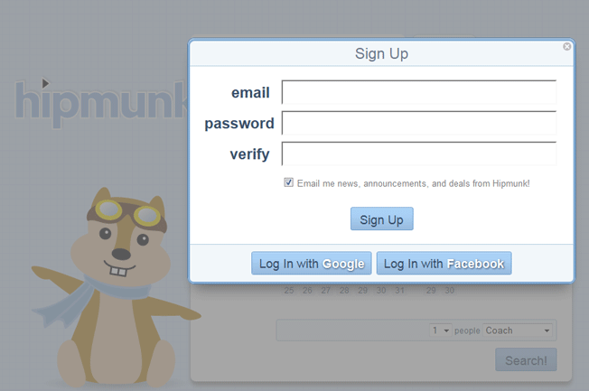
This company has simplicity as their core marketing principle. Not only is booking a flight incredibly easy, but signing up is a breeze as well.
Sign Up Form Takeaways:
- Large form fields for easy input.
- Minimum of only 3 input fields. This makes for a fast sign up process.
- One click sign up with either your Google or Facebook account. It is interesting to note that they don’t have Twitter as an option. Just because all of us web geeks use Twitter, doesn’t mean the rest of the world does.
The one questionable issue with this form is the pre-checked email opt-in. The main problem with this is you generally get more people not interested in your email newsletter, which hurts your email campaign performance. You may even end up cannibalizing your email marketing by being flagged as too spammy. Don’t forget the power of permission marketing!
2. This Old House’s Newsletter Options
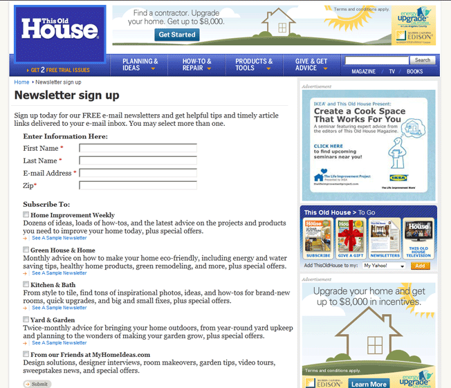
Remember, don’t forget to focus on your other sign up forms besides account creation. You should focus some energy on your newsletter sign ups as well.
Sign Up Form Takeaways:
- Select between five different targeted newsletters. If you’re a part of a larger organization that has complimentary newsletters, why not try to increase the readership of each?
- View a sample newsletter of each variety. This is a very courteous option that allows potential readers see what they are going to get by signing up. A great way to get highly interested readers.
- Notice that none of the check boxes are checked. This Old House is following permission marketing correctly.
3. NPR’s Custom Podcast Feed
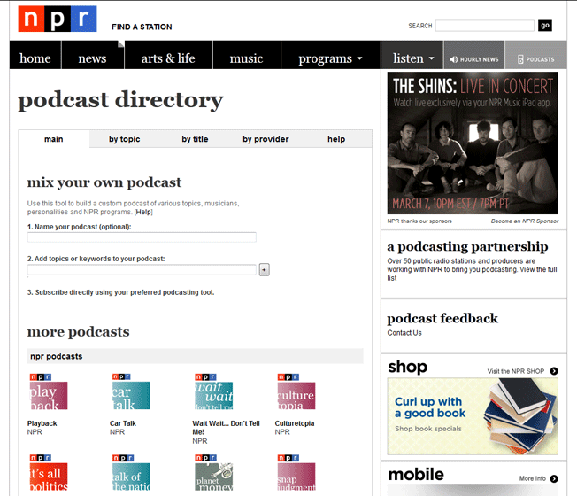
Not only is this form easy, it’s fun! This form is an example of a genius way to offer audio content to fans. Their “Mix Your Own Podcast” is a great way to offer NPR’s highly demanded content.
Sign Up Form Takeaways:
- NPR provides you the ability to name your own audio mix. Making sign up a thematic process is a creative way to get potential users excited about your service.
- You can easily choose the shows that you want in your mix.
- NPR allows you to sign up the feed with iTunes, Zune or RSS.
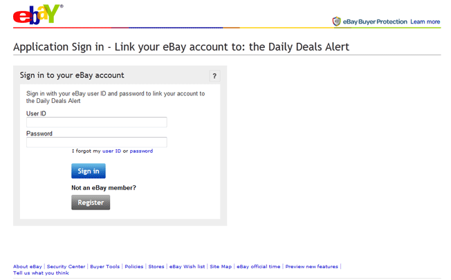
4. eBay’s Daily Deals Alert
eBay is a great example of a company that makes sign up for complimentary services a breeze. Why create the hassle of making your loyal customers fill out yet another arduous sign up form?
Sign Up Form Takeaways:
- Sign up using your existing eBay account. There is no need to force the visitor to sign up from scratch and go through email confirmations and hoops all over again.
- Register even if you are not an existing member. At the same time you don’t want to exclude non-members.
- Links your account instantly after clicking “Sign In”. How much more easy can it get than this?
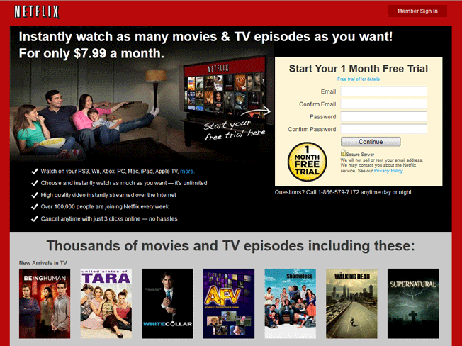
5. Netfix Free Trial
Here’s a great example of dressing up your sign up page with benefits. Benefits can help improve your sign up conversion.
Sign Up Form Takeaways:
- All of the benefits of signing up for a free 1 month trial are clearly visible.
- If you have any questions, you can call a toll free number…24 hours a day!
- Informs visitors that Netflix will not sell or rent your email address. Again, making it easy is one thing, but instilling trust and promoting benefits is a great way to increase conversions.
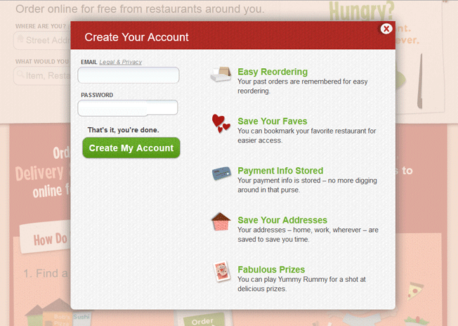
6. GrubHub
GrubHub put a bit more design energy into their sign up process. Their sign up form is a pop-up that dims the background so that the focus is on the sign up form.
Sign Up Form Takeaways:
- One email and one password prompt. They even use language to create an environment of ease by using the words “That’s it, you’re done.” It gives the user the feeling that the process is done before they have even entered one character of information.
- Benefits are nicely packaged along the right side. This is a good set of elements to test to reach for sign up improvement.
- Dynamically informs visitor their password strength as they type. If password security is important to your sign up process, be sure to make it easy for visitors by dynamically checking password strength.
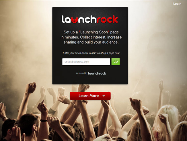
7. LaunchRock’s One Step Sign Up
Even though I’m not quite sure what LaunchRock does, I love their sign up page. It is the home page!
Sign Up Form Takeaways:
- One input requirement for fast sign up. This is what you should aim for: The smallest number of fields possible. Remember, if you can test just one input field – it’s worth it!
- Nice splash full photo background. This thematic imagery creates an energy that can make signing up exciting.
- Very minimalistic design to put the focus on obtaining one input: the email address.
LaunchRock’s sign up page is very similar to Living Social and Living Social was able to get 30 million subscribers!
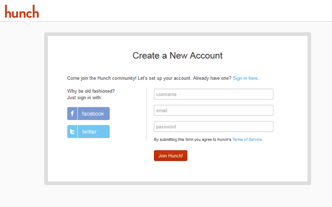
8. Hunch
Hunch’s sign up page may look boring, but if you’re about to start the process of sign up form improvement – this is the page to copy. It’s a great baseline for anyone creating a new site.
Sign Up Form Takeaways:
- Two social media sign up options. Not cluttered with too many options.
- Clean and focused look. The focus is on sign up.
- Only 3 inputs required for sign up. No checkboxes or other elements to slow down the sign up process.
Copying this sign up form and testing different variations is probably the easiest way to get started on improving your sign up conversion. As you iterate new sign up form designs, you can test adding benefits, trust logos and adjusting the number of fields and social features.
Instances When You Don’t Want Breezy Sign Up Forms
Breezy sign up forms aren’t for every business. Certain circumstances may make you think twice about making it too easy. Below are three areas where “breezy” can cause potential problems down the road.
Security Issues
If your online service will be storing sensitive user information, then you will probably want to stay away from easy sign up forms. Below are some sensitive cases to take into consideration:
- Banking Information
- Social Security Numbers
- Access to Paypal or Online Payment Information
- Credit Card Information
- Home Address Information
In the above circumstances you’re going to want to demand the user create strong passwords, which usually requires double entry and complicated password phrases. However, you can design the administration section of the user account to have more rigid security measures if you still want to strive for an easy sign up process.
Exclusivity
In some cases, it’s a smart strategy to make your website exclusive. If played right, creating an air of exclusivity can create scarcity and increased demand for your service (think Facebook in its early years).
If you’re going for exclusivity, consider using an invite sign up system, or ask for more information from your users. Remember, more information gives you the ability to create business personas, and helps with more granular marketing segmentation.
Lead Generation
If your sign up form doubles as a lead generation mechanism (like a webinar sign up), you definitely don’t want to make your sign up form a breeze. Generally, sales teams need a diverse set of form information to be able to sort lead quality. This helps the sales team operate more efficiently and enables a priority for targeting prospects.
Remember To Test!
The most important thing out of all these examples is to get in the habit of testing your sign up form. Copying another website’s sign up form structure may seem like a smart move to make, but without testing your sign up conversions or overall goals – you’re not taking full advantage of your form improvement efforts.
Have you seen any super simple or awesome sign up forms worth mentioning? Please discuss in the comments below!
About the Author: Sean Work is the former Director of Marketing at KISSmetrics. You can follow him on Twitter @seanvwork.
Comments (22)