Landing pages and people are not as different as you might think. That’s because landing pages are written by people. Sounds obvious now I mention it—but the fact is, it can sometimes be hard to keep the worst parts of ourselves out of what we create. Here are three very bad habits common to landing pages (*cough*marketers*cough*), which tend to depress conversion rates.
1. Self-importance
“Hello Peter—what’s happening. Uuuh, I’m going to have to ask you to…go ahead and…yeeeaaah. That would be great…”
No one wants to be this guy. Not even awful, self-important bosses. He thinks he’s good with people. He thinks he’s making things happen. But…no. Just no.
Unfortunately, just as with bosses, it’s terribly easy for landing pages to get like this. Here are a few common ways:
Trying to be clever instead of trying to be clear
This is a particular problem for headlines—using puns, for example, or trying to play on pop culture references. I once saw a headline on a chef-related site saying “Got food?” I suppose it seemed like a good idea at the time, but it doesn’t imply any promise to solve a problem or answer a question.
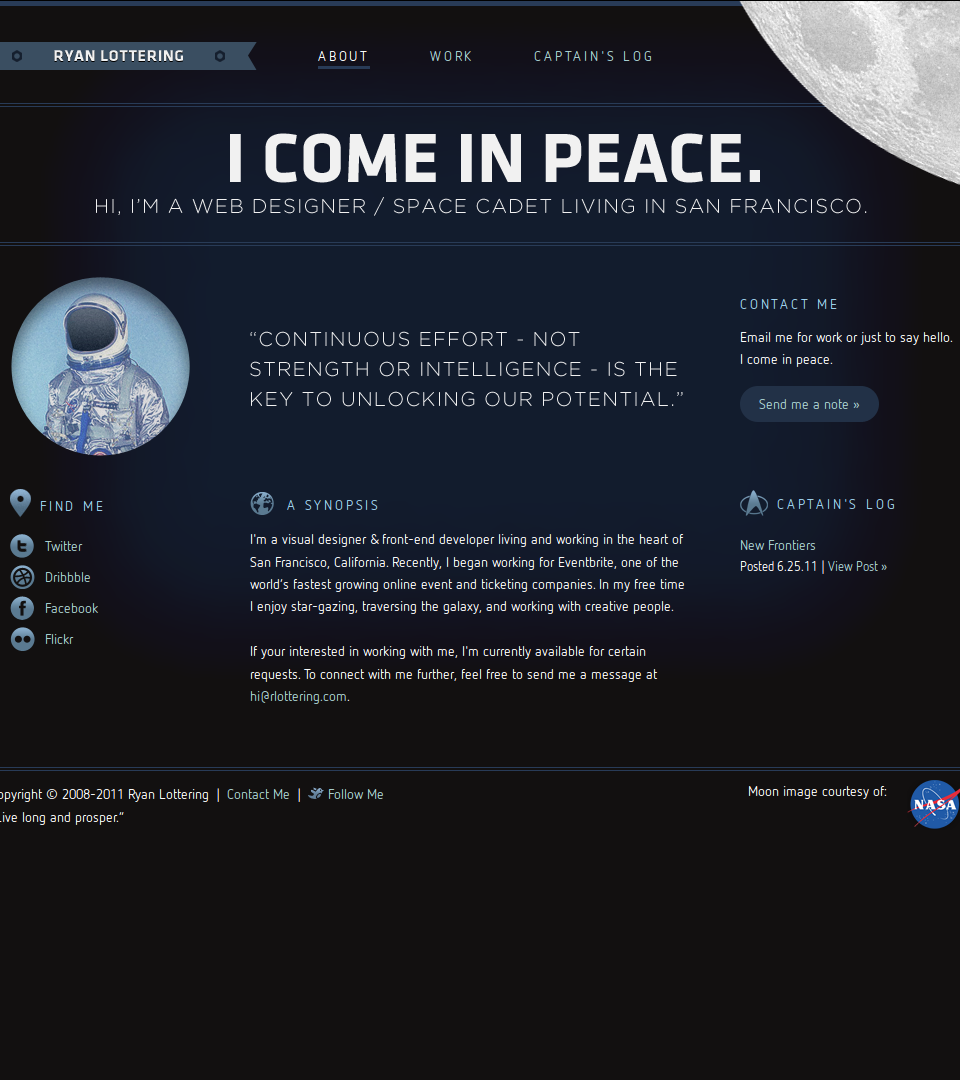
But cleverness can be an issue for far more than just headlines. On the website below, the attempt at cleverness starts with a confusing, seemingly irrelevant headline—but then cascades down until the entire design ends up looking like a Star Trek fan’s space enthusiast site:
Nattering on about themselves
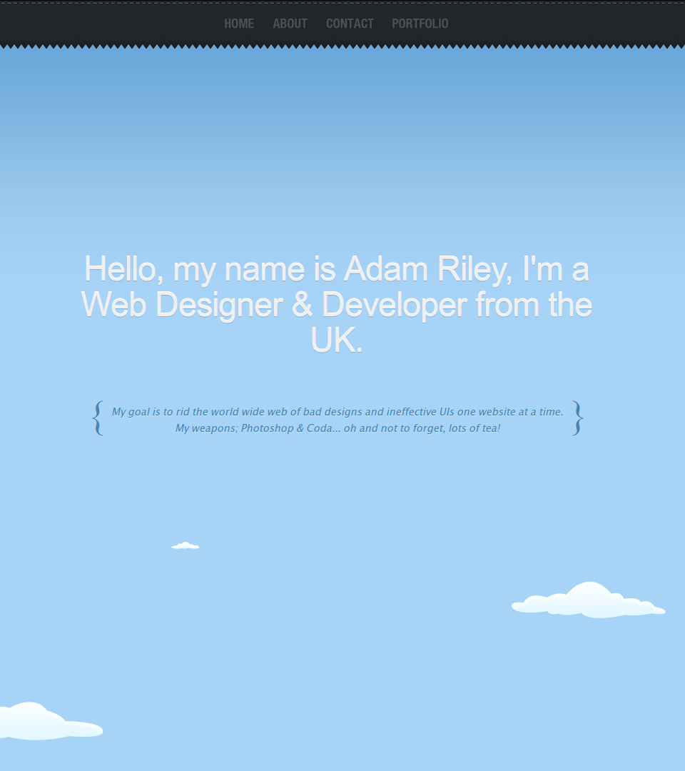
“The CRM Software Leader,” ZohoCRM’s landing page declares. And this is really what self-importance is all about. Boasting. Not thinking of what others are interested in, because you’re too entranced with your own excellence. A particular problem, I’m afraid, for creative types—of which I regrettably am one. There’s only one thing prospects are interested in, and it ain’t you. It’s whatever problem they have in mind when they get to your page. Talk about that—or they’ll bounce. Here’s a web designer who lost the plot on this one:
Trying to sound impressive
I’m sure we’ve all met someone like the Harvard grad student in Good Will Hunting. You know, the one in the bar with the pony tail and penchant for passing off quotes from history books as his own original ideas? He likes apples.
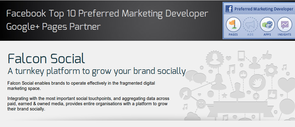
For landing pages, the epitome of the equivalent egregious proclivity is characterized by such latinate vocabulary and nominalized language common to corporate marketing copy. Stuff that uses big, vague words to say very little, but sounds very grand doing it. It’s like Rice Krispies—takes up a lot of space; has virtually no substance. A thin layer of some tasteless, nutritionally-deficient material, blown up with a lot of hot air. There’s nothing to sink your teeth into:
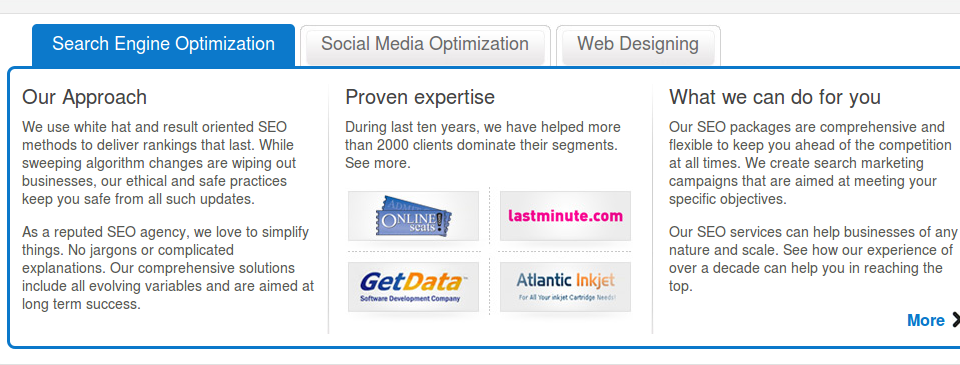
But it doesn’t have to be complete marketese to turn prospects off. Here’s a page that tries to walk the tightrope between a conversational style and buzzword-infested fuzz-puff—but falls to its inevitable demise:
2. Impatience
Penny-Penny-Penny-Penny-Penny-Penny-Penny-Penny-Penny-Penny-Penny-Penny-Penny-Penny-Penny-Penny-Penny-Penny-Penny-Penny-Penny-Penny-Penny-Penny!
We all want to make a sale. And we’d prefer to make one sooner than later. If we had our druthers, a landing page would consist of one big call-to-action button right at the top.
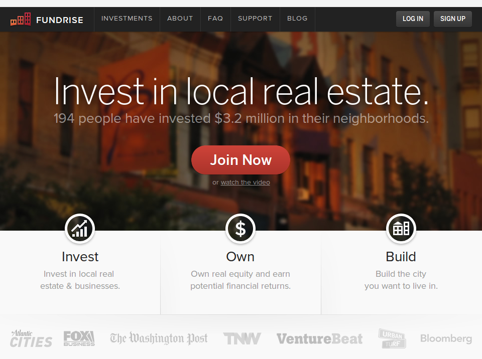
Unfortunately—we realize this—our prospects need a little more to work with before they decide to do whatever it is we want them to. But not, you know, a lot more:
Fourteen words should enough for anyone to join something that involves investing—especially when we’re talking millions of dollars. Right?
Hrmm, maybe not.
The problem is actually not being impatient for an action. Rather, it is being impatient for a big action. For joining or signing up or paying or talking to a salesperson or whatever the case may be. Because actually, prospects are impatient too! They don’t want to read lots of copy, or have to put in a lot of effort. They want things quickly, they want things easily, and of course they want things cheaply. But this doesn’t translate into landing pages being able to ask for big actions right up front.
Rather, it translates into being able to ask for small actions. Prospects want to do things—but they also want to take baby steps. Like men, they’re afraid of commitment. They like to feel they’re being active, rather than passive. But they don’t like to take actions without knowing what they’re getting into. So give them small actions. Ones which will move them toward taking the big action you ultimately want, by gradually helping them learn about it and see that it’s for the best.
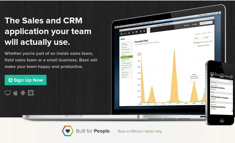
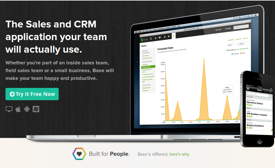
So less like this…
…and more like this:
3. Coyness
I hope you’ve been practicing your telepathy, because although I’ll never ask directly, I’d really like you to plant one on me.
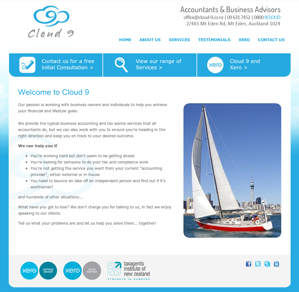
On the other end of the spectrum, we have those pages which seem to have forgotten the reason they exist. Pages which go to all the trouble of enticing a prospect, getting them fired up…only to come over bashful at the last second and think better of asking for anything. Pages like this:
Some coy landing pages manage to at least whisper their desires with tiny buttons that fade into the background:
But in both cases, prospects aren’t inclined to stick around if they don’t immediately see what they can do. If they miss it, they have plenty of other landing pages to look at—which won’t be so reticent about asking for an action.
That’s 3 nasty habits—do you have any others to share?
Perhaps your landing pages aren’t condescending or pushy or shrinking violets. But they could be indulging many other bad habits. Have you encountered any? Share them in the comments.

About the Author: D Bnonn Tennant is an expert in a rare trifecta: marketing, copywriting and web design. He is the author of the free email micro-course “5 Sales-Spiking Website Tweaks Gurus & Designers Don’t Know”. When he isn’t teaching entrepreneurs how to turn more visitors into customers, he’s either knee-deep in the guts of someone’s landing page, or schooling his kids in the manly arts of archery, fisticuffs and how to grapple a zombie without getting bit.



Comments (19)