Getting that guest blogging gig is one thing…actually getting subscribers and customers from it is quite another.
For example, if you land an article on a huge site like Lifehacker or Tim Ferriss’ blog, you are likely to create some serious traffic to your site.
The question is…is your site prepared to convert one percent of those visitors? Five percent? Ten percent?
Over the years I’ve seen some terrible landing pages and I’ve seen some really great ones. For those really great ones they always shared some common traits…ten in fact. And for each trait that you use in your landing page plan, you’ll have the opportunity to increase conversions by at least one percent…and perhaps even 10 percent if you use all 10.
Let’s get started.
1. Create an ultra-convincing byline with this 3-sentence formula
Pretend for a moment that you got a guest posting gig over at J.D. Roth’s Get Rich Slowly blog. Your guest post is going to be about how you got out of debt by following his 9 rules to mastering your money.
And let’s also say that this was your first guest post and don’t really know what to do once you’ve finished writing the post…
Well, what you have to do is write a killer byline.
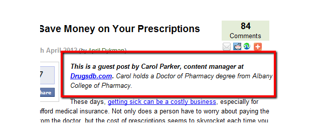
What is a byline? It’s basically a short bio of you…the writer. Here’s what it looks like on Roth’s blog:
To create a compelling byline use the 3-sentence formula. Each sentence answers the following questions:
- Who are you?
- What do you do and for who?
- What’s the call to action?
So in our example above your byline for J.D.’s blog could look like this:
This is a guest post by Your Name, lead blogger at yourblog.com. Your Name helps other people get out of debt. Grab his free course on getting out of debt today.
Notice how everything is geared toward J.D.’s audience? And it’s that freebie that will be getting people to click that link to your site. It’s all about creating the right offer.
2. Create a landing page specific to that audience
Most people will send traffic directly to the home page. That’s a mistake.
If you want high conversion rates for your traffic, then you need to create a landing page designed specifically for the traffic that will be arriving on your landing page.
In this case you not only want to design a landing page that addresses J.D.’s audience…but you want to make this landing page have the same feel as did your guest post.
That means your landing page needs to be about getting out of debt.
Now of course, your website probably deals with an entirely different subject matter. Obviously you should be guest blogging for sites relevant to your industry. And besides, backlinks from related sites are better for your SEO anyway.
3. Write a truly killer headline with the 4 U’s
Create the right offer and a flood of traffic will hit your landing page. But if you don’t have the right headline…those people will flood right back out of your landing page.
The best method I’ve ever found for writing killer headlines is to use the 4 U’s approach:
- Unique – Your headline needs to be original, so you’ll need to do your homework and find out what competitors are writing. A simple test to determine if your headline is not unique is to imagine someone else using it. If they can use it…then it is not unique.
- Urgent – Next, you need to create a sense that time is scarce and that if the visitor doesn’t act NOW…he’s going to lose out big. You can create urgency by saying something is in limited supply…or a discount is only available for a short period of time…or your competitor is about to have this same secret.
- Ultra-Specific – Next you need to be very precise about your headline. Is it eight steps? Does it take 10 minutes? Will it help you lose 42 pounds? Will it increase sales by 143%? The more precise, the more credible your headline.
- Useful– Finally, your headline should promise the visitor that it can help them accomplish a practical goal that they care about.
Okay headlines will only use one of these elements. Good ones employ two. Great ones will squeeze in three. But killer headlines use all four!
In our example you could write “How the 9 Rules of Mastering Your Money Can Help You Eliminate $37,000 of Debt in Less Than 365 Days.”
Of course whatever you write, you have to be able to prove it.
4. Write killer copy using the PAS formula
While the purpose of the headline is to get people to stop…the purpose of the copy is to get people to do your bidding.
And the best way that I’ve found to do this is to use the PAS formula…or Pain-Agitate-Solve.
Here’s how it works:
- Pain – Identify a real problem that your target audience has. It could be massive amounts of student loan debts…or burnout from trying to get a start up from off the ground. One of the very first lines of copy you write needs to say something like “Do you suffer from…?” That will identify your targeted visitors.
- Agitate – Once you’ve identified the real and most important pain in that prospects’ life, next you need to stir it up. Identifying the pain will help you to relate to your prospect…agitating the pain will help get them to be emotional about it. Point out that if they don’t do anything about their problem that they are going to be poor, lonely, overweight, slow, fired…think in terms of the consequence they could suffer if they don’t act to fix their pain.
- Solve – Once you’ve satisfactorily agitated your prospect…offer your product as the solution.
How much copy you write for each section depends upon the complexity of the problem. Something more complex will take longer both to identify and agitate…
However, if you did a good job with the first two, you won’t need a whole lot of copy to offer the solution. Your visitors should be begging for it!
5. Put call to action above the fold
Really effective landing pages will keep the headline, sub headline and call to action above the fold.
This doesn’t mean that everything needs to be above the fold. You are free to write a two-page post with dozens of bullets that does nothing but continually push home the benefits to the visitor.
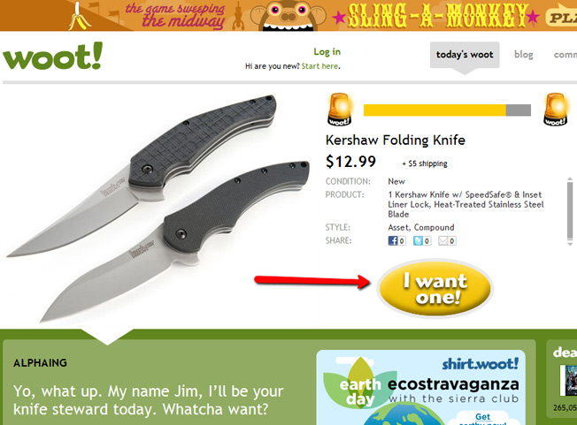
Woot! does this superbly…
The call to action is above the fold…but the copy continues below.
Just make sure the CTA is above the fold because most people will make a decision about what to do within the first 4 seconds of being on your landing page.
6. Put a short video on the landing page
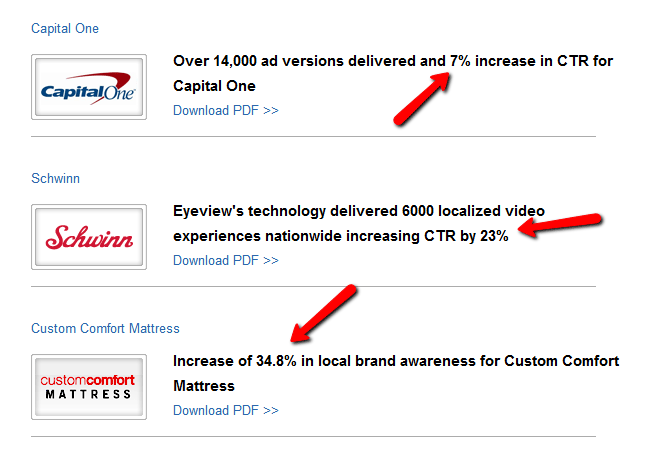
I’ve seen conversions skyrocket from a simple video that explains the why and what of the landing page. In fact, Eye View Digital did a study that showed you can increase conversion by 80 percent!
Some of their own case studies even show this:
What this does is puts a human face onto the landing page, builds instant credibility and engages those visitors who are power skimmers.
7. Request only the absolute bare minimum
High conversion rates on your landing page will only come when you make the requirements for subscribing very low. In fact, for every additional piece of information…and every additional field you add…you could be losing conversion points.
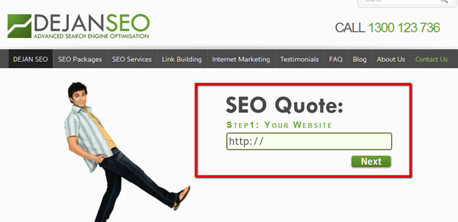
In the same vein, make it absolutely clear what you want them to do. And the best way to do that is keep it simple like Dejan SEO did.
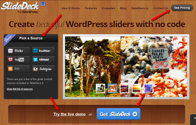
Slide Deck, while I love their product, complicates their landing page:
They’ve got four actions you can perform.
Never complicate the conversion by thinking “Hey, since I have their attention I should ask them if they also want to join my podcast, download my free book and register for my upcoming webinar.”
That is a recipe for disaster. You’ll make visitors indecisive and go away.
8. Add social proof
You may have a problem tooting your own horn when it comes to your success because you don’t want to come across as stuck up…but trust me…it will help your conversions!
You can tell visitors of your successes quickly and easily in a variety of ways:
- Subscriber count – Announce how many people already subscribe to your blog or email newsletter list.
- Social media followers – Show people how many people are connected to you via social media.
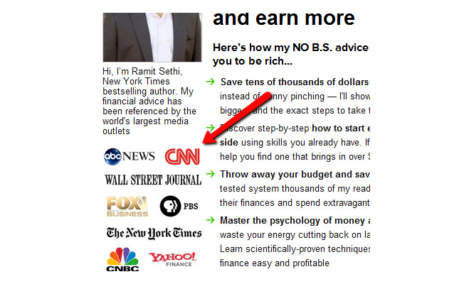
- Logos – Display the logos of reputable companies who’ve endorsed you.
These simple little additions to your landing page will help push many would-be fence sitters in your direction…thus increasing your conversion rate.
9. Use killer design
There is no doubt about it…a well-designed site will convert better than a poorly designed one. The killer design communicates professionalism, trust and security…
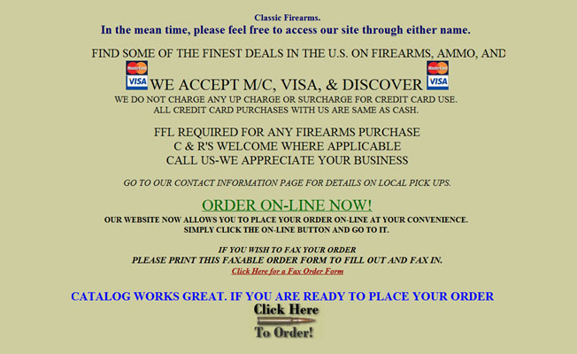
where the poorly designed site does just the opposite…
In the end it’s worth hiring a good designer to design your landing page.
10. Test
The final tip for squeezing every bit of conversion success out of your landing pages is to test what you have. Use the tips above to create a control that you can start testing with (and can use as a baseline against future tests).
Then start testing everything. For example:
- Headlines – Run A/B tests that compare two very different headlines that contrast two very different benefits. Challenge all of your assumptions!
- Color – I’ve seen this in my own personal research…color matters! Don’t take it for granted, but test different color schemes to see which one boosts conversions.
- CTAs – Create multiple calls to actions using different words. For example, “Try” versus “Join.” You’ll be surprised how much difference one little word can make!
- Videos – Don’t just take my word for it…test to see if adding a video will actually increase conversions. You may learn that the audience coming down the pipeline doesn’t like videos.
- Social proof – Perhaps people will respond when they see that large companies have endorsed you…but your conversions don’t budge when you add social media proof.
The truth is that everything can be tested…and that you should get in a habit of testing to learn more about your visitors and prospects. The more you learn the better you will get!
Conclusion
Each one of these tips has in its power to increase your conversion rate by at least one percent…use them all effectively and you could be converting over 10 percent of visitors.
That means if you just get 1,000 visitors from a guest post, you’ll land 100 new subscribers. Five thousand visits and you’ll get 500!
What other guest blogging landing page techniques can you share that will raise conversion rates?
Comments (19)