Your relationship with your users is a lot like any other human relationship. It’s easy to forget this over the internet, but you’re both real people underneath all that data.
Deep down, you’re responding to a need, developing an emotional connection, and exchanging value, all in ways that overlap in what can be a bit of a disorganized mess.
So what’s important to a budding relationship? At the heart of it, people just want to know they’re not wasting their time. The welcome email is your first opportunity to convey that.
Welcome emails generate 3x the transactions and revenue of any other email. So not only is it an important step in developing a long-lasting relationship, your welcome email is, in itself, a valuable conversion opportunity.
9 Ways You Could Be Sending Better Welcome Emails
Test Everything
A quick note before we get started. Obviously, your business model is going to vary wildly against the selection of everyone reading this, but I’m hoping to bring a little something for everyone, so some of these tips are going to be disparate or straight up contradictory. Please don’t try them all at once.
Of course, if you’re going to be testing everything, you need to develop a strong sense of exactly what the next step of your user activation process is. If you start trying to sell someone in the first email, you might come off as pushy, set simple goals to move them down the line.
1. Make a Human Connection From the Start
Sometimes, this just won’t scale, but if you have a steep learning curve and/or a high LTV for users once they’re up and running, a really simple workaround for all this design and testing business is to just connect your new user with another person.
If you’re really small, you can even do this. The important thing is that there’s a real human shuffling them through the onboarding process and you’re honest about where replies will put a user in the feedback process.
This process can be manual or automated, but remember that the user can tell if an email is sent by marketing software, so don’t pretend it’s not.
2. Kill the Text
Let’s be honest, there’s a pretty good chance that most of the text of your email is going completely unread. If you suspect that this might be the case, try just ditching it.
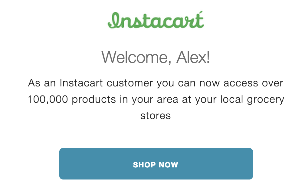
If your welcome email is essentially a large button and some wrapper text, there’s a singular point of failure: the text of said button. Always make sure that it makes sense without the explanation.
The above example gives you one simple, logical action to follow through on, even if you’re on mobile. All the text is nice and big as well as – importantly – pretty much irrelevant. It’s basically “Welcome to Instacart, click here to Instacart.” You had me at “Shop Now.”
3. Offset Your Fancy Branded Email
You don’t want to leave a new user hanging too long for the confirmation of their new account. The rule of thumb is to make sure they receive it within 5 minutes.
But this means that when they receive the beautiful email you’ve designed, tested, and redesigned into oblivion, they’re probably still on your site in the middle of a workflow.
If your users typically make it through the next couple of steps after signup on their own, it might be a good idea to delay your big, conversion-focused email until they’ve had a chance to move forward.
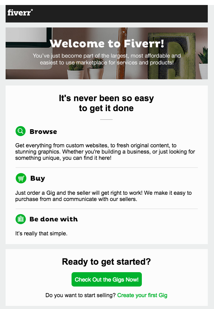
This Fiverr email is great at dropping you right back in the workflow they want you in: checking out the gigs. It’s just a quick reminder and a button.
4. Make it Personal, But Not in a Weird Way
Did your new user sign up on mobile? Where are they located geographically? Did they join as part of a particular campaign?
A lot of this is affected by how deep into your app people can go without signing up.
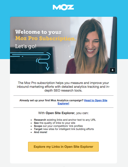
In this fantastic example, Moz tracked that my signup came while using the free version of the Open Site Explorer, so their welcome email pointed out some of the benefits of the OSE and linked me directly to it.
5. Deliver the Goods
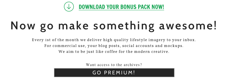
I don’t usually advocate for gating content or utilities, but there are certainly services that do for which it’s a perfectly fair trade. One such service is Death to The Stock Photo; they send a monthly pack of photos meant to replace the standard, cringe-worthy stock photo library.
6. Fly Casual
One thing that’s easy to overlook while crafting a welcome email is the flow that got them there. If you’re using some sort of email capture modal, maybe they’re still reading your blog, but if they just signed up through your standard new user form, they might have just gotten dumped into the middle of your app.
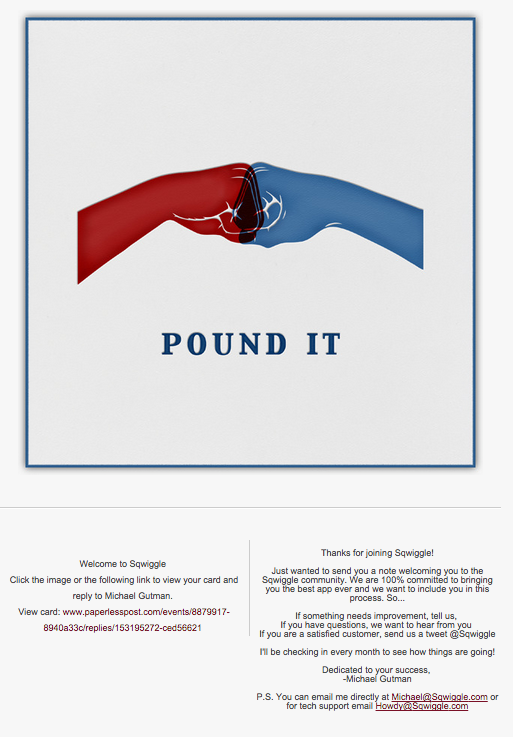
If you’re trying to get people to click through on a welcome email that comes at the same time, make sure the two flows work in parallel.
This welcome email from Sqwiggle is a great way of achieving that: don’t have a CTA, just say hey and move on. There’s some contact info in the footer for reference but this email makes very few demands of the recipient, which is unusual, but kind of awesome.
7. Remind Them What They Like About You
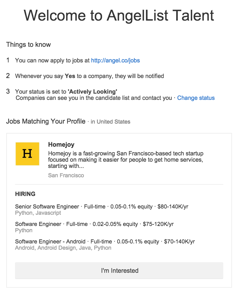
When you sign up for AngelList’s job board as an applicant, this is the email you get:
It starts out letting you know where you are in the onboarding process, what the next steps are to use the service, what happens when you take that next step, and a way to shut it all down.
Then there’s a sample that demonstrates the biggest differences between AngelList and other job boards – salary + equity listing, uninflated language requirements, and one-button application.
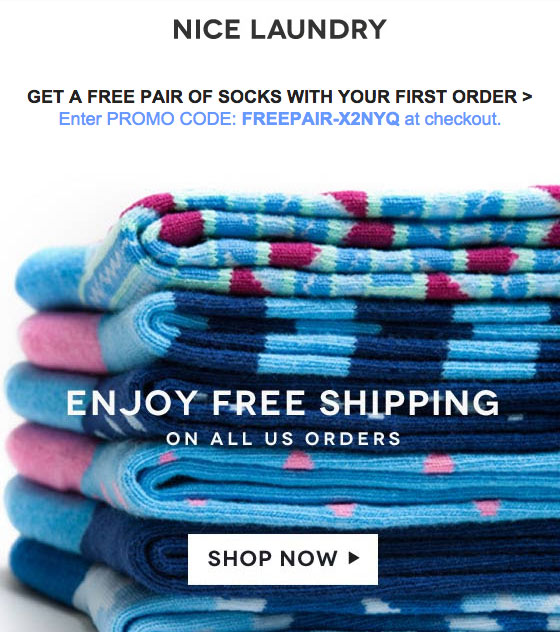
8. Surprise Them With a Gift
Never underestimate the power of free stuff. Buy one get one, discounts, free shipping, etc. All these make great welcome gifts.
Test, Test, Test (And Test Some More)
If there’s one thing you should be taking away from all this, it’s that you should really just be trying stuff. Keep it in line with your normal voice, tinker and test, and always verify with your analytics.
Then, once you find something that works, take those findings and apply them to all the rest of your email strategy.
About the Author: Alex Mohr runs marketing for Sendwithus in San Francisco. Elsewise, he spends most of his time roasting coffee, baking muffins, and avoiding hills. Follow him on Twitter @alexophile.


Comments (4)