Colors affect us in countless ways—mentally and physically, consciously and subconsciously. Psychologists have suggested that color impression can account for 60% of the acceptance or rejection of a product or service.
Good color choices should never be neglected in web design. A bad color combination can have the same negative effect as poor copy and slow load times. In this infographic, we will briefly discuss color coordination and how you can use this to your advantage when designing your site. Special thanks to @speckyboy, @smashingmag and @onextrapixel.
Click on the infographic below to view a larger image:
Website Color Scheme Examples
Complementary Colors – Naturestable.com
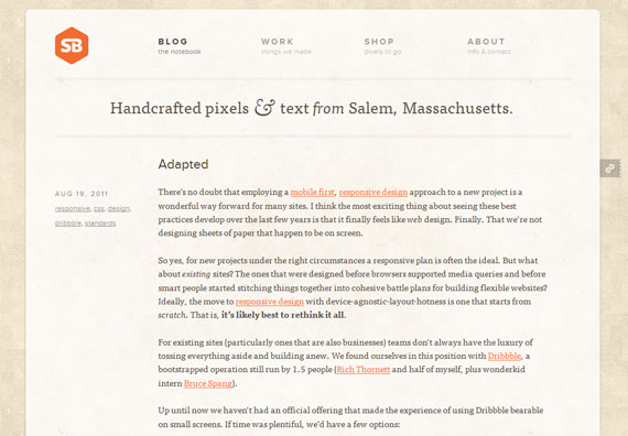
Analogous Colors – Simplebits.com
Split-Complementary Colors – Finaltouchapp.com
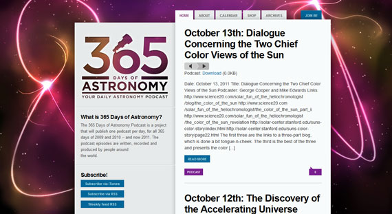
Triadic Colors – 365daysofastronomy.org
Tetradic Colors – Floridaflourish.com
Square Colors – Panerabread.com
It’s important to have a consistent color scheme on your website. To learn more, check out this short video:


Comments (10)