The University of Alberta has a daily news email it sends out every morning to recap the stories that were posted the previous day on news.ualberta.ca.
The email was started in September 2011. Subscribers signed up through an integrated call to action on all story pages and a few other places on the university website.
It grew slowly in its first year to more than 400 subscribers by November 2012. This was still small in comparison to how large the university community, city, and province is, as well as the readership the news site gets on a daily basis – approximately 30-50,000 unique page views per month.
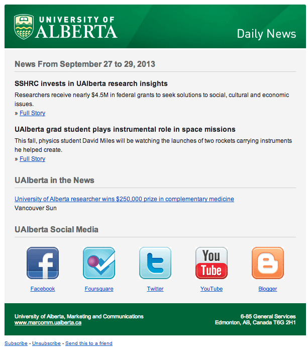
Here’s a look at one of the Daily News Emails:
The Nudge Experiment
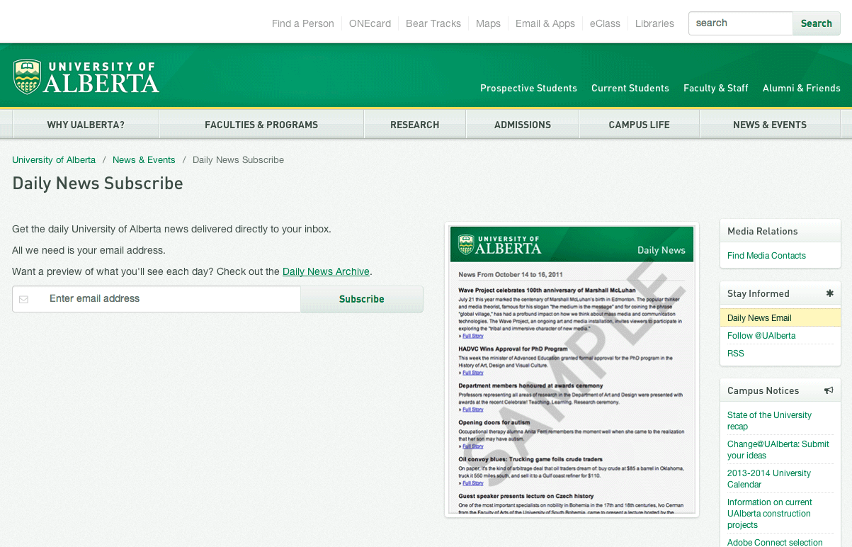
Before the experiment, a call to action was on every news story and on a few pages across the site as a button or link. This resulted in a couple of subscribers per day at most. The calls to action sent visitors off to a short form where they had to provide their name and email address. This was simplified to just an email in the launch of our responsive site, but subscription rates stayed relatively low.
Here’s a look at the sign-up form before the nudge was set up:
One afternoon while reading the blog post about Qualaroo’s new idea to use the tool as a nudge instead of just a feedback or survey tool, we saw a potential to use it for the daily news. Given the low subscription rates and the energy to put out the daily news, we wanted to find new, simple ways to promote the email, especially to those already reading the news.
Although the main audience is campus faculty, staff, and students, we found a large quantity of traffic came from search, sometimes as much as a third of our traffic, with a quarter of that actually being new traffic to the site. Many of the stories have keywords with specific names or research terms that get searched on daily. Some readers come in for one story and leave, so we needed to look at a way to engage a reader who obviously has an interest in a topic or piece of UAlberta information.
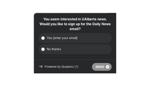
We decided that after a reader visited a story and stayed on the page for 10 seconds, we would have a nudge pop up saying, “You seem interested in UAlberta news. Would you like to sign up for the Daily News email?”
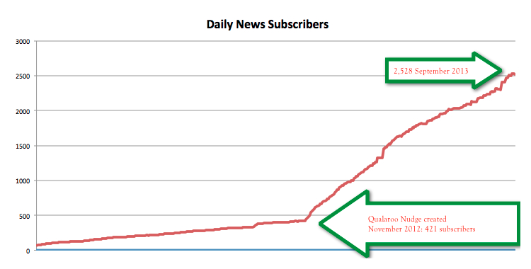
After just a few days, we saw the results and realized we had triggered quite an uptake in subscriptions. We generally were seeing one or two sign-ups maximum per day before the nudge was set up. Now, we have days where we see as many as 12 to 15 sign-ups.
Here’s a look at the response rate over nine months:
The Process
This remains a somewhat manual process. Every couple of days, we export the .csv file and upload it into our mail client, checking against duplicates and any current subscribers. Since this is constantly growing, we are beginning to look at ways to import the addresses more quickly.
We’ve also used this as a case study to share with clients who will be picking up the same strategy on a couple of key news/magazine sites around campus.
The Results
As noted, this short and sweet nudge saw phenomenal response immediately. The sign-up rate for those who responded has stayed steady above 20%. The subscriber list has grown almost 500% in less than a year. The open rate for the email has stayed steady above 30%.
What began as an experiment, stuck as a constant call to action. We continue to monitor this to see if sign-up and open rates decline, but with continued positive growth, it’s still running.
The Takeaways
- Don’t be afraid to test. The simplicity of the survey/nudge tool allowed us to quickly implement the nudge with little development time. Had we debated and not tried something new, we might still be stuck with less than 1,000 subscribers.
- Don’t underestimate desktop users. At the time, the mobile version of the survey/nudge tool had not been created yet. Although a growing portion of views to our responsive site are mobile now, desktop views remain high. Implementing a feature to a select audience can still produce big results and leverage future marketing ideas.
- Experiment with other cases. Speaking of future marketing ideas, we are experimenting with other subscription and lead capture cases around campus. Some are working, others aren’t, and some need tweaking. It’s all a learning experience for both us and the members of the campus community. You never know which one could produce gold.
- Calling the Right Action. It can be difficult at a content-rich organization or company to identify and pinpoint the right business goal with a client. Unlike a product site or campaign page, the content on some pieces at a university can get quite verbose or organizational centric. If you can make only small tweaks to the content with a client, look for ways like nudges, sidebar items, or other means to push the visitor toward a bigger goal than just the information on the page. The results could surprise you.
About the Author: Jason Buzzell is officially the Web Content Writer/Editor for University Digital Strategy at the University of Alberta in Edmonton, Alberta, Canada. He is part of a four-person digital analytics team that works with faculties and departments across the campus to optimize content and marketing campaigns. He is informally a wannabe Digital Strategist who loves using data through surveys, web analytics tools, and other UX exercises to produce awesome content. You can follow him @Buzzilinear or connect with him on LinkedIn.


Comments (14)