As a business owner, what can be worse than having a visitor leave your site due to an annoyance that you can control? You may lose sales due to numerous factors that are out of your control. But what about the ones that you can control? Wouldn’t it be great to have a nice, clean website so that you can focus on optimizing the things that matter?
In this blog post I’m going to share some things that send users away from your website – all of which you have the power to reverse!
1. Center of Page Advertisement
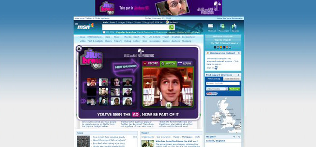
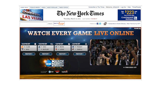
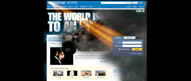
These are the ads that takeover webpages and make the user navigate around the ad.
Now, if the sole purpose of your website is to generate ad revenue, it’s understandable that you’re either trying to leave a lasting impression or maximize your click-throughs. But ask yourself: what is it costing in terms of visitor loyalty and experience? Are you ruining it for them?
In general, do not have advertisements that interrupt the visitor’s time on your site. They can be viewed as the equivalent of a salesman popping out of nowhere and giving you a sales message an inch away from your face.
Websites should be facilitating intuitive navigation and respecting the visitor’s time on your site. Instead these ads do everything they can to get a user to click on the ad and not read the websites content.
Instead…
Opt for graphics that don’t interrupt the visitor’s time on your site; in many cases this means re-thinking your advertisement strategy (if you are using one). We highly recommend staying away from advertising as a secondary income source. If your primary income source derives from subscriptions or e-commerce sales, then it’s probably a better idea to focus on getting more visitors to buy your service or your product, rather than having them click away to a competitor.
2. Stock Photos
Generic, one size fits all stock photos do not help your website convert. These are all too common on ecommerce sites and don’t add any genuine authenticity to your site. Here’s one from a local bank:
Other websites will have stock photos of meetings, or people behind their computers:
These images tell me nothing about the business.
Stock photos have been around for a long time and they certainly have their place. However, they are now too common and can make a website look poorly designed. Ultimately it just looks careless and could be damaging to the perception of your business.
They don’t help tell the unique story of your business. Photos provide an opportunity to showcase your product — Apple does a great job with this.
Don’t gloss over any part of your website. Every pixel, every word, every color and every picture matters. Stock photos can ruin an otherwise well-designed website.
Instead…
Go for pictures of your product or your customers. This will add authenticity to your site. In the case of a franchise or a business with multiple locations, it may be useful to use a geo-location service to show the visitor what the building that is nearest to the location looks like.
3. A Hard To Use Site
Visitors of all ages and technical acumen are visiting your website. Making a complicated website with lots of options may satisfy the techies, but sends novices away. Easy to use websites will have fewer options, but often are more visually appealing and will work for more people.
Visitors should be able to find what they’re looking for quickly. If you have too many options, they may just leave your site.
Instead…
Websites need to adapt to the user, not have the user adapt to the website. Users shouldn’t have to learn how to navigate your site – it should come naturally (this includes error pages).
The thing to remember is that everyone going to your website will come with a different goal in mind. Some may want to see your pricing, others may want to see your About page, others may want to see your help section, others your contact information. Try to come up with a list (or see what your most active pages are) and prioritize them. Then focus on making them really easy to find from any page on your site.
And one of the best ways to come up with this list is to look at your website analytics and survey your visitors.
4. A Slow Site
What’s better: finding a page you’re looking for in 30 seconds or finding it in 38 seconds? It may sound insignificant, but when you’re a business, every second counts.
Speed can impact the bottom line and decreasing page load time improves conversions. According to CacheFly, “E-commerce sales losses may be as high as $4.35 billion due to slow download user frustration”.
Further, “Visitors who consider a website ‘fast’ will visit an average of 1.6x more pages than on a site they consider slow. That’s 60% more chances to close a sale, or a 60% revenue boost for advertising based sites.”
You can see how fast your speed is using a free tool like Page Speed.
Instead…
You’ll want to talk to your web host to see if any speed issue is resolvable. If not, look into switching web hosting providers.
If you have a traffic heavy site, you may want to look into getting a content delivery network (CDN).
Probably the lowest hanging fruit you can go after to improve page loading time is to decrease the size of your images.
We recommend checking out this Unbounce article that has some very practical tips on reducing page loading time.
5. Auto-Play Videos
Here’s a quick way to send someone away from your page:
- An interested prospect comes to your site.
- A video starts playing a few seconds after they enter.
- Their speakers are turned up, the visitor becomes startled and cannot find the mute button.
- Visitor leaves your site never to return again. They go and buy from your competitor that offered a quiet, non-forceful shopping experience.
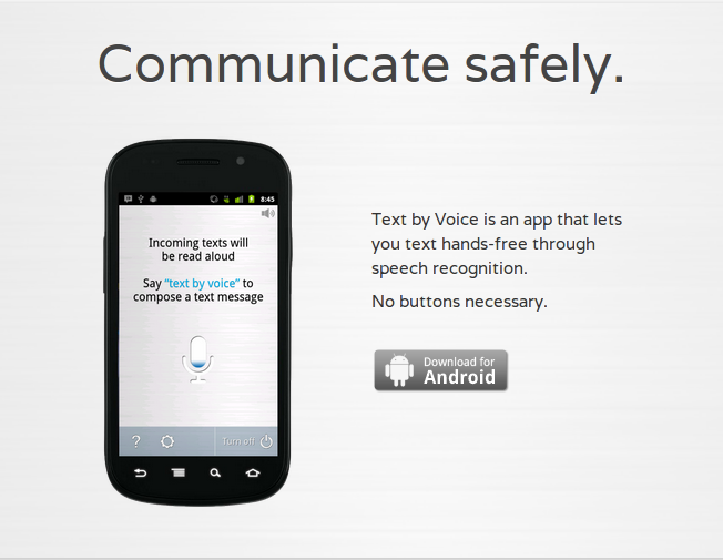
Videos are not a bad thing to have on your website. Videos that play automatically are. There’s a lot of unknowns that the website creator has – they don’t know how loud it will be for the visitor, they don’t know if the visitor wants or needs to see a video, they don’t know if the visitor knows where the mute button is, and they don’t know if the visitor even has their speakers on.
One of the great benefits of shopping online is that there is no salesman to bother you (generally). Why introduce this into your customer’s online experience?
Instead….
Have a video on your site, but don’t force it on the visitor by playing it as soon as the page loads. Let the user control how they want to use and view your site.
6. Pop-Ups
It’s 2012, why does your website still have annoying pop-up advertisements?
Even if they’re promotions from your company, they still get in the way of the visitor. Remember that pop-up blockers exist for a reason: people don’t like to be interrupted while browsing the web.
Instead…
Don’t allow pop-up advertisements on your page. Save pop-ups for the spam sites.
If you want to promote, but don’t know the best way to do it without a pop-up, consider putting the promotion on the side of your pages. For example:
These banners are clickable links and are very visible on the page. If a user wants more information, they can just click the banner. These websites are putting their users in control. Consider doing the same.
7. Ad Copy Doesn’t Match Website
Your ad on Google says “Save 15% on Tools!.” The visitor clicks your ad and gets to your site and you give them a landing page talking about 10% off Refrigerators.
The visitor clicked on your ad because of the sale or value prop that you were making. This makes it very important that you are clear in your website copy. They should find matching text on your landing page from the ad they clicked on within a few seconds.
Instead….
Having a consistent message from ad to landing page has been shown to increase conversion rates. If your ad says “Free Shipping on all orders” your landing page should show the exact same text in the headline or sub-headline.
8. It’s Not Clear What You Do
You may know every aspect of your business, but don’t assume that your visitors do. Your visitors should know within the first few seconds of visiting your website what you do. This can be done with a clear and concise headline, video or both. Failure to do this could result in an increased bounce rate and ultimately lost sales.
Some websites will have an easier time showing what they do. More unconventional businesses will struggle a bit more.
Instead…
Your headline should be clear and above-the-fold. It should also be no more than a sentence long.
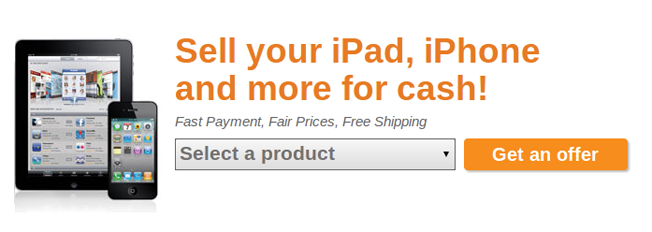
Here are a few good examples of businesses clearly telling the user what they do in less than a sentence:
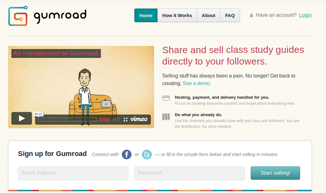
Many businesses will also have a 1-2 minute video on the homepage that gives a brief overview of their business and their unique value proposition. A great example of a combination of great headline with a video is Gumroad:
The headline and sub-headline tell what the business is and they include a supporting video for people who don’t like to read (which is most of the internet population).
9. Long Sign Up Forms
The fact that someone wants to sign up for your product or service should make you ecstatic. You should do everything in your power to make it as painless as possible.
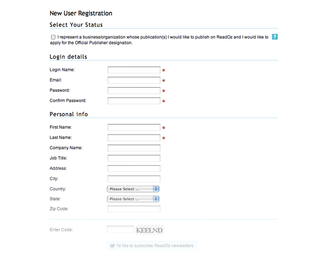
Instead, many sign up forms are like this:
This form should not have any of the field labeled under “Personal Info”. Depending on your business, you shouldn’t even need a username, as an email address is sufficient enough.
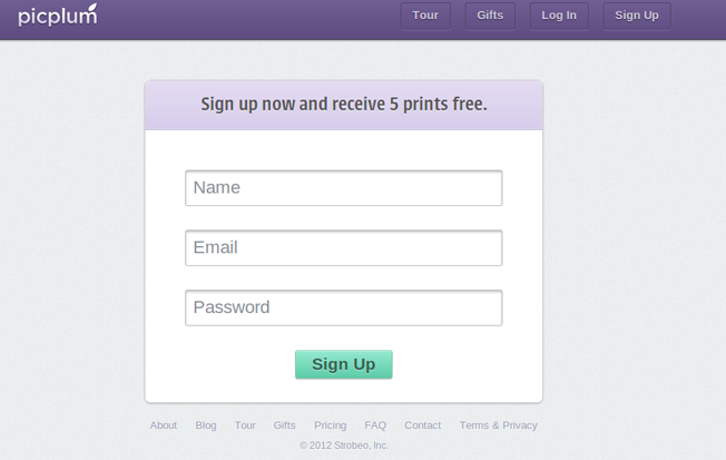
Check out this sign up form from Picplum:
Picplum is a service that will need a mailing address, but they don’t ask for it up front. They only ask for it when it’s needed.
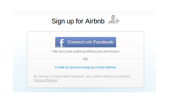
Many businesses now use Facebook Connect. Check out this form from Airbnb:
Whatever you prefer to use, just make sure it’s simple and painless. Don’t create a problem when someone is so close to signing up. Long sign up forms present problems, short sign up forms generally don’t.
There is an exception to this rule – if you are doing lead generation, sometimes it’s smarter to ask for more information that will help you define the quality of your lead. In some cases, it has been shown that more form fields convert higher. This all boils down to: Always test your form fields to see what converts better!
Instead…
In general, a sign up form should take no longer than 20 seconds to fill out. Only ask for information that is absolutely necessary and remove the nice-to-haves. It may not work out best for you, but it will for the visitor – and that’s all that matters.
Over To You…
Do you have any tips that you would like to share with our readers? Please leave them in the comments below.
About the Author: Zach Bulygo is a content writer, you can follow him on Twitter @zachcb1.




Comments (44)