The world is rapidly going mobile, and if you haven’t already built a mobile version of your website yet, then your competition will gladly take care of this part for you…by taking your mobile visitors away from you.
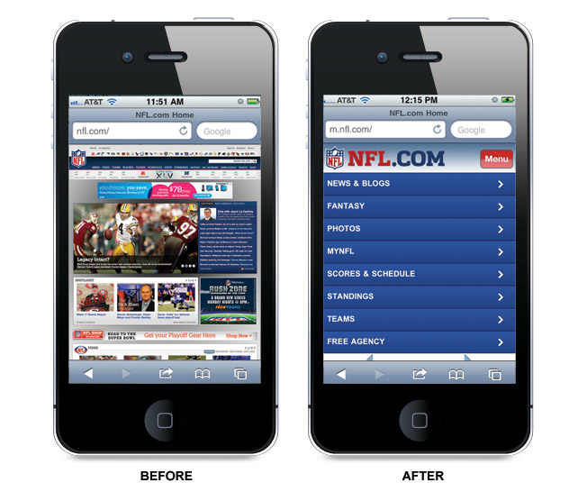
Here’s a great example of how a “mobile makeover” can drastically change the experience for your mobile visitors. Just take a look:
Before and after mobile optimization. The difference is obvious.
Today we are going to go over some simple guidelines to ensure your website’s mobile experience is designed to please and convert!
1. Keep Your Mobile Site Simple, Consistent and Easily Navigable
Remember, mobile screens are much smaller to navigate than desktop and laptop screens so only give essential information you need to make the user experience pleasant and clear. Too much information can be distracting and frustrating to a viewer on such a small screen. Below are a few things to keep in mind:
- Keep your page from being content heavy with excessive information.
- Prioritize the content that users need most.
- Make sure the landing page is clean, clear and concise. Visitors can always click through buttons to access more information on a secondary page.
- Keep important features and structure consistent across the entire site (menu options, back-to-home screen, etc.)
- Lead your potential customer to the heart of the information, making a clear path to the action you want visitors to complete (buy now, rsvp, download, submit, visit, etc.)
- Make sure to use as few form fields as possible (no more than 6) to keep the page neat and streamlined.
- If your site is on the complex side, make sure to include a search bar for easy navigation.
2. Provide an Easy Scroll Experience
Do not set up your user experience to be a “pinch and zoom” situation. You will lose most customers with all of the hassle this creates, especially if you are asking them to fill out a survey or extended form field.
Use checkable boxes and scrolling menu bars to simplify the data entry process. By reducing the content on your page, you have the option to make the text size a little bigger (i.e. legible on a small screen). This makes the essential information on the page accessible in one easy vertical scroll.
Also, make sure the action buttons are of a decent size and have enough space in between each for easy navigation with fingers. Always keep in mind you are making a page where visitors will be using their fingers instead of a mouse arrow.
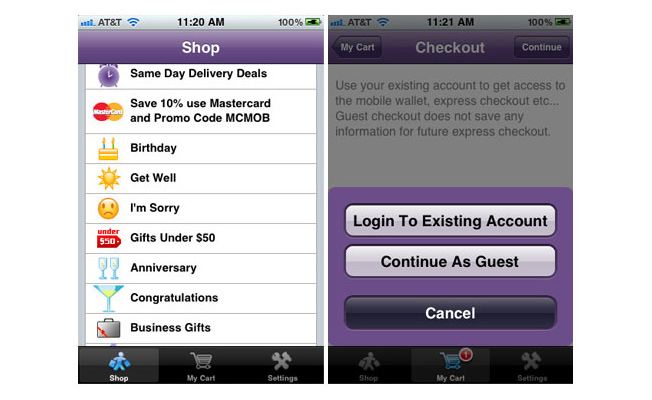
Sample screenshot from 1800 flowers’ mobile shopping experience. Notice the clear organization of categories, consistent menu bar at the bottom of the page and generous space between buttons with larger, legible font.
3. Keep the Font Size Legible and Large
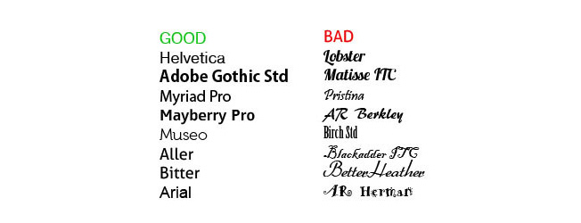
The goal should be to draw the average viewer in with easily legible text, eliminating the need to zoom in on the screen. You don’t want your viewer squinting to read text or unable to discern the letters so we suggest using at least a 14 point font size. Keep the fonts structured and less stylized. Here are some beautiful, more design savvy fonts that are legible and will look fantastic.
4. Talk in Sound Bites
Keep your text short, sweet and to the point. Make it catchy. Create memorable phrases that your audience can easily tweet out and repost. You can also include a short testimonial from a satisfied customer. Your mobile landing page is where you should consider using the following:
- Titles
- Slogans
- Mission Statements
- Short Descriptive Phrases
- Action Buttons
- Scroll Menus (keep your content in lists)
- Bullet Points (instead of paragraphs)
Here are a few examples:
- “Danny’s is the best pizza in town!” – customer testimonial
- Enter to win a year’s supply of our new products! – new store contest
- Business is what we do – corporate slogan
- Sign up for neighborhood discounts today! -local business deals
- Save big on your next meal! -download coupon for a restaurant
- “Keeping you one step ahead of the rest” – shoe company slogan
- Want clear and healthy skin? Get 25% off our most popular package. -skin care company
- BUY NOW, REGISTER, RSVP, ENTER, DOWNLOAD, etc.
- Sleek and Sophisticated. Be on every turn of the society pages. – luxury brand designer
- “To bring inspiration and innovation to every athlete in the world. If you have a body, you are an athlete.” – Nike’s mission statement
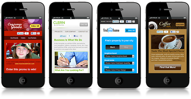
Notice the short and punchy description lines, clear action buttons, clean backgrounds and complimentary photos and text color in these examples.
5. Let the Imagery Speak
In a visually tight space like mobile, image choice is a great way to quickly sum up your message. The right image can speak volumes evoking a visceral experience and connection from your viewer that might not be possible to do with only text on the smaller mobile screens. When choosing imagery, here are a few things to remember:
- Choose an image that will draw your audience in and incorporate a matching seamless background.
- Another option is to use a non-distracting photo or abstract image as the background of your page.
- Avoid choosing harsh and clashing colors for your image or background. Neon yellow and other similar color are hard to look at on screen and do not make your page pleasant to view.
- Do not let the background visually compete with the text, so make sure the text color is easily visible on the background and does not get lost in a pattern.
- Always remember to size your photos for web and compress them so your viewers will enjoy faster image loading time on the site. ImageOptim and TinyPNG are good tools to reduce image size without sacrificing quality.
- Keep a complimentary color palette in mind when creating your page. It is important to use colors that are complementary to the imagery you have chosen, creating a visual experience that is pleasing to the eye and not too distracting.
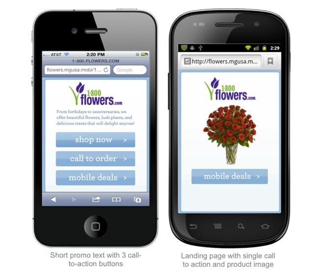
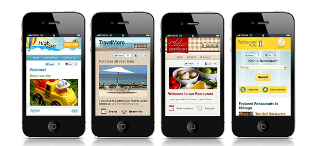
Here are a few more examples of complimentary photo, text and background usage. Choosing an image that picks up a color in the logo is always a nice touch.
6. Make Sure it Scales
It is a shame to have a beautiful page that does not scale to all of the different mobile devices out there. There are over 500 different screen sizes between Android, iPhone, windows, blackberry and tablets, making it a challenge to have a truly mobile optimized device ubiquitous landing page.
Try to follow these three guidelines for scalability:
- Make sure your page scales to both landscape and portrait views.
- Avoid coding your mobile site in Flash or using Flash video if you can because it does not load on all devices (mainly iPad and iPhone).
- It’s recommended to create your mobile site in HTML 5 because it solves many problems of flash on mobile.
Finally, Google announced last September that websites that are optimized for mobile will factor into ad quality. So if you want to keep your Quality Score up and continue to run a smooth Adwords campaign, you should probably start thinking about making some well designed mobile landing pages immediately!
7. Set Up Your Own Analytics
It is a good idea to set up a plan for tracking your analytics in advance. One stunning reason why is that two thirds of mobile traffic does not allow third party cookies. This can make it really difficult to track the effectiveness of your mobile advertisement performance.
For example, iPad and iPhone do not allow cookies unless you turn them on manually. And you can’t assume that consumers will turn them on.
The solution to this is to use analytics software that uses 1st party cookies to track visitors. Ultimately, you should track conversions and conduct A/B or multivariate testing to improve your site’s goal performance.
8. Make Interface Actions Easy
Remember, your visitors are viewing your page on a phone and there are plenty of easy action options to provide for them.
Consumers search locally all the time so make it easy for them to find you and connect. When using icons and action buttons, make sure to use universal symbols so your visitors can easily understand what to do and where to do it on your page.
Consider including:
- Click to Call
- Maps
- Foursquare
- Tumblr
- Form Field Submissions
- 1 Stop Checkout
- Visit a URL
- Play a Video
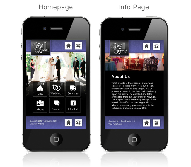
This is a good example of mobile friendly, universal menu and content buttons.
Time To Get Moving!
The bottom line is advertisers and businesses must pay attention to consumer behavior because consumers will be expecting a consistent and dynamic presence on all mobile devices. Mobile is quickly becoming to consumers what web used to be – an intent driven space.
Any searches or ads clicked through on mobile will most likely be acted on within 24 hours, if not at the moment of engagement. Currently, mobile ad space is 10% cheaper than on web, so now is the time to buy into mobile before the prices rise with the standardization and optimization of mobile practices. With these standards in place, mobile is on course to become a 20.6 billion dollar market by 2015.
In order for businesses to achieve their highest potential and profit in mobile, they need a seamless mobile strategy that includes banner ad placement, a correlating mobile landing page and a mobile optimized site.
Many times a mobile landing page will route mobile viewers to the advertised business’s unoptimized website where the potential customer is lost (known as bounce rate) due to jumbled, small and confusing content. In some cases, the page might even appear blank if it was created on a platform that does not work well on mobile devices.
The message is clear: If your business does not have a mobile strategy in place, you need to stop what you are doing and optimize for mobile so you can drop in at full force and ride the mobile wave all the way in!
About the Author: Duffy-Marie Arnoult is the Director of New Media at PageWoo – Create dynamic mobile banner ads and landing pages that are optimized for tracking conversions and scaling to every screen resolution.
Comments (16)