Web design is a tricky subject.
People have different opinions about what constitutes good web design and what doesn’t.
Some people think your site needs to be super sleek with an up-to-date, modern design in order to get attention. Others believe that web design doesn’t really matter all that much and you just need a site that works and lets people do what they want, like Craigslist.
Both answers are right depending on which industry or business you’re talking about. But how do you figure out what’s right for you? And how can you make sure your web designer knows what they’re talking about and won’t make mistakes?
This post presents seven deadly web design sins you don’t want to make on your site. The good news is that they’re all simple principles every website should follow. So whether you get a slick design or not, you still need to know about these design principles and how they apply to your site.
You can use these principles to make sure your web designer knows what they’re doing. Just because someone is a good designer doesn’t mean they know how to design for the web. And just because someone designs websites doesn’t mean they know how to design a site that will convert. Pay close attention to the principles presented in this post, and use them if necessary to make sure your designer designs a site that’s optimized to get the results you need.
Mistake #1: Fonts that are too small
The first mistake people make is creating a site with fonts that are too small.
The reason for this is that, back in the day, most websites had small fonts. The standard was somewhere around 12px (9pt), and nearly everyone followed that standard.
But, over time, people started to realize that 12px fonts are hard to read online. When a screen is 24 inches from someone’s face, small fonts make it difficult to read.
People also started to realize that you have only a limited amount of time to get visitors’ attention and let them know they’re in the right place. One study even states that the average attention span is 8 seconds, one second less than the average attention span of a goldfish. A similar study states that people read only 28% of the words on an average web page.
A study found the average attention span of people is 8 seconds, one second less than that of a goldfish. Is that even possible? Flickr: photographer23, Creative Commons license
In order to get people’s attention right away, you need to do the following:
- Compose great headlines that grab readers’ attention.
- Write interesting content that will get them to read more than 28% of what you’ve written.
- Use headline fonts that are big enough to demand attention.
- Make sure body fonts are large enough to read so readers don’t give up because they’re tired of squinting.
For all the reasons mentioned above, font sizes have increased over the last few years to the point that many view 16 px as the very minimum font size, and many sites go even bigger with 18 px as a minimum, especially when a lot of reading is involved.
Here are some examples of exceptional web design with great font sizes:
- Headline: 41 px
- Body: 18 px
- Intro text: 26 px
- Body: 19 px
The point to keep in mind is that the purpose of writing copy is to get it read. When you pay a writer good money or painstakingly write website copy yourself, you want to make sure it gets read and doesn’t get hidden by a small font that makes the copy difficult to read.
You also need to remember that not all fonts are the same size. A 16 px Arial font can be smaller than a 16 px version of another font. This is something you need to be aware of when choosing a font size, so you don’t arbitrarily pick 19 px because another site did, only to find out your 19 px version isn’t as big.
Keep in mind that footer fonts can be on the smaller side and so can subtext, but if you’ve written something you want people to read, consider using a 16 px font at a minimum. And, in case you don’t want to take my word for it, Smashing Magazine preaches the same thing in this article: A Reference Guide For Typography In Mobile Web Design.
Pro tip: In order to get a feel for the size font you’d like to use, based on websites you like, download the WhatFont extension for Google Chrome. It’s a Chrome plugin that makes it really easy to click on fonts in order to find out what font type and size a website is using.
Mistake #2: Moving sliders
I still don’t understand why so many websites use moving sliders.
Are they effective? Do they convert? Are they the best way to present your information to customers?
In most cases, they are not.
Back in 2017, Peep Laja wrote an article for ConversionXL titled Don’t Use Automatic Image Carousels or Sliders, Ignore the Fad.
In the article he quotes Chris Goward of WiderFunnel and Tim Ash of SiteTuners as saying the following:
We have tested rotating offers many times and have found it to be a poor way of presenting homepage content.
-Chris Goward
And …
Rotating banners are absolutely evil and should be removed immediately.
-Tim Ash
Laja also mentions two even older studies where rotating sliders were proven to be ineffective.
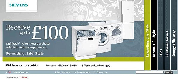
The first was by usability guru Jakob Nielsen. He asked a visitor if Siemens had any special offers for washing machines on their site. In fact, they did have an offer in 98-point font that said customers could get cash back on a new appliance. Unfortunately, the user didn’t see the offer because it was cloaked in a moving slider and ended up being completely missed.
This points to a theory among conversion experts that sliders cause banner blindness similar to ads in a sidebar. People are used to seeing irrelevant ads in a sidebar, so they have a tendency to ignore them. This principle seems to apply to rotating sliders as well.
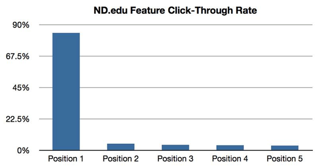
The second study was from the University of Notre Dame. They found that only around 1% of visitors clicked on the slider, with 84% of the clicks on the item in the first position.
In short, we’ve known for years that these sliders just don’t work.
In 2019, web designer Joe Rinaldi commented that “If you’re currently using a slider on your homepage — or considering it for a future website redesign […] ditch the slider” and replace it with something more effective.
What’s the point of having a website slider if only 1% of people click on the item that is taking up your most valuable homepage real estate, especially when 84% of those clicks are on the first item anyway? Why annoy people with something moving that’s difficult to keep track of? Why not give them a single option to choose from since the majority click the first item anyway?
So why do so many people use sliders since they appear to be so ineffective?
The best theory I can come up with is that it seems like a cool and high-tech feature, and it’s easy for web developers to implement. Based on those two factors, business owners say, “Hey, I want one of those fancy moving slider things,” and web designers comply because they look “cool” and aren’t that hard to do.
But website owners need to consider whether they’ll be effective and whether they’re the best way to convey information on their site, something Peep Laja, Chris Goward, Tim Ash, and many other smart Internet marketing folks no longer believe is the case.
To solve this problem, start by asking yourself what is the best way to present your information instead of picking a site you like and copying their design, including the cool-looking slider they use on the homepage.
I used this approach with a friend of mine a few years ago for a website he was building for his tutoring company.
He and his business partner approached me and said, “Hey we want to build a website … and we want to have a slider on the homepage that has this information,” and then he showed me a flyer they hand out at schools to advertise their service. The flyer was beautiful, presented the information incredibly well, and, surprise, surprise, didn’t include a slider (those pesky sliders just don’t seem to translate well into the world of printed flyers).
So I suggested, “Why don’t you just duplicate your brochure that’s already working on your homepage and then put a contact button along with your phone number and email underneath.” We tried that, and here’s how it turned out …
The site ended up looking great, avoided the dreaded default slider, and converts well. What’s not to like?
When it comes to building your own site, follow these instructions to get the same results:
- Remember not to blindly add a slider just because everyone else is doing it (even if your designer recommends one).
- Consider what is the best way to present your information on your homepage instead of just blindly copying what your competitors are doing.
- Choose a single important offer to list in the A-space on your homepage, and go with that. There will always be other things you want to promote, but you can do that farther down on the page or with a button at the top of the page. Pick one offer, make it prominent, and then get out of the way and let your website go to work.
- And to really hammer down the last point, think about the #1 goal you want your website to do. Focus on that instead of all the other calls-to-action.
Again, in case you don’t want to take my word on this, here are some articles you can read that support this point:
Mistake #3: Low contrast fonts
Another huge mistake people make is using low contrast fonts.
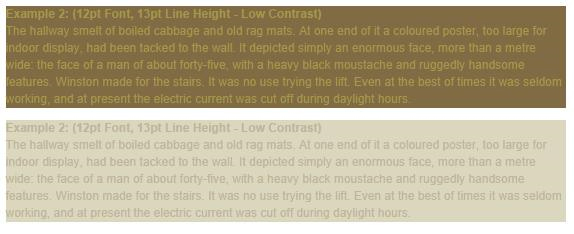
Low contrast means a lighter font on a light background or a darker font on a dark background. I’m not sure if this is something that looks OK in print design, but it’s never a good idea on the web.
You always want to make sure your website content is as easy to read as possible. The Smashing Magazine article referenced above told us that the amount of light that gets through our eyes at age 40 is only half the amount of light that gets through our eyes at age 20. This drops to 20% by age 60. On top of that, nearly 9% of Americans are visually impaired.
With these stats in mind, do you really want to make it harder for visitors to read your content, especially after you’ve paid so much and worked so hard to get them to your site in the first place?
Low contrast for fonts is always a bad idea.
You can solve this by always using high contrast fonts. If the background is dark, the font should be light, and if the background is light, the font should be dark.
Actually, I’ll take this even one step further. Rarely are there times when you need to use any font colors besides black or white. Sometimes designers choose a lighter gray font on a white background or a light blue font on a dark blue background.
Why? Is that really easier to read, or are you just trying to add “visual appeal”? Books use black fonts on a white background for a reason — it’s easy to read. Websites would do well to follow this example.
Here are some samples of great font contrast:
Help Scout Blog
Evernote
This is an example of good contrast on an image, which is not easy to do.
Harry’s
The lesson to remember is that fonts should always have high contrast to the background behind them. If you find the text difficult to read and feel like there should be more contrast, don’t hesitate to call your designer and let them know. Your website isn’t a design showcase. It’s a place to make sales and increase conversions.
Bonus tip: Not only is high contrast important, but you also want to use reverse type sparingly. (Reverse type is white text on a black (or color) background instead of black text on a white background.)
In fact, David Ogilvy, one of the greatest ad men of all time, said ads should never be set in reverse type. Colin Wheildon, editor of the largest Australian motoring publication, set out to test this theory. His findings were astounding.
According to the study, below is a list of the comprehension level for different colors and backgrounds:
- Black text on white: 70% good, 19% fair, 11% poor
- White text on black: 0% good, 12% fair, 88% poor
- White text on purple: 2% good, 16% fair, 82% poor
- White text on royal blue: 0% good, 4% fair, 96% poor
Isn’t that incredible? The results from black text on a white background compared with white text on a color background are nearly the exact opposite!
The takeaways are:
- Always remember to use high contrast fonts, but also …
- Use reverse type sparingly.
Sometimes reverse type looks good, but it can have a drastic impact on readability and retention. As such, you should use it only for parts of your site that don’t require as much reading and aren’t as important. Overall, you’d be smart to think twice before using reverse type.
This reverse type looks “cool” on HubSpot’s homepage, but it may not be the best for readability and comprehension, especially in the most important space on the entire site.
Mistake #4: Poor line height for text
Line height for text is something that often gets overlooked. A lot of web designers and developers choose a font, pick a size, arbitrarily select a line height, and then call it a day.
But line height has a surprisingly significant impact on a site’s overall design and appeal. Choosing the wrong line height can leave fonts looking crowded. It can ruin your entire design.
The good news is that talented web designers have an excellent eye for this and will automatically select a good height for you. The bad news is that some web developers don’t have an eye for this design and may pick the wrong line height.
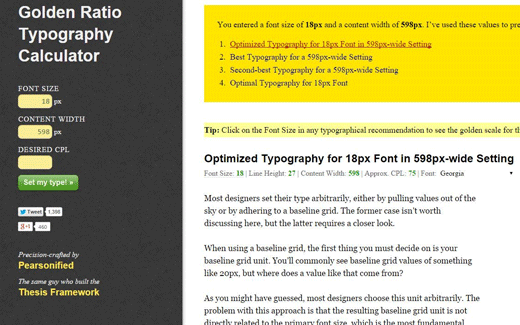
Chris Pearson of DIYThemes felt so strongly about this that he built a line height calculator configured to something known as the golden ratio. Here’s Google’s definition of the golden ratio:
A simpler definition is that the golden ratio is a proportion that’s believed to be aesthetically pleasing. Without boring you with more detail, Chris Pearson used this ratio to build a calculator that combines font size and content width to come up with the ideal line height. The good news is that the calculator makes this super easy to do. You simply plug in your font size and content width, and the calculator will tell you what your line height should be.
You may not have realized it, but there’s a reason some designs and font combinations are more pleasing than others. Great designers know how to achieve the golden ratio on their own, but Chris Pearson’s calculator makes it easy for everyone else to do the same.
Mistake #5: Line length that’s too long
Another mistake you can make is creating lines of text that are too long.
So, what’s the optimum line length?
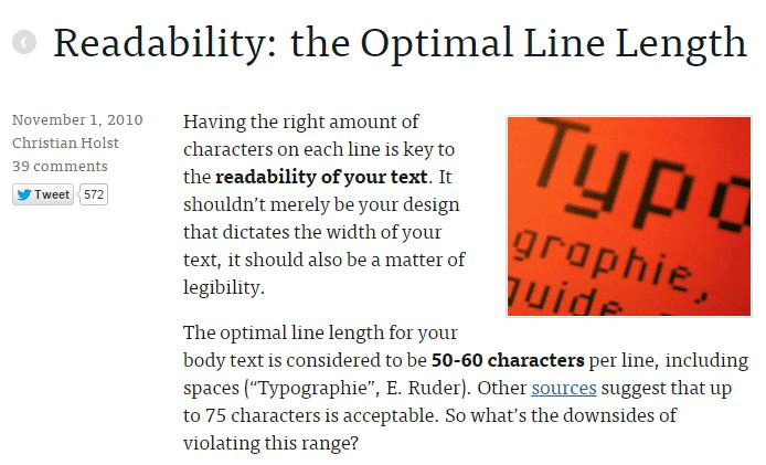
The Baymard Institute published an article that says 50 to 60 characters per line is best, with up to 75 characters being acceptable.
The reason line length is so important is because long lines of text are intimidating to read online. If the line length is too long, some people will not begin reading because it doesn’t look like a very good reading experience.
On the other hand, if line length is too short, readers have to start and stop lines frequently, which becomes annoying.
This problem is compounded by the popularity of responsive design. If you don’t set a maximum width for content section, you have no way of knowing how long the line length will be for your blog or any other piece of text since screen sizes vary so much.
At the time the referenced article was written, The Baymard Institute dealt with this problem by setting a maximum width for their text of 516 pixels, which leaves an average of 65 characters per line at a font size of 18 px. This creates a great reading experience, as you can see in the image below.
Once again, this is a design detail that not all designers are going to pay attention to, but now that you know long lines of text are intimidating to read, you can direct your designer and developer to make sure you deliver an optimal experience for readers.
Mistake #6: No accent color for calls to action
The next web design sin is not using an accent color. Here’s what I mean:
Smart Internet marketers know that you need a good accent color to draw attention to key calls to action. If you’re asking someone to “Buy Now” or “Start a Free Trial,” you want to make sure you use a button color that will draw people’s attention so they’ll click and take the action you want them to take.
This seems simple enough, but I’ve seen multiple occasions where designers didn’t reserve an accent color for the most important calls to action. Instead, they chose a color that’s already used on the site for something else. That’s not a good idea.
Here are some rules of thumb to follow for accent colors:
- It needs to be bright enough to draw attention to whatever you’re attempting to draw attention to.
- It needs to be complementary with the other colors on your website so that it doesn’t clash.
- It needs to stand out from whatever background it’s on. This means that a blue button on a blue background probably isn’t a good idea.
- It needs to be reserved for key calls to action so it doesn’t blend in by getting overused on the site.
In the example below, you’ll notice that the CTA button is bright orange. This helps it stand out from the white background. Also, orange is not used anywhere else in the design (except for a splash in the logo which is small enough that it doesn’t compete for attention). You can check out the full page here if you’d like.
Mistake #7: Common design principle violations
The final deadly mistake is not following common design principles, which is something that Steve Krug talks about in his book Don’t Make Me Think.
The point he makes is that website visitors are used to being able to find certain features in certain places. For example, they’re used to finding logos and taglines in the top left of a page and menus in the top right. They’re also used to being able to find an About page and a Contact page if they want to learn more about the organization or get in touch.
This means it’s a good idea to include those features on your site and that you should think twice before breaking common design principles. This may be something you think is obvious, but it’s not always.
Some website owners, for example, decide to be super creative and come up with a different way to display the menu. Instead of being at the top where it’s normally found, it’s included in the branches of a tree that’s built into the background design (or some other creative way to include a menu other than the standard way).
Sometimes these crazy new approaches work, but often they don’t. In most cases, it is much better to follow common design principles (so you don’t confuse visitors) than it is to come up with a crazy new layout that may be creative but not intuitive.
Conclusion
Hopefully, you’ve learned a lot by reading about these seven deadly web design sins. Most of them seem to be common sense, but they all get broken more frequently than you would think.
Now that you’re aware of these principles, pay attention to the websites you come across and see how many follow these rules. I’m confident you’ll start to realize how important these rules are, which will reinforce why they are important to follow.
Over to you: Did I miss any deadly web design sins you frequently see committed online?
About the Author: Joe Putnam is the founder of ConversionEngine, an agency that combines CRO with PPC to help businesses run profitable paid ad campaigns. He’s helped organizations increase SEO traffic 10X, cut their cost per acquisition in half, and 20X their leads from Google Ads. Visit now to learn more.










Comments (95)