Almost all Internet users do two things on a regular basis:
They use search engines. They use Facebook.
As a marketer or business owner, one of your biggest jobs is to funnel people from other websites to your own.
You can achieve this with an ad campaign on search engines, hoping for a high click-through rate. Ideally, you target market ad copy in social media as a component of your advertising campaigns.
Your target audience hangs out in various parts of the web, but a huge percentage of any target audience uses search engines and Facebook. An online ad has a huge opportunity to succeed in a social media platform.
That’s why they are so important, and why we pay so much attention to SEO and social media marketing.
Because, once you’ve found your target audience, it’s just a matter of finding a way to get your content in front of them.
On Facebook, there are a few ways to do that.
The main way (and by far the most effective) is to advertise.
This goes for just about all social networks. It’s why social media advertising spending continues to grow every year. It’s a lead magnet for your target market when done right.
On Facebook alone, there are millions of businesses that have advertising campaigns on the social media giant.
Most social media marketers understand the value of Facebook ads.
But despite the overwhelming evidence that Facebook advertising can be successful, some people still claim that it’s not effective.
Many businesses spend a few dollars on advertising one time, don’t get results and then write off advertising as a failed experiment.
It’s obvious to you and me that this only shows that they don’t know what they’re doing. Either they didn’t target market their online ad or they didn’t give it the time and total number of ads to be successful.
The effectiveness of advertising depends on your knowledge, skills, and experience.
The more you advertise on a platform, like Facebook, the better you’ll get.
If you’ve been considering getting started with Facebook ads, this post will help push you over the edge.
I’m going to break down the 5 steps to Facebook advertising to get the click through rate success you desire.
Step 1: Interesting comes first
Before you make your first ad, there’s something that you need to understand.
When it comes to the typical news feed of a user, there are hundreds of things vying for a click. Social media has a very small attention span. Ad copy is just one item running through feeds
There are links to different parts of Facebook in the left sidebar (messages, events, photos, etc.).
Additionally, there is a newsfeed of hundreds of posts by friends and brands. All of these have likes, comments, shares and other links that can be clicked.
Finally, there are ads, trending topics and friend suggestions in the right sidebar.
Add it all up, and there’s a lot going on.
This has an important implication for any ads you create: In order to get any attention, your ad needs to stand out from hundreds of competing elements. Thus, social media advertising campaigns must get online ad copy right to hit the target market and increase conversion.
They all want the user’s attention, but you need to find a way to attract it and quickly get your message across.
You also need to consider that a lot of your competition consists of other ads. The total number can take up over half of the screen at times.
So, not only do you need to stand out from regular content, you also need to stand out against ads from large brands who spend a lot of money optimizing their ads to get attention by your shared target market.
The biggest rule behind attention: It’s pretty obvious which parts of an ad get the most attention.
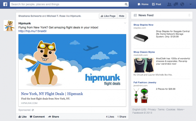
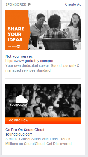
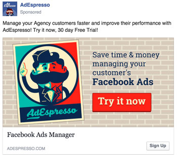
Let’s look at a few example ads. Pay attention to where your eye is drawn first:
If you’re like 99% of people, you saw the picture first.
While there are a few different types of ads you can run, most consist of just a few elements:
- an image – which takes up 50+% of the ad space (and can have color)
- a description – above the image in a newsfeed ad, or to the right in a sidebar ad
- a headline – which is much more prominent in sidebar ads than newsfeed ads
All 3 parts can have a large effect on online ad performance.
The most important one that affects click through rate, however, is the image. Imagery is important in your marketing campaign.
Not only does it take up the most space, but it’s also the only way you can get your ad to stand out from everything else on the screen.
Your title will be a default font and blue color, while your description will be the default black font. These can’t stand out from everyone else’s, because they all look the same.
But, your image can be anything you’d like (aside from offensive or banned images).
Many articles will tell you that a certain type of image will perform best for you. But, they’re wrong.
The best performing image is one that contributes to the message of your ad but also stands out from everyone else’s with the same target market.
And, the way you do that is simple:
Do the opposite of what everyone else is doing.
You gain attention from contrast, from creating an image that looks out of place.
Here’s an example. Everyone uses high-quality stock images with a pretty overlay. It’s the easiest way to create beautiful custom images quickly.
But those pictures don’t always stand out.
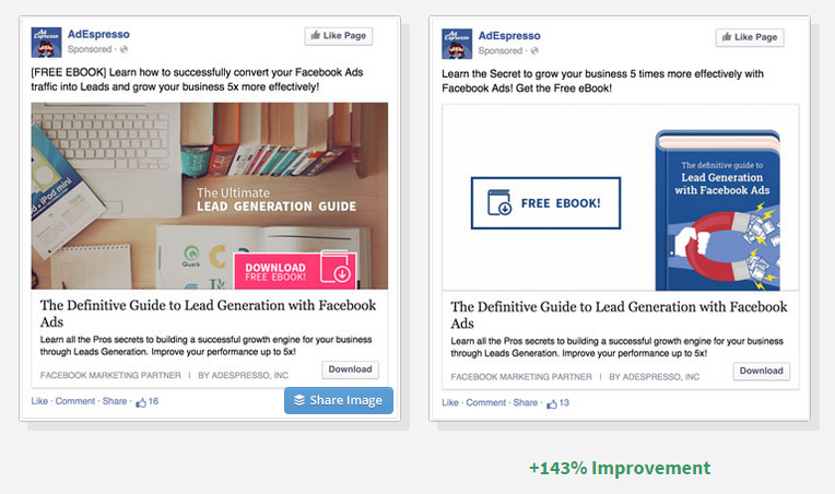
In one split test, the arguably plainer and uglier ad crushed the other version. The uglier one was the lead magnet because the target market related to it better.
The ad on the right performed 143% better, which is huge.
While everyone else is using colorful, flashy pictures, they tried a super plain ad image that looked out of place. And it paid off.
How to craft an intriguing description: All effective ads need a high performing picture. At this point, there’s no argument in that. The competition is just too high to profit without one.
So, that’s your first priority, and it’s mostly how you stand out in social media.
However, the second place that a reader’s eye goes is your description of the online ad (often instead of your title in the newsfeed).
While this area won’t attract as much attention as the image, it is where you’re going to put the bulk of your message.
It’s difficult to communicate a message in a picture, which is why your description is so important.
It needs to quickly (total number of 2-3 lines) make the user interested enough to click through to your content or offer.
In general, you’ll get the best conversion rate by linking to a landing page that offers a free bonus, but they’ll be relatively low-quality subscribers.
I would rather link to a piece of great content (perhaps one with a content upgrade), even if it has a lower conversion rate. This is because the subscribers I do convert will be much more engaged in the future.
Don’t try to get clever with your online ad description, just write the biggest benefit of clicking through to your page in as few words as possible (e.g. “Get a copy of ___ for free” or “learn how to get a 150% ROI with social advertising in this post…”).
If you need help, Facebook has a great tool called Power Editor designed for FB ads. Using Power Editor can simplify things because it’s designed for this social media platform, but it isn’t your only option for advertising campaigns.
Step 2: If you invest in Facebook Ads, invest in this as well…
Without even making your first ad, you already understand the most important part of it:
Your image.
A great image gives you the potential of having a great advertising campaign, while the wrong image can ruin campaigns from the start.
If you get one thing from this post, let it be this:
If you’re going to invest a significant amount of money in Facebook ads, you need to invest in your ad images.
No, they don’t have to be works of art, but they should be created by a designer.
If you are not a designer, that means paying for images. It’s worth it.
A small difference in conversion rate makes a big difference over time, especially when an ad is shown to tens of thousands of people on Facebook.
And, the right image on Facebook ads doesn’t just make a small difference, it can make a huge one.
One of the biggest mistakes I see and read about is when a business owner will set aside $100 and devote it all to paying for impressions/clicks.
Instead, they should use a portion of that to make better images than the random ones they throw together in a half-heartedly designed online ad.
So what should you try to include in an image?
Like I said before, the best image will change depending on what competitors are using for their pictures. It is also contingent on how your target market communicates.
There is no “best type of image”, however, there are some general best practices that you should follow for just about every picture you use.
I’m going to focus on newsfeed ads (the big ones in the middle of a user’s feed) from now on because they get a much higher interaction rate than sidebar ads.
Principle #1 – Use the right size: If you upload an image that doesn’t match the dimensions that ad pictures are supposed to be, you’ll end up with a squished or cut off picture.
For obvious reasons, this isn’t effective.
So, while using an image that is the right size won’t guarantee your marketing campaign success, it’s necessary in order to give you a fighting chance.
The tricky part is that images can be used in many ways.
Even if you just limited your ad to be shown in the newsfeed (which you can do), it will show up differently based on the user’s screen size and device.
It also depends on which type of ad you run. Some support larger images than others.
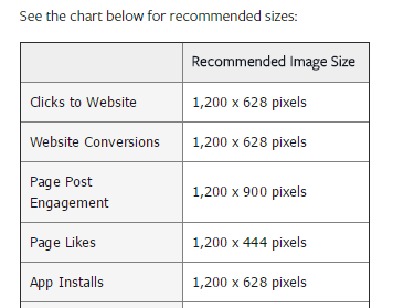
For these reasons, Facebook recommends a specific image size for each purpose:
For the most part, you’ll either be advertising to get clicks to your website or to get more likes and followers on your Facebook page (the 3rd and 4th types above)
Facebook will scale down your image, thus the reasons that the recommended size is so much bigger than you’d think it should be. If you use these recommended sizes, your image should show up well in almost all situations.
If you get really specific with how your ad is shown, you can create smaller images with exact dimensions.
I’d recommend that you stick with the image sizes provided by Facebook, but it’s up to you.
Principle #2 – Color: Probably the most effective way to attract attention online is through the use of color in your ad campaign.
More specifically, through the use of color AND contrast. People move through a social network quickly seeking something to captivate them.
By using colors that are as different as possible from what the users expect, your online ad will stand out more.
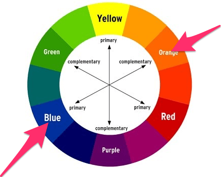
You can figure out what these colors are by looking at a basic color wheel. Contrasting colors are on opposite sides of the wheel.
Since Facebook is primarily blue (and white), it makes sense that pictures that contain orange will stand out and can be effective in advertising campaigns.
Does that mean that orange is the best color?
It’s not that simple. It goes back to your need to stand out from your competition to get the best total number of likes.
Since some of your competition also knows about contrasting colors, they use orange in their ads as well.
You could end up having a similar color scheme to a competing ad, which will reduce your ad’s effectiveness.
In general, I’d stay away from dark blue, since that’s the color of Facebook. Aside from that, you should test multiple bright colors that stand out (depending on other ads).
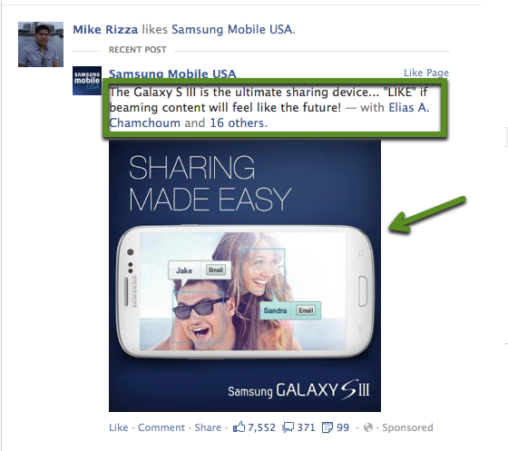
Principle #3 – Value proposition in the picture: While the main purpose of your image is to draw attention, that doesn’t mean that it can’t contribute to your message when focusing on a target market.
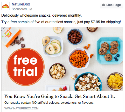
When you have a really enticing offer, try to make it really clear in the picture:
Users will read that text before deciding if they should read your description.
One thing to be aware of is that Facebook has a somewhat controversial rule about ad text in images.
The text in any image cannot exceed 20 percent of the image’s space. So don’t try to write long descriptions in your images, because they’ll likely be rejected by the social network giant.
Keep it short and simple.
Principle #4 – Make it shareable: One of the big benefits of Facebook ads are that they appear similar to normal content.
Users can, and do, “like” them and share them.
If you have a really great offer, it’s possible to have your ad shared many times, which will get it in front of more people without paying for it.
Obviously, going viral isn’t the easiest thing to do.
However, you can still benefit by making your images as shareable as possible.
Images with certain things in them are more likely to get liked and shared.
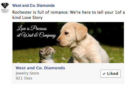
The most popular examples are kids and pets:
You can’t always squeeze something cute into your images, but if you can: go for it.
Principle #5 – Be original: To stand out as much as possible, you need to do more than pick a clever color scheme.
Instead of using stock photos, have custom illustrations done.
Including something funny or unexpected will attract more attention and may also lead to more comments and shares as an added bonus.
Always try to find a way to include something that’s a bit unexpected. It makes the user puzzled, so that they spend a few extra seconds examining your ad.
Step 3: Money is won or lost in targeting. Here’s how to do it better
If you’ve ever done any paid advertising before online, you know how important targeting is to the success of a campaign for a positive click-through rate.
If you target the right people, you obviously get more clicks and conversions.
But, if you’re showing an ad about beef jerky to a vegan audience, your targeting is way off and you’ll make 0 sales.
In reality, you’ll be between the 2 extremes, but you should always aim to target only the people in your actual audience.
Due to all the data that Facebook has on people, they’ve been able to develop some amazing targeting tools that are very powerful when used right.
You can (and should) test different options to see which targeting methods work best for you.
Option #1 – Create a website custom audience: Facebook advertising is all about “audiences” now. You need to specify the type of people you want to show your ads to. Facebook takes care of the rest.
But, there are a few different ways to create an audience.
One way is to create a custom audience, and I’m going to show you 2 variations of that and why it’s so powerful.
What if you could advertise only to people that know who you are, but aren’t subscribed to you in any way? It’d be great, because you already have some credibility in their eyes, right?
Here’s what the first custom audience type consists of:
- You install a tracking pixel on your website (just some HTML code)
- If someone loads a page with your tracking code on it, they are added to your custom audience
- You can create target market ads for these visitors
Fair warning, this is most effective if you have a decent volume of website traffic. If you’re only getting 50 people a day, you might find that you won’t get many impressions with your ads.
If so, try a different method that I’ll show you soon.
If you do have decent traffic, here’s how you get your tracking pixel.
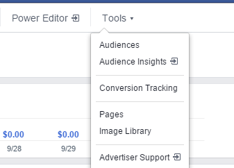
First, go to “ads manager” while logged in to your Facebook account. Click on “Tools” and then “Audiences” along the top toolbar:
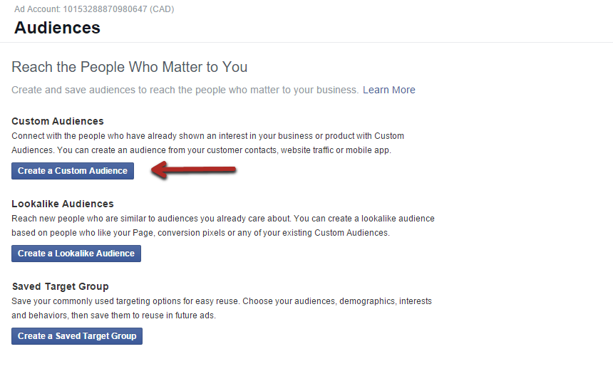
Next, click the first button to “create a custom audience”:
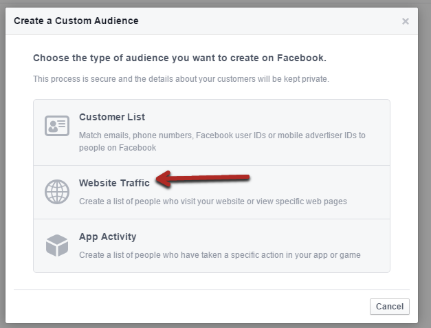
That’ll trigger a pop-up with a few different options.
For this first variation, pick “website traffic”:
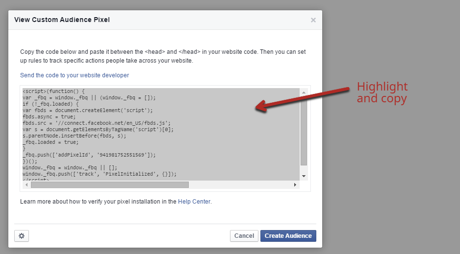
Once you agree to the terms, you’ll get a new screen with a javascript code.
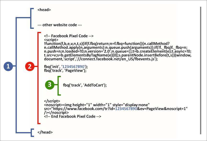
You install it just like you install Google Analytics on your site. Copy and paste it somewhere in your header:
If you don’t want to track visitors to certain pages of your website, just don’t put the code on those pages.
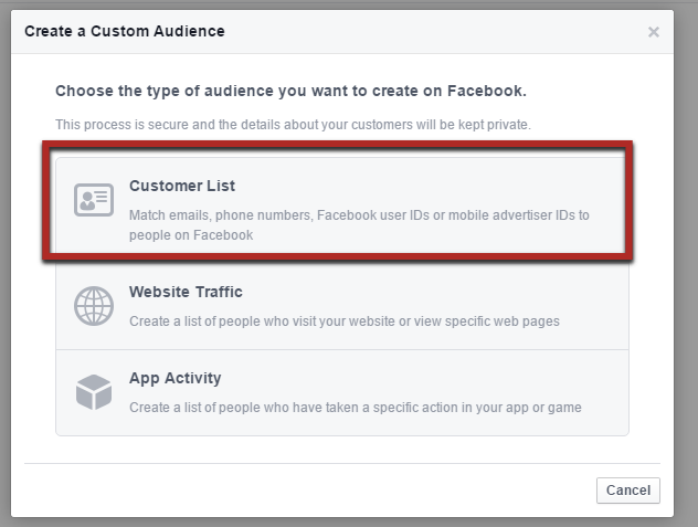
Option #1(b) – Create a custom audience based on email subscribers: When you clicked that first blue button, there was one other really useful type of custom audience you can build.
This option allows you to upload the email addresses of your subscribers and customers. Facebook matches these to users so that you can advertise to those subscribers and customers as a custom audience.
There’s also one other amazing benefit of doing this in your marketing campaign that I’ll show you in option #2.
For now, select “customer list”.
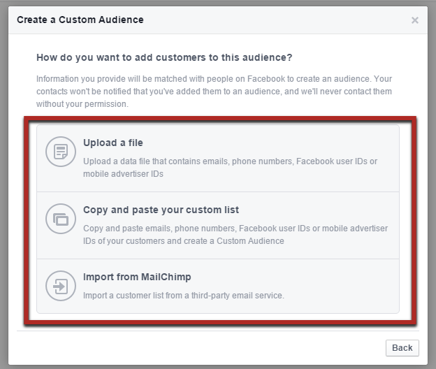
You have a few different options to import your data. Pick whichever one you’d like:
In most cases, it’ll be easiest to just upload a .csv or .txt file (the first option).
For example, in Aweber, if you go to your list of subscribers, you can click the “export CSV” button at the bottom to generate a file with all your subscriber data:
Option #2 – Find tons of people that match your best customers: This is probably the most impressive feature of Facebook advertising.
It requires you to create a custom audience first, using either of the variations I already showed you.
Those are powerful targeting tools. But there’s one problem: They’re limited.
You only have so many people visit your website or on your email list. This can limit how far your Facebook ads can reach for a total number of viewers.
That’s where this option comes in, which allows you to create a “lookalike” audience.
Essentially, Facebook analyzes the custom audience you already made. They consider their demographics, the pages they like and the content they post (among other things).
Then, Facebook looks at its billions of other users and finds other people who share similar traits to your original audience.
This can expand your potential audience by thousands of times what it currently is. And, it’s not just any audience, it’s a potential audience that matches the type of people who are already your customers and subscribers.
I hope you see how powerful this really is.
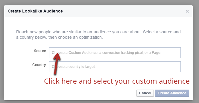
To set it up, go back to the first “audiences” page that you selected from the top menu.
Now, click the second blue button to “create a lookalike” audience.
It’s very simple from here.
In the “source” field, just put your cursor in the text box, and then pick your custom audience from the drop down menu that appears.
You also have the option to specify any countries that you prefer your target market audience live in, too.
That’s really it.
Click the “create audience” button and you’ll now have a new audience in your account that you can target with your any online ad.
Option #3 – Learn to target by interests, but do it well (The standard option): Those first 2 options are great for creating highly targeted audiences that typically convert really well.
However, they do depend on having a decent sized audience already.
But, perhaps you may not have a big enough audience yet.
Until you do, you’ll have to go with the old fashioned option, targeting by interests.
When you create an online ad, there are a few different areas that allow you to pick options that narrow down Facebook users (that fit into it) for best chance at a high click-through rate.
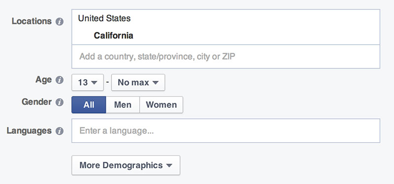
It starts with demographic options, which consists of hard data like age, gender, location, etc.
The better that you know your target audience, the better you’ll be able to fill out the demographics that you want to target.
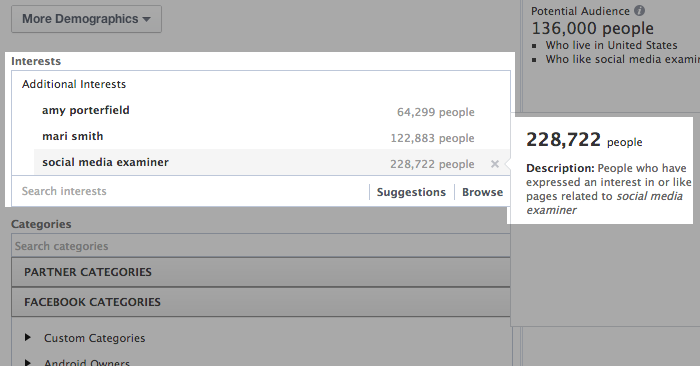
Next up are the interests, which are probably the most important part in developing an ad that is a lead magnet.
When you click on the field, you’ll get a large list of interests to choose from. You can also search for a specific term:
These interests come from pages that users like, or at least interacted with.
It’s not perfect, but it can produce a fairly targeted audience.
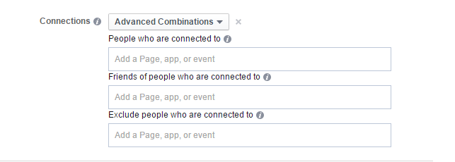
The alternative is to continue down to the connections section. Choose “advanced combinations” from the dropdown menu:
This lets you be a bit more specific, by entering the pages of your competitors. Your audience will consist of people who have liked those competing pages.
If you have to use this option, try to get as specific as possible. You shouldn’t have a huge audience at the end, or you’ve likely gone too broad and will have poor conversion rates.
Step 4: How much should you spend on Facebook ads?
As I’ve mentioned, Facebook advertising is highly competitive.
Not only that, but it takes some time and practice with advertising campaigns to figure out the best way to convert Facebook users into subscribers or customers.
While Facebook advertising is relatively cheap, you still don’t want to be throwing money away on a campaign that isn’t going to deliver a positive return on investment (ROI).
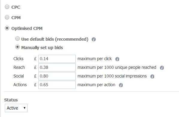
Determining your bids: When you create an audience, you have a few different bidding options at your disposal:
- Cost per click (CPC)
- Cost per mille (CPM: Cost per 1,000 impressions)
- Optimized CPM
In general, it’s best to go with CPC. When you bid per impression, you never know where your ad will show up.
Regardless of which option you choose, you’ll be able to set your maximum bid per click or 1,000 impressions.
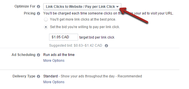
What you can also do is to have Facebook optimize your ad campaign for a specific event. For example, you can optimize for clicks on a link back from the social network to your website:
You do need to be a little wary of this type of optimization, especially when you’re just starting out.
If you optimize for clicks, Facebook is going to show your ad to users who click on things the most. These are usually the lowest quality traffic (but not always), because they’re always ready to click on the next thing.
Regardless of which options you choose, you’ll get a suggested bid range.
If you’re brand new to advertising, start on the low end of this range. The lower you bid, the fewer impressions you’ll get, but it still may be enough for you.
You can always increase your bids later.
There isn’t a definitive best bidding option, you should try them all out.
How much will you spend? Don’t start out spending hundreds of dollars per day. Wait until you have a profitable campaign before you scale up to that.
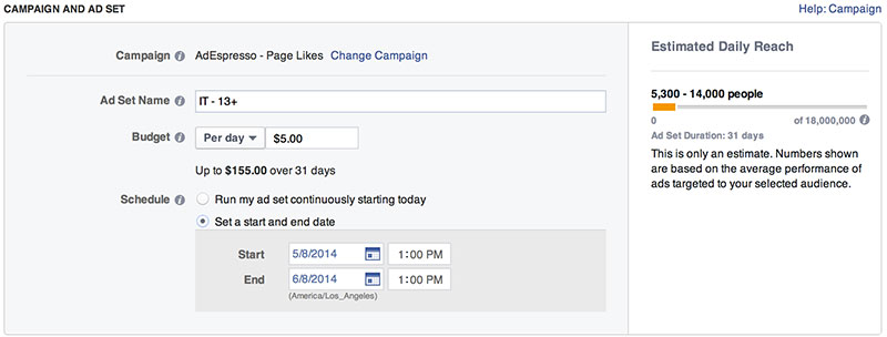
When you’re first creating a campaign, you’re asked to specify your maximum daily budget.
For most people, spending $5 per day is enough to start.
This will allow you to collect a good sample, over a few weeks, to determine if the ad campaign is worth trying to improve.
If a particular ad is performing horribly after a few thousand impressions – scrap it.
Step 5: The most profitable advertisers have one thing in common…
Most beginner advertisers have the wrong impression of successful advertisers.
They believe that experienced advertisers put together a few new ads for a campaign and are able to achieve profitability on most of them.
The reality is that most ads are losers, at least initially.
The goal of your first ads shouldn’t be to get an amazing ROI, because it’s very unlikely that you will.
Your goal should be to get a slightly profitable or even a break-even result. I’ll tell you why this is a good thing in a minute.
But first, there’s one key thing that all good advertisers know…
They know if a campaign is profitable or not: Never start an advertising campaign without a specific purpose.
You may want to drive traffic to your website.
You may want to get more likes on your Facebook page.
It doesn’t matter: pick a goal that you think is important.
Before you get started, you need to know the value of that goal.
If you’re trying to convert that click through rate into email subscribers, you need to have a very good idea of what a subscriber is worth.
The same thing goes for a Facebook like; how much is one worth to you?
If you don’t know this, you’ll never know if your advertising has a positive ROI or not. Estimate this value as accurately as possible.
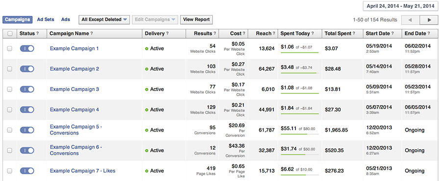
You want to be able to go into your Facebook reporting, see the “cost per action” (click or like) and instantly know if you’re profitable or not.
The difference between many losing and profitable campaigns: I just told you that a break-even first ad is a good thing.
Any guesses why?
The reason is that you can almost always improve your conversion rates by split testing those ads. Which is a better lead magnet; improve that one, test more and improve again, then continue this process.
It’s pretty easy to turn most break-even ad campaigns into solid profiting ones.
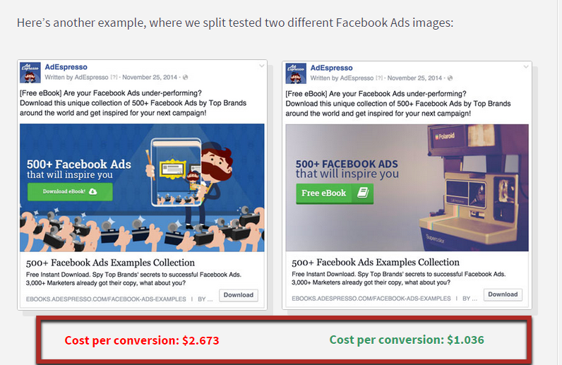
For example, one split test was able to lower the cost per conversion from $2.6 to $1.04. That’s a 60% decrease in cost per conversion.
That’s a pretty rare improvement, but smaller improvements can be made to most ads.
Split testing is very simple and doesn’t take a lot of time.
You simply duplicate an ad that you’ve created, keeping everything the same. Then, you change only one part of it. You might already know this, but the reason to only test one element at a time is because it gives you clear data.
After you let it run for a statistically valid amount of time, you’ll be able to tell if that one change had any effect on your click-through rate results.
What can you test?
- The image
- The description
- The heading
- Your targeting options
Typically, the image will have the biggest effect, based on the reasons we went over earlier.
I’ve included a whole chapter on how to run your first split test in my guide to conversion optimization.
Conclusion
Facebook represents one of the largest user bases on the entire Internet.
For 99%+ of niches, you can find a large portion of your target audience on Facebook through advertising campaigns.
Advertising is the most effective way to quickly get your message to this audience.
However, like any advertising, you can lose money if you’re not smart about it. But, if you follow the 5 steps that I’ve laid out in this post, you’ll make fewer mistakes than most others would.
There was a ton of information in this article, so if you have any questions, just leave me a comment below.



Comments (91)