Okay, right up front I need to call your attention to the fact that you’ll never convince anyone to opt in to anything if they aren’t right for your offer—or if your offer just sucks.
In other words, these tricks aren’t magic bullets—they aren’t the deciding factors in my high opt-in rates.
But if you’ve got a good offer and well-qualified traffic, they certainly will improve your existing opt-in rates by at least a few percent. So here they are:
1. Make the offer match the medium
I’m starting with this because it seems the most obvious to me—yet almost no one I know of does it. Not even top email marketing experts.
Making the offer match the medium simply means that if you’re asking for someone’s email address, it should be because you need it to deliver what you’re offering.
You don’t need someone’s email address to show them a video.
You don’t need someone’s email address for them to download a PDF.
People routinely view videos and download files without needing to be sent links first via email. By forcing him to click a link in an email, you’re actually breaking your prospect’s normal sequence of clicking links on web pages. And this really draws attention to how you’re harvesting his contact details in exchange for an ethical bribe.
But if you offer the content of that PDF or video in the form of an email course, for example, then obviously you need your prospect’s email address to send it to him. You can’t send an email course any other way than by email.
An email course is also particularly easy to justify because people absorb information best in small, actionable chunks. So you’re doing your prospect a favor by not giving him a half-hour video he’ll quit watching after the first two minutes, or a 15-page PDF he’ll just put into his giant folder of unread documents.
2. Offer less than you think you should
Speaking of unread documents, there’s a lot of talk from the dimmer areas of the internet marketing world about “moving the free line”—giving away more and more free content to “build value”.
This is the opposite of what you should be doing, especially at the opt-in stage—because your prospect will only get value if he can absorb, retain, and use what you’re offering.
But he is very busy. He is information-overloaded. He is jaded and cynical and suspects you’re full of crap. He is not ready to invest a lot of time in seeing what you have to offer, or trying it out. The idea of reading through multiple pages of your content, of having to check out a bunch of files or a sequence of videos, not only bores him…but triggers his avoidance reflex.
So even if what you’re offering is genuinely brilliant and would completely change his life if he took the time to learn and implement it, the fact is he will not learn and implement it. Thus he will get zero value out of it.
And he knows that—hence your offer has zero perceived value, and will fail.
So offer less than you think you should. Find ways to emphasize how easy your information is to absorb and use. Show him that the time and energy you’re asking him to invest is very small, and the payoff is much greater.
Email micro-courses are ideal for this too, because you can deliver useful information in short, easily-digested chunks, staggered over enough time that your prospect won’t be overwhelmed. It gives you the ability to offer ongoing value. But you can also use cheat-sheets, short videos or special reports, or even things like specialized calculators, and apps that generate useful content or structures.
The important thing is to give him something he will use. Not something he should use. Something he will use. That’s the only kind of thing he’ll find valuable.
3. Reduce form fields
The only thing you need to send your prospect anything by email…is his email address.
Yet nearly every opt-in form in the world at least asks for my name as well. Sometimes only my first name; sometimes my last name too. That’s often not all. What do my occupation or company name or physical address or (heaven forbid you use it) my phone number have to do with sending me some small nugget of goodness via email?
Precisely nothing, of course—and if I know it, your prospect knows it. So once again you are drawing attention to the fact that you’re harvesting his details. Add to that the fact that even two fields (name and email) is twice as many as one, and therefore represents twice as much friction—and thus potentially half the conversion rate. You have to wonder if it is really worth it.
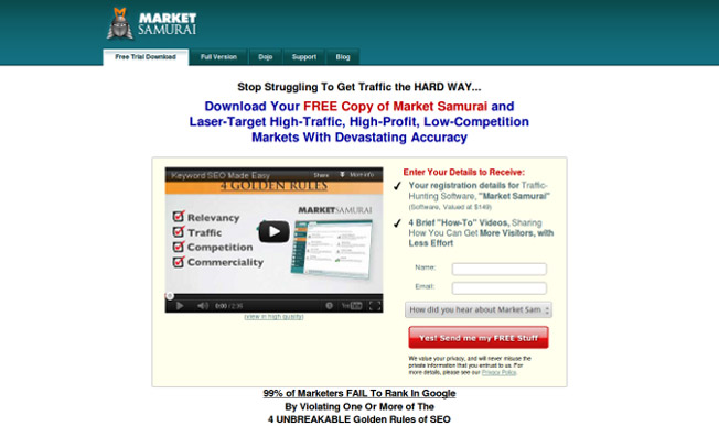
Market Samurai asks for a name in addition to the email address, and then adds further friction by asking prospects how they came to the site. That could be important info, but it definitely adds friction to the page, and calls attention to what’s really going on here: information harvesting.
4. Turn your call-to-action into a give-the-payoff
After spending hours on funnels and objectives, sequences and timings, it’s only natural we start thinking in terms of what our prospects must do to trigger the events we have planned.
That’s why we talk about the call to action—we are asking our prospects to do something.
The trouble is, that’s backwards. Prospects want to know what they get, not what they have to do. Rather than calling our prospects to action, we should be giving them the payoff we’ve promised. We should be emphasizing what you will do for them, not what they must do to get it.
The most egregious example of terrible give-the-payoff copy is on buttons. Often we even forget to change the default text—“Submit”. (In case this has slipped by you before, go look up “submit” in the dictionary—and then think about whether it carries the kinds of connotations that make for the best relationships with customers.) The button is not the only place where marketers forget to emphasize what their prospects get, but it is the most obvious place. Below I’ve included some examples of typical button copy, with suggested improvements for improving their implied value by reframing them in terms of your prospect:
5. Use a splash page
This goes one better (a lot better) than the standard, in-your-face, get-the-hell-outta-my-way opt-in popups that load over existing site content when you first view a page.
Popups are universally despised by web users. In one survey by usability researcher Jakob Nielsen, 95% of users reported that their online experience was affected “negatively or very negatively” by design elements that popped up in front of their windows. 93% reported the same for elements which covered what they were trying to see.
More importantly, in a survey of 18,808 users, over 50% reported that popups affected their opinion of the advertiser very negatively. Almost 40% said it affected their opinion of the website very negatively.
Not a great way to start a relationship with a prospect.
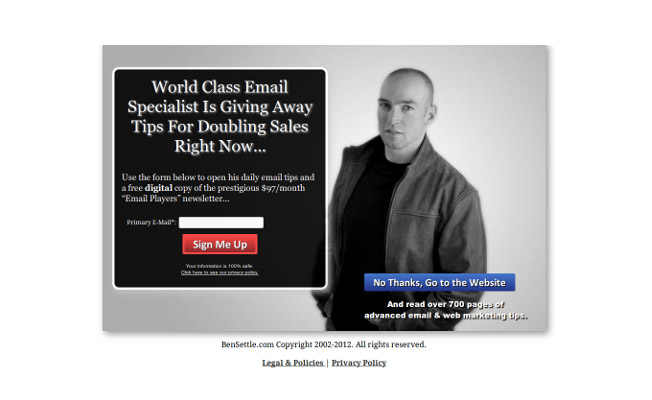
A splash page avoids these problems while still giving you the chance to capture prospects when they first arrive: When they type in your URL, they’re taken directly to your squeeze page, which also includes a nice big visible button saying something like, “No thanks, take me to the main site”.
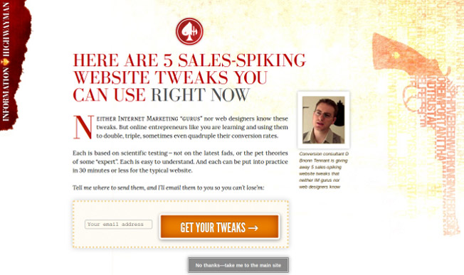
Email marketing maven Ben Settle uses an opt-in splash page that comes up before his homepage at www.bensettle.com—as do I, on my own business site at www.informationhighwayman.com. Notice also that neither Ben nor I ask for a prospect’s name; just their email address.
Of course, the splash page only appears before the homepage. If you try sending someone to a squeeze page when they click a link to an article or product, they ain’t gonna be real impressed. But if prospects are just going straight to your homepage, why not offer them something of value as soon as they arrive—provided you make it clear how to continue to the rest of your site?
Got any tricks of your own?
These aren’t the only tricks I use, but they are some of the most valuable. Do you have any that you’ve discovered in your testing? If so, show us your smarts by sharing in the comments.
About the Author: Bnonn is the creator of the email micro-course “5 Sales-Spiking Website Tweaks Web Designers & IM Gurus Don’t Know.” It is one quick lesson per day, each with a tested conversion-boosting tip you can implement on your site in 30 minutes or less. Get them free at www.attentionthievery.com.


Comments (64)