It happens to all of us.
Sometimes we fail to achieve our set goals, especially when it comes to conversion optimization, our bounce rate and generating and capturing leads. According to Econsultancy, “only about 22% of businesses are satisfied with their conversion rates.”
This means that there are tons of web sites and internet marketing campaigns that aren’t hitting their score when it comes to building better conversion rates.
You’ve worked hard to build your landing page design and it looks great. But, somehow despite the good landing page, the CTA button, and the short copy – you’re not converting leads and driving up your conversion rates as you expected and your bounce rate doesn’t seem to be falling.
If you study several landing pages, you’ll notice that some of them don’t inspire you with their call to action.
Worse, you even doubt the credibility of the marketing campaign or owner making you not want to visit their web site at all. Whatever turned you off on that landing page design is a credibility killer which is bad news for lead generation and conversion rates.
When you’re building a landing page for the purpose of converting leads into customers, you must take bold steps to eliminate all potential credibility killers so you can drive traffic to your web site or achieve the goals you need. You need to think about landing page conversion.
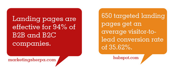
Landing pages, in general, are effective tools for building your business. According to MarketingSherpa, “landing pages are effective for 94% of B2B and B2C companies.”
In this in-depth article, I want to show you 4 landing page credibility killers that you should eliminate right now in order to improve your landing page optimization and get more site visitors.
Here we go.
1. Lack of Social Proof
Credibility is contextual. In other words, what I see as being credible may not mean anything to you. For me personally, copy with a big, bold, red headline seems spammy to me. I won’t click or take any other call to action.
Other people might love it.
However, social proof is an integral part of building the kind of credibility that most internet marketing experts want. A landing page design that lacks social proof may convert fewer leads than one with social proof even if it’s a good landing page that hits all the right bullet points on our conversion rate list.
With social proof, you don’t need to explain that your product truly delivers results. It just shows. Of course, there’s nothing new about social proof and its use in good landing pages, but how often do you use it?
The concept of social proof was popularized by Robert Cialdini in his book Influence.
It’s based on a simple principle: we’re all more likely to do what we observe other people do. This principle relies primarily on numbers – the higher the number, the stronger the proof, and therefore the lower the bounce rate.
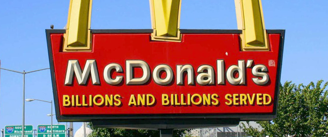
Do you remember the classic McDonald’s billboard ad? Obviously, if they’ve served billions of people, we would all believe that they truly know what they’re doing, right?
Would you want to eat in a restaurant that’s completely empty, or board a commercial airplane with no other passengers?
In the same way, nobody wants to take the first chance and lose money. If others aren’t doing it, then why would you want to be the first? It’s about building a great user experience and that starts with establishing trust.
When potential customers don’t see any form of social proof, they’ve just confirmed for themselves that your offer probably isn’t as valuable as you’ve claimed.
That’s why integrating social proof into your landing page is crucial.
Let’s get practical now. If you’ve been featured on Huffington Post, Forbes, or the New York Times, or if you have renowned companies as clients, let the world know. Share these blog posts on your social networks, work it into your About page or web copy, even share it with your mailing list. It’s about building credibility for your brand.
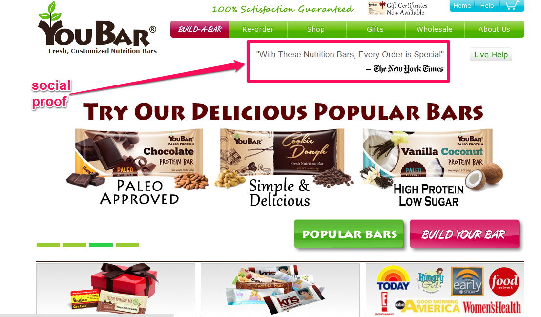
Remember to make your social proof visible. YouBars is one of the sites that understand the value of social proof. The site featured positive quotes from the NY Times and other popular publications.
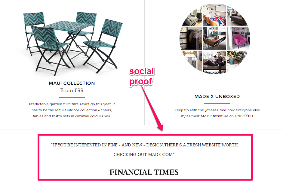
Made.com, a company that sells custom made furniture direct from manufacturers, also uses social proof, displayed below-the-fold. Take a look:
There’s also such a thing as negative social proof. Negative social proof sends a signal or message to your target audience that you’re lazy, dishonest, ineffective or all three. This is not a good landing page tactic.
For example, if you have a blog but haven’t updated it with any blog posts in the past 3 months (especially when the dates are displayed), then you’re leaving negative proof – you’re signaling that you’re unreliable and you don’t care about delivering a fresh user experience.
Other forms of negative social proofs that you should remove include:
- Social network share counters that show nobody is sharing
- A Facebook page with no new posts and fewer than 43 fans
- Testimonials that sound too-good-to-be-true or fake
- A product that’s too costly – or too cheap
- Allowing spammy comments to stay in your comments feed on blog posts and social media networks
Remember that social proof comes in different forms. You may not have thousands of social media shares like UpWorthy, but you should start with what you already have. Showcase the exact or estimated number of the customers and clients that you currently work with.
MailChimp does this well.
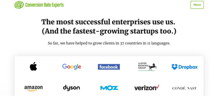
Or, you can show how many countries your products or services have reached and how many customers you currently have. See how Conversion Rate Experts displays it right below the headline, above-the-fold?:
Last but not least, you can also use a case study to improve the credibility of your offers.
People will feel more confident in your product or services, knowing that your offer will help them get results, too.
Through showcasing a case study and proven results you’ve generated for other brands, people can trust you more, because you’ve got results to show for it.
Note that there is also external social proof that isn’t quantifiable or seen by the customers.
For example, well-known brands like Amazon don’t need any on-site social proof to show that their products are of the highest quality. Amazon is already a household name and people believe that they can trust it.
But as much as you can, use honest, trustworthy social proof to build credibility and your quality score. Get rid of the negative social proof and watch your conversion rates soar.
2. Lack of Security/Social Symbols
Do you want your customers to feel secure?
I asked this question earlier, but it’s worth repeating. The truth is that if your customers don’t feel secure, they won’t respond to your offers, no matter how helpful you claim your product is.
Security and social symbols that can boost good landing pages credibility include:
- Quality/money guarantees
- Clear return/refund policies
- Trust marks
An absence of these social symbols and security features on a landing page can actually lower conversions.
If you have a lesser known brand and you haven’t included one of those security features on your landing page design, it’s going to be difficult to convince potential customers to buy from you.
Let’s assume that you sell clothing and shoes. Before customers place an order, they’ll be asking questions like “will it fit?” and “does the color look the same as it does in the picture?”
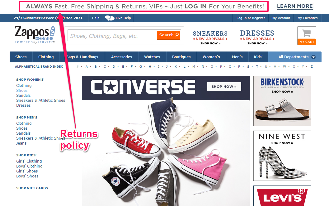
To give the customer a sense of safety when they’re spending their money on your items or services, clearly state your refund and return policies. Zappos has grown into a very successful shoe and accessory site, in part, because of their iron-clad “no questions asked” return policy.
Zappos allows returns in a longer timeframe than the customer is probably used to enjoying. If you were personally shopping for a digital camera and were presented with two retailer return options, which would you choose?
Retailer A: “We accept free returns for 30 – 45 days after purchase.”
Retailer B: “We accept free returns within 6 months. Guaranteed.”
I would absolutely choose Retailer B because the time frame for the return policy extends into 6 months whereas Retailer A offers only four to six weeks with no guarantee. Retailer B is sure to get a better conversion rate.
Ideally, you could allow your customers to buy your products on a trial basis. If you trust that your product will deliver and motivate people to stick with it, offering it on a trial basis can help increase customer confidence.
Glasses Direct, a brand that sells eyeglasses, builds strong credibility with their customers, by giving them the opportunity to buy on a trial basis.
A money-back guarantee always reassures prospective customers about purchasing a product. After all, they have nothing to lose. If your product doesn’t deliver, they can get their money back, this is a great user experience as it’s win-win.
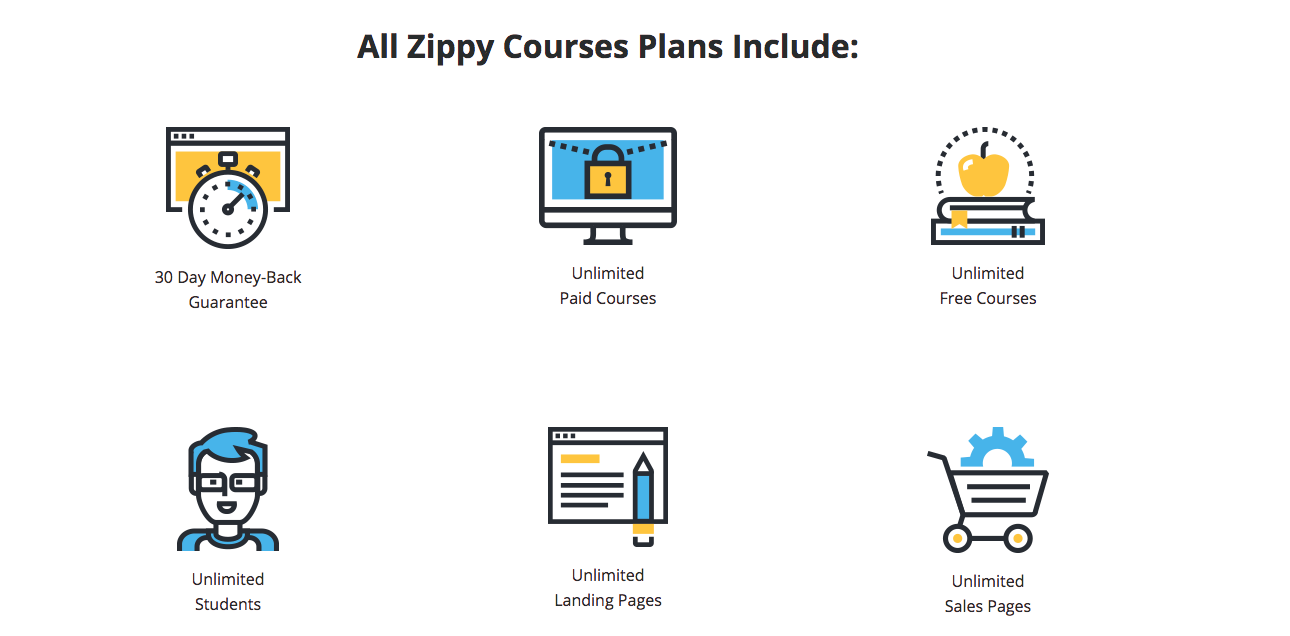
Derek Halpern offers a money-back guarantee for his Zippy Course.
All of these security measures will help increase the conversion rate on your landing page optimization and boost your credibility. Without them, your credibility will be questionable and customers are much less likely to take the risk.
Before we close out this section, let’s quickly look at trust seals.
Trust seals are symbols that help reassure site visitors and customers (especially those who don’t trust the brand) that their personal information (e.g., email address, credit card details, phone number) is secure with the company they’re giving it to – assuming they’re completing a form on the site, responding to a survey, or filling out a questionnaire.
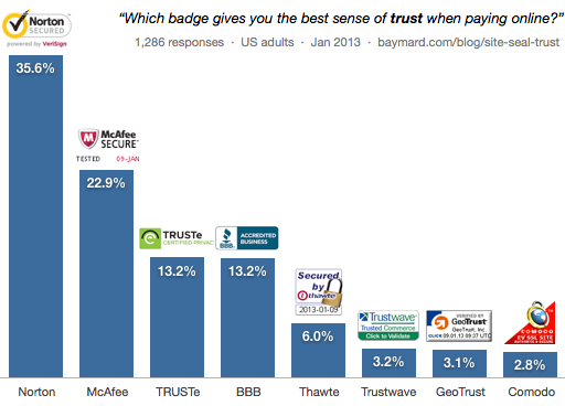
Some common trust seals are shown below:
When people come to your landing page, they may not understand textual security promises. Stating that their credit card information is secure only takes you so far.
You’ve got to add visual clues in your landing page design, such as colors, graphics, and background colors, as well as visual seals, to your payment forms. This will instantly increase your copy’s credibility – because they prove security to your prospects & customers.
Trust seals are effective credibility boosters on your landing page. But, not all trust seals are created equal. Some are trusted more than others.
Baymard conducted a survey to determine which trust seals are most trusted. The sample size was fairly large and Baymard received 2,510 responses. They tested up-to-date versions of 8 of the most popular site seals.
Out of these 2,510 responses, 35.6% of respondents trust Norton’s seal most of all, followed by McAfee.
So does the Norton seal work best?
Well, not necessarily. Every website and niche is different. A Norton seal may have worked better for these consumers, but others might prefer a BBB seal since the BBB as an organization is focused on protecting the buyer.
The best way to know which trust seal is ideal for your landing page is to conduct an A/B split test. Then, you can be sure which seal reassures your specific prospects and customers most of all.
Do you have a privacy policy statement on your landing page? Sometimes people hesitate opting into a newsletter or buying a product unless you state that their personal data is safe and secure.
3. Poor Grammar and Misspelled Words
Your landing page tactics don’t have to include copy that will win a Pulitzer Prize award, but it should be structured properly. Good grammar and correct spelling are important for your credibility as a person and business.
Of course, don’t let perfection paralyze you when it comes to your landing page conversions. But, pay attention to your grammar – because not only does it impact your user experience but you will be judged by what and how you write.
There are customers who will think less of your brand when they repeatedly come across poor grammar in your copy.
You should pay attention to detail.
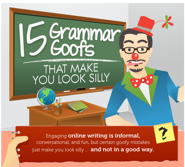
Way back in 2012, Copyblogger shared the “15 Grammar Goofs That Make You Look Silly,” and it went viral. The infographic still holds true today in 2019. Content marketers and bloggers can still learn a lot from it.
Do your best to write correctly. Every word, phrase, and sentence is important – no matter what industry you’re in, good grammar means business.
For example, Colour Works conducted a study of 1,700 online daters and found that 43% of users consider bad grammar decidedly unattractive while 35% find good grammar to be appealing.
When the error is prominent, bad grammar and spelling mistakes can reduce sales. Over time, it results in reduced trust for a site or marketer.
Conversational writing is the easiest way to write engaging and useful content. Sometimes, it’s okay to choose to break a rule, if it results in copy that flows well and makes sense.
But there are some grammatical errors you should avoid at all costs.
Why would any reasonable writer use “you’re” instead of “your” and “their” instead of “there”?
These are common words used every day. Falling into such mistakes can be unpardonable, especially if your target audience is always looking out for a writing error.
The infographic above can help you avoid some of those spelling and grammatical goofs that would make you look silly and destroy your credibility, which we all know – leads to a soaring bounce rate.
Using tools like Grammarly can help you avoid silly mistakes. It is free to use and extremely helpful for people who are constantly creating content.
As a final check, have an editor review your copy, like I do, to reduce the likelihood of typos living on your landing page and hurting your credibility and your conversion rate.
4. Using Unrealistic Headlines
There’s no doubt that the headline is important. In fact, it’s arguably the most important element of your landing page tactic.
When you look at the perfect landing page, the headline comes first, because it’s the first thing the customer sees.
Why is the headline so important?
Ted Nicholas, a renowned direct response copywriter, said that 73% of buying decisions are made when customers look at the headline. And, Brian Clark asserted that 8 out of 10 people will read your headline.
Given these reasons, you can see why a lot of people write unrealistic or wildly inflated headlines, but headlines like that will kill your credibility.
Instead, write powerful and irresistible headlines that offer enormous value and are based on reality.
Writing click-bait just to lure people into your copy will boomerang negatively and won’t do a thing to improve your conversion rate. Even if people are attracted by the headline, they likely won’t click on your call-to-action.
If your headline sounds too good to be true, then it probably isn’t true. Avoid such headlines and your copy will be more credible and will lead to better landing page optimization.
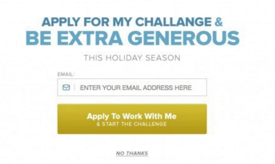
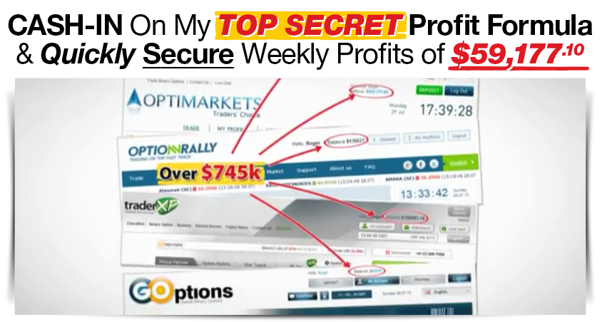
Additionally, avoid making unrealistic claims. Here’s an example of a typical headline that makes an unrealistic claim:
Conclusion
If you’re a beginner to lead generation and customer acquisition, progress is usually slow at first even if you have a good landing page.
But, with consistency, you can build a high converting landing page that builds your business along with improving user experience and encouraging people to follow your call to action.
But, as I said earlier, there is no one right – or wrong – approach to landing page optimization and reducing your bounce rate. There are other credibility killers, but the only way to be certain about what works and what to ignore is to conduct A/B tests.
Which other landing page credibility killers have you eliminated from your landing pages with an aim for higher conversion optimization?



Comments (67)