Google loves posts with 1,500+ words. Readers also love sharing posts of this length. And so, we all strive to reach that number.
But, what if I were to tell you that your readers read your articles for less than 15 seconds?
Oh and yes, this number too is on the higher and hopeful end.
Wondering how I know how many words your readers will “actually” read from your long post?
It would typically take about 5 minutes to read a 1,500-word article. Imagine how little people are reading if they are only sticking around for 15 seconds!
If you’ve been spending hours whipping out long-form content, know that your readers have been ignoring most of it.
But, there’s help: You can use findings of various web readability studies and other general web writing and styling practices to boost your post readership.
Here are 12 of the most effective writing and formatting tactics to give you a head start.
1. Take the inverted pyramid approach to writing each post, paragraph, and sentence
If you read a newspaper story, you’ll see that it covers the most important questions right at the beginning of the piece. The leading few sentences (often called “the lede”), answer questions like: Who, What, When, Where, Why, and more…
The first 2-3 sentences tell you what the story is about.
As you read further, you’re filled in on the secondary details. And, then come quotes, stats, and other supporting details.
The approach of offering the most important information before filling in on the secondary details is called frontloading. It’s also called the inverted pyramid approach to writing content.
When venture capitalist Tom Tunguz moved on from Google to Redpoint, he felt that his messages weren’t as convincing as they used to be at Google. Surprisingly, he solved his problem by changing his style of communication.
He switched to the inverted pyramid style of communicating.
If changing the communication style can be so powerful for communicating key sales messages, imagine how much more powerful they can be to get your readers to read your work.
Tunguz extended his use of the inverted pyramid style of communicating to his blog post ideas as well.
Following the inverted pyramid approach will boost your content’s readership because the online audience is known to respond well to this style of writing.
Here’s how you can improve your post’s readability and apply the principles of frontloading:
- At the post level: Work on your post title and introduction. Treat it like your story’s lede. Make it entertaining. Add a copywriting hook. But keep it clear and tell your readers what your post is about and what its key message is.
- At the paragraph level: Just like your post’s opening line(s), your paragraph’s opening or leading sentence should summarize what that paragraph is about. Basically, you need to make your point right at the opening of each paragraph.
- At the sentence level: Ditch the passive voice. When you start writing in the active voice, you’ll start placing the most important information right at the beginning of your sentence. (You’ll also naturally write shorter sentences as a result.)
2. Write consistent sections
If you look at this post, I’ve started each section by introducing the idea. When you’ve read through the first three sections or so, you will feel a sense of consistency.
Such consistency creates a pattern and makes reading easy. Your target audience will appreciate that. Following this tip will help your readers go with the flow and read your entire article, from the post title straight through to your conclusion.
A simple section structure could be:
- problem
- solution
- tip
You can go on repeating the same structure throughout your post to create a desired pattern.
But:
If all of your sentences and paragraphs start reading the same, your post will lack rhythm.
This is something that you can improve by using images, lists, block quotes, videos, and other such elements. And, most importantly: by varying your sentences.
Henneke, from Enchanting Marketing, offers some brilliant advice on this:
In writing, rhythm is defined by punctuation and the stress patterns of words in a sentence. Long sentences sound smoother, while short sentences make your content snappier.
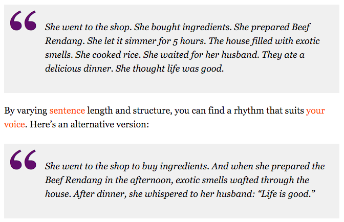
Here’s an example she uses to illustrate how variating the sentence style can create a rhythm in writing:
Just varying the sentence length and adding some punctuation can make your prose more engaging.
3. Focus on the first three paragraphs
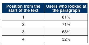
Readers are known to pay attention to the first 3 paragraphs [or content blocks] on a page. The following graph shows the visibility dropping drastically after the third position.
Nielsen draws the similarity between this pattern and the pattern that people follow when they use search results (the majority of the clicks go to the top organic search results).
To use this proven reading pattern, outline your blog format for the post so that your most meaty sections appear before the others.
More so, structure your blog post ideas in a way so that your best points get listed in the first sections of your post.
When your first few points look familiar, readers tend to bounce back thinking, “Oh, I’ve seen this before—nothing new.”
If I started this post with a generic point like adding images, I’m sure I would have lost some of the readers right away.
In his guest blogging course, Jon Morrow also advises his students to write the most unconventional, the novel, and the most unusual content before rehashing what others have said. So, pay special attention to your leading 3 sections.
4. Use a lot of subheads
You probably know the 80/20 headline rule. It states that 80% of the readers just read the post title. For every 8 people that read a headline, only 2 read the post.
I’d recommend that you extend this principle to your subheads as well. Think of each subhead and the following section as a complete post. And assume that 80% of your readers will read just the subhead and not the following section.
By writing engaging subheads, you’ll be able to draw readers further into your post’s independent sections.
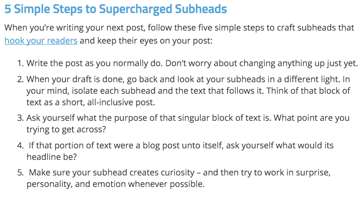
Gary Korisko shares some practical tips for doing so:
Good subheads that invoke curiosity act like anchor points in your post. The better you get at writing subheads, the better readership you’ll enjoy for all posts on your web site.
5. Structure keeping skimmers and scanners in mind
It’s true that readers don’t read the full post, but it’s also true that they don’t always skim.
Studies have shown that website readers keep switching between reading and scanning modes. So, they’re reading some of the time and scanning on other times.
Essentially, when your target audiences comes across a section that interests them, they switch back to the reading mode from the scanning mode.
Since skimmers/scanners use subheads as anchor points, it’s important to think of them while structuring your blog post ideas.
When structuring, ask yourself this question: Will my most-hustling scanner/skimmer audience halt in their tracks when they see this section?
If the answer is a yes, you’ve probably got a great post title subhead. Otherwise, you might want to try something else.
Not only will this tip help you to get the attention of the skimmers, but it will also help you get more people to switch back to reading mode from skimming mode, and help to lure in more long-term readership of your web site from your target audience.
6. Add block quotes
Block quotes work great, because they act as evidence in your post. People tend to trust them.
By quoting the top authorities in your niche, you can create the impression of a solid, research-based post. This is something that will prompt readers to read your full work.
Relevant quotes improve the quality of your blog post ideas. As a popular resource for journalists puts it:
Used effectively, quotations can provide important pieces of evidence and lend fresh voices and perspectives to your narrative. Used ineffectively, however, quotations can clutter your text and interrupt the flow of your argument.
7. Hook readers with internal cliffhangers
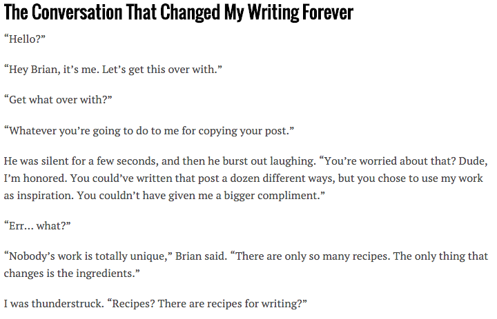
Internal cliffhangers or “bucket brigades,” as made famous by Brian Dean, are a great way to grab the attention of your target audience. When readers encounter them, they tend to hang in some more because these elements call for immediate attention.
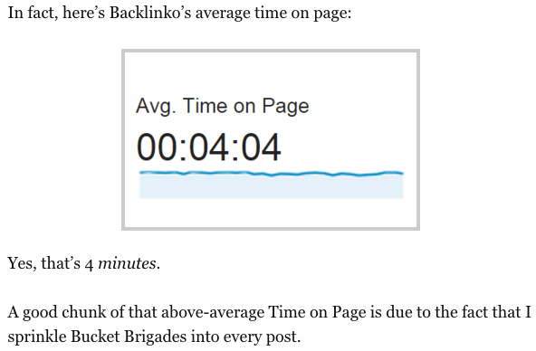
Brian was able to boost the average session time of his user to more than 4 minutes, by simply breaking up his posts using bucket brigades.
Here’s what he says:
When you first start using bucket brigades in your posts, you might feel a bit funny, as they look unconventional. But, they work like magic.
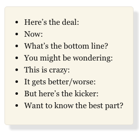
Brian shares the following list of bucket brigades:
Demian Farnworth suggests the following:
- For example
- Let me explain
- Here’s what I mean
- Here’s why
- Sound silly? It’s not
- Case in point
Again, like most of the styling elements on this list, don’t overdo it. Use them when you expect to lose your reader’s attention.
They’re a great way to break up your post’s longest sections. Every time you feel like you’ve been going on a while, add a break with a bucket brigade.
8. Write in a conversational style
“Youify” your content.
If you read my posts, you’ll know that I have a very casual style of writing. It’s almost like I’m speaking to you.
This style of blogging gets read because every time you say “you” or “your,” you pull your reader into the discussion. Also, by using you’s and I’s, you can keep the content of your web site from looking like a set of essays.
Remember:
Your blog posts aren’t academic papers. You can go easy with the style and you should. By making your posts conversational, you can draw your readers in and engage them better.
9. Add interactive elements
GIFs, tweet boxes, polls, surveys, infographics: these elements aren’t as mainstream as images, but you see a lot of them.
CopyHackers sure seems to be a big fan of them. Open any post and you’ll find 4–5 engaging GIFs.
Use with care with your blog formats:
Some people hate the use of GIFs in posts. If you feel that your readers might not like it, stay away.
Tweetboxes, again, are a great formatting tool. By designing elegant tweetboxes, not only will your content look great, but it will also be shared more, because tweetboxes make sharing easy.
Surveys, polls and calculators also make a post more engaging and inspire readers to read more of it.
10. Spice it up with images
Images are great for making your posts more appealing, we all know that. It’s like formatting 101.
Why?
Well… perhaps it’s because readers feel distracted with images (even if they look refreshing).
My tip is to stop using just stock photos. Use a good mix of charts, graphs, annotated screenshots and more. Whenever you use charts or screenshots, you can refer to them within your post and help the reader focus on the content.
Nielsen says:
… users pay attention to information-carrying images that show content that’s relevant to the task at hand. And users ignore purely decorative images that don’t add real content to the page.
Make sure that you use a few, but relevant, images.
11. Write small sentences
Sentence length is not always a problem, because most good bloggers can write meaningful 15-word long sentences.
In fact, if your average sentence length is 14 words, you can be sure that your readers will understand up to 90% of what you’re saying. When it’s just 8 words, though, the readers will get the full story.
While long sentences aren’t always bad, they become a problem when you try to write them. Instead of creating long, deep sentences, you end up confusing your readers.
Try to write short sentences. Short sentences add clarity to content and make it look snappy. They’re easy on the eyes as well… especially nowadays where people consume more content on mobile.
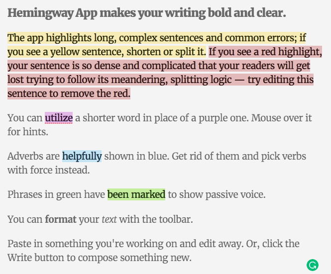
To remove all the overly long sentences in your post, edit it using the Hemingway App. The Hemingway App editor helps you rewrite all of the long sentences in your post and boost its readability.
When you’re ready with your shiny new post, go to the Hemingway App and paste your content into it. Next, look for all the sentences that the app highlights in red. All of these sentences are long and can be rewritten for clarity.
12. Space it up
Whitespace isn’t just a tool to give the reader’s eye a break. It’s actually a cue.
Designers have used it forever to draw their users attention to the most important elements in their design.
Just like designers, you can also use whitespace and guide your readers through your post.
The creator of Usaura (a usability testing tool), Dmitry Fadeyev says:
White space also makes content more readable. A study (Lin, 2004) found that good use of white space between paragraphs and in the left and right margins increases comprehension by almost 20%. Readers find it easier to focus on and process generously spaced content.
By just spacing up your text, you can get your readers to read your full post.
SmartBlogger’s Jon Morrow does this really well. Look at the following post, from his blog:
Notice how he uses whitespace and gives readers some room to breathe.
Whitespace is also your single biggest tool when you want to create mobile-friendly content. It makes reading easy on mobile — almost effortless.
Conclusion
To get your longest posts read, don’t think about content alone.
Think about how you outline it. Think about how you write it. And, finally, think about how you format it.
It’s only after you get a handle on your post’s outline, style, and formatting that you’ll be able to hook your readers.
I hope I could get most of you to read until now.
Have you tried any of these tips? What are the other tips that you use to get your longest posts read?


Comments (84)