On this blog we talk a lot about websites that have effective calls to action, non-cluttered home pages, and trustworthy designs with the intention of showing what techniques help improve conversions.
After years of showing our readers examples of what works and what doesn’t, one thing we have noticed is an awful lot of similarity between website designs in the same space.
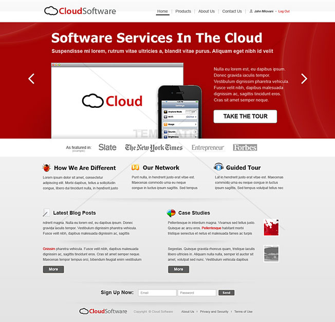
Above: We have your typical “software as a service” (SaaS) website. Look! They even have a template for it!
My hunch is that either:
- After years of people copying each other’s designs, SaaS businesses have determined that this is what a SaaS website should look like.
- Or, after years of individual A/B testing, this is the winning outcome of what an effective website should look like.
I guess I lean more toward point #1…
But why not make your site unforgettable?
You know you have stumbled across websites that completely blew your mind in terms of sheer creativity and just plain awesomeness. Is it possible to turn your SaaS, eCommerce, or blog site into something more exciting than that same boring, old, template-d look? Is there another way to deliver your unique selling proposition to make a really lasting impact?
More importantly, do you have the guts to try something completely out of the ordinary?
What the hell is a Purple Cow?
Oh yeah – I should explain what that means.
Purple Cow is a term coined by marketer Seth Godin. The basic premise is that if you took a drive through the country and all you saw were the same common, ordinary brown cows, and then you turned a corner and suddenly saw a purple cow… Well, you would never forget that you saw a purple cow because it’s that unforgettable.
So the idea is this: how do you market and design your product or service to be VERY different from the competition, to a degree that you can leave a permanent impression on people?
In today’s post we’re going to go over 10 websites that have left a lasting impression on their visitors. Now, they are not all business websites – but they are inspirational. The point is to stir up your mind, get you thinking outside the box, and dreaming of Purple Cows tonight.
Let’s take a look, shall we?
*Note: some of these websites are older and may require Adobe Flash, so iOS users please keep this in mind when viewing them.
1. Noedesign.com
This website is a favorite of mine.
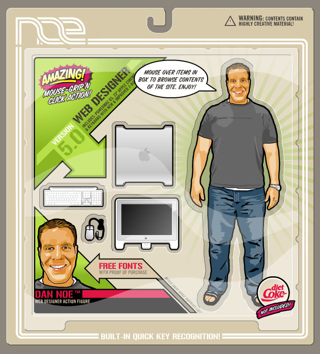
It was Dan Noe’s personal website to showcase his design abilities back in 2005. It got the attention of Communication Arts Magazine, and they subsequently gave him an award for it.
If you click on his figure, the “packaging” flips around and gives you more details about Dan, a free font download, and other terrific interface experiences – that still impresses me to this day.
I mean, even the deliberate way the site loads is awesome!
If you study this site long enough, you will see all of the little nuances of your typical action figure toy package. He comes complete with an arsenal of a Mac desktop computer, a mouse, and a keyboard (unfortunately Diet Coke is NOT included – i.e., batteries).
His site really gives you a personal feel for what kind of designer he is and a deep look into his creativity. This site is definitely a Purple Cow for a web designer.
2. Slaveryfootprint.org
https://www.slaveryfootprint.org
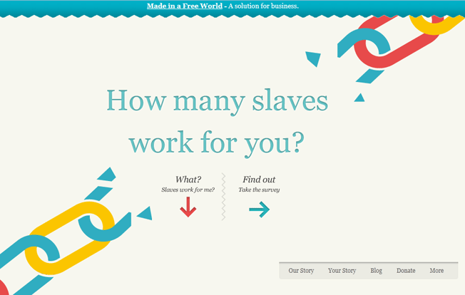
This site does a great job of making you feel horrible for being a techie, technophile, or whatever you want to call yourself. But it also does a wonderful job of educating you on how your consumer goods are sourced and what you can do to get them more ethically. Once you use this site, you will never forget it.
If you ever want a lesson in home page copy, Slaveryfootprint.org is a great teacher. With a main heading of “How many slaves work for you?” – visitors are immediately compelled to start thinking, and curiosity leads them right into a brilliantly designed survey.
3. The Bullitt Agency
https://www.thebullittagency.com
There is no escaping their introduction.
As soon as you go to thebullittagency.com, your computer is taken over, and a full screen, surreal presentation is given. It’s a tour of international cities made of 3D models. But the effects and attention to detail of the models is something you’ve never seen before. The videography is also on another level.
If I were a DJ, I would definitely want this agency to handle my bookings.
4. Subservient Chicken
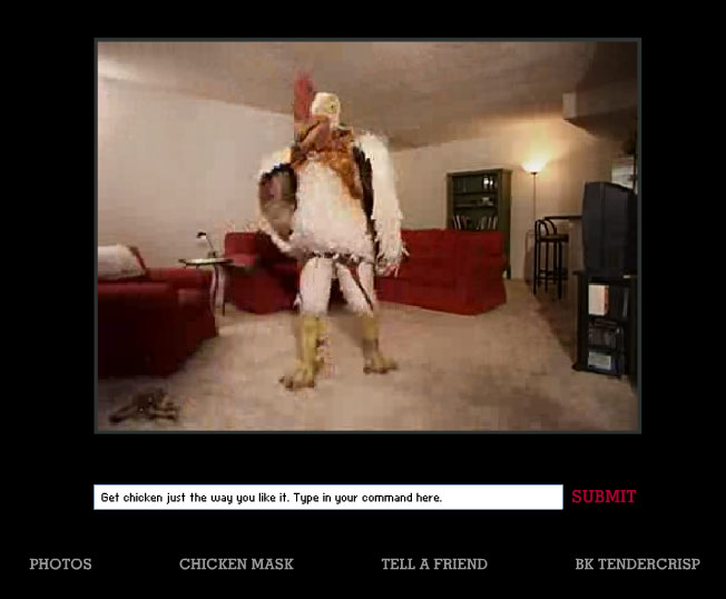
This is another oldie but goodie. This website was Burger King’s attempt at showing customers that they can “have chicken their way.” And it worked! With over 15 million unique visitors accrued during the campaign, Subservient Chicken was an early viral internet marketing ploy that has been cast into Purple Cow history.
The way this website works is: you simply type in commands, and the Subservient Chicken will perform every one of them. Kind of like having your own genie in a lamp – except it’s a 6 foot tall chicken. You’d be surprised at some of the words it knows!
5. The Oatmeal
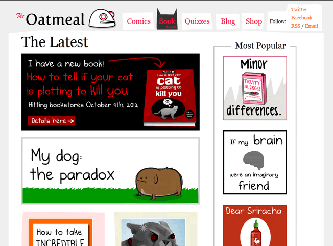
The Oatmeal doesn’t deliver any crazy functionality or award winning design. But very few websites have the ability to immediately draw you in like The Oatmeal does.
The content is so original and funny that even upon your first glimpse of this website, you have to click on one of the panels.
This site proves that you can make a web business out of something simple, such as cartoons. While other online businesses spend years creating tons of code, blowing through millions in cash – The Oatmeal makes money with Adobe Illustrator and the Save To Web Function.
6. Tinke
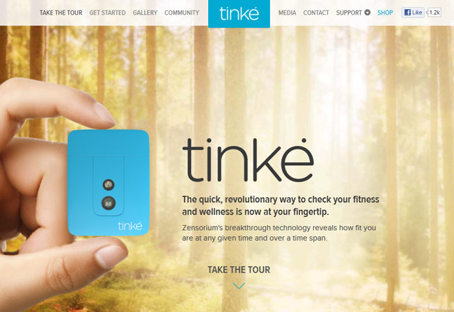
An amazing product should have an equally amazing website to market it. That’s exactly what Zensorium set out to do when they went to market their fitness monitor Tinke.
The screenshot above doesn’t do the website justice. You really have to experience the tour to get the Purple Cow feel.
The tour moves effortlessly, as all the main elements align into position to highlight the focal point of each section. This motion directs the visitor’s attention to the right place to really drive the selling points home.
I’m sure the design firm who made this website, is quite busy these days…
7. Dangers of Fracking
https://www.dangersoffracking.com
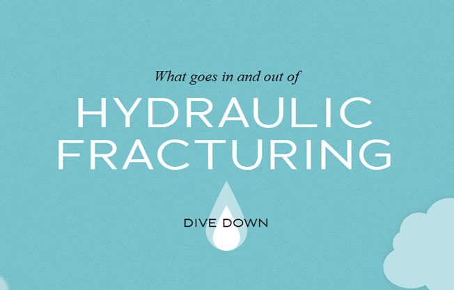
This is similar to Slaveryfootprint.org in that it’s a site to raise awareness, not to push a product. It’s a creative website that doesn’t require any resource intensive technology to move visitors through the story.
An interesting point to notice is that the “non-businessy” websites tend to bring out extraordinary creativity! I think this has to do with the psychology behind what motivates creativity – sometimes just waving dollar bills in front of people doesn’t get the best results…
8. Ro.me
Websites designed to promote movies and albums are really interesting to me. There is so much money devoted to something that has a limited lifespan – seems like a waste – but it can work.
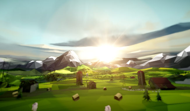
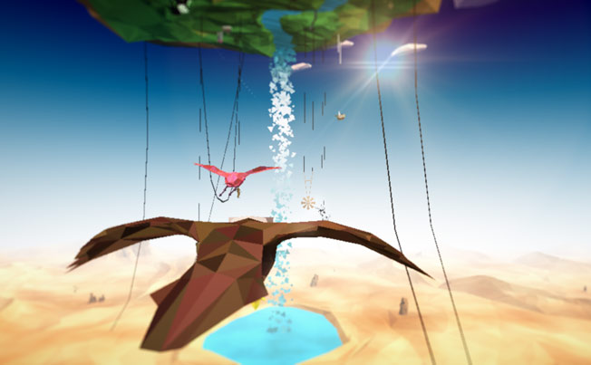
I’m not going to try to explain what’s going on with this website because the little I understand is mind blowing: an interactive dream where you can steer…
change perspective…
fly…
add to it, vote on other dreams – and all set to a music track. Yeah. It’s wild.
Instead of me trying to explain it, just watch this video:
9. Squarespace.com
I don’t think I have ever been so quickly sold on a website building service before. Not only is the design wonderful, it ingeniously builds my trust and approval for the service along the way. I can finally send all my noob friends to a place to get their site done, without having to worry about who to refer them to and what bridges may get burned along the way.
This is a great Purple Cow website for a SaaS business. It’s a non-traditional portal that sells, convinces, and makes something so complicated look so easy. I give Squarespace.com 5 thumbs up!
10. Google
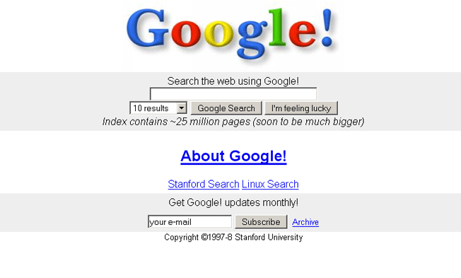
Of course, Google is unforgettable. I’ll never forget the day my friend showed Google to me in a Caltech computer room back in the late 90s. It was the very essence of a golden viral marketing moment: he said to me “Hey, look at this…” and then stepped away to let me drive. Religiously, I haven’t used another search engine since.
Now, I know your saying “Google! Yeah I already know about Google – show me something new so I can get inspired!”
But let’s go back 12 years when search sucked.
You had search engines like Lycos, Hotbot, Altavista, and Yahoo. And you would spend hours searching for what you were looking for, switching among different search engines. But nothing quite cut it.
On top of that, you had search engine home pages cluttered with all sorts of crap and even more cluttered results. It was just an awful experience.
Then Google came along and simplified everything. Not only did they provide better results, there was nothing to it but searching!
And for the most part, they have kept it that way ever since. Even after years and plenty of people in different departments of the company trying to squeeze their say onto the homepage – they have stood firm on their position to keep it simple and straightforward.
It’s amazing that, even to this day, other companies still have fights on what to “squeeze” onto their own home page, when the only thing that’s probably going to do is cause a worse user experience and a decrease in conversions.
Learn from this Purple Cow! You have been using it every day for how many years now?
And let’s not forget that Google has other Purple Cow products, like:
- Gmail – Web based email always looked like Hotmail until Gmail came along.
- Google Earth – You know you were amazed the first time you three dimensionally zoomed into any square inch on earth and got a satellite image.
- Google Docs – So simple and obvious, entire businesses run off of it.
11. BONUS – Zombo.com
“The infinite is attainable at Zombo.com”
This site is unforgettable – but doesn’t really drive any business home…
Well that’s it! I’m sure you have some sites in mind. Please enlighten us in the comments below!
About the Author: Sean Work is the former Director of Marketing at KISSmetrics. You can follow him on twitter @seanvwork.





Comments (14)