
Web design has changed drastically in the past few years.
And some of the website-design techniques that still exist today are sabotaging conversion.
They’re faux pas that are killing your conversions.
Your website should be beautiful, but also functional. You need to have the best of both worlds.
But tons of marketers are still using design techniques that only serve one purpose: looking good (rather than driving conversions).
But do they work? There’s no point in having a beautifully designed website if it doesn’t convert.
Your site could look like one of the first websites ever made, but as long as it converts, you should be happy.
And unfortunately, tons of marketers are choosing style-based websites without thinking about how they impact conversions.
If you want a conversion rate above the average 2-3%, you need to eliminate web-design mistakes that are hindering your conversions.
Your website is the one chance you have to make a good impression.
If people don’t like your site, they’re going to bounce and never come back.
But thankfully, there are a few studies that have shown exactly what web design faux pas aren’t good for converting customers.
Here are four web design mistakes that are killing your conversions — and how you can fix them.
1. Carousel sliders
Carousel sliders have become all the rage lately. Go to nearly any website and you’ll see some form of a carousel slider.
They’re wonderful tools on the surface, but once you break down their usage, you start to see a vastly different picture.
I’m not bashing websites that use them.
In fact, I actually love how carousel sliders look.
I’m simply pointing out that they’re extremely popular.
Here’s an example of how Square uses it on their site:
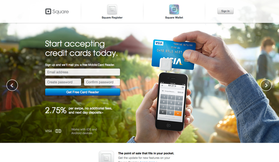
And it’s beautiful, right? Totally.
I’ve even used them on my homepage in the past, so I completely understand the appeal they bring.
And they’re not just used on homepages. You can find carousel sliders in multiple different points or locations on a standard website.
This means you can use them to show off tons of different options.
The whole idea of sliders emerged when people wanted to start condensing their homepages.
It allows you to include more information, more images, and more content on a single page without overwhelming the user.
Great idea, right? Sure.
It looks great and it seems functional, but is it?
Absolutely not. In fact, it’s a web design faux pas that’s killing your conversions.
There’s even a site dedicated to the question: “Should I Use A Carousel?”

And the verdict is: No! A definite, firm no.
Why? Because carousel sliders take up the majority of your screen real estate, yet data shows they don’t convert.
They simply don’t get the traction, clicks, or interaction that people think they’ll get.
And unfortunately, you could be wasting tons of screen space with them.
According to conversion optimization expert Peep Laja, sliders rarely work and are better left off the homepage.
Peep Laja recommends using static images on your homepage or, at the very least, a carousel slider that doesn’t automatically rotate.
For example, Hilton uses a carousel slider on their site, but it doesn’t automatically move after a specific time.

This still gives the user control of the experience and doesn’t annoy them with changing screens unless they decide to interact with it.
So, what do you do instead? Try a long-form homepage like Evernote.
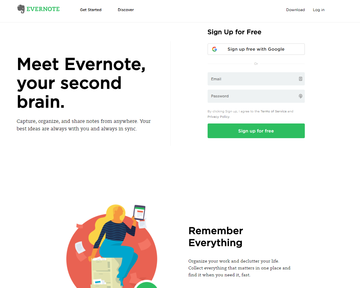
This allows you to have all the content you need on the homepage without using a conversion-sabotaging web-design feature.
2. Speed
Ah, good old website speed. This is one of the biggest blunders I still see.
Heavy page elements, like carousel sliders and animated graphics, can quickly drain the speed from your page.
And speed is the name of the game when it comes to web design, SEO, and keeping visitors around for a longer amount of time.
If your website is slow, you can expect lower conversion rates.
Google’s latest PageSpeed benchmark data found that the longer your website takes to load, the higher the bounce probability.
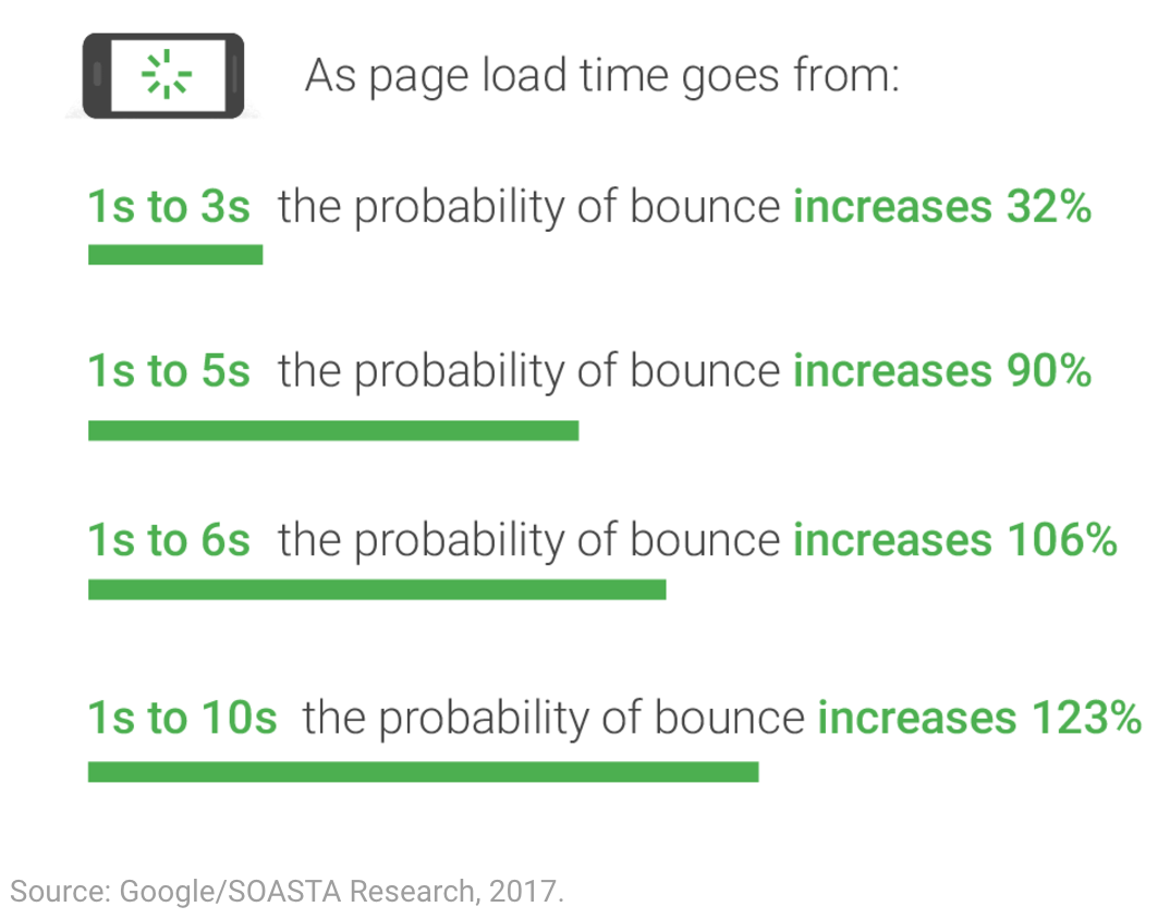
In fact, if your website takes 10 seconds to load, the likelihood of a bounce increases by 123%.
And I hate to break it to you, but you likely aren’t in the one- or two-second range.
Google’s data shows that most industries don’t even come close to the benchmark.
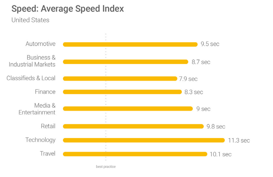
This means the majority of sites in most industries are losing customers solely because of slow page speeds.
And that’s not all, unfortunately.
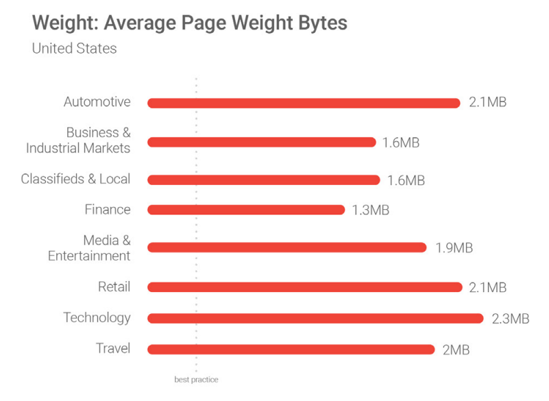
One of the biggest causes of slow website speeds is due to the average page weight. The majority of us are guilty of having heavy pages.
Speed is one of the biggest web design faux pas today, if not the biggest.
It’s also one of the biggest conversion killers.
According to TruConversion’s data, 83% of website visitors expect a site to load in three seconds or less. The average load time for top e-commerce stores is 10 seconds.
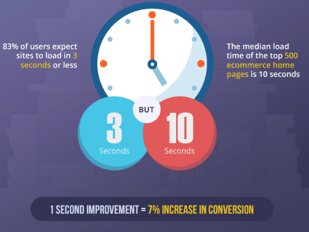
Even a simple one-second improvement in speed can result in a 7% increase in conversions.
It’s of vital importance that speed is fixed, fast.
Speed is going to cost you conversions, and ultimately, money.
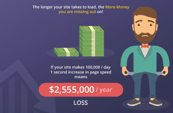
If your site is making $100,000 every day, a one-second delay in page speed could cost you over $2.5 million a year.
Of course, most sites probably aren’t bringing in $100,000 per day, but you get the point.
Lack of website speed will cost you conversions, sabotage ROI, and make users unhappy.
So here’s the potential upside of fixing your speed problems.
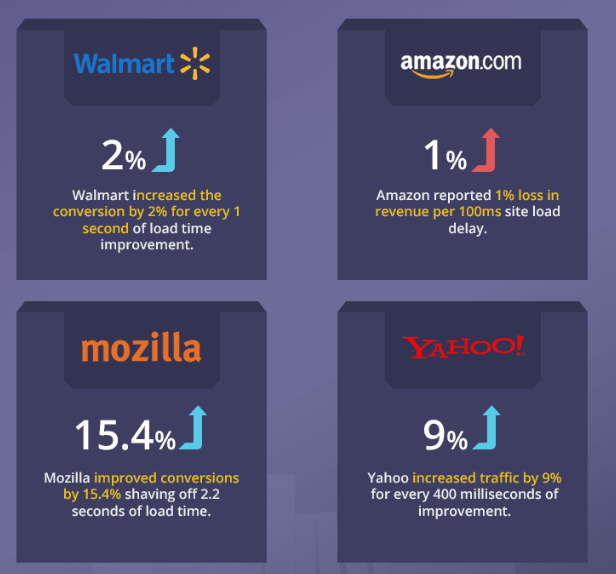
With just tiny amounts of improvement, like 400 milliseconds, Yahoo was able to increase traffic by 9%.
Mozilla improved conversions by over 15% when they increased their speed by two seconds.
So here’s how you can start to increase your speed today.
Clean up your code
First, start by cleaning up your code.
Bloated code is one of the biggest reasons why websites are slow.
You can use a tool like Varvy to test your code and clean it up.
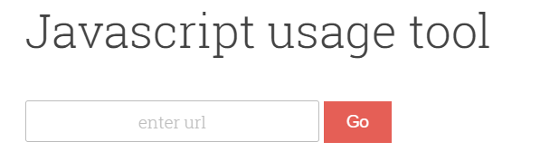
Simply enter your URL and hit “Go” to start seeing which scripts and code are taking up too much space.
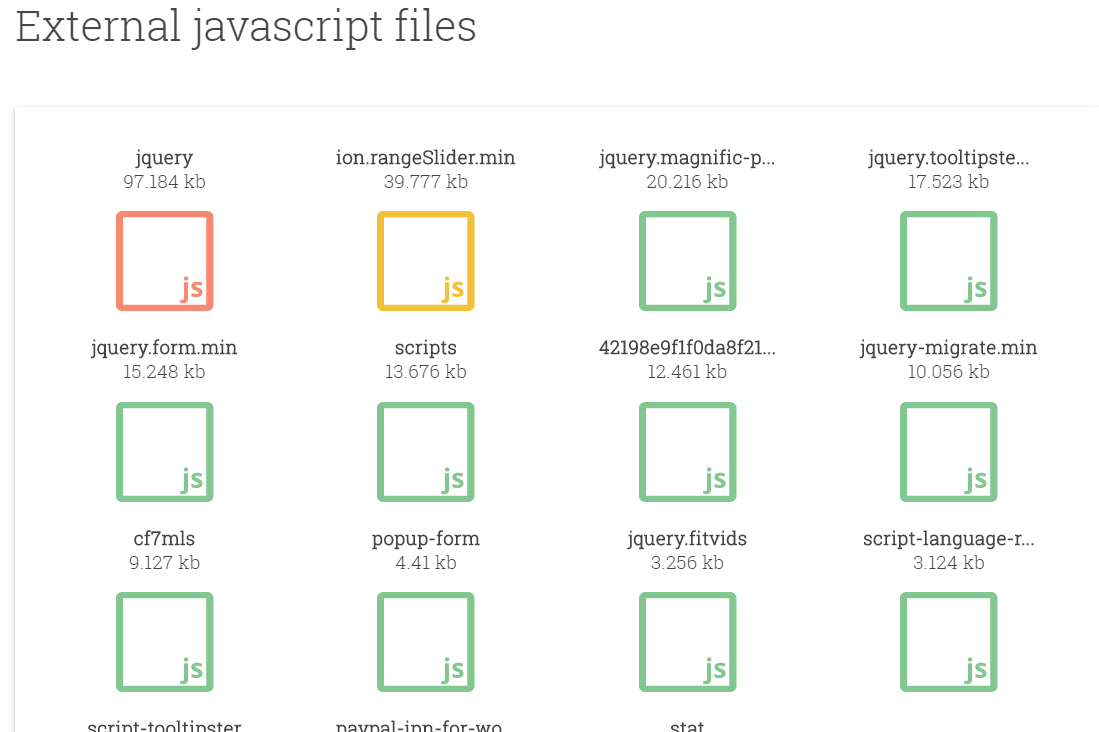
For example, those red- and yellow-highlighted scripts are too big. They’re likely hindering some of my speed.
The goal here is to identify what’s causing the speed problems. Most often it revolves around poor coding.
Test your PageSpeed Insights
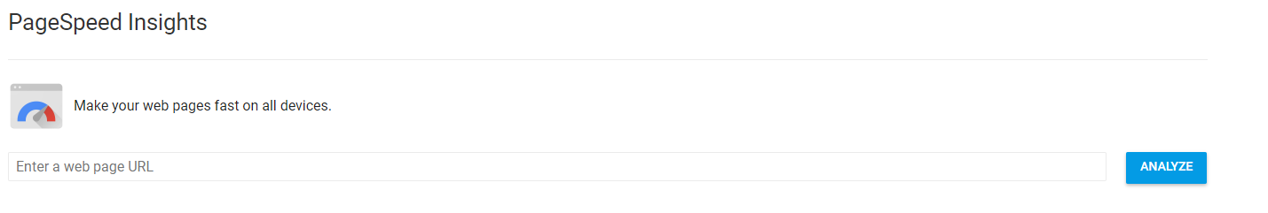
Google’s PageSpeed Insights tool is one of my favorite ways to test the speed of my site and constantly keep up with the changing benchmarks.
This tool is excellent because it will outline exactly what’s causing the slow speeds on your site.
On top of that, it will give you detailed instructions on how to improve it.
So if you aren’t that skilled in technical website details, you will have guided instructions to use or send to a webmaster.
Start by entering your website URL and hitting “Analyze.”
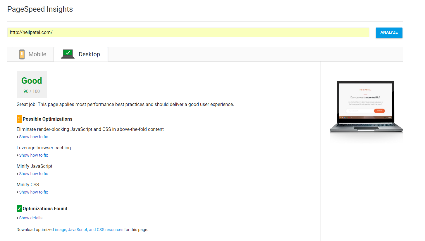
The tool will show you exactly what you’re doing right, and more importantly, what you’re doing wrong.
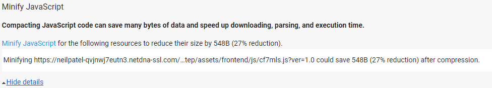
For example, when I click on a “Possible Optimizations” item, it gives me more details on what’s wrong and how to fix it.
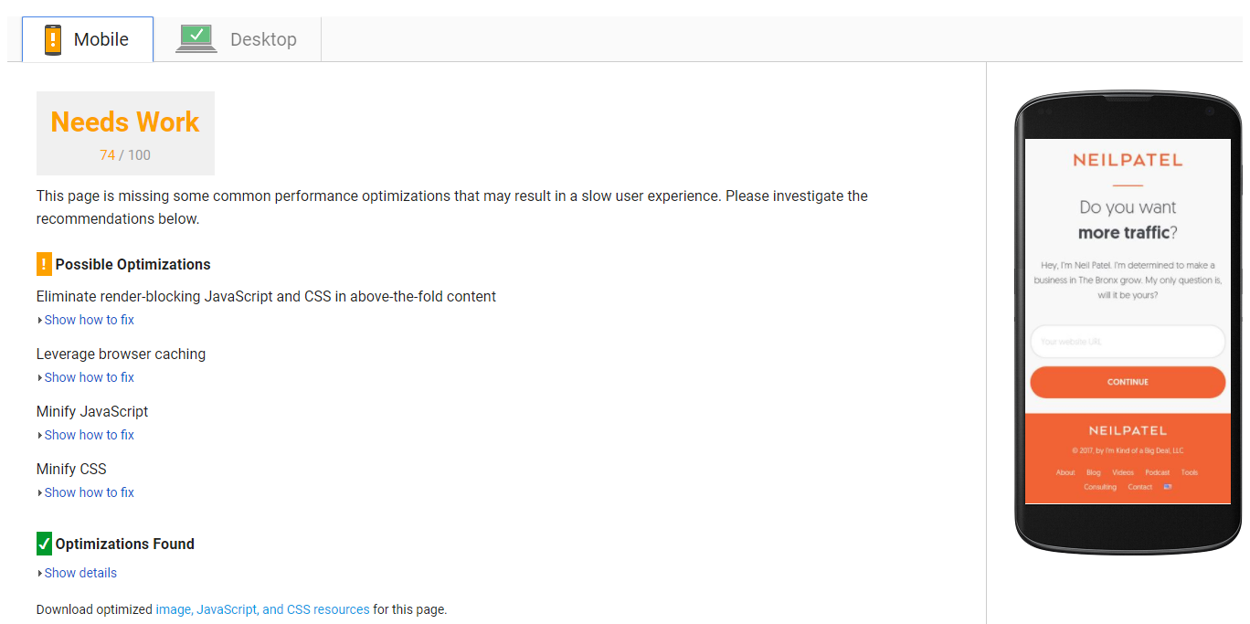
It also scans your mobile site, too — if you’re wondering how to optimize that.
It’s a great way to test your site flaws and improve the speed.
Once you’ve made some improvements, come back and test your site again to see what improvements made the biggest difference.
3. No social sharing buttons
Social shares can be the lifeblood of growing your business, promoting content, and building buzz around your site.
I use social media every day to promote my content and drive traffic.
In fact, it’s one of my favorite ways to promote viral content. I use it for every blog post that goes live on my site.
But what happens when people can’t share your content? It’s one of the biggest blunders I see in web design today.
People simply don’t include sharing buttons on their blog content, or they include it on the wrong pages, like the homepage.
Here’s how I structure my social sharing buttons.
First, when someone lands on my blog post, I don’t instantly ask them to share.
Why? Because they haven’t even read the content yet. I don’t want to clutter their screen with buttons they will tune out.
I try to make the screen less detailed, clean, and easy to focus on the content on the page.
When someone starts to scroll down the page, that’s when I start to push the social-sharing buttons.
Why? Because social-sharing buttons have become their own brand of banner blindness.
And banner blindness kills conversions.
If you’re not familiar with this term (banner blindness), here’s a quick summary.
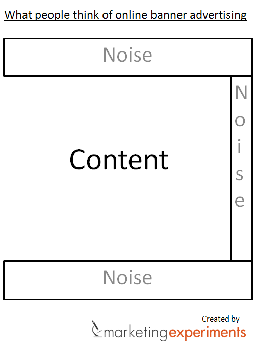
Essentially, people are sick of seeing banner ads. They subconsciously tune them out.
When I had social shares immediately appearing on my blog, they were netting almost zero shares.
People just ignored them and scrolled right past, meaning my content suffered greatly with little to no user promotion.
But now, when someone scrolls down, the buttons fade in slowly.
That means they’re going to stand out and someone will actually take notice of them.
This strategy has increased the social shares on my average blog post by 25.3%.
So here’s how to set up your social shares just like mine.
Head to AddThis to get started.
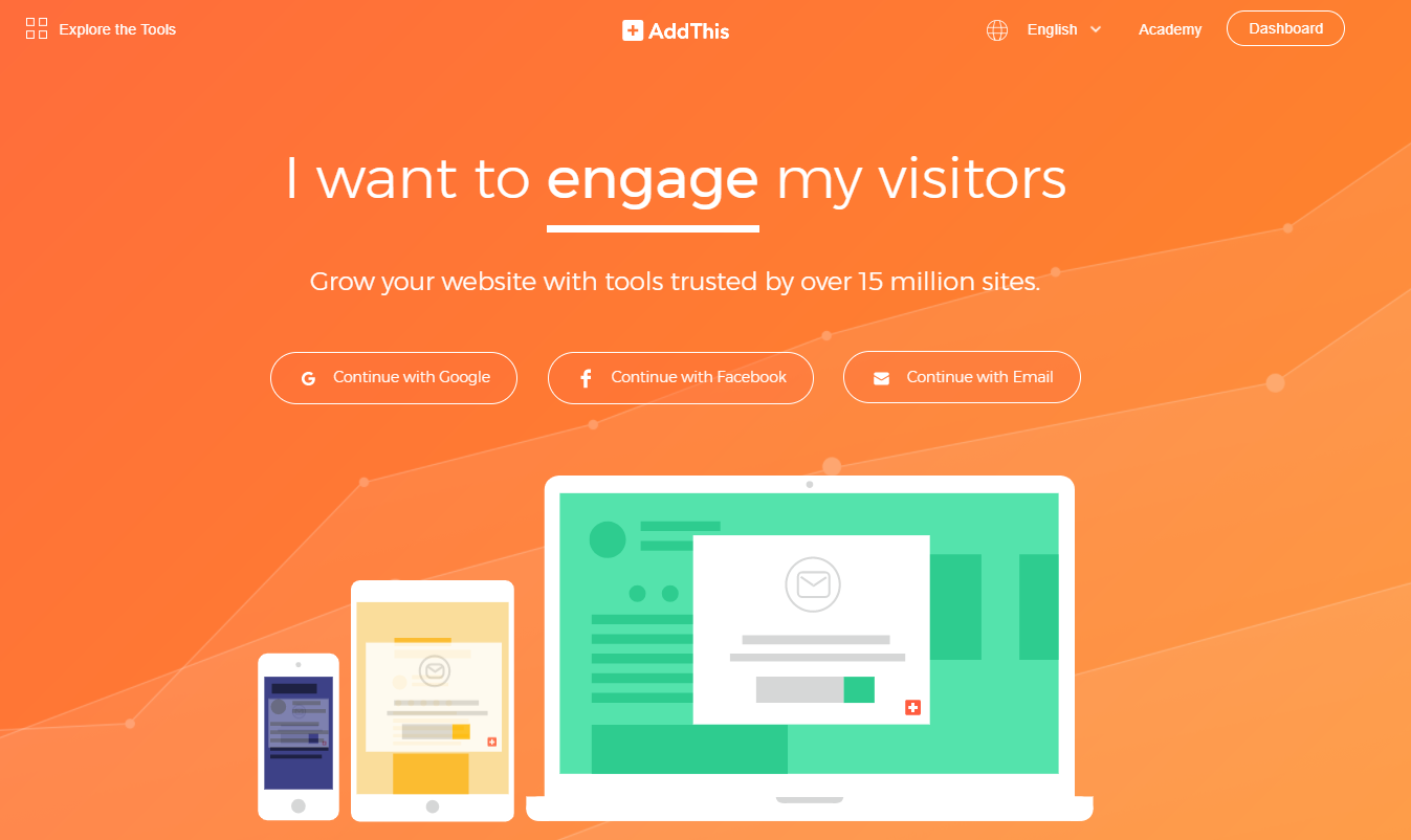
AddThis is a great way to include social-sharing buttons that follow the user as they read down through the post.
Register with your email address for free and head to the dashboard.
Here you can choose between a few different options, but for this example, we want to set up social-share buttons.
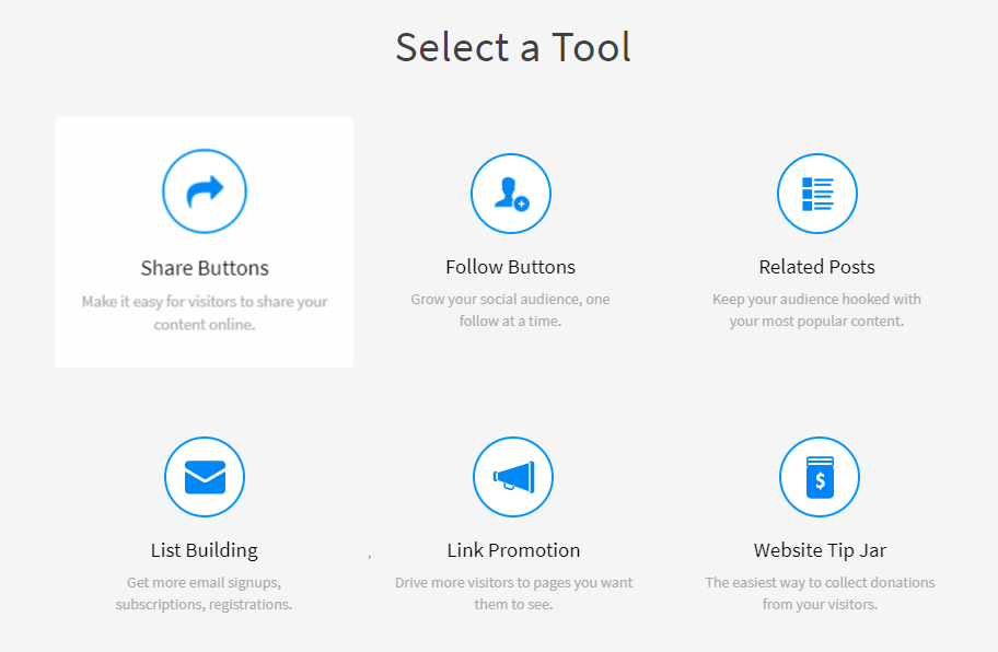
This is where you can choose between a few different types of sharing buttons.
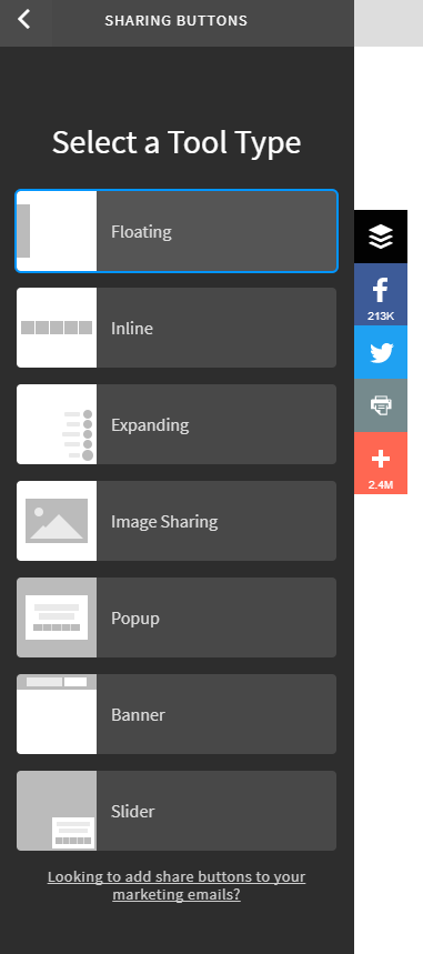
You can even use them in banner or slider form.
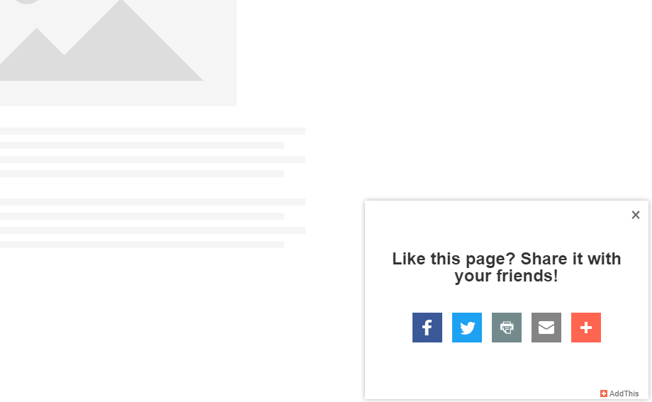
Once you’ve selected the sharing buttons you want on your site, click to continue and start editing the position and social-sharing icons.
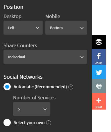
You can even edit things like style, button size, and color.
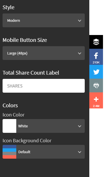
AddThis is a great free tool you can use to include awesome social-sharing buttons on your site with ease.
And the great thing about AddThis is the easy customization and mobile optimization.
Start adding social-sharing buttons to your blog content today if you want to take advantage of your traffic and generate more social shares.
If you don’t, you risk your content getting fewer links, shares, and traffic.
4. Not using opt-in pop-ups
Most people have the impression that pop-ups are annoying.
But the real focus should be on these questions:
Do they work? Do they convert?
And the answer to both is yes.
It’s just like the case of carousel sliders. Carousel sliders are perceived as pretty and useful, but they don’t convert.
Opt-in pop-ups are considered annoying, but they work.
And if they drive conversions, we want them on our sites.
Nikki McGonigal, a food blogger, started using pop-up opt-ins to generate subscribers.
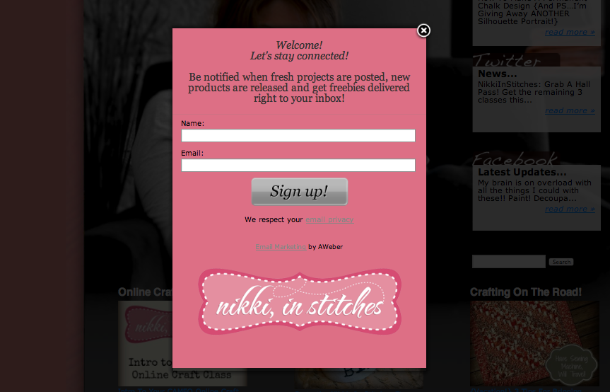
Using this simple tactic, she was able to capture 7,000 more email sign-ups in just eight months.
She raised her conversion rate to 5.5% by using pop-ups.
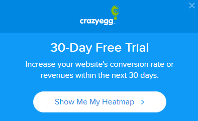
There’s an entire blog post here on CrazyEgg that shows countless examples of how incredible pop-ups can be for increasing conversions.
And I use them on CrazyEgg all the time.
Why? Because they work.
They get people to take notice and convert.
I even use them on QuickSprout.
Websites have one real goal: producing conversions and revenue.
So if you aren’t using the latest and greatest lead-capture techniques, your website isn’t doing its job.
Calls to action should be your number-one way of driving subscriptions.
If you don’t make it known to the user the action you want them to take, you can kiss those conversions goodbye.
Want to set this up today? We can use the free tool AddThis once again.
Navigate back to your dashboard and select the “List Building” option from the tools list.
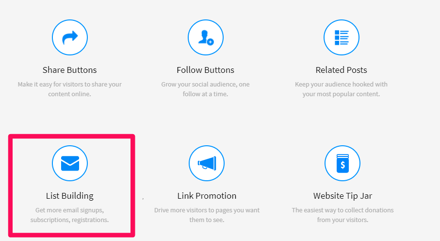
Next, you will be asked to choose a type of list-building tool.
The key here is to select “Popup” as your option.
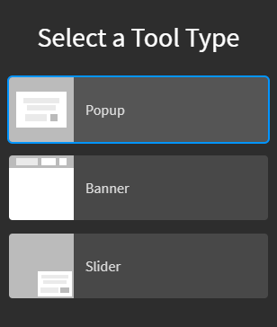
On the right-hand side, you can also get a quick preview of how this tool type will look on your site.
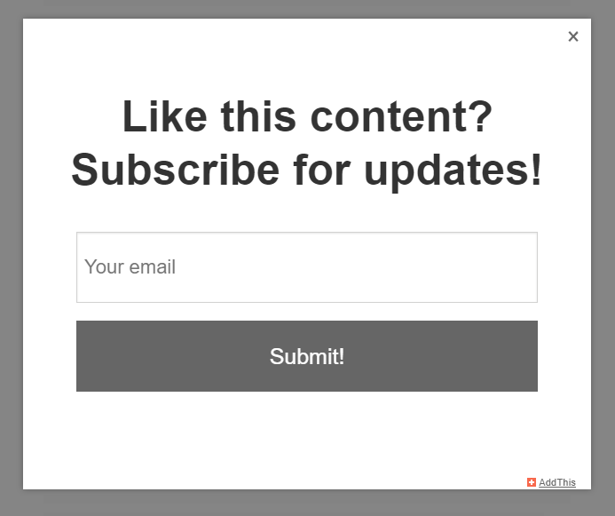
Next, you can easily customize the headline and CTA-button text to your liking.
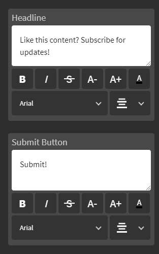
For example, if you want to use this as a welcome message, you can consider offering a discount in exchange for their email.
Next, choose the layout you want. You can also change the background type to a specific image.
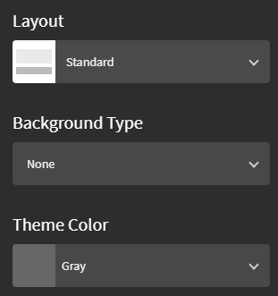
The customization options are great and they allow you to add diverse elements to your pop-ups.
Also, one of my favorite things about this tool is the ability to connect your pop-up submissions and conversions directly to an email platform or CRM.
This means you can automate the entire process.
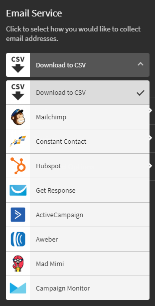
Or you can simply select “Download to CSV” if you prefer having a file of emails.
Using AddThis is a great way to eliminate conversion-sabotaging web-design strategies.
Add pop-ups based on different pages, exit intent, or welcome screens to start capturing more leads fast.
I started using them on my sites and I saw rapid increases in email submissions. It’s an incredible way to grow your email list fast.
Conclusion
Web design has progressed greatly in the past few years.
New designs and page elements appear every few months that make websites look better than ever before.
But some of these website-design techniques sabotage conversions.
Just because they look good doesn’t mean they work well.
They’ve become faux pas that are killing your conversions.
Having a website that isn’t functional won’t drive more conversions.
Your website needs to have great design while maintaining its ability to convert.
Yet tons of marketers are still using design techniques or ignoring faux pas that are hindering conversions.
If you don’t fix these actions on your site, you risk losing out on tons of conversions.
And the standard 2-3% website conversion rate isn’t enough.
It shouldn’t be a stopping point.
We should all strive for a high conversion rate.
Start by removing carousel sliders. They might look pretty and include more information in less space, but people don’t interact with them.
They’re simply a waste of space.
Next, you need to focus on improving speed. Speed is one of (if not the most) important thing on a website.
If you have slow speeds, you can’t expect to convert visitors — because nobody’s waiting for your page to load.
Next, make sure you use social-sharing buttons to promote your content and drive more shares and links.
Lastly, use opt-in pop-ups to make the most out of your website. No good website is complete without great CTAs.
Fixing these web-design faux pas will mean a better user experience for your visitors.
And that could mean big increases in conversions.
What web design mistakes have you fixed that were sabotaging your conversions?
Grow your traffic