
When I first started my blog, I didn’t have to worry about mobile search optimization.
Heck, mobile search wasn’t even a thing! Back then, people had flip phones! Remember those?

My first blog articles were hitting the web in 2007, a whopping two years before smartphones dominated the market.
Obviously, very few (if any) of my readers cared if my site was optimized for their flip phone.

But after the explosion of smartphones, it only took a few years before mobile search became the new normal.
Overall, the marketing community has adapted pretty well to the change.
Most businesses have switched over to responsively designed websites. Most SEOs know the basics of mobile SEO.
But I’ve noticed that we’re lacking in one main area: Tools.
Think about it. We have plenty tools for keyword optimization, SEO performance, analytics, keyword tracking, split testing, conversion optimization, site speed, and just about everything else.
But when it comes to mobile search, what tools are you actively using?
Thankfully, there are a number of tools that can help you perfectly optimize your site for mobile. I want to share six of my favorites.
Want more mobile traffic? Learn how I increased my mobile search traffic by over 40,193 visitors a month.
Google’s Mobile Website Speed Testing Tool
Google has so many testing tools that it’s easy to lose track of what’s available and what you should use.
For a long time, I used the PageSpeed insights tool.
Recently, however, Google started phasing out some of their old tools.
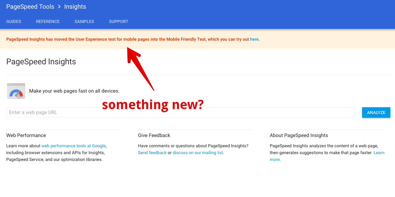
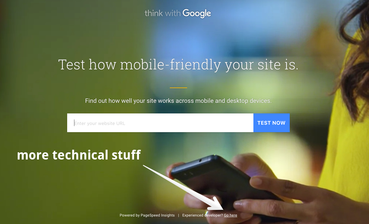
Instead, they’ve released something way more visually appealing, easy to use, and helpful.
It’s called Mobile Website Speed Testing. (Yeah, that’s a mouthful.)

Let’s walk through this tool to see how it can help improve your mobile search.
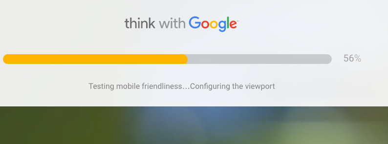
First, type in your URL and click “Test Now.

It takes just a few seconds for the test to run.
The next screen you see gives you an at-a-glance scorecard of your site’s performance.

Here are the three scores you’ll see:
- Mobile friendliness – This score measures how usable your site is for mobile. Is it easy for people to tap, swipe, and navigate your website on their smartphone or tablet? Is the experience negatively affected by interstitials or tiny touch points?
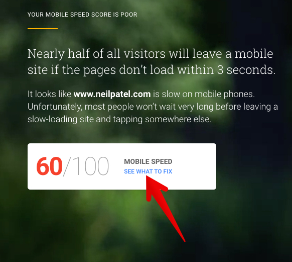
- Mobile speed score – The mobile speed score measures how quickly your page loads on a mobile device. Mobile users tend to have less patience, not to mention less bandwidth speed, than desktop users.
- Desktop speed – The final score measures how quickly your site loads for desktop users.
The tool provides a detailed explanation of each of these points:
Here’s my mobile experience report.

This is my score for mobile speed.

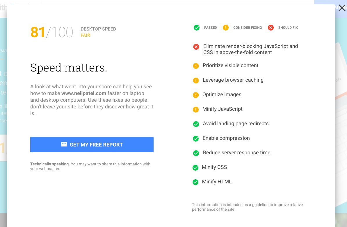
And here’s what I’m reporting for desktop speed.

The final page invites me to get a free report.

It’s a simple report on the surface. It’s more helpful than you might think if you just scrolled through it really quickly.
One of the helpful features is that you can download a report. Click any of the “Get My Report” buttons to start this process.
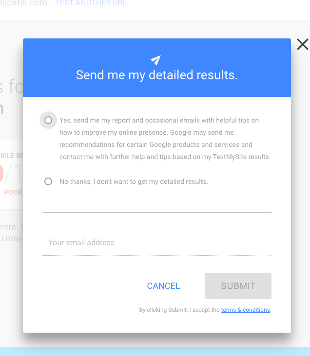
You’ll have to check the “Yes” button.
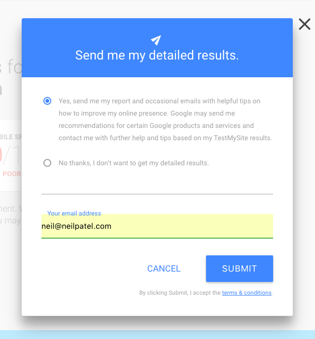
And click “Submit.”
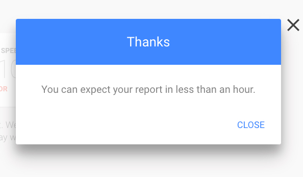
The tool tells you that “You can expect your report in less than an hour.”
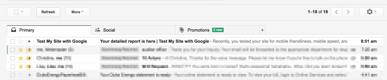
My report arrived in my inbox 39 minutes after I clicked “submit.”
The email report includes your main score along with each of the recommendations for improvement.
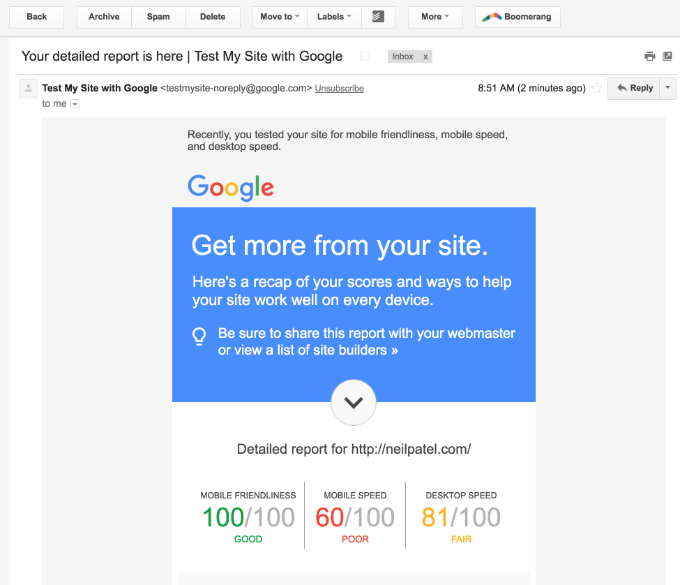
These improvements are also included in the web report itself. (You don’t need to get an emailed report, although it could be helpful.)
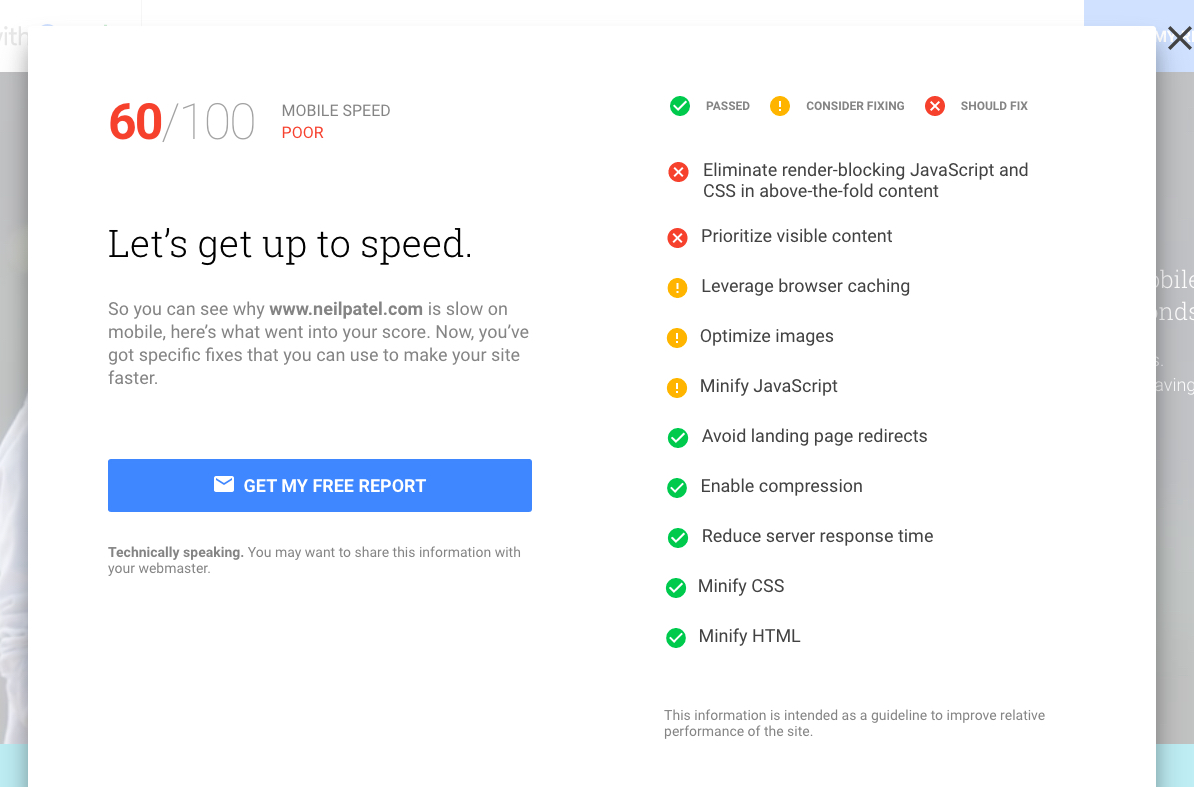
To see each of the details, click “see what to fix” in each section of the report.
Instantly, you’ll see a complete report of all the issues that are “wrong” with my mobile site speed, complete with a color-coded key. Handy!
The desktop speed report looks similar – a summary of recommendations with a priority rating.
This is all pretty helpful stuff, especially if you’re looking for a fly-over view of your site’s mobile optimization.
But what if you want more of the technical stuff?
It’s easy to overlook it, but there’s a little link right here that you can check out.
There’s nothing extraordinarily new in this section. The link directs to Google’s directory of web performance fundamentals.
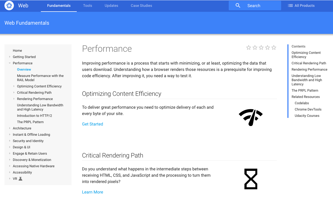
This is helpful advanced information, but for most SEOs, it doesn’t provide an impact upon your mobile search.
Stick with the main tool, and you should get the most helpful information for mobile optimization.
Google’s Mobile Friendly Test
Google rolled out the Mobile Friendly Test around the time of “Mobilegeddon” (April 2015).

The mobile algorithm was a huge shakeup in the SEO world.
A couple months before they flipped the switch on the algorithm, however, Google provided fair warning.
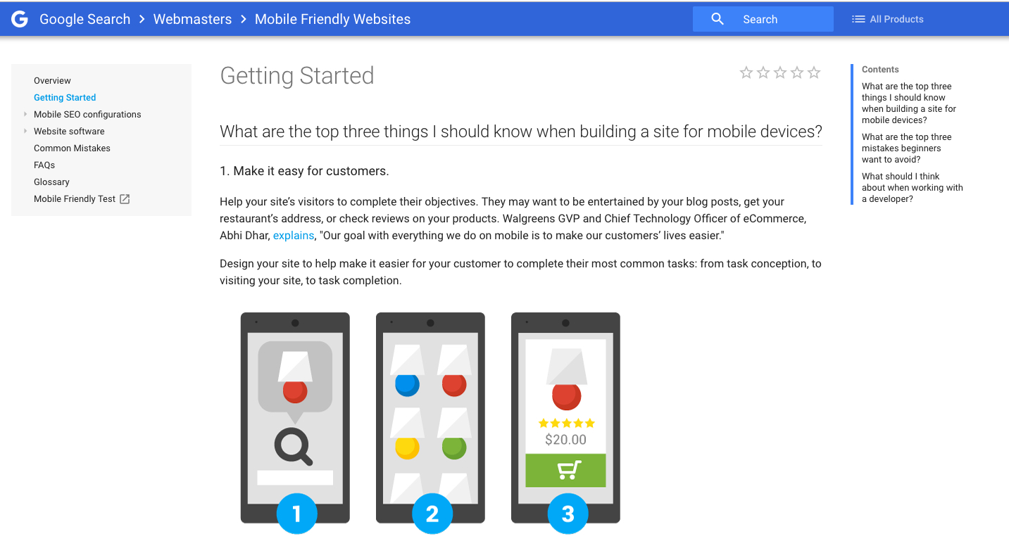
To help websites get ready for Mobilegeddon, Google released their “Mobile Friendly Websites” guide.
And, even more helpfully, they created the Mobile Friendly Test.
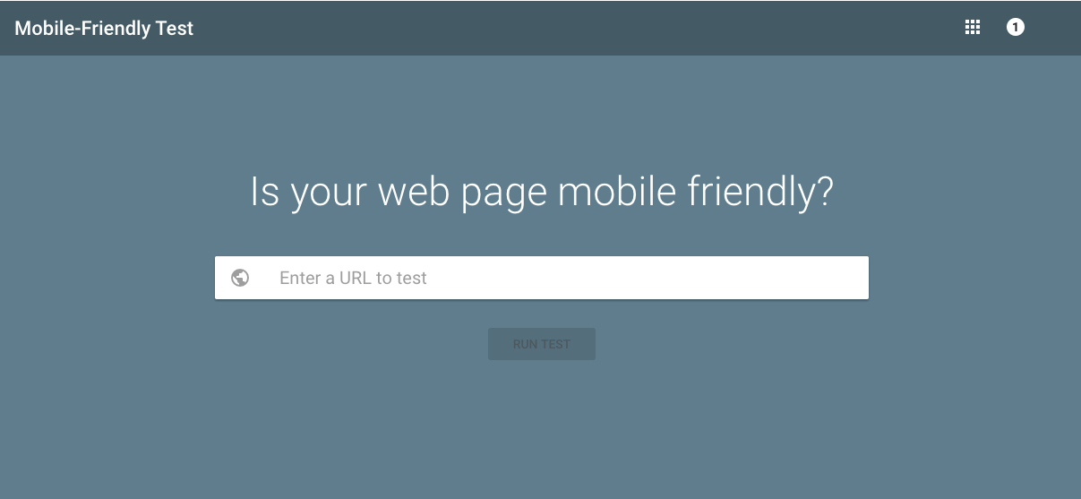
Let’s give it a go. Add your URL and click “Run Test.”

The analysis takes less than a minute to run.
Here’s what you’ll see.
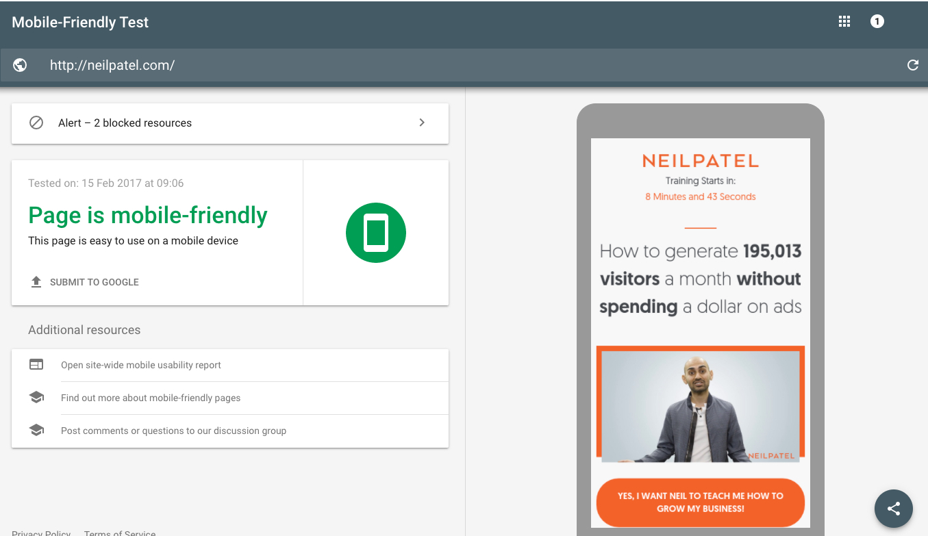
The test provides a simple pass/fail grade. If your site isn’t mobile-optimized, you’ll see a report like this one:
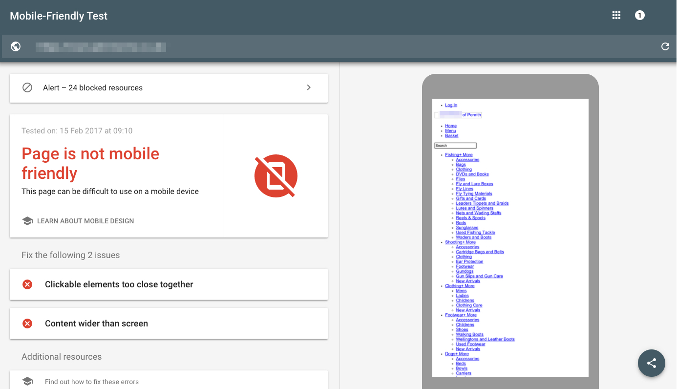
The mobile-friendly report is helpful if you want to get a simple snapshot of whether or not a site is prepped for more advanced mobile optimization.
If the site fails, your first step is to create a responsive website.
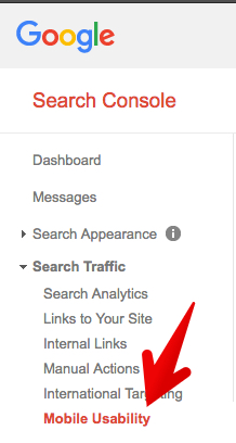
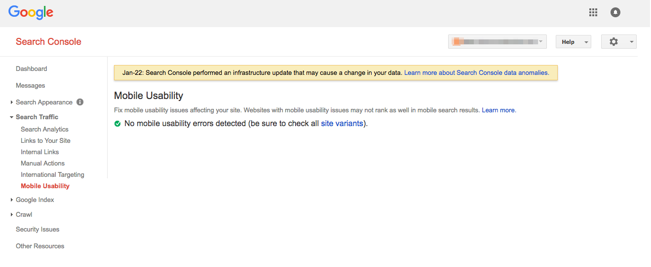
This tool is basically the same as the one you can access through Google Search Console. To use the tool via Search Console click Search Traffic → Mobile Usability.
You’ll see the same pass/fail grade in the GSC report, but without some of the detailed explanation and screenshot.
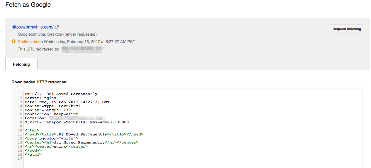
Fetch as Google using Googlebot Mobile
Even if your site is mobile-optimized, it’s helpful to look at the way Google is fetching your mobile site.
To analyze this, log in to Search Console.
Click “Crawl.”
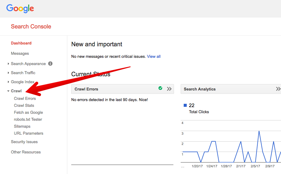
Then click “Fetch as Google.”
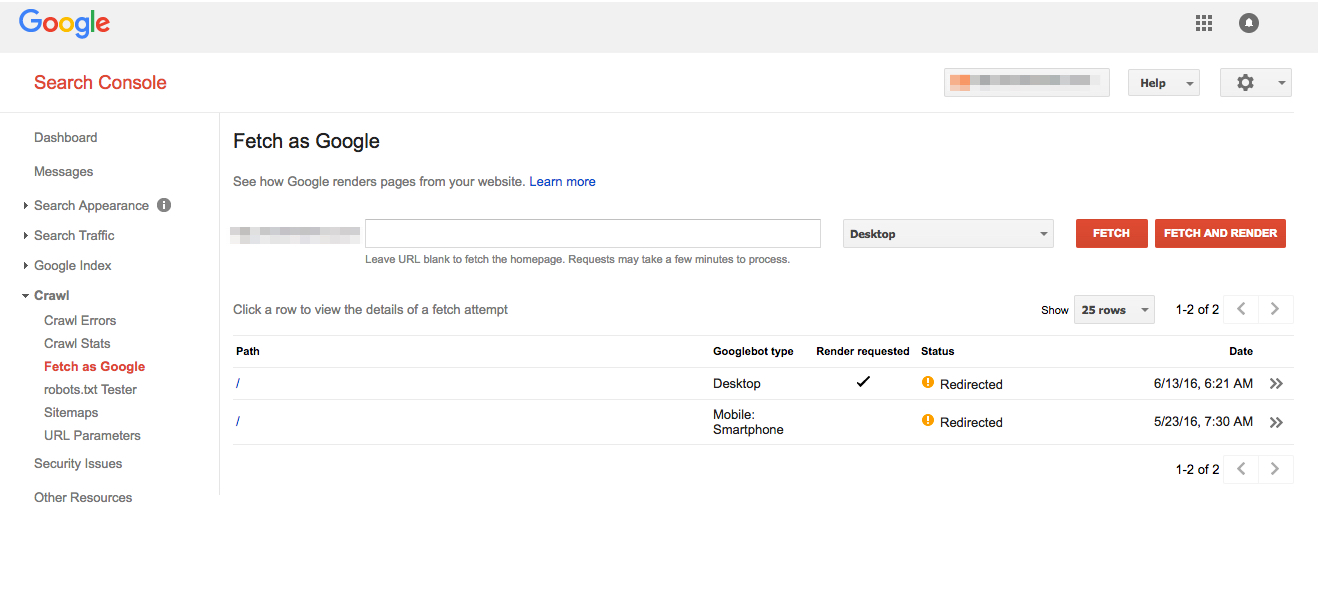
You can leave the URL blank to fetch the homepage. Click the dropdown menu and select “Mobile: Smartphone.”

Then click “Fetch and Render.” It takes the Googlebot about a minute to fetch and render your site.
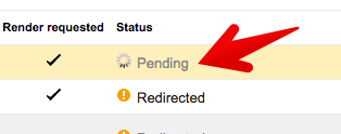
Once it’s completed, you can view the render report by clicking the double arrow on the far right.
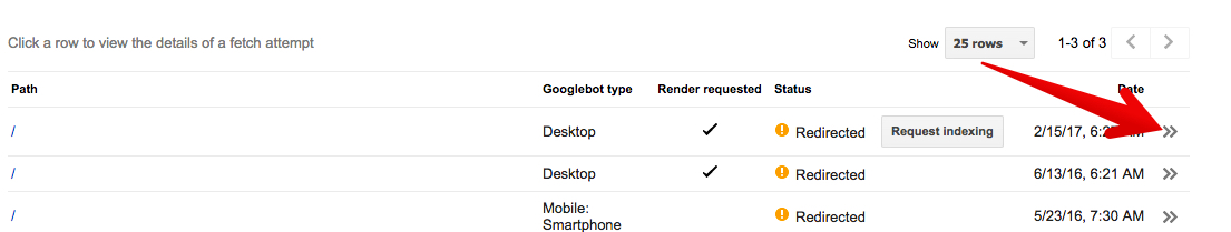
Here’s an example of a report for a page with a 301.
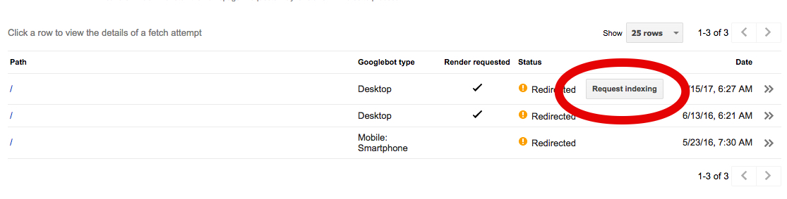
The fetch and render tool is helpful as a quick way to request indexing, especially if you’ve noticed an indexing latency on your site.
To do so, simply click the “Request indexing” button.
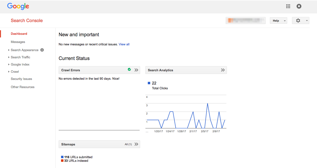
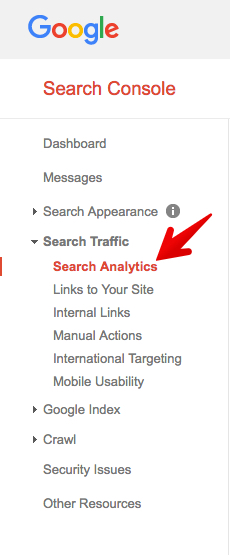
Google Search Console Search Analytics
You can get plenty of great mobile search analytics using Google Analytics. (For purposes of brevity, I’m not including a discussion of these reports in this article.)
One great source of mobile analytics is in Google Search Console, not Google Analytics.
To check out these reports go to Google Search Console → Search Traffic → Search Analytics.
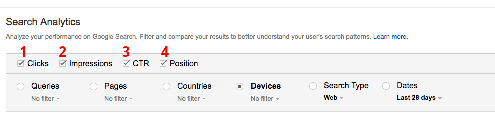
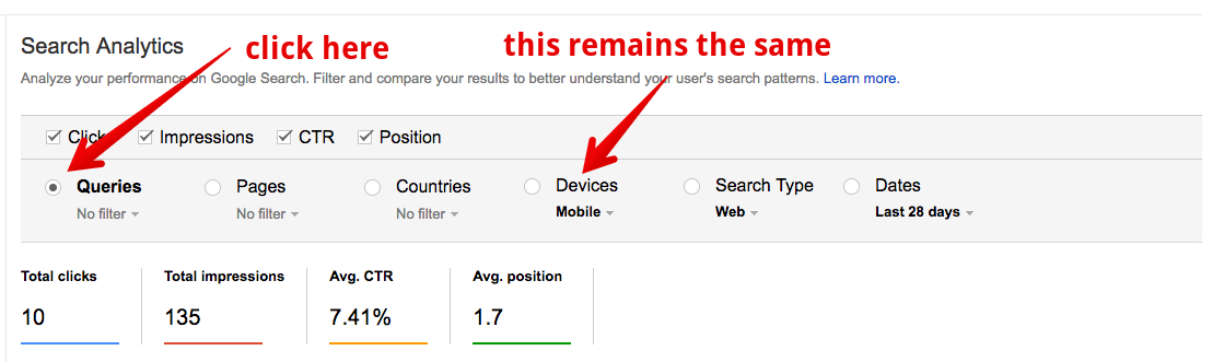
To provide the best mobile analytics, here’s how to configure your search.
Check each of the four boxes (for the most comprehensive data).
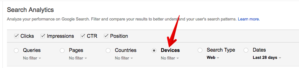
Then click “Devices.”
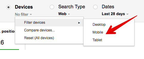
Click the “No filter” drop down menu. Then click “Filter Devices.” Then click “mobile.”
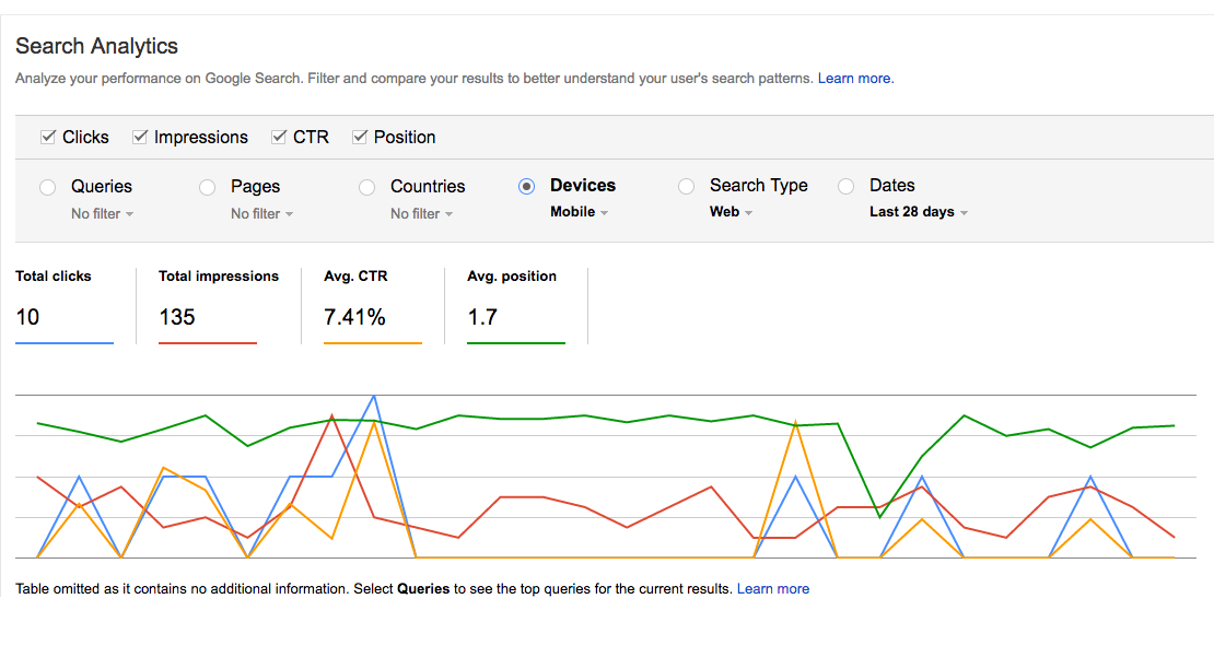
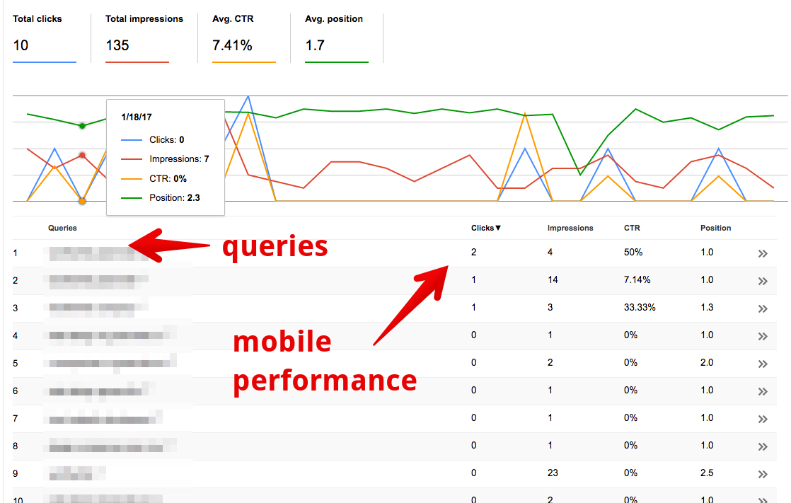
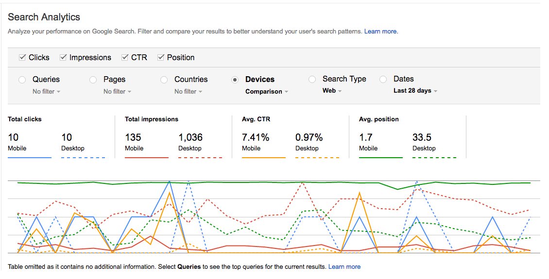
What you’ll see is a comparison of your clicks, impressions, CTR, and mobile search results positions.
Next, click “Queries” to see a breakdown of the mobile performance of specific top queries. Your mobile filtering settings remain the same.
You’ll see a report of user queries that direct to your site along with specific click, impression, CTR, and position data.
You can also compare desktop to mobile search analytics.
To do so, click Devices → Mobile → Compare Devices.
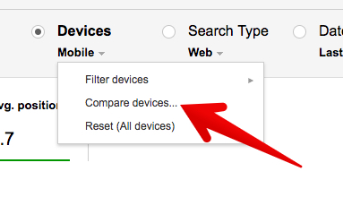
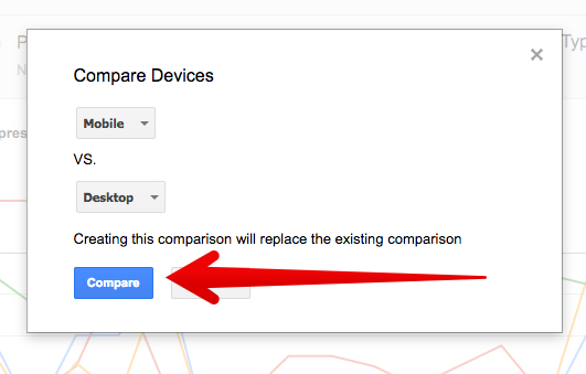
Make sure that you are comparing mobile vs. desktop. Then click “Compare.”
The comparison uses dotted lines.
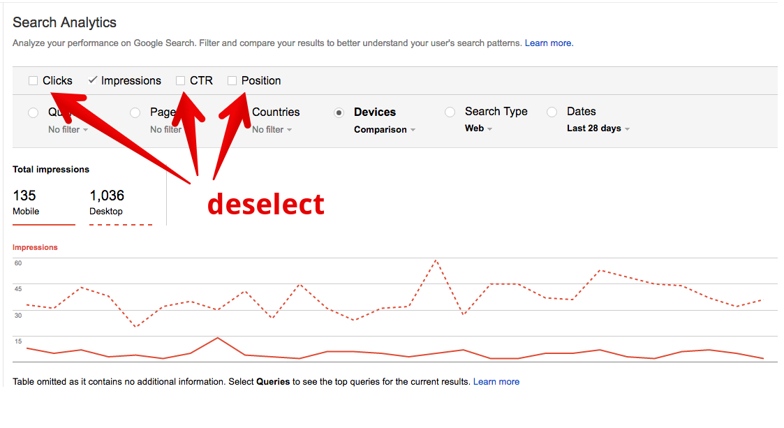
This kind of reporting could get visually confusing, so you may want to ratchet down the number of features you’re viewing at a time.
In this view, I’ve deselected clicks, CTR, and position to compare only total impressions of desktop vs. mobile.
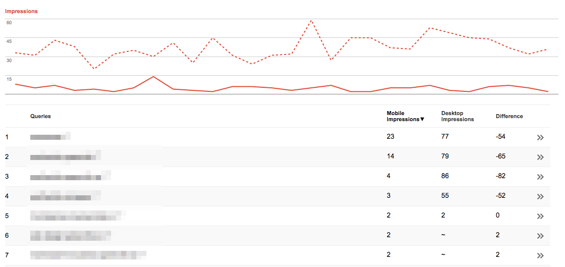
The real value of this comparison comes in the details. Like before, you can click “Queries” or any of the other search filters to look at individual results.
Here, I’ve clicked Queries to see an analysis of desktop impression vs. mobile impressions. The report even tabulates the difference between the two.
In my opinion, Google Search Console’s search analytics provides some of the most detailed, helpful, and actionable data for mobile SEO.
There are thousands of variations of data analysis that you can perform. After playing with the data for a while, you’ll probably come up with some mobile optimization ideas.
Mobile SEO Page Analyzer
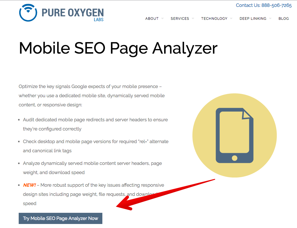
Another helpful mobile tool comes from the developers at Pure Oxygen Labs.
Pure Oxygen provides a paid service, but their basic SEO audit is free. You are required, however, to submit your email address.
Let me show you how to use the tool, and the kind of information it provides.
First, go to the Mobile SEO Page Analyzer. Click the button, “Try Mobile SEO Page Analyzer Now.”
You’ll see a screen with a mobile viewport and an entry form.
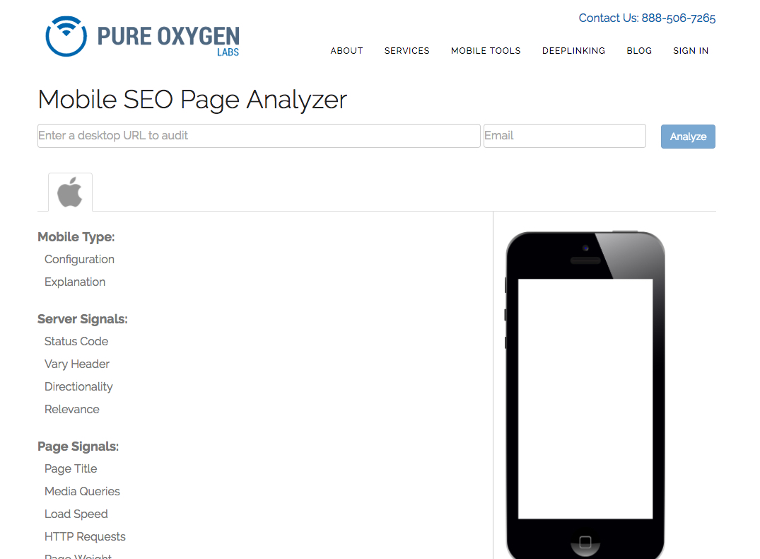
You won’t see any results until you complete the form and receive a link in your email.
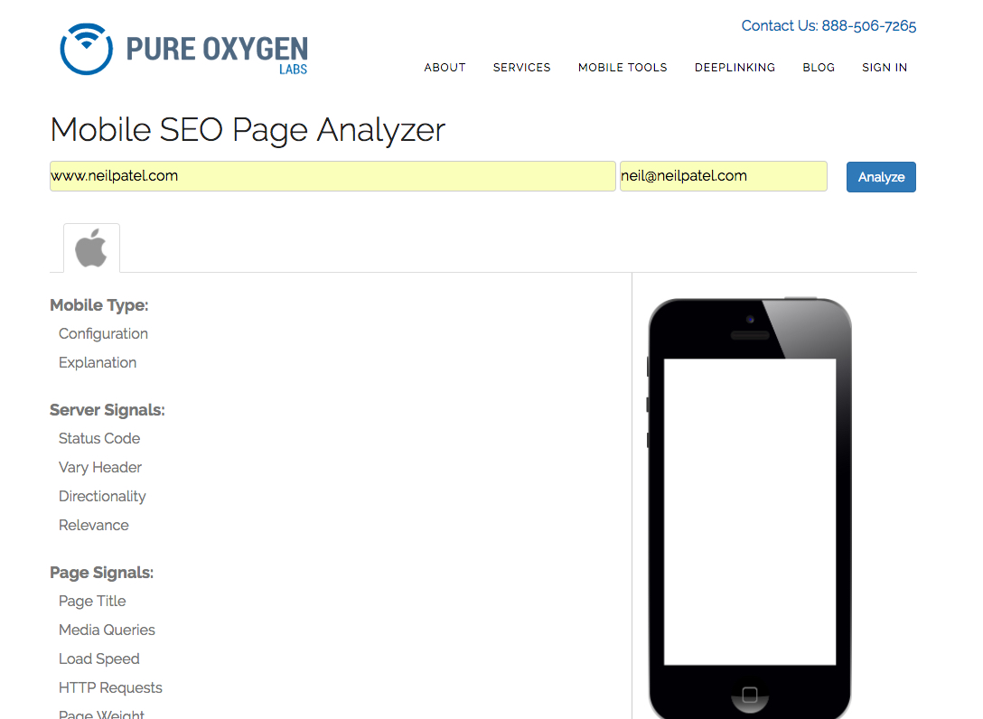
Add the site you want to analyze and provide your email address.
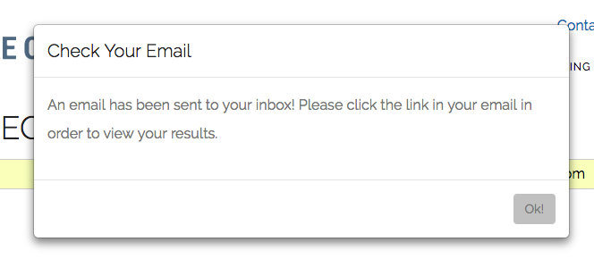
Once you click “Analyze” you will be prompted to check your email.
Unlike Google’s report, this email will hit your inbox right away.
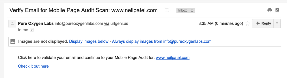
Click the “Check it out” link to see your report.
Here’s what you’ll see.
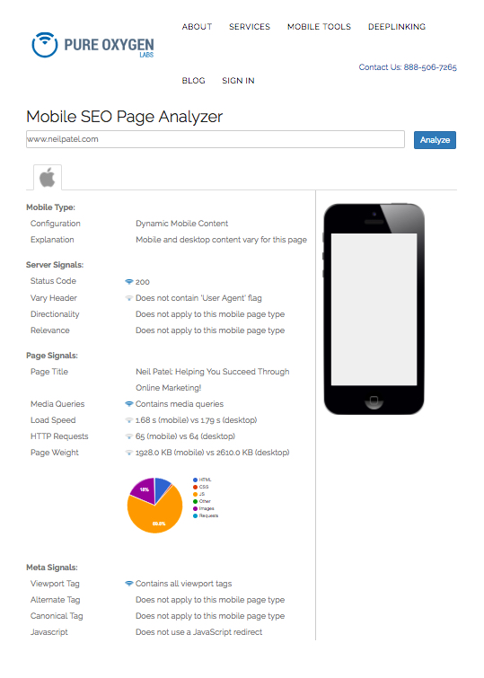
As long as you have some awareness of server and page signals, the report will be somewhat useful. It’s not a huge amount of information, but it’s enough to give you some insight and action points.
The information isn’t directly applicable like the information in Google’s reports. In other words, this report doesn’t explain to you that you need to minify your CSS.
The report does however provide a few helpful information points about your site that can help you plan mobile improvements.
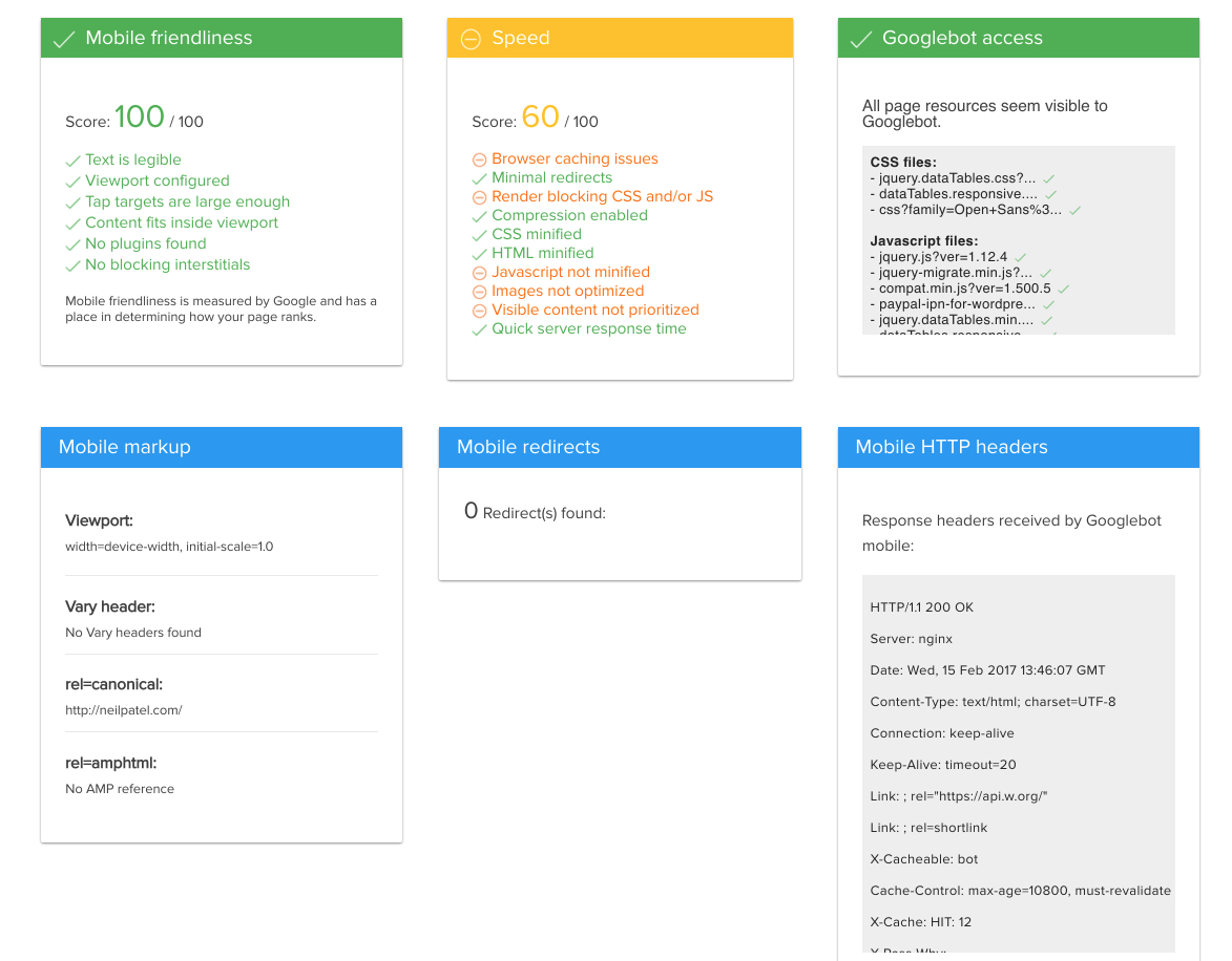
Mobile SEO Issues Tool
Another quick mobile SEO audit tool comes from Varvy. The tool’s purpose is to “check mobile issues.”
Let’s take a look.
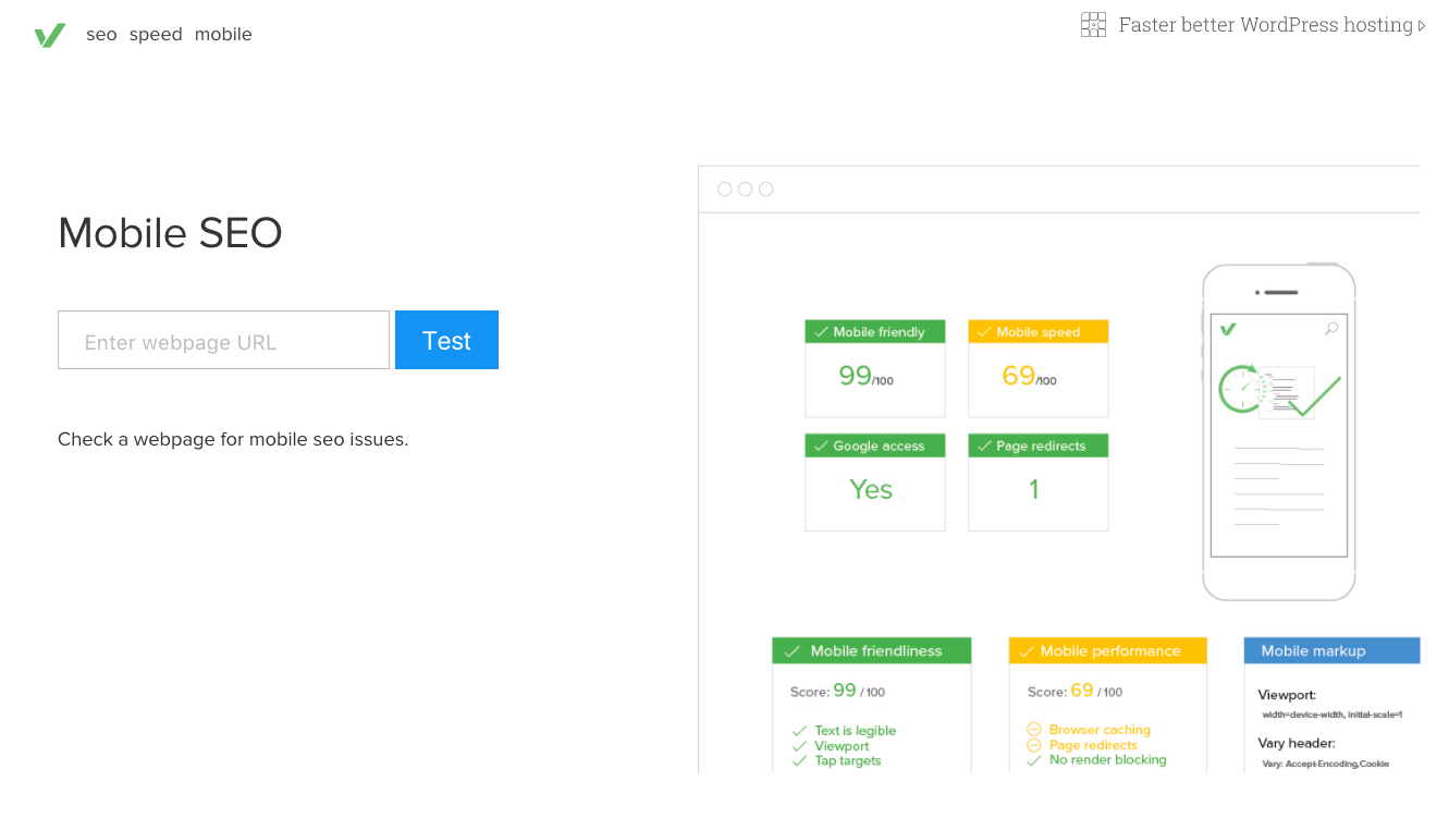
All you have to do is add your URL and click “Test.”
It takes just a few seconds to generate a report.
The report summary is quick and easy to understand.
The summary includes four issues:
- Mobile Friendly – the goal is great usability
- Mobile Speed – the goal is fast
- Google Access – the goal is that Google has access to the site
- Page Redirects – the goal is zero
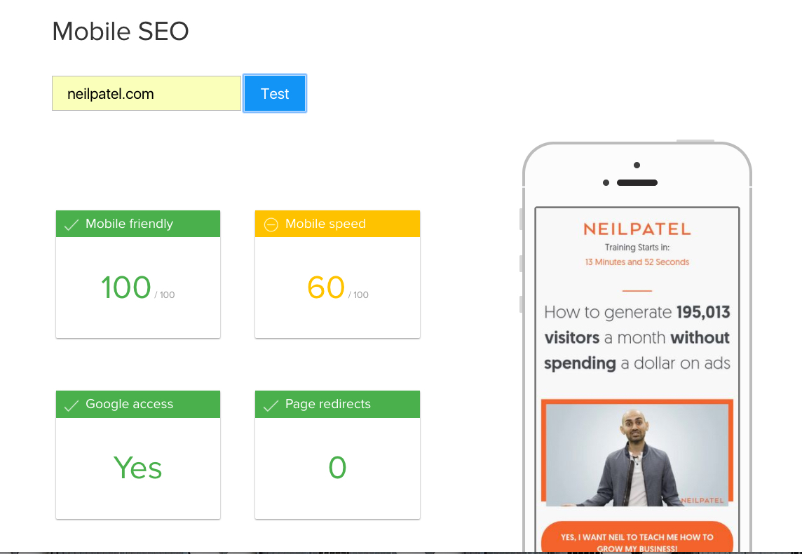
Your goal is to have four green boxes.
(I’m fine with a slower than recommend mobile site speed. My video converts like crazy, so it’s a trade-off I’m content with.)
The real value of the report comes when you scroll down. There is more advanced information, which can be helpful for your site’s mobile technical SEO.
That’s the extent of the report.
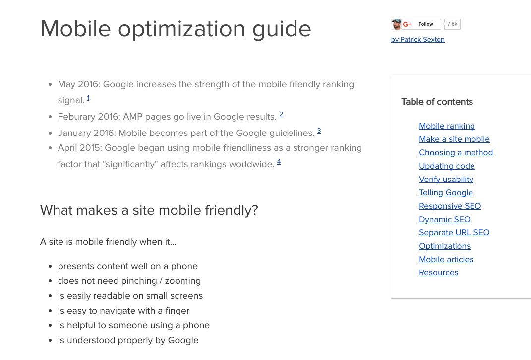
Below the report, you can read a helpful mobile SEO guide, complete with illustrations.
Conclusion
Obviously, There are many more mobile SEO tools than just these six.
One of the big ones? Google Analytics? I’m a data junkie, and I can get my fix with all the mobile data that’s available on GA.
In my experience, these are helpful because they are 1) free, 2) relatively easy to learn and use, and 3) provide the kind of data that can help you make a difference in your mobile SEO.
It’s important to keep in mind that there is no single tool that will magically fix all your mobile SEO concerns.
In my experience, the most helpful thing is to learn as much as you can about mobile usability.
I’ve mentioned this elsewhere, but the evolution of SEO has brought us to the point where search optimization is really about user optimization.
By giving the user exactly what they need, want, and expect is the way to succeed. In the end, we’re not dealing with just crawlers and algorithms.
We’re dealing with real people using mobile devices in their everyday life.
When you optimize with people in mind, you’ll automatically be optimizing for the search engines, too.
What are your go-to mobile optimization tools? How do you use them
Grow your traffic