If you’ve spent any time at all learning about web design, online marketing, or conversion-rate optimization, you’ll have heard to never put calls to action below the fold.
Indeed, in industries where web designers know enough about marketing to use calls to action in the first place, you see an awful lot of “templatification”—websites all starting to look suspiciously alike. Here’s an obvious example: tech startup websites. Don’t they all look a little like this?
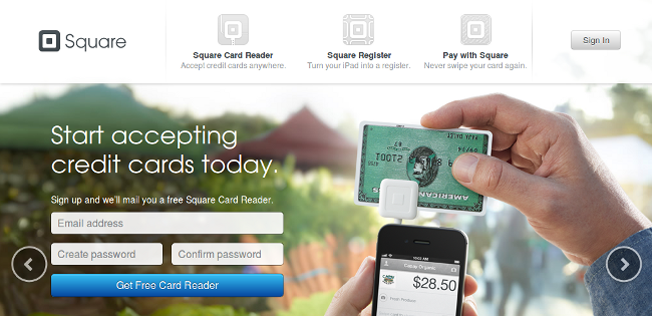
Your typical tech startup website: a headline, a sentence or two of copy, a pretty image or video, and a call to action button—all inside the first 600 vertical pixels.
Or this?
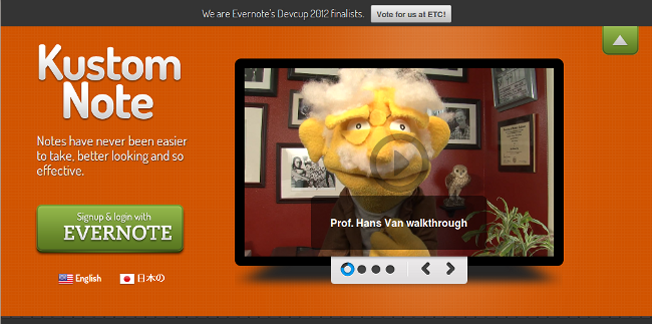
There’s another one! Different colors and text, but almost exactly the same layout.
Okay, so maybe they’re not always identical—sometimes they flip the content!

This one went a bit crazy and mixed up which sides the copy and image go on, just to keep things interesting.
Now, I’m not claiming that this layout is never appropriate, or that it’s wrong for these particular sites. But it is setting a worrying trend all based around the fundamental premise of “keep the call to action above the fold”.
This basic design is only as good as that premise.
But what if that premise is wrong? What if calls to action below the fold work better?
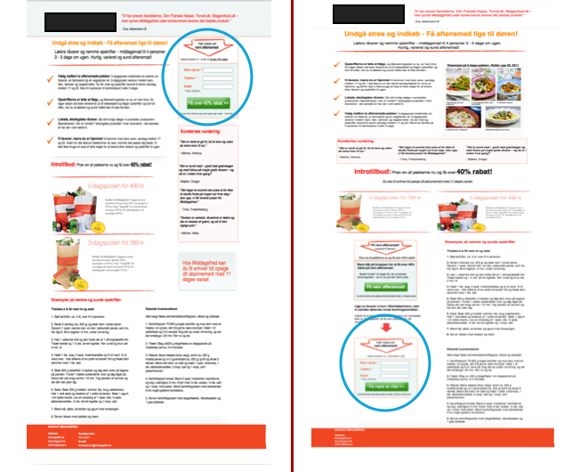
What if, for example, MarketingExperiments discovered that this page with the CTA tucked away down at the bottom…
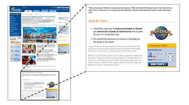
…out-converted this page with the CTA right at the top, by 20%?
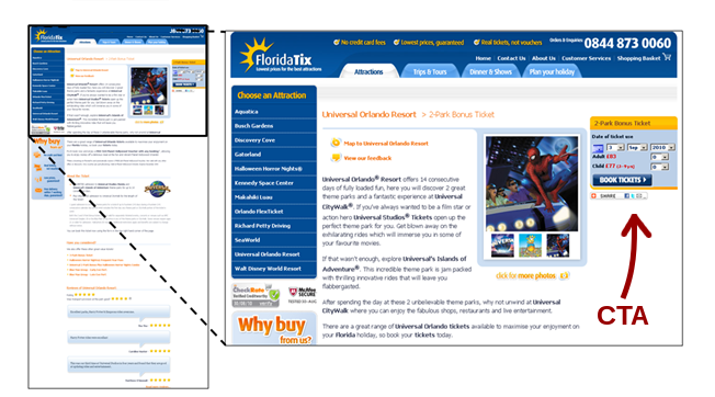
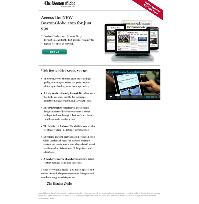
And what if Michael Lykke Aagaard of Content Verve found that moving the CTA on this page far below the fold contributed to a 304% lift?
A split test run by Content Verve, in which moving the call to action to the bottom of the page (right) contributed to a 304% lift.
And what if Certified Knowledge found the same thing: conversion rates went up with a call to action below the fold?
How can this be?
“Bnonn,” I hear you wail, “Jakob Nielsen has shown definitively that only 20% of people read below the fold. 80% of user attention is focused above it! How can a CTA that only gets 20% of attention instead of 80% possibly convert better?!”
Well of course only 20% of people read below the fold, silly goose. We didn’t need Nielsen to tell us that. David Ogilvy’s research into the readership of advertisements all the way back in the sixties showed that only 20% of people read past the headline. And that was long before the internet came along! As he put it, “On the average, five times as many people read the headline as read the body copy.”
He also noted, “Research shows that readership falls off very rapidly up to 50 words of copy, but drops very little between 50 and 500 words.”
That’s a rather important insight because 500 words of copy, set at 16px or above at the optimal 75 character measure and 150% line-height, will take up at least 1,000 pixels of vertical space—putting the call to action well below the fold even at full-HD resolutions (anything further down the page than about 700px can reasonably be considered below the fold at the moment, since 1366×768 is the most popular screen resolution, and browser chrome takes up at least 68 pixels).
Which is not a problem, since Jakob Nielsen showed, all the way back in 1997, that users will scroll if what they see above the fold interests them enough to keep them reading.
Maybe you can see where I’m going with this.
The fold has nothing to do with it
The fold is actually a red herring. It has no bearing whatsoever on conversion rates as far as calls to action are concerned.
Hang on, what? Didn’t I just show definitively that calls to action below the fold convert better? Nope, actually I didn’t—I showed something else entirely, which I’ll explain in just a moment. But first, to prove my point, here’s a classic example: of these two Boston Globe signup pages, which do you think converted better?
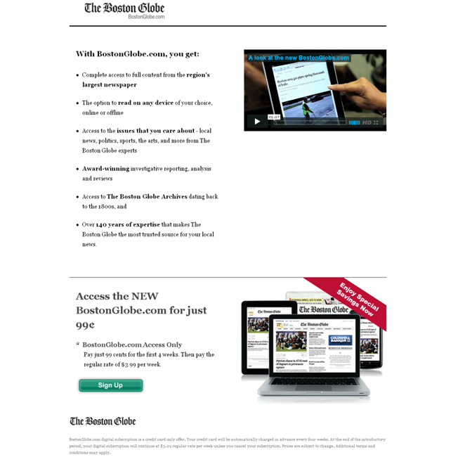
Which converted better? This page, with the call to action at the bottom; or the control, with the call to action above the fold?
Oh, it’s a trick question all right. The answer is that there was no significant difference between the treatments. Waaah, that wasn’t what you expected at all, was it?
But it does give us a pretty decent clue as to why the fold is irrelevant—and what the deciding factors for conversion actually are with respect to CTAs.
Hint hint.
No? Okay, here you go:
It’s all about motivation
How motivated is your prospect to click that button? How desirable does he find your offering at the point you ask him to click?
In other words, what I showed in the examples where the below-the-fold CTAs converted better was not that calls to action convert better below the fold—it was that, in these cases, prospects were more motivated to take action after they had read more copy.
Well that makes sense, dunnit?
Higher conversion rates have nothing to do with whether the button is above the fold, and everything to do with whether the button is below the right amount of good copy
So then the question becomes, How much copy do you need? And that isn’t so hard to answer, because there are only really 3 combinations of prospects + offerings worth mentioning:
- Presold prospects who already want what you’re offering when they arrive. The specifics of your offering are irrelevant here—give prospects a call to action immediately so they can keep their momentum going!
- Uncertain prospects + an offering that is very easy to understand and immediately see the value of. These prospects will only need a small amount of strong, very clear copy to convince them to hit that CTA. Since not much copy is required, your button will be higher on the page—coincidentally above the fold.
- Uncertain prospects + an offering that requires some explanation to see the value of. These prospects will need a reasonable amount of copy that is not only clear, but also very well-written to keep their interest from the headline all the way through to the CTA. Just how much copy you need will depend on how much your prospect already knows, how complicated your offering is, how much it costs, and so on—but it could easily be 500 words, or it could be 5,000 (there’s a reason you don’t see calls to action above the first third of long sales pages).
Asking for a commitment before you’ve made the value of it clear to your prospect is really self-defeating. The only answer you’re likely to get is no. Plus it can seem very “in your face”—it rubs people the wrong way, and actually increases anxiety because it seems pushy or salesy.
So not only is a CTA high on the page often asking for a commitment too early in your prospect’s thought sequence, it might also be stimulating a negative reaction that makes him much less likely to convert at all.
And that is why the fold is a myth.
The issue isn’t whether the call to action is visible when your prospect first arrives. The issue is whether your call to action is visible at the point where your prospect has become convinced to take action.
How about you?
Are you ready to start moving your calls to action into the logical place on your pages (the end), adding more copy to explain your value clearly, and seeing the lucrative results? Let me know in the comments.
About the Author: As well as knowing a lot about copywriting, web design and calls to action, Bnonn is the author of a free email micro-course called 5 Sales-Spiking Website Tweaks Web Designers & IM “Gurus” Don’t Know—none of which have anything to with the dreaded fold. Known in the boroughs as the Information Highwayman, he’s usually knee-deep in the guts of someone’s homepage, or teaching his kids about steampunk, Nathan Fillion, and how to grapple a zombie without getting bit.
Comments (72)