Engagement is the first thing you will need for your product. Without engagement, you won’t have returning users, and you won’t monetize. One of the easiest ways to make your app more engaging is to gamify it. But just because it’s easy doesn’t mean it’s the best way to engage your users.
Games tend to be fun and stimulating, which is why we like them, but they are often cheesy and out of context when directly applied to consumer or business apps. So, instead of mindlessly throwing game mechanics at your app, what you really want to do is design the right engagement loops for your app and optimize them.
I’m a product manager specializing in user engagement, and I’ll explain some of my methods for building engagement features.
What is engagement?
Engagement can mean different things depending on your app. For example, on Facebook, engagement with your post means a click, share, like, or comment. For websites or games, it can mean time spent on a site. For Google, it’s a search query. For YouTube, it’s time spent per session, videos played per session, and secondarily, events such as comment, like, share, search, etc.
You get the idea. Engagement is the key performance indicator (KPI) for your app’s core behaviors.
Once you’ve identified your target users, use cases, and key problems you are solving, you can start building your user experience and engagement loops.
What are engagement loops?
Engagement loops are things users do over and over again when they’re properly engaging with your app. There is motivation, action, and then feedback. In games, engagement usually follows a progression of increasing difficulty called cognitive flow.
The following are examples of engagement loops:
Facebook’s newsfeed: Bored (motivation), check newsfeed (action), read a post, comment, like, or share, visually confirm action is done (feedback), and feel socially active (emotion).
FarmVille: The desire to progress in the game, buy a seed, plant the seed, water the seed, wait, harvest the plant, get money, and feel accomplishment.
Google: Seek information, search, go to search results, and feel satiated.
My engagement framework
Once you figure out your engagement loop, you can use my engagement framework for optimizing it. My technique is based on my own experience in analytics, social gaming, and product management, with influences from Marty Cagan, Steve Krug, Steve Blank, and Eric Ries; human-computer interaction (HCI) and user experience (UX) concepts; and Google product design principles.
Basically, it’s six strategies that increase engagement. They are listed below with examples. You can use SHIRES to help you remember: Show, Human, Incentivize, Reduce, Explain, and Supersize.
The SHIRES framework
Show them – Provide guidance to the user for the purpose of creating awareness.
- Create a video, like CLEAR
- Use animations or pictures
- Create an onboarding experience such as spotlight overlay tours
- Show notifications that need to be cleared
- Reposition user interface (UI) elements for discovery
- Make important UI elements fixed position
- Use wizards
Human touch – Curators, support teams, and community managers, or the illusions of them, can really make users feel special; attention reciprocation.
- Curated content (EyeEm has fresh missions for users to try.)
- Engage with users via email or in-app messaging such as Intercom or Vero (Strikingly also does a great job.)
- Free help (Airbnb sends photographers for free.)
- Paid-for help and partner networks (e.g., Shopify allows you to build your own store but also helps connect you to experts or apps.)
Incentivize them – Give rewards for good behavior.
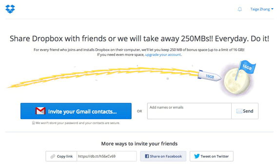
- Give bonuses: discounts, free space, more stuff, special status, etc. (e.g., Dropbox was great at this by giving away free space for desired behavior such as tweeting, inviting friends, and automatic mobile uploads)
- Give credit or points where it’s due (e.g., Hacker News and Volley use a great karma system without making it tacky; it’s also a reputation indicator.)
- Create demand: limit time or quantity to drive scarcity
Reduce barriers – lower the cost of using your app by addressing bugs, usability, and points of confusion
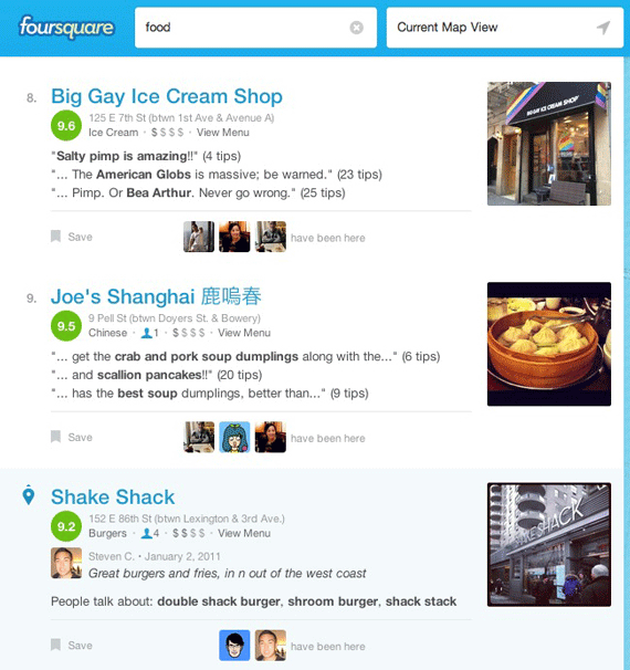
- Put examples in front of users so all they have to do is browse (i.e., Kickstarter, Indiegogo, App Store, etc.)
- Easy access or prominent locations (i.e., Amazon 1-click)
- Pre-populate data and autocomplete (e.g., Address Autocomplete)
- Allow them to click or tap instead of type (e.g., social logins)
- Talk instead of type (quite popular for Chinese people because typing takes forever; e.g., Facebook Voice Messages)
- Reduce clicks required for workflows
- Reduce choices – I highly recommend reading The Paradox of Choice
- Give the option to use OAuth (Open Authorization)
- Free trials and no credit card requirements
- Integrations into other services (At Kera, our users needed access to high-quality audio, so we integrated VoiceBunny API. PadLister has a tool to help you post to Craigslist.)
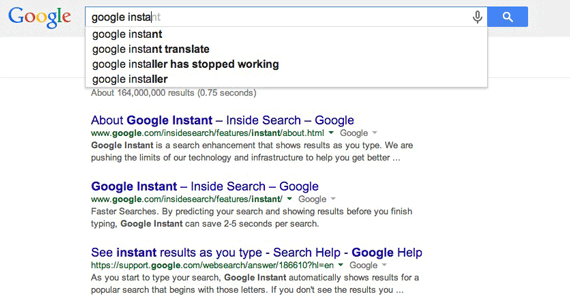
- Speed everything up – one of Google’s philosophies
- Make a script for them
- Mobile friendly or responsive design
- Localize
- Increase usability
- Eliminate bugs and improve user experience
Explain it to them – UX design principle and customer buy-in
- Explain how long things will take
- Show progress bar (read more about the power of the progress bar)
- Articulate their pain to build empathy
- Explain the “why” or benefits to get buy-in (If you can get buy-in from a toddler by answering why, then you can convert that user! Facebook, Twitter, Netflix, and Amazon all explain their recommendations, in part to reduce creepiness and increase compliance.)
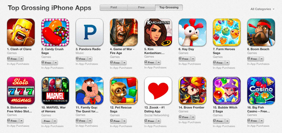
Notice how the App Store’s top grossing apps are all “free” apps.
Supersize sunk costs – allow users to do more before asking for something
- Shuffle the funnel (At OANDA, we increased conversion rates massively by letting users trade first and then do the regulatory paperwork. The old process was to sign up, do paperwork, and get access.)
- Let users spend more time on the site or get access first
- Let users try a free version
- Let them make small purchases
- Create loyalty features such as currency, points and “member since [date]”
- Create membership mentality
- Provide free training resources (e.g., Hootsuite Academy, Shopify Academy, and Appcues User Onboarding Academy)
Bonus tips
Social proof
This is more marketing than product, but it’s smart to build social proof into the product. Some examples are: show how many people have performed the action, create expectations or obligations from a real person or friend, or reference a person’s face or name.
I also have this crazy idea to create a group chat box for all the live visitors on the website and the customer success rep. I haven’t seen it, but this concept maps to a real-world environment where you can chat and see other people around you. Wouldn’t that be cool on an e-commerce site? Maybe even show a feed of what people just bought? Folks might go to Tesco Groceries just to see who else is there!
Another idea is instead of a generic “like” or “tweet” for your e-commerce product, how about creating a button that says: “Interesting t-shirt. Should I buy this? <yes> or <no>.” Yes or no are links that tally the vote on the product page for a user.
The benefits to the user are that it allows him to determine if that product is cool among his peers (facilitates buying decision), and it effectively bookmarks the product in his social media stream. The benefits to the business are that you get to increase product awareness and traffic, get insights on the product, and increase your conversion for the original buyer.
Imagine if there was a new product startup with pre-orders that you think you might want to buy. You might be hesitant because it’s a big risk (no reviews, no showroom, no guarantee, etc.). But if a friend could take that jump with you, you’d be more comfortable about spending money on a crazy idea. So how about creating a feature that helps users ask friends to buy along with them?
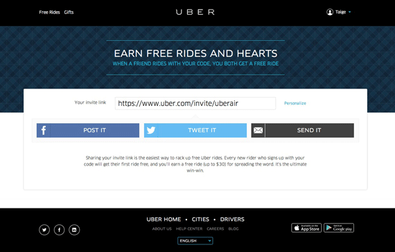
For example, Uber allows you to buy a cottage vacation with friends and split the cost.
Reminders and external notifications
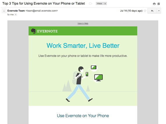
Another marketing-ish engagement feature is reminders: notification emails (like the Evernote reminder above), drip emails, just-saying-hi emails, SMS, and tweets.
Imagine if Dropbox punished you for not inviting friends. (They don’t.)
Punishments
Unlike in games where your town or pets die if you don’t take care of them, not many apps have punishment features. Dropbox won’t punish you for not inviting friends, but I have seen some apps lock you out of features or your account for not paying your monthly fee or logging in enough.
There’s another type of punishment you may want to consider. I worked on a marketplace app where the providers canceled jobs too often, which created a lot of problems for clients. We fixed it with stronger cancellation punishments.
In terms of engagement, sometimes you need to punish bad actors or behavior to boost overall community engagement. Let’s say you’re a forum, social network, or marketplace. You may want to penalize users who troll or don’t respond quickly, and potentially, you may want to ban them because their behavior may lead to a decrease in overall community engagement and satisfaction.
Conclusion
I believe it doesn’t really matter what industry you’re in. As long as your application has users, then these engagement concepts will work.
People learn by having things shown to them. They do things when they are incentivized or motivated in some way such as with rewards, alignment of interests through explanation, or simply fun. They prefer something to be easier rather than harder. They are social. They respond to personal attention.
So that’s the general framework I use to brainstorm ideas for engagement features. Usually, I’ll A/B test different features or MVPs to determine what works best and then refine with smaller tests such as copy, graphics, locations, etc.
By building more engaging apps, you’ll activate more users and create more positive user experiences. Building the right engagement features will also naturally help with your retention rates.
About the Author: Taige Zhang is a freelance product manager specializing in user engagement and growth. After starting his career at Apple, he helped build traction at several startups in social gaming, consumer web, B2B SaaS, and FinTech industries. You can find him on his blog or @taigeair.
Comments (4)