Sometimes, all you need is one high converting landing page to bring in the big bucks.
Here’s the proof.
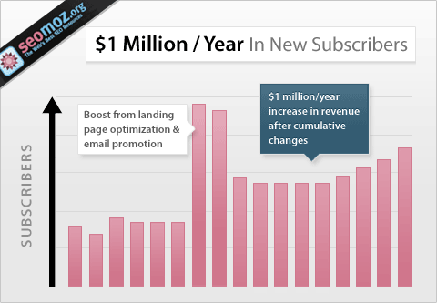
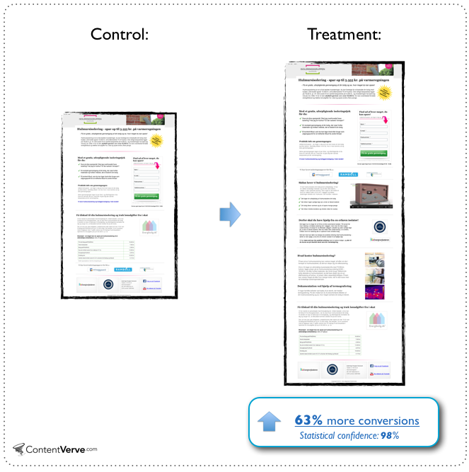
Conversion Rate Experts generated $1,000,000 million for Moz with a single landing page, an enticing call to action, and a few emails.
Even if you don’t generate that amount of revenue, a high converting landing page can be the foundation of a successful online business. In this guide, I will dig into the elements of successful landing pages and show you how to create landing pages that convert well, every time.
The guide will cover:
- Understanding Landing Pages
- Conducting Market Research
- Designing Your Landing Page
- The Psychology of Color
- How to Increase Your Landing Page Conversion Rate
Let’s dive in…
Understanding Landing Pages
Marketers spend a lot of time driving traffic to their website and blog pages with the hope that the target audience will join the opt-in process. But, if these destinations don’t entice prospective customers into your sales funnel and educate and convert them into customers, you are wasting your time.
That’s why landing pages are so important and designing a great landing page takes more than slapping on graphics, text and a call-to-action (CTA) button.
Let’s start with the basics:
What is a landing page? A landing page is any webpage where you send visitors, in order to initiate a conversation and close a deal.
Effective landing pages are often standalone web pages with a single focus; a call to action pointed at your target audience. Hopefully this is a lead magnet for you.
You absolutely need to make the landing page a positive user experience to get a higher conversion on email marketing.
According to The Landing Page Course, “Landing pages live separately from your website and are designed to only receive campaign traffic. As we’ll see, this separation allows them to be focused on a single objective and makes analytics, reporting & testing a simpler task.”
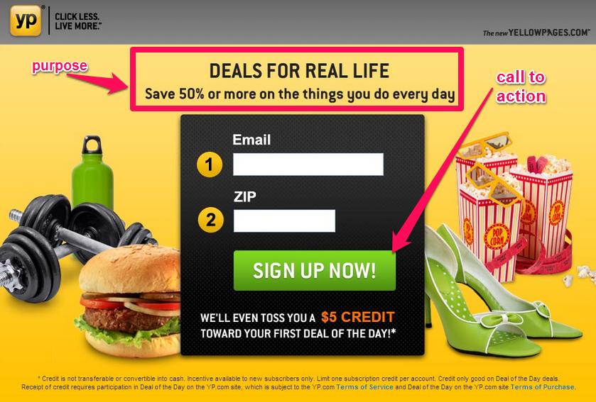
You can use a landing page for almost any purpose – to capture email leads, sell a product, invite people to a conference or webinar, make an announcement or offer a discount … the choice is yours. But, that purpose needs to be clear and linked to an appropriate call-to-action, as this example from Yellow Pages shows:
Why you need a landing page: According to Hubspot, 48% of marketers craft a new landing page for each campaign.
Every online business has a specific reason why they need a landing page, but here it is in a nutshell: you need a landing page to achieve a particular goal, whether that’s building your brand, growing your email list or making a profit. At its core, it facilitates some type of opt-in process.
Here are some of the main benefits that you can gain for your online business by using specific landing pages for your marketing campaigns:
1. Promote a positive first impression: An eye tracking study highlighted by Conversion XL shows that it takes 2.6 seconds for a user’s eyes to land on the part of your site that will leave an impression.
In fact, that time could be even shorter. Ion Interactive says people form impressions in just 1/20th of a second.
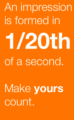
In other words, people won’t stay long on your site, so first impressions count. Landing pages can help you appeal to your audience, so that they will want to stick around and make the switch from reader to customer.
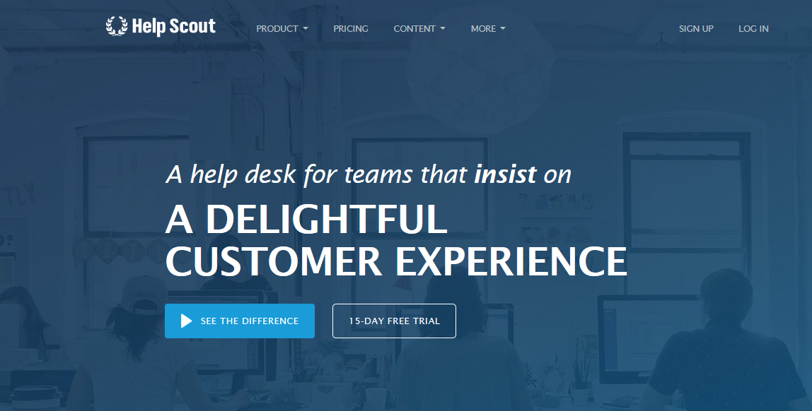
Help Scout’s landing page piques my interest and makes me want to try their service. That’s the impact of a great landing page design that leads to a simple contact form or subscription form.
2. Take advantage of trust elements: Did you know that images, videos and graphics can attract your visitors and persuade them emotionally to take action? That’s because 40% of people respond better to visual information than to text. It makes for a positive user experience.
I’ve seen tremendous results with a hand-crafted illustration for my About page.
And, adding images to my Advanced Guides Series has had spectacular results, with over a million unique visitors from Google alone.
3. Increase the conversion rate: It’s easier to capture email leads from a well-designed landing page than from a typical blog or site where the singular goal is higher conversion to a subscription form.
That’s because while your blog may focus on highlighting popular posts, gathering email subscribers or recommending affiliate products, a landing page has only ONE purpose.
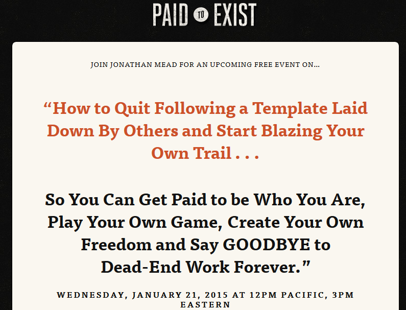
Some landing pages don’t even have navigation elements, in an effort to reduce distractions. An example is this landing page from Jonathan Mead, founder of Paid To Exist.
If you want to create a high converting landing page, you have several options:
Text-only landing page: Most online marketers prefer to use copy that is primarily text-based for their landing pages. They don’t include videos or large graphics. just a couple of images to appeal to the section of your brain that processes visual information.
Since page load time affects Google rankings, the major advantage of a text-based landing page is speed for a positive user experience.
A text-based landing page will deliver quickly on what the headline promises. Copyblogger is a typical example:
Copyblogger uses a CTA button instead of a text link, which is something that I do on my own site to make the CTA obvious and attractive.
Video landing page: According to eWeek, online video platform revenue is projected to top $800 million by 2019, as YouTube, Vimeo and other video sites become more popular.
As recent research shows, one-third of all online activity is people watching video and it’s a great way to help them understand your products or service. That’s why you should consider adding video to your landing page. Many successful internet marketers are already doing this.
Here’s a video landing page from Blog Tyrant. This is his About page, but it’s cleverly designed to build his personal brand AND his email list.
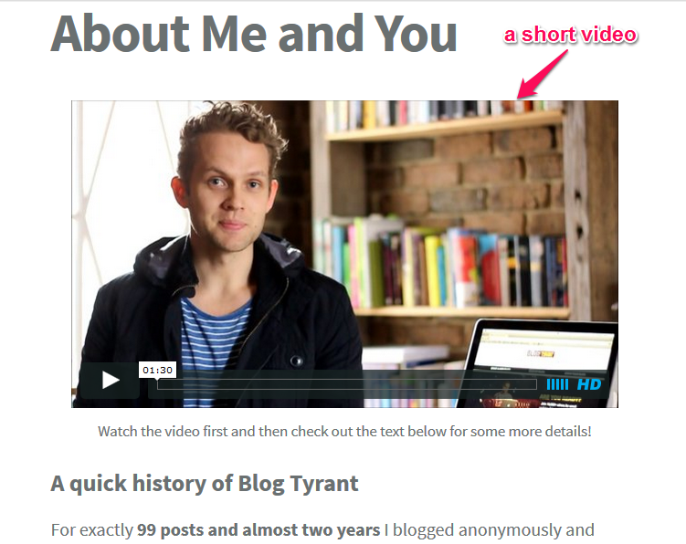
No matter what your product or service is, adding a short video that walks the prospect/customer through your offer will improve your conversions as long as the opt-in process is simple too.
The benefits of using videos on your landing page are:
- Retention: A valuable video will inspire people to stay longer on your page, allowing your message to penetrate.
- Increased trust: Videos give your product life and a voice, increasing trust.
- Meeting customer preference: Unbounce found that many people prefer to watch a 5-minute video rather than read an article. If you give people what they want, your landing page will convert better.
You will need a catchy call-to-action as part of your video. Here’s an example from Derek Halpern.

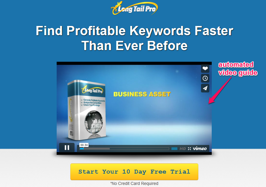
Videos can also show prospects how your product works, which is a must if it needs to be installed or configured. For example, when you visit Long Tail Pro, you automatically watch the video to learn what the keyword software can do for you and how to use it.
Keep your landing page video short and useful, because desktop viewers tend to stick with videos for less than 5 minutes. In contrast, iPad video viewers stay and watch a video for up to 5 minutes.
Note: Sometimes you can have a hybrid landing page, where more than one element is used in the copy. A landing page builder can help you with ideas for this.
Long or short copy? Should landing page copy be long or short? It depends on the page. It’s common to find long copy landing pages in the internet marketing industry. It’s a great format when you’re trying to showcase the benefits of your products or service in order to close a sale.
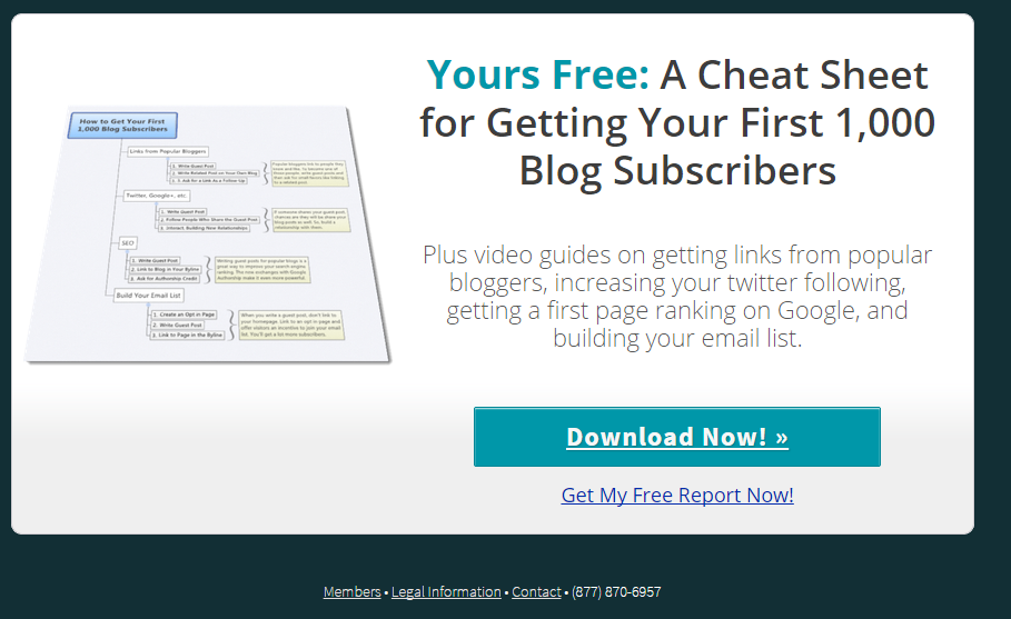
On the other hand, if the aim of your landing page is just to request someone’s email address in exchange for your free report, your copy and page can be short to enhance the user experience, get more consumers to jump into the opt-in process and have more subscription forms completed.
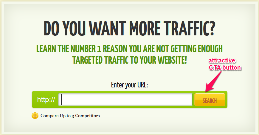
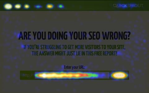
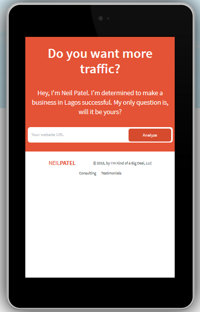
A typical example of a short copy landing page is Quicksprout. It currently converts at 67.2%, because I only ask for people’s URL.
My personal opinion is that you should test both types of copy and make your own decision.
Conversion Verve conducted A/B tests on short and long copy landing pages. In the study, they found that short copy yields great results when there is little commitment on the part of the customer/visitor and little risk related to the conversion goal.
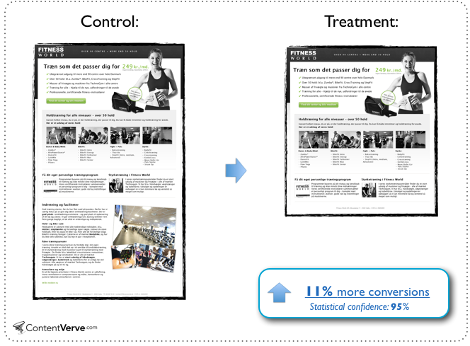
On the other hand, long landing page copy works well when the offer requires a high level of scrutiny, a higher level of commitment and there is greater perceived risk for the conversion goal. Or, as I often say, “the bigger the ask, the longer the page.”
If you’re selling a premium package at $1,997, you need to give plenty of reasons why someone should fill out the subscription form and spend money on your product.
Examples of good and bad landing pages: How do you tell a good landing page from a bad one? I think it all boils down to the purpose it fulfills. If the landing page can seamlessly solve the reader’s problem, then it’s good.
But, if it doesn’t satisfy the end-user, it’s an awful landing page. That’s not just about the copy, but the placement of your CTA button, the color and ease of navigation. If you want visitors to convert, don’t make them search.
Let’s dissect a few landing page examples:
Example #1: When I searched for “military training kits” (without quotes) in Google, I decided to click the first two organic results to see which one had the better landing page. I was looking for a tactical training kit that’s affordable, easy to order and fun to use. The first landing page I discovered was Govx and it’s a pretty good page.
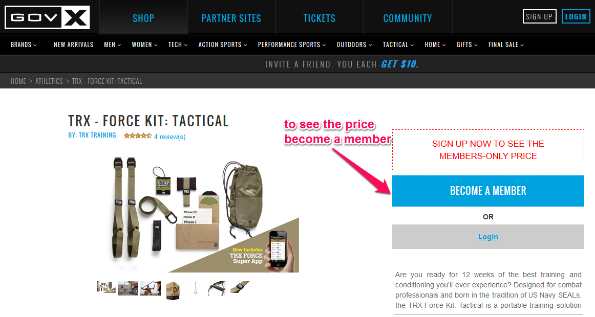
Why is this landing page good? People who search for a particular keyword are very targeted.
When I arrived at the site, I immediately saw the tactical training kit that I wanted to buy. That was a plus.
Another good thing about this landing page is that the items are on the left hand side.
Since people read in an F-shaped pattern, I saw the items before I could be distracted.
The only negative was the call-to-action. The page didn’t do enough to interest me in becoming a member or joining a training class. However, the huge product discount offered could make up for this.
Rating: B
The second result led me to Military Kit, an awful landing page.
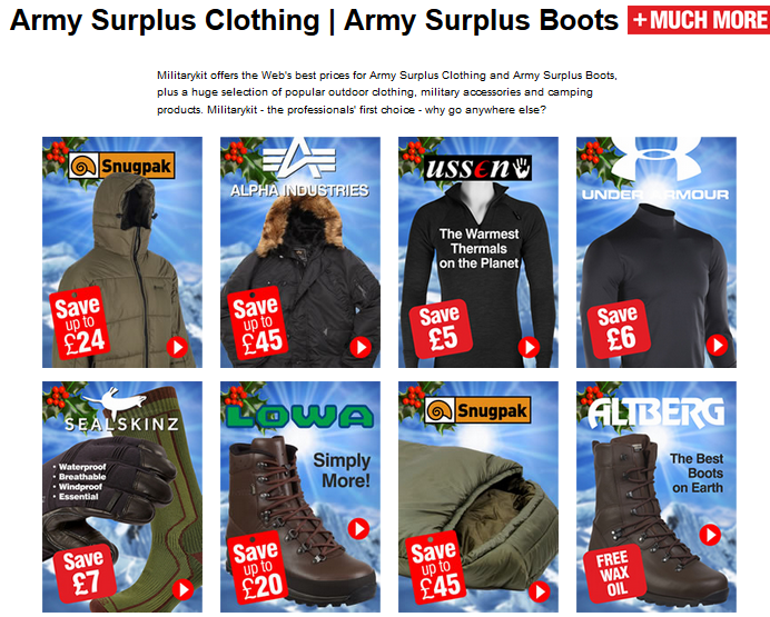
Why is this landing page bad? The first problem here was that the page wasn’t relevant to my search. I was looking to buy a military training kit (all-in-one), not army surplus equipment and clothing.
Even worse, it was very difficult to navigate the site and find the military training kit. The site failed the first rule of landing page design by making me search for the product.
Rating: C
Example #2: Next, I tried looking for bass guitar lessons and found a great landing page- ArtistWorks.
Honestly, this is one of the best landing pages that I have seen recently, because all of the essential elements (headline, offer, benefit, testimonial, image, call-to-action) are well placed. The colors blend with the image.
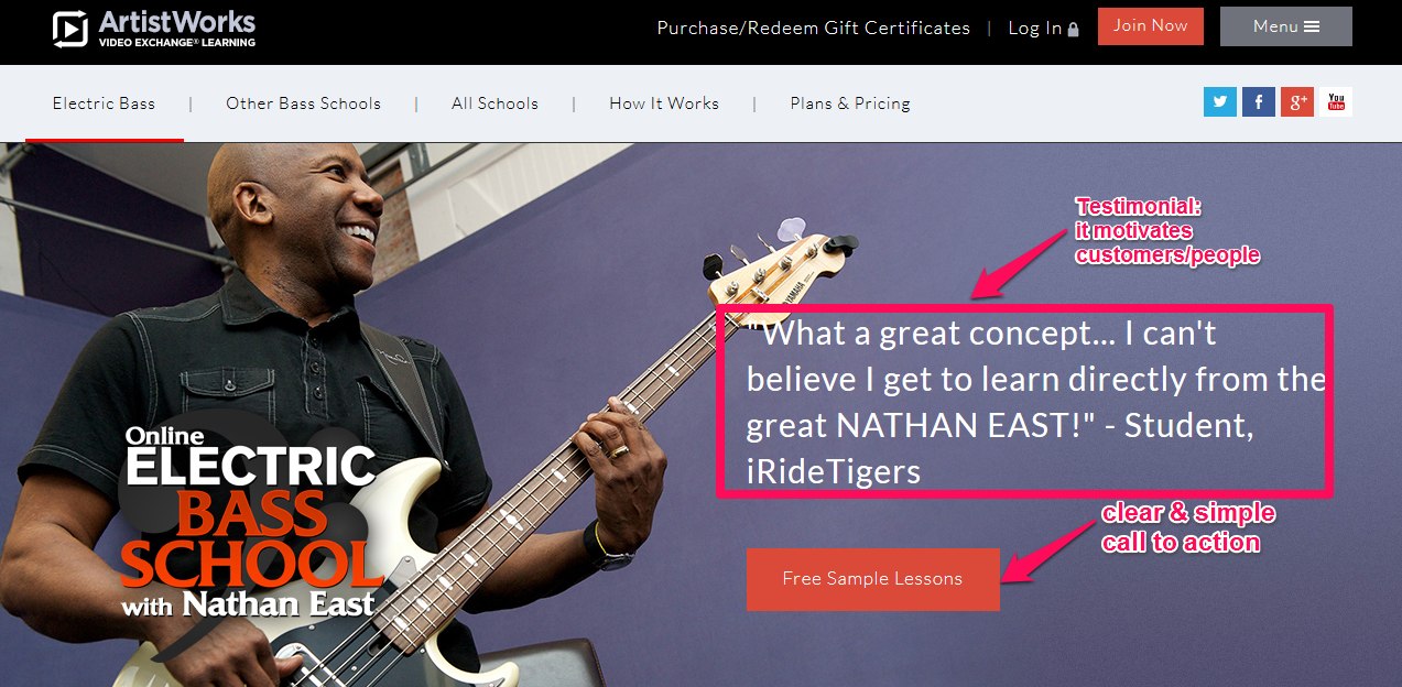
Let’s closely look at this screenshot. Even the top navigation bar is clean and doesn’t distract from the main focus of the copy – getting people to take a free sample lesson.
When Nathan East smiles, you know he’s definitely going to tutor you to stardom. That image alone creates a positive first impression, especially for first time visitors.
Rating: A
In contrast, the CyberfretBass landing page needs some tweaks.
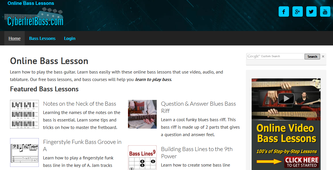
The major problem with this landing page is this: If someone who has never played a bass guitar visits this page, the person will be confused, because the lessons are not rated. In other words, which one should a beginner take first and which one should come last?
It’s good that several lessons are available for free, but there is little help for the person who is struggling with information overload.
There is also no specific call-to-action on the landing page.
Rating: B
Now that you understand what a good landing page is, you’re ready to create your own high converting landing page. Let’s get started.
Step #1: Conducting Market Research
Every good landing page starts with market research: gathering vital information about your target market and customers in order to create value and provide a desirable customer experience.
Market research is important, If you have to, you can do it on a shoestring budget. Fridge Magazine shows some of the popular channels that you can utilize when conducting market research:

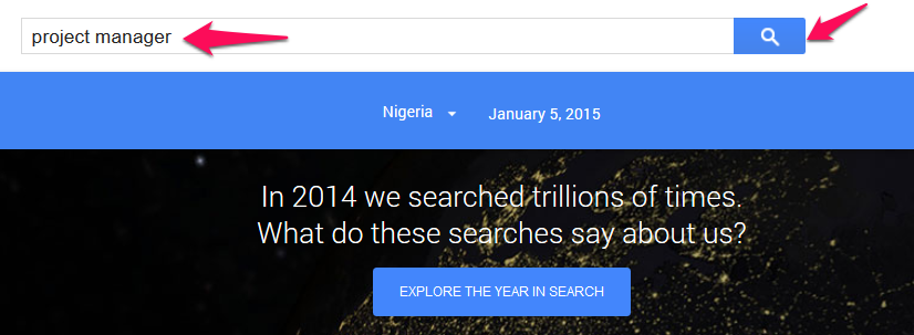
How popular is your topic? One key piece of information is whether there is any interest in your topic or blog post series. Suppose you want to release something for project managers. What does demand for that area look like?
Let’s find out in just 3 steps:
Step #1: Visit Google Trends. Type your keyword into the search box. Click the search icon.
Step #2: Study the trend for the past year.
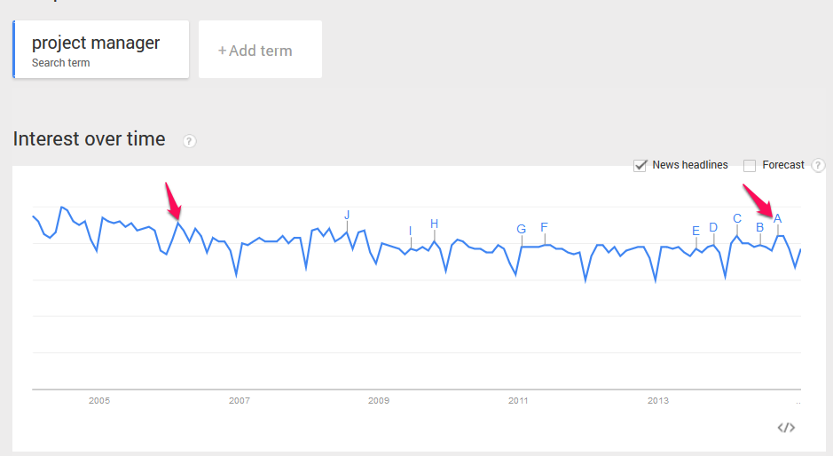
The chart above shows steady demand for “project manager” as a search term in 2014. That’s a good starting point for deciding whether to build a landing page focused on this area.
Next, it’s time to find out more about what your prospects want.
One thing to be careful of, when conducting market research, is that what prospects SAY may not match what they DO. For example, if you survey your email list to find out their challenges, they may say that they are struggling with traffic generation.
But, you may not realize that they don’t really want another e-book or a piece of software that promises an avalanche of web visitors overnight. Instead, they might be looking for one-on-one video coaching or a webinar where you show them live how you generate traffic to your site.
To create a high converting landing page, you have to understand their mindset. This is why landing page templates are good. They’ve done a lot of this research and have a drag and drop method to helping you achieve higher conversion rates.
The mindset of a landing page visitor: As an online business owner, you have to focus on re-orienting your entire business around your customer. Your landing page has to make them want what you have to offer. But, that can be a challenge, as ESPN shows:
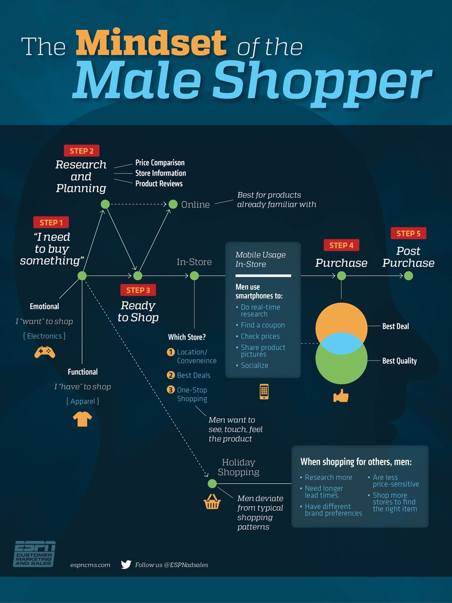
This infographic shows us the 5-step process that the male shopper goes through before and after purchasing a product/service:
Step #1: I need to buy something – This is the decision-making phase. The shopper decides what to buy and this phase is driven by emotions. In other words, the consumer may not necessarily need the product, but they may think they want it because of the user experience.
Step #2: Research and planning – The shopper tries to get more information. He uses product comparison charts, reads product reviews and gets store information.
Step #3: Ready to shop – Where can the product be purchased? The study reveals that men want to see, feel and touch the product. Where is the store located? And, how convenient is shopping online vs. shopping in-store? How easy is the opt-in process?
Step #4: Purchase – Once the issue of store location and shopping convenience has been addressed, the male shopper will further consider products with the best deals and quality. If he’s convinced, he will place an order.
Step #5: Post-purchase – The shopper is concerned with the experience that he had while shopping at a particular store. Were the items shipped on time and in good condition?
Your landing page will have to answer some of these questions. A landing page builder can help you develop a clear concise way to present this if you aren’t confident in doing this yourself.
Another way to find out more about your customers is via social media. This way you take to talk to them rather than have them find you through a search engine.
Market research through social media networks: When you monitor your customers on social media, you get to know what they said about your brand and where.
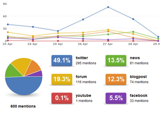
Having a conversation with prospects or customers is one of the best ways to extract useful data about them, your brand and your market. It’s also cost-effective. It also creates a positive brand and user experience from the start.
But, how does social media compare with traditional market research methods like interviews? Germin8 compares them, noting that you are more likely to get honest feedback on social media.
Which platform should you use? It depends on what you are looking for. Twitter is often used for quick updates on the latest events, products, and services. Facebook works well for sharing links to your content, webinar or an upcoming product launch in order to build buzz around it.
You can also use Quora to conduct market research.
Just plug your keyword (lead generation) into the search box:
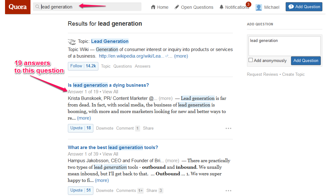
Next: click the ‘View All’ link.
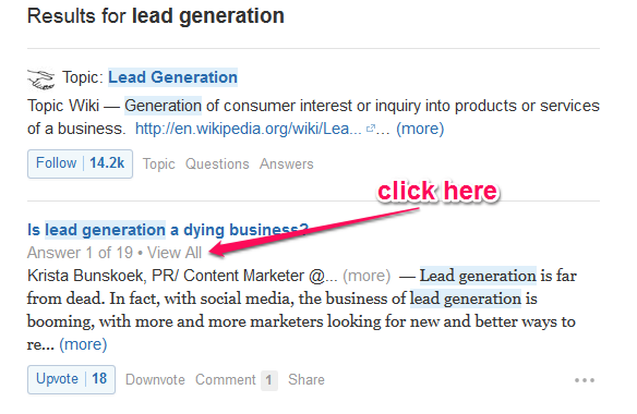
You will see all of the answers to questions about lead generation. This can help you find a direction for your landing page and how to create the subsequent subscription form.
Understanding keyword intent: To close out the market research section, let’s see how to look beyond a given keyword and understand the intent (purpose) behind it and how that relates to your target audience.
Keyword intent is about finding out what users really want. Interestingly, it’s easier to know the intent behind a long-tail keyword than a seed keyword.
Using Google Keyword Planner, I searched for “flat abs training.” These were the related keywords and their average monthly search volume:
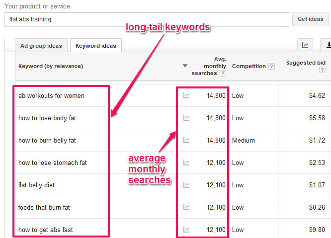
The first long tail keyword (ab workouts for women) has 14,800 average monthly searches. The competition is low – which means that very few advertisers are bidding for the term.
As a content writer/blogger, if you write content and include that keyword in the headline, build relevant links to the page and send some social traffic to it, you may succeed in improving your ranking, but your conversion rate will be low without a concise opt-in process.
Why? It’s because you didn’t optimize for the people who actually want to buy the product.
Let’s see how keyword intent from the results above can help you identify the best product for your landing page:
- Ab workout for women: The searcher is probably a woman who works out and wants to improve her abs. Content that shares the best workouts for women won’t be relevant for this consumer, because her focus (intent) is the abs.
- How to lose stomach fat: Here, it’s obvious that the searcher is a newbie to weight loss and would like a step by step (or how-to) guide to the process of losing stomach fat.
- How to get abs fast: If you have a product in the form of training videos or a step by step tutorial, you could easily convert these searchers, because they’re DESPERATE. Whenever you see “fast,” either as a prefix or suffix in a keyword, you know that you’re dealing with a special group of customers who believe in overnight results.
However, don’t use hype or tricks in your content. Be honest and provide value to turn the searcher into a customer.
Step #2: Designing Your Landing Page
In this section, we’ll look at the anatomy of a perfect landing page creating the call to action to the opt-in process. Even though useful content is king, design will generate interest and affect how your content is perceived. As Unbounce shows, every element of your landing page matters. You can innovate, but don’t leave out anything essential. A landing page template can keep you on track.
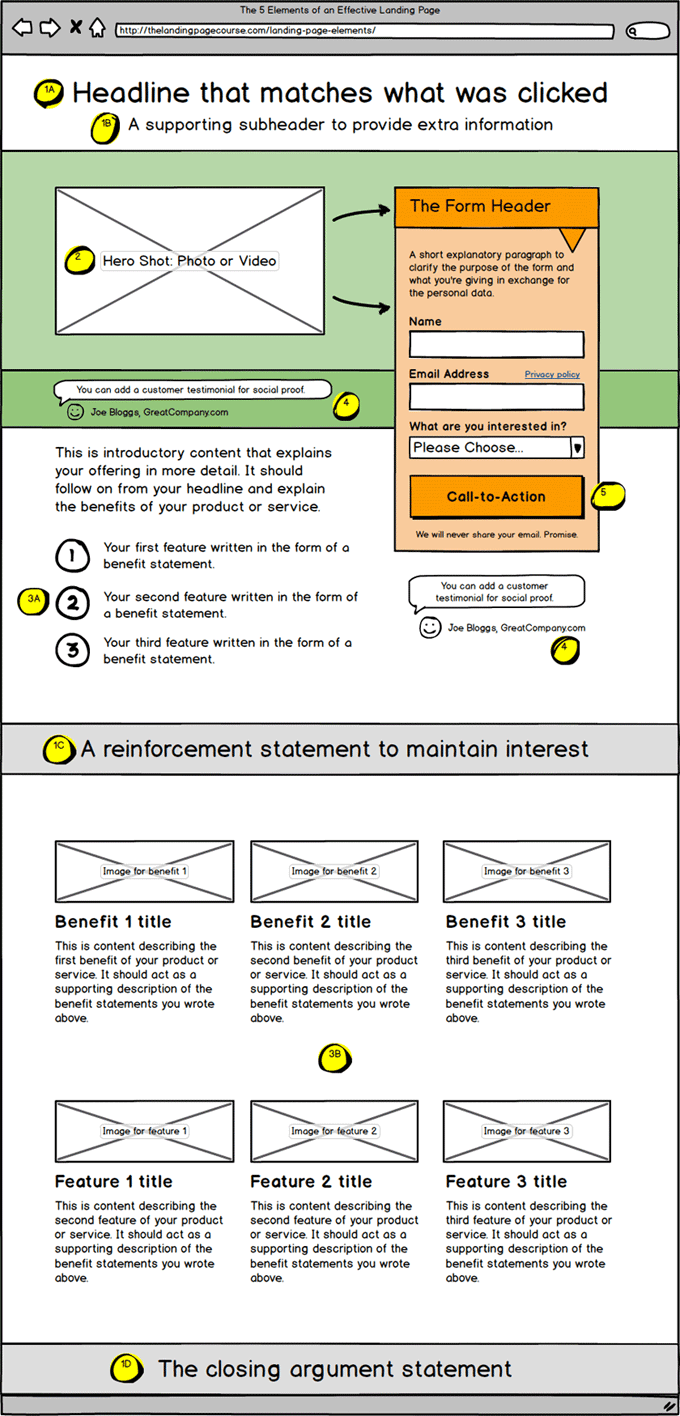
Here’s a quick rundown of the key landing page elements:
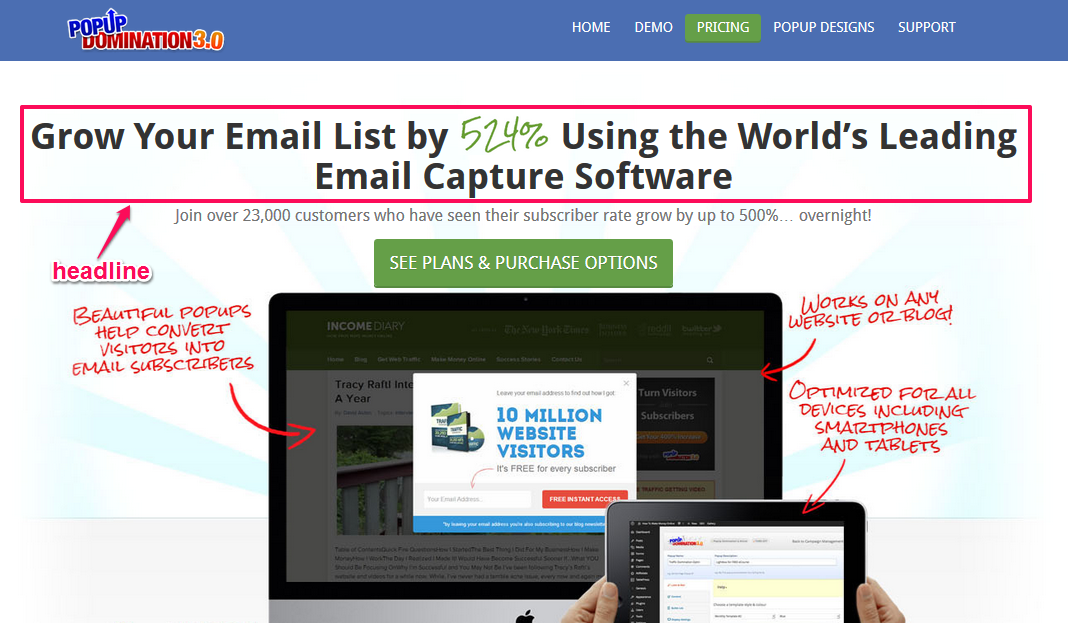
1. Headline: The headline is the first and most important element in your landing page. Make it bold, clear and benefit driven.
Blogs that write catchy and valuable headlines get the most social media shares.
That works for landing pages, too. For a high converting landing page (a lead magnet), your headline must be creative, straight to the point, create urgency and solve a particular problem. In fact, they have to be magnetic for someone to complete the subscription form.
An example is Pop Up Domination.
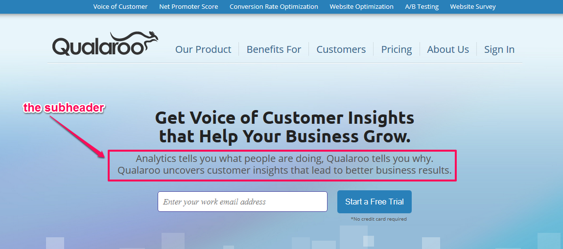
2. Supporting subheadline: Never underestimate the importance of a great subheadline. Top Left Design says that a subheadline will give people a reason to read all of your copy, instead of skimming or scanning it. Use it every time to give more context to the main headline. Check out this great example on Qualaroo.
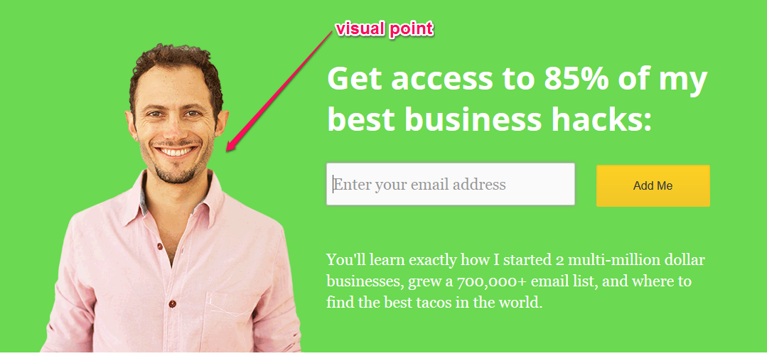
3. Visual focus (headshot, video etc.): The brain processes visual information faster than text. That’s why you need to add a visual focus to your landing page, such as your headshot, a photo or video.
OkDork has a good landing page, when it comes to visual engagement. Take a look:
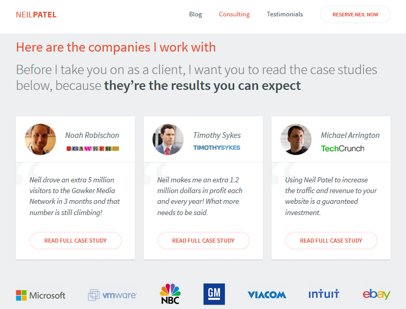
4. Customer/client testimonial (optional): You can also add real customer testimonials to your landing page. Testimonials can boost your sales. But, only use them after you have gotten results for other people. If you’re just starting out, this is optional.
I use clients’ testimonials on my landing page. Testimonials build trust in your personal brand, because you are showing real results for real people. Its part of the positive user experience you are trying to achieve in your landing page builder.
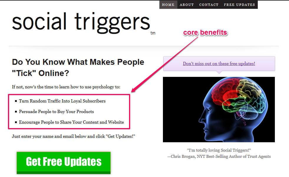
5. Core benefits: To appeal to customers and inspire them to take action, highlight the core benefits of your product/service on your landing page. Derek Halpern, founder of Social Triggers, does this on his home page.
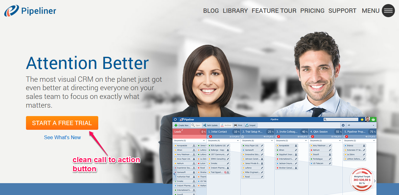
6. Call-to-action: In order to successfully convert visitors to email subscribers or customers, you need a simple, clear and clickable call-to-action. You could use a link, but call to action buttons are commonly used, because they grab attention, especially when they are colorful.
Pipeliner has a great call-to-action button on their landing page:
Landing page design tools: There are several tools that you can use to design this such as a landing page template or landing page builder – very similar but one allows for more customization. The right tools help you collaborate with your team and work more efficiently.
Some of the top landing page tools are:
- Unbounce: A landing page builder you can use to build, optimize and carry out A/B tests to determine what works and what doesn’t on your landing page.
- OptimizePress: Easily create landing pages, sales pages and membership portals.
- PopUpDomination: One of the best pop-up opt-in box creators around. It works for beginners, intermediates and online business experts as a landing page template with drag and drop ease.
- OptinMonster: A great exit intent tool that will help you capture emails and leads. It’s a flexible, yet very easy to use landing page template.
- Optinskin: Glen Allsop’s WordPress plugin for adding opt-in boxes to your blog posts, landing page and fan pages.
- Instapage: You can use Instapage to create a single professional landing page, 100% free. But, if you want more landing pages, you’ll have to upgrade to a paid version of this landing page builder.
- Leadpages: This is popular, because you can collect email leads from anywhere without displaying an opt-in form.
- Landerapp: Create amazing landing pages for your marketing campaign and design a contact form.
- Getresponse: Use their landing page builder to run a marketing campaign that will bring you profit. It’s an additional $15 per month, if you’re a Getresponse customer.
Once you have decided on the tools for your landing page, there are a few more areas to pay attention to when creating it.
Clear user interface and experience: For your landing page to work, make sure that the user interface is clear. The focus is on your visitor, not you. You have to align every element on your landing page to appeal to the end-user.
Clean and legible fonts: Most consumers shop online using mobile devices, says Pew Internet. This means that you must make your landing page mobile friendly.
You can check how your landing page appears on different mobile devices by using mobiletest.me.
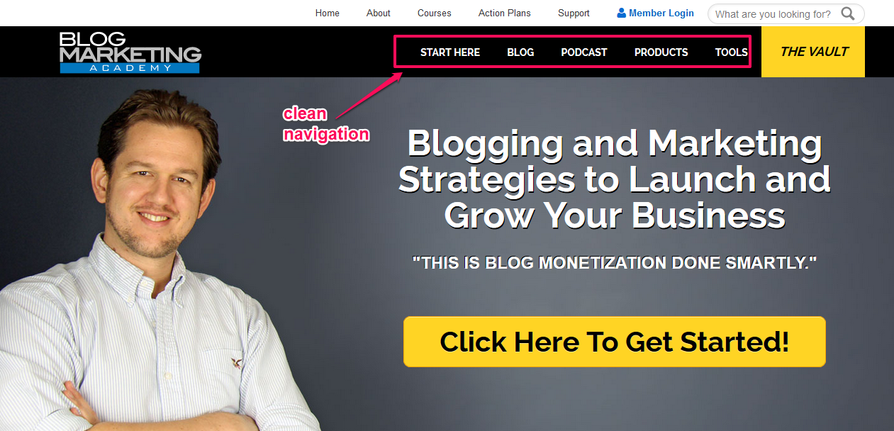
Simple and user-friendly navigation: Generally, it’s not advisable to have external navigation on your landing page. But, if that’s what you decide, make sure it’s simple and user-friendly.
You can learn from David Risley, founder of Blog Marketing Academy. His landing page looks professional, has a visual focus, a clean design and is easy to navigate.
A.I.D.A. Model: One of the best known practices in the content marketing world is the A.I.D.A model. A.I.D.A. is an acronym for: Attention, Interest, Desire and Action.
Use this to lead potential customers through the sales funnel on your landing page to generate more subscription form or buyers. Here’s how.
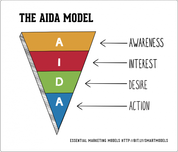
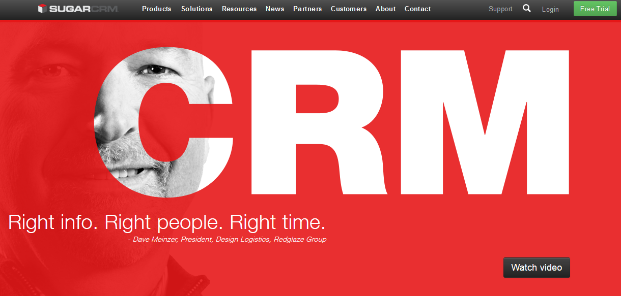
1. Attention (Awareness): You begin by attracting attention, in order to create awareness of a particular offer. That’s the role of the headline and sub-headline on your landing page. This is why Sugarcrm uses a bold text “CRM” on its landing page to catch people’s attention.
2. Interest: You build interest in your product/service by highlighting its core benefits and features. Mentioning other experts or linking out to them can also build interest.
3. Desire: After getting prospects interested, it’s time to fan the flames and use emotional power words to close the deal. Multinational companies use celebrities on billboards, because they want you to desire their product.
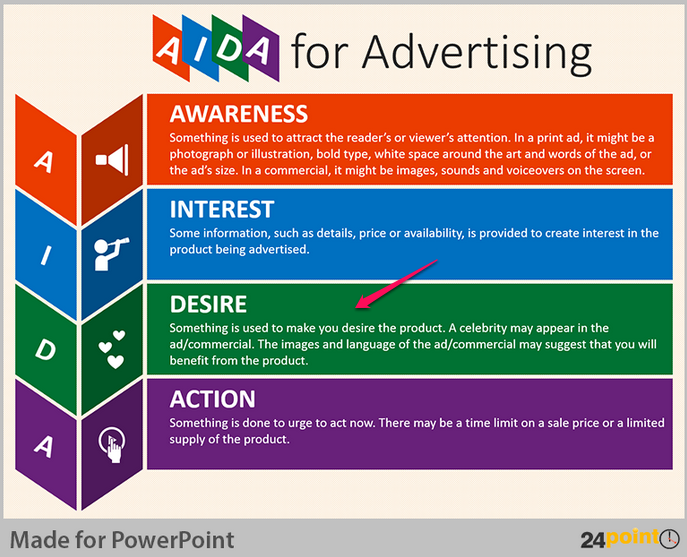
Prospects must desire your product before they will buy it. Use testimonials, money back guarantees and free shipping to channel consumers’ desire towards your product.
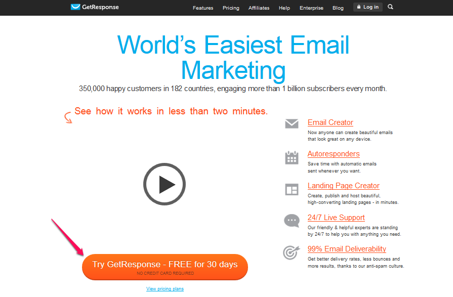
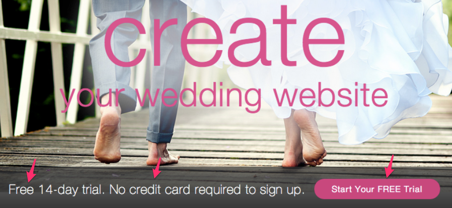
4. Action: After generating interest and desire, it should be easy to close the sale with just a nudge. In terms of your landing page, this means urging them with a call to action now, by giving a deadline, creating scarcity, slashing the price or giving a bonus package. You want them to start the opt-in process here and complete a subscription form. Free trial periods work well for software:
Step #3: The psychology of colors
The right colors will improve landing page conversions. Color psychology tells us that you will feel anxious in a room painted yellow and peaceful in one painted blue. Color psychology works online too, as the Logo Company‘s chart on how colors affect buying decisions shows:
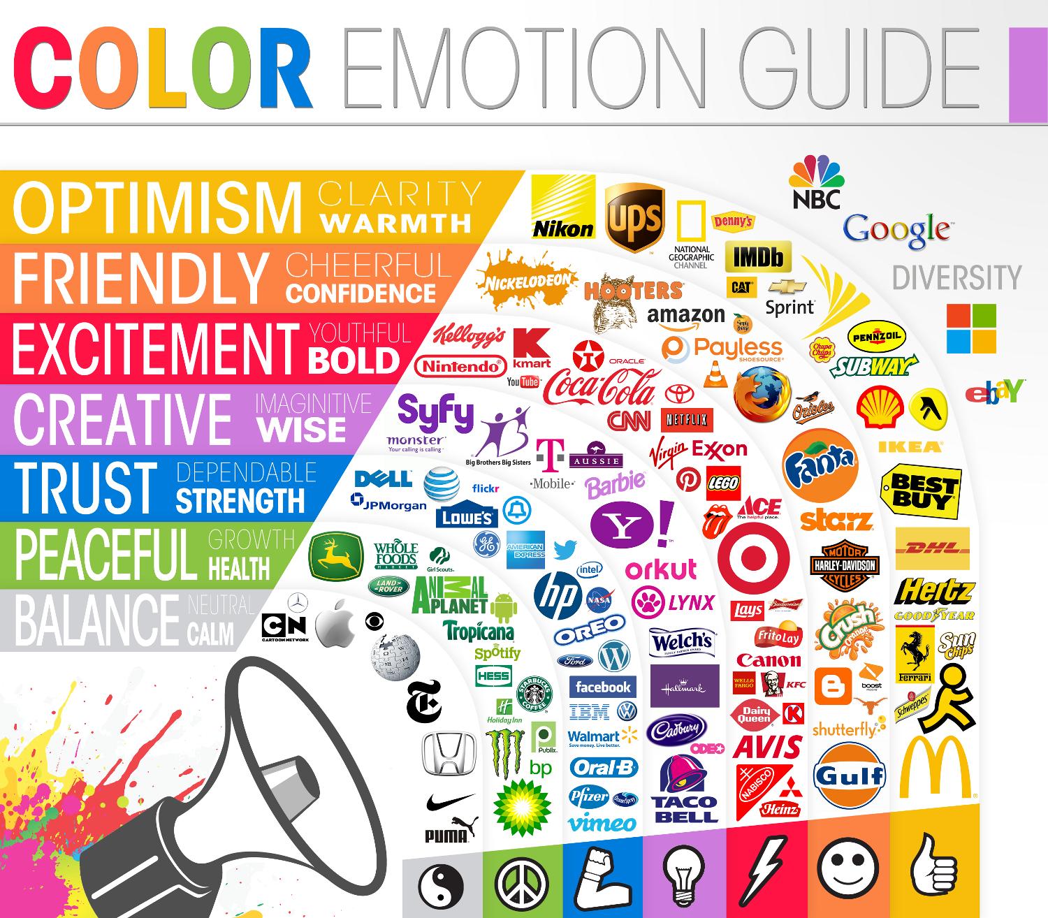
In a research study titled, “The Impact of Color on Marketing,” researchers discovered that up to 90% of consumer decisions about particular products are based on color.
Here are some key color areas to think about.
Background color: If your background color is wrong, your page won’t convert as well.
When using a solid color on your landing page background, make sure that it won’t interfere with the text. And, if it’s a deep color, make sure that the text contrasts well.
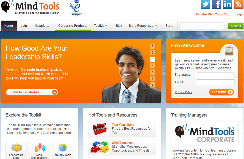
Mind Tools has a lot on the landing page, but it uses a background color (the blue sky image) that focuses your attention on the text and tool boxes.
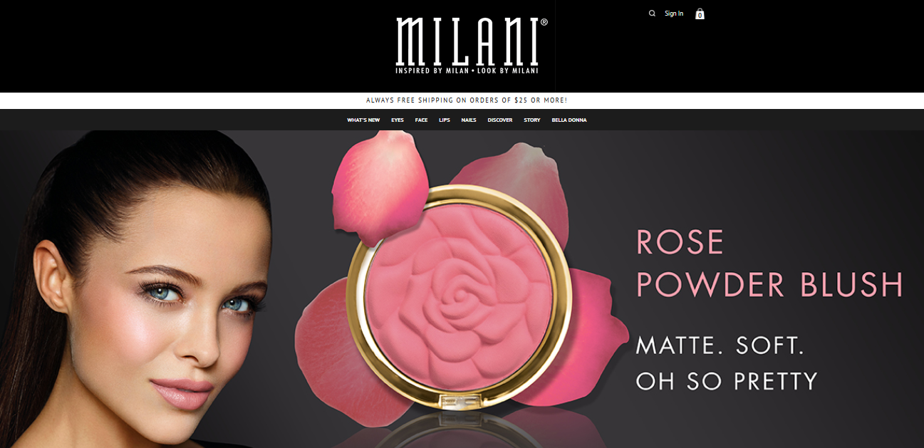
Milani Cosmetics uses a black background and light text, blending the text color with the image effectively.
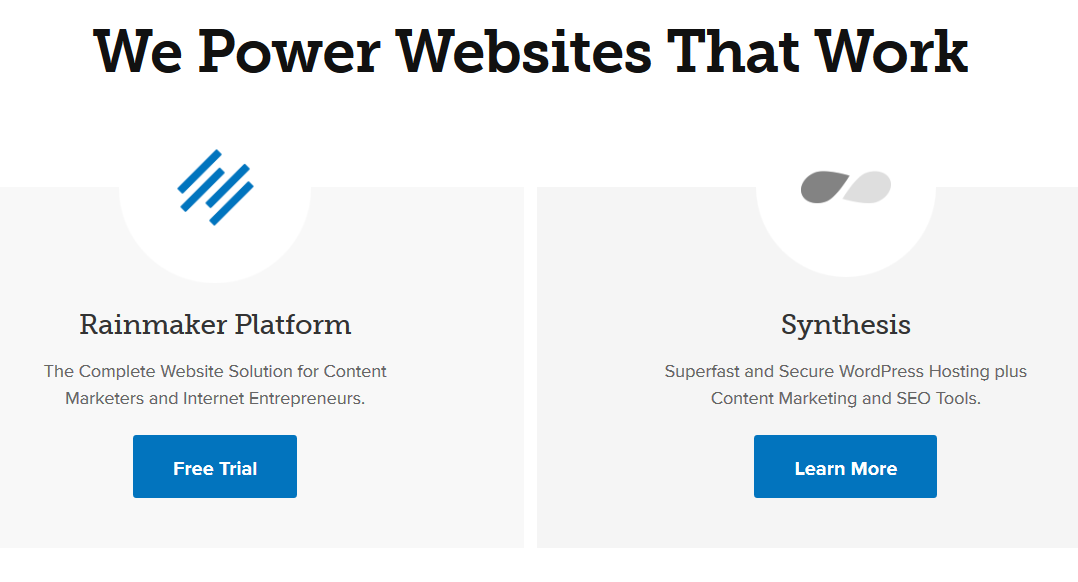
On the other hand, you can adopt a minimalist design for your landing page and just make the background plain white. I’ve had success with white backgrounds, especially on CrazyEgg and so has Copyblogger Media.
Link Color: I’ll have to agree with Peep Laja, founder of Conversion XL that “there is NO best color for increasing conversion.”
Linking out from your landing page, especially when you want to accomplish a special goal (such as capturing email leads) is not a good practice. But, if you are going to link, start with the web convention of using blue for underlined links (and maroon for followed links).
Note: Feel free to be creative with your landing page. If red links work for you, use them. If green links are getting clicked more, use those.
Call-to-action colors: I believe that the color of your CTA can either inspire people to click or discourage them. A lot of conversion rate experts have conducted in-depth research on the best way to position, write and use calls-to-action.
I personally like this guide: Which Color Converts The Best, by Conversion XL.
In choosing colors for calls to action, consider what each color represents and how consumers will perceive them.
For example, the color pink is symbolic with unconditional love. Brands often use this color to target women, as it’s seen as more feminine. Orange radiates warmth and happiness.
Below, Mingle2 uses orange to send that subtle message.
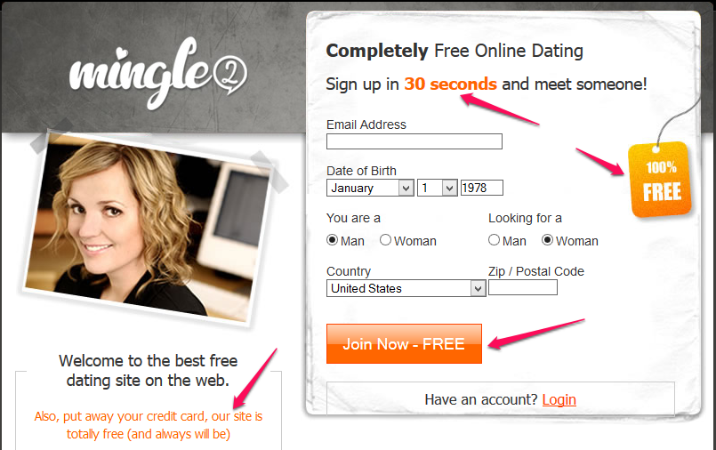
If you’re not targeting females and are not in the dating industry, should you still use pink or orange color on your call-to-action? Of course you should.
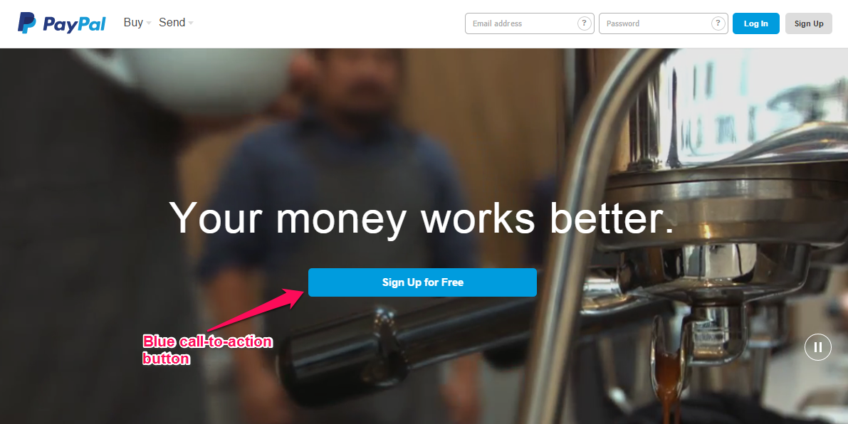
Blue is the color of trust and peace. If you sell digital items, like ebooks, software, plugins and themes, blue will most likely help build trust and loyalty among customers.
Several online payment merchants use blue for their call-to-action buttons, because they want to give end users (customers) peace of mind improving the user experience and increasing consumers jumping into the opt-in process.
Bottom line: Don’t believe anyone who tells you that a particular color IS the best choice for your call-to-action buttons. Remember that every industry and marketing campaign is different; test and measure to find the right ones for you.
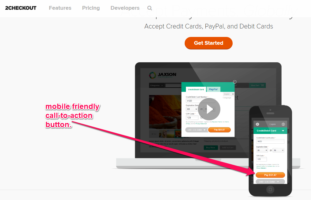
Finally, you have to be mindful of mobile users. I can’t tell you how discouraging it is to visit an online store on my tablet, only to find that the call-to-action button overlaps with the pricing. Obviously, I don’t stick around.
Make your call-to-action buttons mobile-friendly.
Step #4: How to Increase Your Landing Page Conversion Rate
With the right approach, you can increase your conversion rate by 134% – or even more!
There are simple ways to optimize your copy and call-to-action buttons to produce the best results.
Use the K.I.S.S. principle: According to Princeton University, K.I.S.S. stands for “Keep It Simple, Stupid.” In K.I.S.S. marketing, this is all about staying on topic on your landing page. People’s attention span is short, so you have to capture their attention and draw them in quickly
Jon Morrow uses the K.I.S.S. principle on his guest blogging course. This helped him generate over $100,000/month in 2014.
Do you know how to apply the K.I.S.S. principle to your landing page builder and increase your conversion rate?
- Use a bold, catchy headline to explain the benefits people stand to gain.
- List 3 – 5 core benefits of your product/service, using bullet points.
- Add a simple visual focus on the left hand side of your landing page, just like Jon.
- Make sure your call-to-action button blends perfectly with your background.
Note: You can use both call-to-action buttons and text links on your landing page. Place the text link below the button, as in the screenshot above.
CTA styles that work: There are several amazing case studies on successful calls-to-action. I want to share a couple of these with you.
Wedbuddy got a 73% increase in trial sign-ups by making a few changes to their homepage.
They removed the word “Free” from the text before the call-to-action button.
Next, they personalized the call-to-action button. They changed the default (Start Your Free Trial) to “I want to try it out.” As a result of these tweaks, they got more clicks on the button and boosted sign-ups by 73%.
Lesson: Changing the wording on your call-to-action buttons can increase the conversion rate. And, “free” doesn’t work for all products.
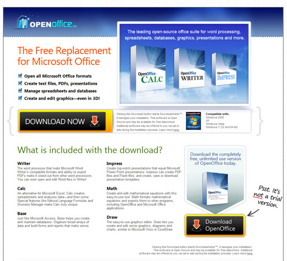
OpenOffice, an office productivity suite, just celebrated 100 million downloads.
Note that they have two CTAs and that one highlights the fact that it’s a full, free version.
If you want to learn more about call-to-action buttons, the psychology behind positioning and even the right words to use, check out 100 Conversion Optimization Case Studies on KISSMetrics.
Conclusion
Landing pages work, but the rules are not set in stone.
As always, I recommend testing different landing page designs and call-to-action buttons to see which one works best for your market. Here are four guides to help you nail A/B testing:
- The Ultimate Guide To A/B Testing
- What is A/B Testing?
- How To Come Up With A/B Testing Ideas Using Qualitative Data
- The Definitive Guide to Conversion Optimization
Have you been using landing pages to acquire leads and sell products?
Comments (70)