Have you ever wondered why all your split testing is only bringing you small, incremental improvements in your conversion rate? Most website owners blindly slog along, testing tiny but noticeable changes like headlines, button color and so forth. You’ll get some results in your conversion rate, but you’ll feel as if you’re hitting a glass ceiling – that there’s really nothing else to tweak to bring about much of a difference.
If that sounds like you, you’re experiencing what blogger Andrew Chen calls the local maximum. It’s the point at which your design is as effective as it’s ever going to be, and split testing different items doesn’t bring the kind of measurable results that they used to.
It’s an unfortunate side effect of split testing – where designers get too bogged down in analytics and making changes that look good on a graph but do little to lift the conversion rate.
What Types of Tests Can I Run?
When tasked with increasing the conversion rate, you’ll be faced with a choice: whether to run an A/B test or a multivariate test. It’s important to understand the differences between these tests as they can give you numbers that are all over the map – and to the untrained eye, all that data can seem overwhelming. Both are important in raising your conversion rate – but one is not better than the other.
A/B Testing
A/B testing involves testing one change against another, for example, two different headlines or two different button colors. The “winner” of this test becomes the new control or the default, and you then prepare to test that winner against another change. It’s kind of like a video game, where you’re trying to always one-up yourself and beat your high score.
Multivariate Testing
Multivariate testing involves testing many factors on the same page. At its simplest, multivariate testing is simply a bunch of A/B tests running concurrently. Instead of testing just one button color or one headline, you could theoretically test different headlines AND button colors AND product shots AND calls to action.
And, while you might be inclined to think that multivariate testing will save you a ton of time by lumping together all kinds of on-page factors and speeding up your results, you’ll likely find that multivariate testing doesn’t show a clear on-page “winner”, but gives you a broad idea of what improvements worked. You can then narrow down these tests into different A/B tests to get a clearer picture of what, exactly, made the customer take action.
Choose the Strongest-Converting Pages First
You don’t want to test on pages that aren’t getting much traffic or conversions since it will take longer to get results. Ideally, you’ll want to choose your strongest, highest-converting pages to test – right from the start. This is also not the time to make small, barely-noticeable changes. Otherwise you may get skewed results from your analytics program – with no clear winner.
Instead, make bold, direct changes that people will notice. While there’s no landing page design that’s absolutely set in stone, there are some great examples out there of the kinds of pages that get people’s attention and get them involved. Plus, thanks to lots of testing, we’ve been able to discover that nearly every high converting landing page has these points in common:
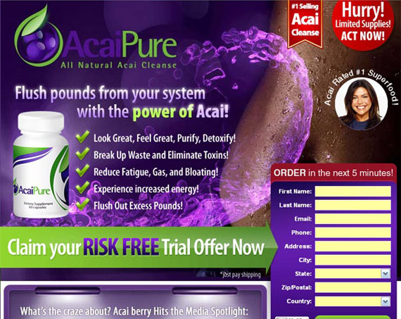
- A strong, convincing and believable headline that promotes the main offer. You can optionally include a sub-headline or bullet points that reinforce these benefits. As much as people complained, the now-infamous “Acai Berry” sites converted like wildfire because of their direct headline, tempting offer and apparent celebrity endorsements. Statements like these lent credibility to the offer and created a false sense of security and safety in the frame of a “risk free trial offer”.
- Remove the Navigation and Other Distractions – Remember, people are looking for any excuse they can NOT to take action. Including your site’s navigation or ads for other products simply gives your visitor the perfect chance to divert their attention away from YOUR offer and onto something else. Notice how the Acai site has no navigation whatsoever, and even guides the visitor’s eye using the bright green arrow. Everything on this site, from the colors to the sense of urgency, has been done with a plan and a purpose.
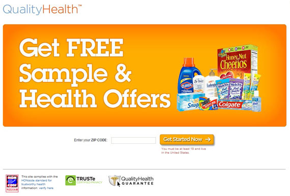
- Include a (Clickable!) Hero Shot of the product – It’s a well-known fact. People click graphics. If possible try to get a shot or even a video of your product in use. This is the one time you don’t want to use a stock photo. As an example, below is a site encouraging people to sign up for free samples. The hero shot of the products show common, everyday items that people are likely to use or have in their home right now. This kind of familiarity (and the fact that FREE is in capital letters) melts away a great deal of resistance and hesitation right from the start.
- Including Trust Seals– Guarantees and trustworthy seals from well-known companies help add a sense of security to the site.
In addition, you’ll also notice that these landing pages include very little copy. People don’t read entire web pages – they scan or skim over them and only pause on areas that grab their attention. According to a study by MarketingSherpa, people who come to landing pages will read only three main things:
- The headline
- Scan the bullet points (or benefits)
- Read the bio or P.S. at the bottom
The more you can compact your landing page into one “screen length” (in other words, without forcing the user to scroll in order to take action), the more likely you are to increase conversions. Along these same lines is the amount of information you collect. In the case of the Acai Berry landing page, they need a user’s shipping address to send the product. But in the case of the free samples site, all that’s asked of the user to start with is to enter their zip code.
Car insurance company Geico also does this with their landing pages:
Asking for a Zip Code as a first (and apparently ONLY) step immediately breaks down any apprehension or barriers in the prospect’s minds. They’ll consider that their zip code doesn’t reveal anything personally identifying about them (except the general area they live in).
As they go through the process of finding out how much they can save on their car insurance (or seeing what kind of samples they can get), they’ll release even smaller “bites” of personal information until the last step, where they finally get the free information they’ve been wanting. As you can also see on the Geico page, having the submit button reaffirm the offer (“Get a Free Quote”) rather than simply “Submit” also helps boost your conversion rate.
Try a Radical Departure from “The Norm”
While the incremental improvements you can get from A/B testing are still valuable, there will come a time where you’ve reached that local maximum. When that happens, try a radically creative change. You may find that not only does a complete overhaul of your site design dramatically increase conversions, it may substantially shift the way you seek out your target audience, and the type of customers you attract. An interesting example of this radical departure comes from 37Signals’ Basecamp homepage redesign.
The previous page was cluttered, with no clear path on what action to take. Sure, there’s a large green button, but it’s almost lost against the text, logos, and even somewhat muted against the pale green background. Along with the photos and screenshots right on the main page, there’s every invitation for the user to go somewhere else and NOT take action.
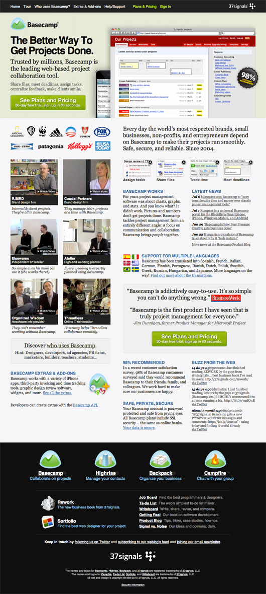
With this in mind, 37Signals decided to try something different – something downright radical from their previous design. They started with a rough layout and ended up with something much more intuitive and user friendly:
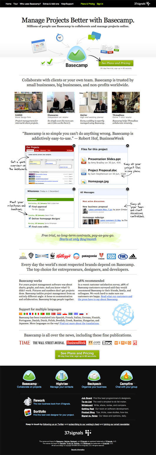
There’s still room for improvement – for example, the icons should at least have an explanation near them (or over them if you’re trying to conserve screen space). They’ve also added another call-to-action link along with pricing details.
The surprising results? A 14% increase in sending more people to the sign up page. Actual sign ups weren’t available at the time the redesign info was published, but as you’ll see when visiting the page today, they’re continuing to tweak and refine it.
Lesson Learned: Don’t Get Too Hung Up on the Small Stuff
Testing small changes can give you a minuscule boost in your conversion rate, but there will be a point at which it pretty much evens out, and your customers don’t get excited anymore. Jolt them out of their comfort zone by testing a new layout, a message directed at a different segment of your audience or another brazen change and see what happens. Above all, realize that testing for higher conversion rates shouldn’t stifle your creativity, but rather should be another tool in your optimization toolbox; used to help you measure and take action accordingly.
About the Author: Sherice Jacob creates beautiful, high-converting landing pages, in addition to designing blogs and writing compelling content. Learn more at iElectrify.

Comments (5)