
Most businesses use Microsoft Excel to input and organize various sets of information.
There are over 750 million people using Excel worldwide.
If you’re familiar with Excel and you have a good grasp on the basics, that’s great — you already have a head start.
But I’m here to take you beyond the basic functions.
You should be using Microsoft Excel to analyze and organize data from your marketing efforts.

It’s safe to say that you probably know how to input numbers, words, dollar amounts, and other figures into the rows and columns of an Excel spreadsheet.
If that’s all you’re using Excel for, you’re not utilizing the software to its full potential.
Why?
Simply put, it’s tough to analyze large data sets without the help of visual aids.
This is where you can use a pivot table to make your life easier.
Despite their reputation, pivot tables are not as completed and intimidating as you might think. You can use them to:
- Summarize
- Analyze
- Explore
- Present
These are all crucial elements in your marketing efforts.
You need to analyze big data to gauge the effectiveness of your marketing campaign.

If you’re not properly analyzing your marketing data, it’s going to cost you.
How can you tell if your efforts are successful or profitable without crunching the numbers? You can’t.
That’s where pivot tables come into play.
They’re great tools whenever you have a large quantity of figures to add up.
You can also use pivot tables to compare similar data and figures from different perspectives.
I’ll show you how to create them and how to effectively analyze your marketing data.
First, organize all your data in Excel.
Before you can make a pivot table, you need to get all your information organized in an Excel spreadsheet.
What’s the source of your data?
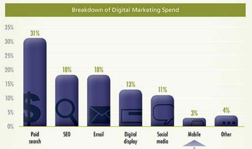
Here’s a breakdown of how companies are spending their digital marketing budgets.
You might have your data on another platform or software that’s not in Excel.
If you’ve been manually inputting the information into an Excel spreadsheet, chances are it’s already somewhat organized.
However, if your data is somewhere else, you need to get those numbers on a new spreadsheet.
There are a couple ways you can make this happen.
The first is by manually typing everything. I do not recommend this.
Sure, if you’ve been manually putting figures into an Excel sheet daily or weekly over a long period of time, it’s not the worst idea.
With that said, however, manually typing a year’s worth of data into Excel is not practical or even realistic in some instances.
Depending on how much data you have, this process could take hours, weeks, or even months. That’s definitely not an efficient use of your time.
A whopping 89 percent of employees admit to wasting time at work.
Your employees are already wasting time, so if you’re not working productively, then it’s a recipe for disaster.
Import your data
To save some time and to maximize productivity, you can import data to an Excel spreadsheet. Here’s how:
Step #1: Select the “File” menu in a new Excel spreadsheet.
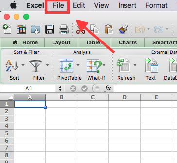
Start by opening a brand new Excel spreadsheet.
Find the “File” menu in the top left corner of your screen.
Step #2: Select “Import” from the drop down menu.
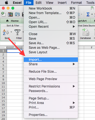
After you click “File”, you will see “Import” about halfway down the menu.
Click “Import.”
Step #3: Select your file type.
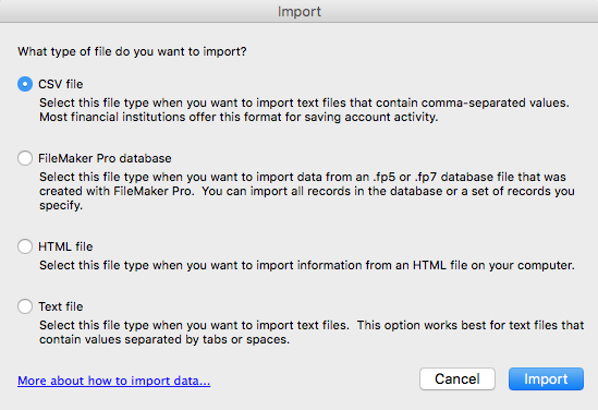
A new box will appear, prompting you to select what type of file to import.
The option you select depends completely on your data source.
Your data is probably in a CSV or HTML file format, but all of the choices are a possibility depending on the platform or software you’re using.
While Excel is extremely useful, it’s not always flawless.
It’s possible that your import process didn’t go 100-percent perfect.
Take some time to go through your information and fine tune any incorrect fields.
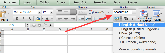
For example, columns that are supposed to be a currency, such as USD, may appear as regular numbers.
That’s an easy fix.
Just highlight the cells and select your currency under the “Numbers” section of the “Home” tab.
There could be some other minor import problems, but it’s nothing you can’t sort out quickly.
If you’re struggling, Microsoft has a troubleshooting guide to walk you through some common issues.
It’s important to get all your data organized before you attempt to create a pivot table.
For the most part, you may just need to delete some empty rows, columns, or blank cells.
Create your pivot table using the data.
Now that you’ve imported all your information into Excel, you can create a pivot table to organize and compare the data.
Right now, your spreadsheet just contains raw data.
To take things a step further, you can create a pivot table to analyze the information.
Here’s an example containing some data about a hypothetical sales team.
I’ll show you how to build a pivot table with this information.
Step #1: Select the data you want to analyze.
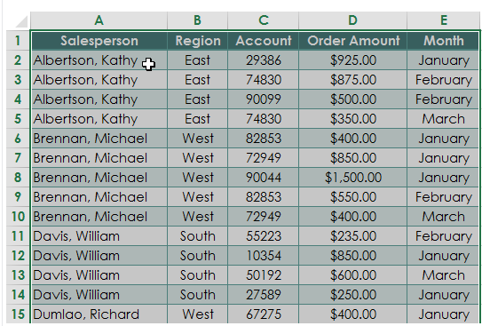
This raw data is great information, but what can you do with it? Not much.
You don’t know the total order amount for each salesperson, and you don’t know the grand total for all the orders.
If you want to analyze your marketing campaign, these are important pieces of information.
First, narrow down the data.
You don’t need to select the entire spreadsheet to create a pivot table.
For example, the screenshot above may contain additional columns for the date of each sale or the customer’s home address.
However, that’s not necessary to compare the sales team and their monthly order amounts.
Just go with the important information.
Highlight all of the cells containing the data, including the headers for each column.
Step #2: Choose “Pivot Table” from the “Data” tab.
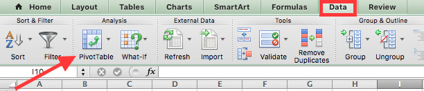
You’ll notice the “Data” tab on the far right side of the top ribbon in Excel.
From here, you can select “Pivot Table” under the “Analysis” section.
Step #3: Create the table.
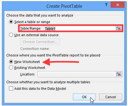
By default, your pivot table will open in a new worksheet tab.
I recommend leaving it that way.
It can get messy and tough to read if you put your pivot table on the existing worksheet with all your data.
If you need to refer to your data sheet, it’s easy to switch back and forth between tabs.
Since you’ve previously highlighted the information in the spreadsheet, the “Select a table or range” option is already marked.
Step #4: Open the new worksheet tab.
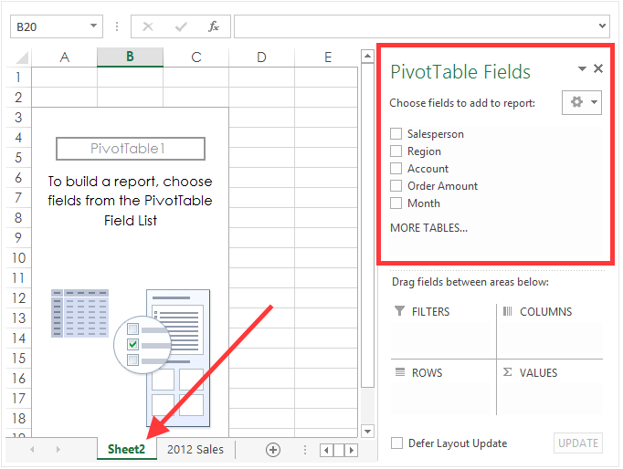
The new worksheet will automatically get labeled as “Sheet 2,” but you can rename this to anything that helps you stay organized.
Notice the top right section of the screen.
The pivot table fields section contains all the headers we highlighted back in the first step.
Remember how I said to only select the important information from your data source?
Well, now you have the option to narrow those choices down even more.
Step #5: Choose the fields.
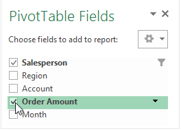
For this example, we’ll just select the “Salesperson” and “Order Amount” fields.
Step #6: Drag the fields to the desired area.
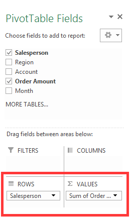
You can put a selected field into one of four areas.
- Filters
- Columns
- Rows
- Values
For this example, I put the “Salesperson” field under “Rows” and the “Sum of Order Amount” under the “Values” section.
Step #7: Change the value field.
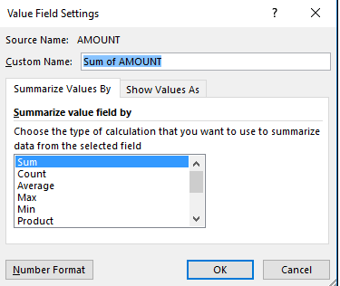
If you want to summarize the value field by something other than the sum, you have some options.
Just click the value field settings, and you can adjust the calculation.
For this example, the only other relevant option would probably be an average.
However, I’ll leave it as the sum for now.
Step #8: View your new pivot table.
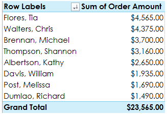
Take a minute to assess what we’ve accomplished here.
Remember how our data looked back in the first step? If not, take a second and scroll back up.
It’s much easier to analyze the information now.
Each salesperson is only listed once, and their total sales are calculated for you.
You can even see the grand total from your entire sales force.
We turned the raw data from the initial spreadsheet into an organized pivot table.
Step #9: Pivot the information.
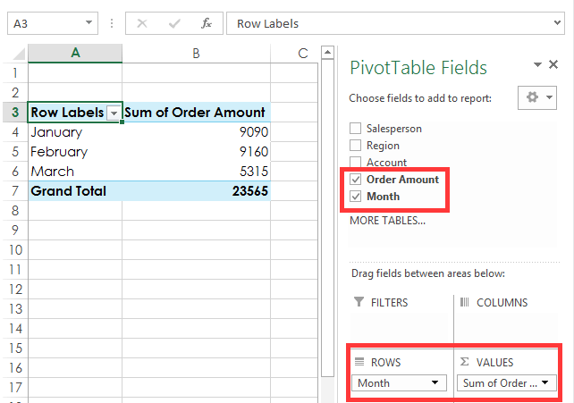
Let’s say you want to see the total order amounts each month.
You don’t need to start from scratch.
This information is easily attainable with a few simple clicks.
Just uncheck the salesperson box and click on the month field instead.
Make sure the “Month” field appears in the “Rows” section on the bottom right of your screen.
That’s it.
The data is calculated for you in seconds.
Continue to mix and match which boxes you want checked off depending on the information you’re trying to analyze.
You can also take advantage of other analysis tools while you’re evaluating the data.
Analyze the results.
OK, so now that you’re an expert in creating pivot tables, it’s time to apply that information to your business.
What should you be looking for?
This graphic from Customer Engagement gives you some starting points to consider when analyzing data-driven marketing.

All your data should help you scale and measure the results of your marketing campaign.
Is it effective, or is it burning a hole in your company’s checking account?
All your data should circle back to the user experience.
Where are your customers hearing about you?
What’s driving sales?
Which marketing efforts are translating to high-conversion rates?
Try to use the results from your data to maximize your conversion rate optimization.
One of the best ways to analyze your marketing data is with visual aids.
Take a look at this graphic from the University of Alabama School of Medicine. They conducted a study about the benefits of visual aids.

If you’re presenting the information in your pivot table to your sales force, marketing team, or accounting department, you can use visuals to convey your message.
Sure, the pivot table is great. We’ve already established that.
But you can take the information from your table one step further if you’re giving a presentation.
If you’re a content marketer, you should familiarize yourself with these statistics before a meeting or presentation.
Create a pivot chart
To keep things simple, I’ll continue with the same hypothetical data from the example that we used earlier.
Step #1: Click any cell in your pivot table.
It doesn’t matter if it’s a word, number, total, or header.
Just make sure a cell within the table is highlighted.
Step #2: Go to the “Charts” tab on the top ribbon.
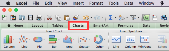
Click the “Charts” tab to display the different chart options.
Step #3: Choose a chart from the list.
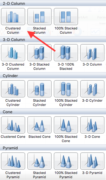
I’m selecting a clustered column for this data set. It’s a good visual representation of the information over three months.
When you’re doing this, feel free to choose any option.
With that in mind, it’s best to keep it simple, especially if you’re giving a presentation.
Step #4: Analyze the chart.
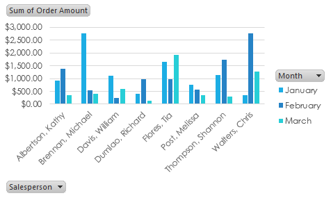
It’s a great visual aid to measure performance and compare them to your marketing strategy.
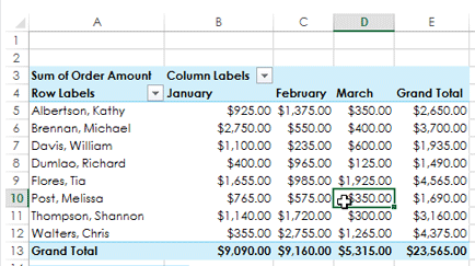
Let’s dive a little deeper into this information.
Michael Brennan had an outstanding month of January.
In fact, it was the highest-performing month out of every sales team member in the data set.
What caused him to drop off so drastically over the next two months?
It could be based on a number of factors, but let’s play out a couple of reasonable scenarios.
It could be a marketing issue. Compare this information to what changed in his region over these months.
Did you scale back your marketing efforts? Did you change your strategy?
You need to create an effective marketing strategy and stick to the plan.
If you changed something on your e-commerce website, it could impact your data as well.
Here’s a video where I explain how to optimize your e-commerce product pages.
Maybe Michael lost motivation, and his numbers dropped as a result.
Take a look at this graphic from the Hay Group.
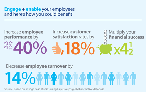
Case studies show that motivated employees increase their performance by 40 percent.
This results in a higher customer satisfaction rate and lower employee turnover, which ultimately increases your bottom line.
If Michael already met his maximum commission quota for the quarter, he won’t be as motivated to continue selling your product.
To fix this problem, you can give your employees uncapped commissions or find other ways to keep your staff motivated.
You need to motivate your personnel to keep your team tightly aligned.
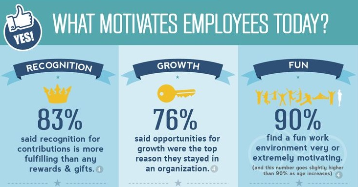
Outside of financial motivation, here are the top reasons employees stay motivated, according to KMI Learning.
What can we learn from this?
Sure, the numbers we used to create the pivot table and pivot chart were hypothetical.
But they still speak volumes to scenarios you may encounter while analyzing your own data.
It’s not always a lack of advertising or error in the marketing department that impacts your sales numbers.
There are other external factors to take into consideration while you examine these figures.
Here’s something else to consider about your marketing data.
You need to have clear goals set so you know what to measure and analyze.
Write down your marketing goals.
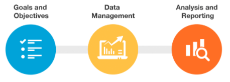
These are the steps you need to take to effectively analyze your marketing data.
- Set your goals and objects.
- Manage your data (using a pivot table).
- Analyze and report (with a pivot chart).
When you break it down into these three simple steps, it’s really not that difficult.
Conclusion
Data is an essential component of your marketing campaign.
As we learned earlier, 87 percent of marketers believe that their company’s data is the most underutilized asset.
How can you effectively analyze your marketing data?
First, you need to get all your information organized in Microsoft Excel.
Follow my simple, three-step guide that was outlined earlier to import your information.
From here, you can easily create a pivot table.
The pivot table will turn your raw data into something you can analyze to evaluate your marketing campaign.
Then take this evaluation one step further.
You can use your pivot table to build a pivot chart. It’s a simple process that only takes a few extra clicks.
Pivot charts are great visual representations of your marketing data.
They work especially well if you’re making a presentation or having a meeting with your employees.
Pivot charts aren’t as complicated as they sound.
Now that you’re familiar with how to make them and use them as a marketing tool, you can get started on your first one right away.
You’ll have it done in minutes.
What data set will you import to create your first pivot table that analyzes your marketing efforts?
Comments (2)