
You probably know that mobile use is on the rise. But do you know how big it really is?
In 2016, there were nearly 150 billion mobile app downloads worldwide.
And if we stay on the trajectory we’re on, then the statistic gurus predict that there will be over 350 billion mobile app downloads in 2021.
And that number will only continue to rise. Though official numbers are lacking, BrightEdge recently reported that 57% of their web traffic came from mobile.
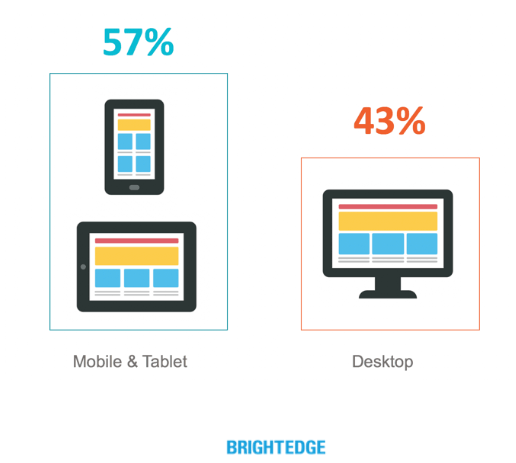
So over half of all website visits came from mobile devices rather than desktop computers.
With a trend this big, you can expect some big impacts. And one of the most significant areas that we’ve already begun to see the effects on is SEO.
Google announced they were underway with their long-foretold mobile-first search index changes.
And web developers, publishers, and SEOs around the globe simultaneously wondered, “Why does this matter?”
According to the Google Webmasters Blog:
Although our search index will continue to be a single index of websites and apps, our algorithms will eventually primarily use the mobile version of a site’s content to rank pages from that site, to understand structured data, and to show snippets from those pages in our results.
This will bring about some big changes. And these changes are a double-edged sword.
If you aren’t prepared, the mobile-first index could sink your SEO strategy before you can say “page two.”
But it also presents an opportunity for you to get ahead while others are still figuring out how to respond to these updates.
That’s why you’ve got this guide.
If you follow the steps here, you’ll be able to leverage Google’s mobile-first index to help you not merely survive these changes but thrive with them.
But first, you need to understand what mobile-first indexing is.
What is mobile-first indexing?
Generally speaking, when you type a query into Google and your results appear, Google largely determines the results through a desktop-oriented method of ranking.
And this used to make sense. But desktop and mobile have different indexing requirements.
And since most users conducted their searches on desktops, Google based their method of ranking on desktop indexing requirements.
But as you’ve seen, times are changing. Desktop will indeed be around for a long time, but Google has to respond to the reality of increasing mobile traffic.
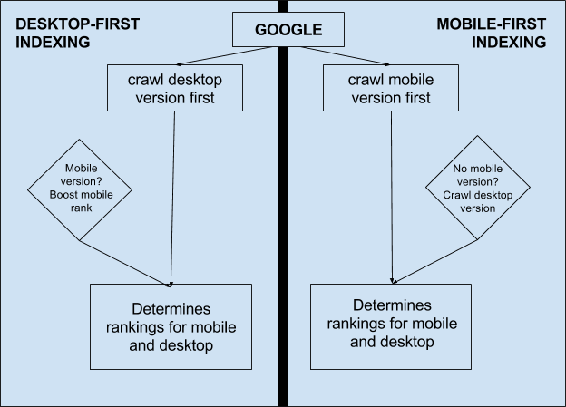
So once Google implements these changes, they’re going to take the mobile version of your site and use it as the primary way to rank you.
And that means Google will look at your mobile site first to determine your ranking.
There is only one index. There’s not a separate index for desktop and one for mobile.
So even though Google’s mobile-first index will evaluate your mobile site first, that doesn’t mean it will ignore your desktop site completely.
This is important because users want to find the most accurate and relevant search results for their queries regardless of what device they’re on. And Google wants to help them do that.
Yes, the number of mobile users globally surpassed the number of desktop users a few years ago.
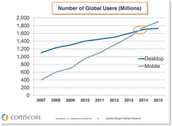
But the mobile trend doesn’t mean that the sun is about to set on all desktop use.
We aren’t seeing a “mobile-only” shift. Mobile use is simply increasing as it has been for years.
And that increase in mobile use is a good opportunity to try and capture new leads.
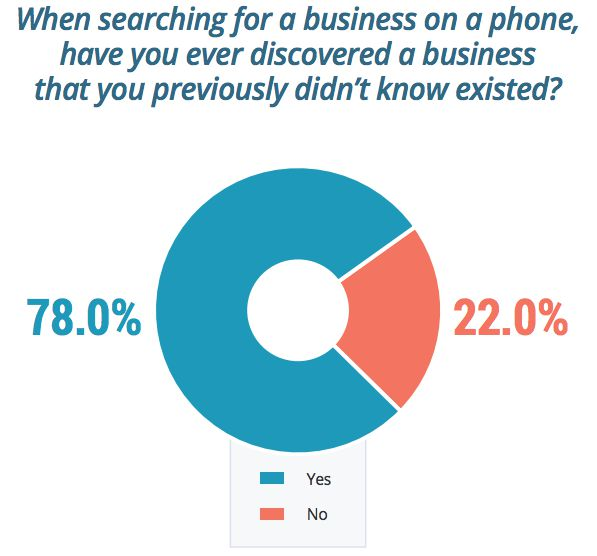
As much as 78% of people say that they have discovered a business that they didn’t previously know about when searching on their phone.
Google isn’t placing all their eggs in the mobile-search basket and abandoning desktop searchers, though.
So don’t use this update as an excuse to ignore your desktop site to get all those leads. It will still help your SEO in many cases.
But hopefully, this puts this change in perspective. Google isn’t trying to do anything radical, and they aren’t trying to hurt your rankings.
If your site is truly relevant to a given search, then Google wants to rank you near the top regardless of the device that the searcher is using.
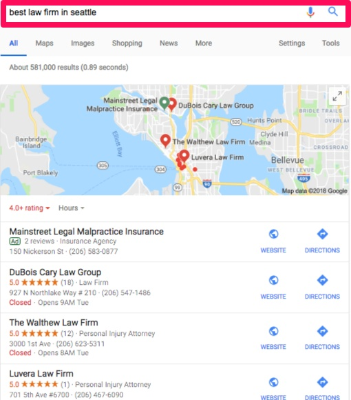
If someone types in “best law firm in Seattle,” and you’re a top-notch law firm in Seattle, then Google wants you to show up for the search whether the person types it in on their phone or their desktop computer.
But you have to help Google out a little.
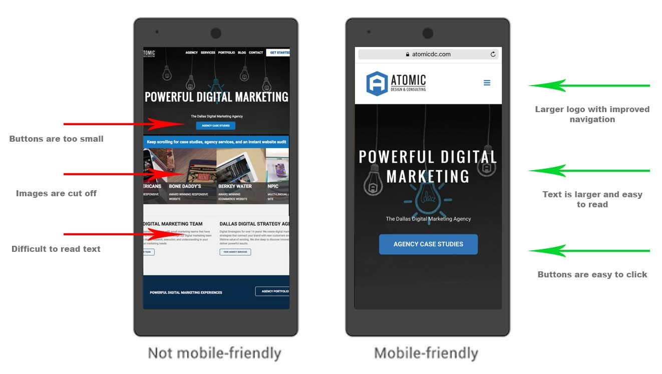
If the searcher is using a mobile device, but the buttons on your mobile site are too small for the fingers of a 5-year-old to accurately navigate with, then you’ll frustrate your visitors.
And Google doesn’t want to recommend sites that will frustrate their searchers.
Just keep a balanced perspective. This update shouldn’t completely change your SEO strategy.
But it does put pressure on you to optimize your mobile site before Google changes their indexing.
One of your competitors could outrank you if they have a mobile-friendly version of their site and you don’t.
So if you want to keep your ranking, you need to be prepared before Google implements their mobile-first indexing.
Get ready now, before you lose your precious spot on page one of the SERP. As I say that, I know what you’re wondering:
When will this change take place?
The answer is rather frustrating. Google hasn’t given a specific date.
At the SMX West conference in March 2017, Google’s Gary Illyes said Google would release mobile-first when their results are “quality-neutral.”
That means that they’re being really careful to make sure that search results stay as close to status-quo as possible or even be a little better.
John Mueller said (during a Google Hangout):
It’s possible that we’ll say well this batch of sites works perfectly fine on mobile-first indexing so we’ll just switch that over and wait with the next batch until we’re certain that they’ve been able to solve these problems. But that’s something where we’ll have more information kind of as time goes by.
Though that gives us a lot of information about how Google is going about this change, it tells us almost nothing about the timing of it. Thanks, Google.
So there’s only one way to make sure that Google’s mobile-first indexing doesn’t hurt you:
Start preparing now.
Test your mobile site to get started
Leveraging Google’s mobile-first indexing to your advantage is all about giving those who visit your mobile site the best experience possible.
So to start that process, you need to determine how mobile-friendly your site already is. Thankfully, this is easy to do.
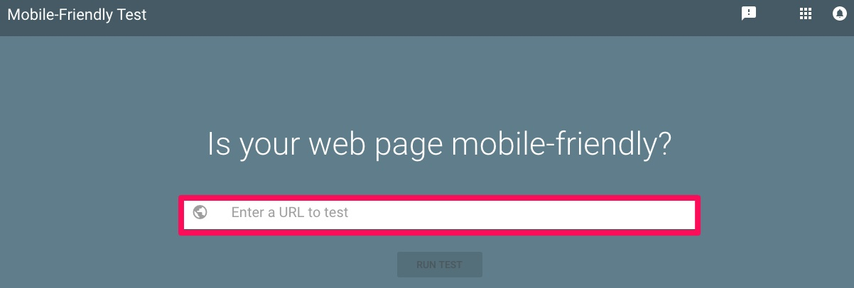
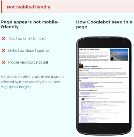
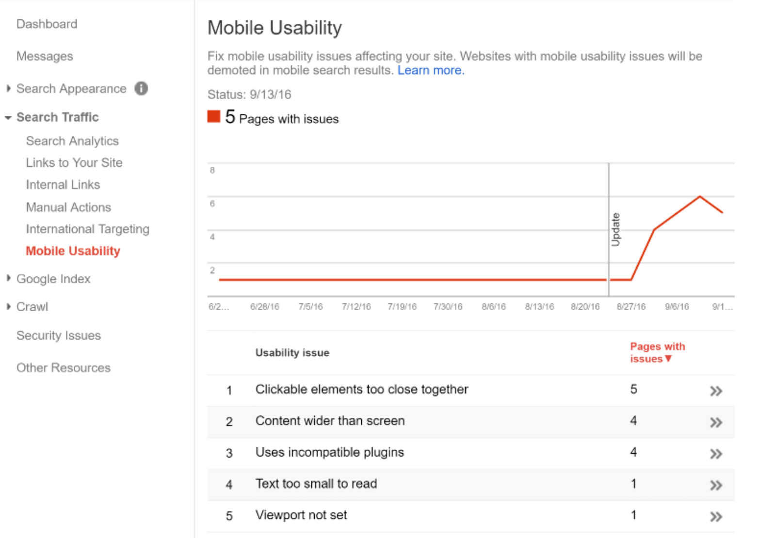
You can use Google’s Mobile-Friendly Test to gauge the quality of your mobile site.
Just enter your URL to get started with the mobile-friendly test.
Once you enter your URL and click “Run Test,” you’ll be taken to a page that tells you whether or not your site is mobile-friendly.
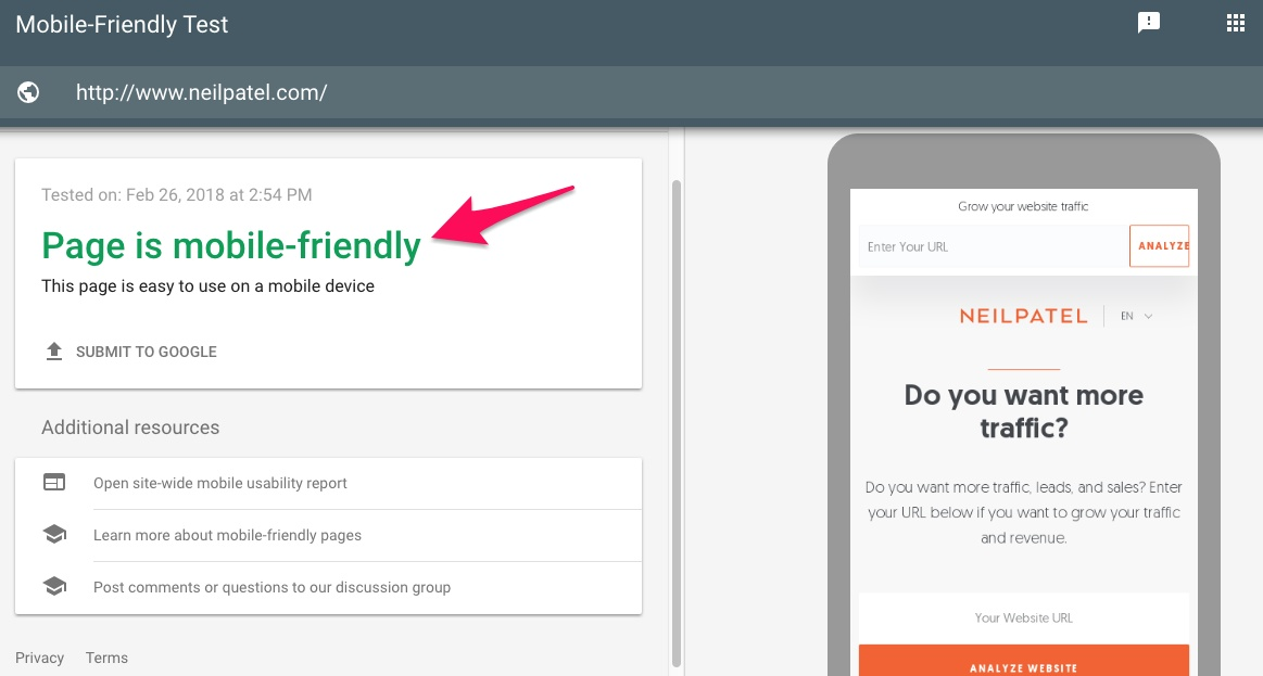
If your page is found to be not mobile-friendly, Google will provide actionable tips on how you can improve it.
You might think that this issue doesn’t apply to you if your site’s mobile and desktop versions are the same.
Are they really, though?
If your content is perfectly-optimized for mobile, you shouldn’t have anything to worry about in terms of search result performance.
What you should care about most right now is user experience.
Make it seamless. Make it as fast as possible. Do your due dynamic diligence.
Here’s a super basic checklist before moving forward.
1. Check all of your dynamic elements.
Can you easily see the content of your desktop site on your mobile device?
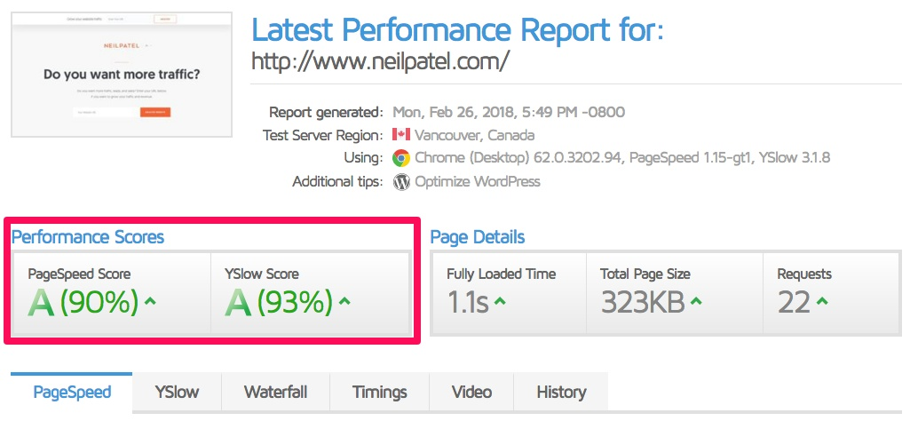
2. Check load times and page speeds.
Are your pages loading in 3 seconds or less? If not, fix it. Check out GTmetrix to see what’s slowing you down.
Much like Google’s Mobile-Friendly Test, enter your URL to get started.

Then, the site will give you a ranking for load times so you can find out where you stand.
3. Check whether or not your site is mobile-friendly or mobile-responsive (there is a difference).
4. Ask if your mobile and desktop versions are truly the same.
Mobile versions used to be watered-down versions of their desktop sites. And the likelihood of this is much higher if you have a different URL (m.yoursitehere.com).
If this sounds familiar to you, then you’ll want to do your due dynamic diligence.
The last thing you want is a bad mobile user experience. It could already be hurting you, but it could kill you now.
5. If you have any hover elements, remove them.
There are no controls for hover elements in mobile. Yet.
So if you have any, just remove them.
6. Test.
Test, test, and test again on real devices.
Go through every page. Time how long it takes to load, etc.
If you want a free guide for content wireframing, check this out.
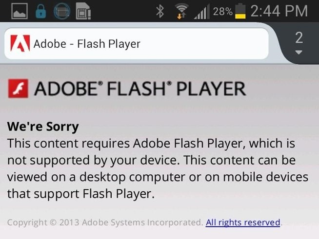
7. Say no to Flash.
Just stick to Java or HTML5.
Some devices aren’t compatible with Flash. And that will mean your visitors will be greeted by this message:
8. No pop-ups.
Pop-ups can be annoying on mobile.
A modal pop-up for new viewers is fine to collect emails for your list. But that really should be it.
You could actually scratch pop-ups altogether by using floating bars or a welcome mat that looks something like this:

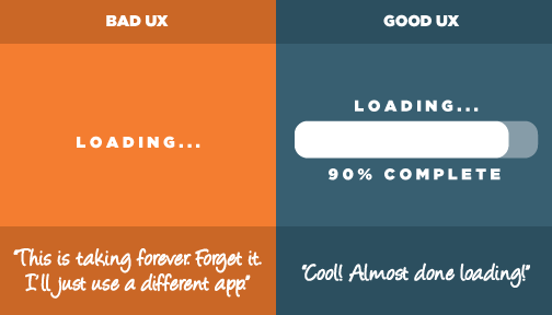
9. Avoid really big graphics for mobile.
Large graphics will slow you down, and landscape pictures don’t really translate well to smaller screens anyways.
First, you’re going to want to read through Google’s Webmaster Blog Post to get it straight from the horse’s mouth. Do a quick scan to see if you even need to do anything.
Your focus moving forward is to consider proper optimization and best practices.
The amount of work you’ll need to do really depends on how your site has handled mobile traffic in the past.
Again, if your site is responsive, very minimal changes will be required. If you need to make any at all.
The following changes may need to be made if your site exists on an “m” subdomain or if it uses adaptive/dynamic serving to send content.
1. Check your content. And check it again.
Content is why we make websites in the first place. Or at least, one of the reasons.
But since mobile has a lot of limitations when it comes to “real estate,” you have to prioritize which elements are absolute musts for you to carry over for the user experience.
But I’m not just talking the actual copy. You’ll need to review all aspects of videos, images, and text.
The foundation for user experience starts with the question: “What do I absolutely need to show visitors?”
And having a responsive website isn’t the only factor in having a really great mobile experience. But it’s part of it.
Here are the basic questions for your content check. It might be helpful to set up a spreadsheet to track your answers.
- Are your texts and images flexible?
- Do you have a default zoom capability?
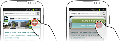
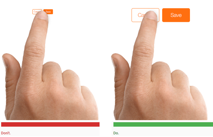
- Are your “tap targets” big enough? Use em or rem units that best suit the design. The default for most browsers is 16px.
- Are phone numbers on your site tappable?

- Does your site have “finger-friendly” design? 44 pixels of whitespace around elements is ideal.
- Are mobile switchboard tags implemented? If so, you’re good.
- If you’re using web fonts, are they loaded correctly?
- Have you activated browser caching? This is primarily for user convenience.
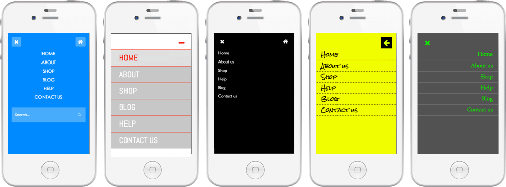
- Do you have a specific mobile menu designed?
- Are your fonts/styles adaptable?
- Is your site grid fluid? (Proportionate vs. fixed)
- Are you using CSS media queries to define breakpoints?
- Are your website’s images resized for speed?
- Are your navigation features visible?
- Are you using a website builder? It better be mobile-optimized.
- Can your site builder detect which device your viewers are using and automatically adjust?
- Did you add your mobile site to Google Search Console?
- Have you checked your speed?
Now, a special note about content.
Remember how annoyed we were when Google said sites would be penalized for having content behind tabs or in accordions?
Not anymore.
Since real estate is such a prized commodity for mobile, having tabs and accordions is almost a necessity now. Mueller confirms this in that same Google Hangout:
“So the mobile-first indexing will index the mobile version of the page. And on the mobile version of the page, it can be that you have these kinds of tabs and folders and things like that, which we will still treat as normal content on the page even. Even if it is hidden on the initial view.”
2. Decrease HTTP requests.
Reducing the number of images or removing them completely is one simple way to decrease your load time.
3. Metadata & social metadata.
You’ll be dealing with less space on mobile, your meta titles and descriptions need to be shorter than they are on desktop so don’t worry about them being the exact same.
As for social metadata, a really basic review of the following is a good start.
- Facebook: Articles, photos, audio, video, and more.
- Twitter Cards: Summaries, images, galleries, apps, video, audio, and products.
- Pinterest Rich Pins: Products, recipes, movies, and articles.
- Google+: Articles, blog, book, event, local business, organization, person, product, and reviews.
And if you want to get into the meat and potatoes:
Although this data doesn’t change your content’s appearance in Google+, it potentially adds links to your Google+ pages in search results.
- Twitter Summary card with a large image.

- Expanded Open Graph article data.
Special note: if you want to choose only one type of metadata to include, then pick Open Graph because all the platforms use it.
4. Optimize your backend.
This includes improving server response times, leveraging browser caching, avoiding unnecessary redirects and enabling compression.
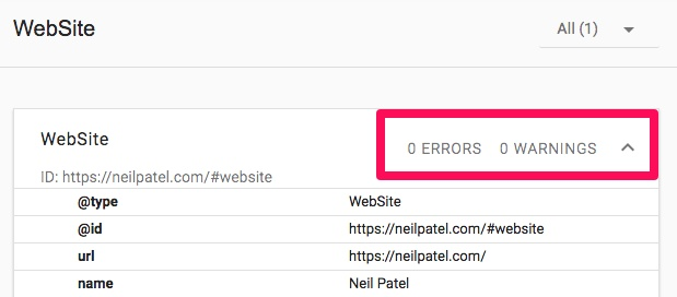
5. Include structured data.
Detailed and relevant structured data can help Google index your site.
Check to see that your desktop and mobile sites serve structured markup. You can do so with Google’s Structured Data Testing Tool.
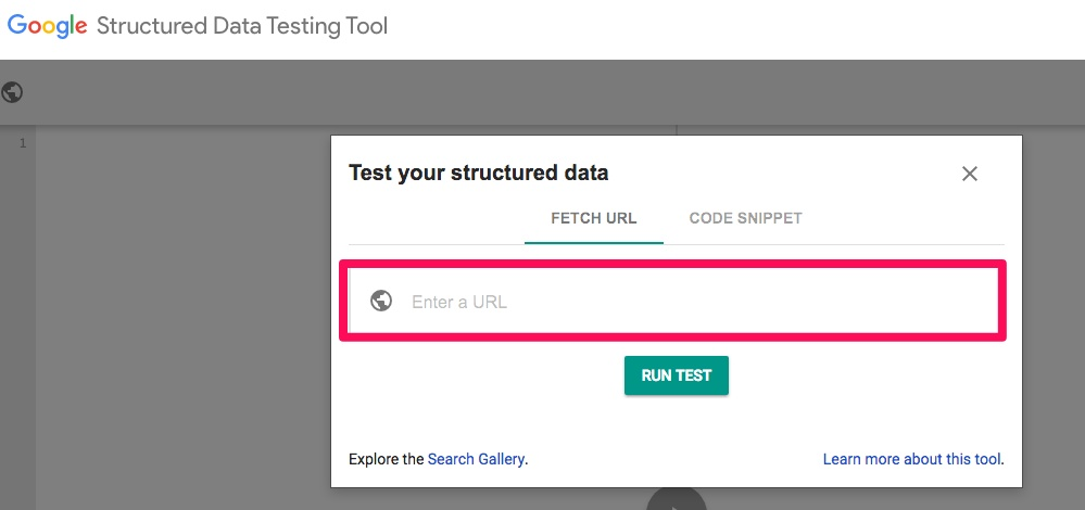
Enter your URL to find any errors or warnings.
But don’t bother with pointless data because it can confuse Google’s algorithm. If you’re not sure, check their guidelines on structured markup.
6. If you have a carousel, make sure it’s designed right.
I’d suggest not using any at all for mobile, though.
They’re really difficult to design properly, and they aren’t ideal for user experience due to the real estate.
Users might not even notice there is one and scroll right past what you were originally intending to highlight.
If you have used one, then design the very first slide to make it clear that there are other slides so you draw attention to their existence.
You’re also going to want to test and optimize these images so they don’t slow your site down (again, it all comes down to speed).
7. Check XML & media sitemaps.
Make sure sitemaps are connected to the mobile version of your site, especially trust signals like links to a privacy policy.
8. AMP. Does it matter?
The short answer: yes, sort of, and no.
Yes, sort of, if you have a WordPress site and are using the AMP plugin or another mobile plugin.

Otherwise, no.
AMP is a totally separate format that gets your site cached by Google to increase page load speed but has little to do with your search rankings.
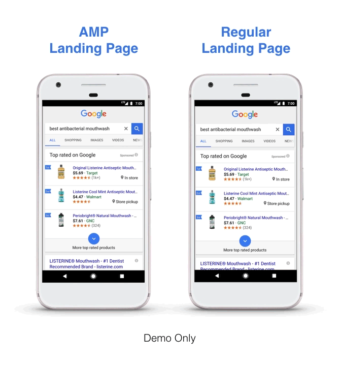
At best, the relevancy of AMP lays with user experience (which will only affect you if your mobile and desktop are the same).
Will Google ever again use the desktop version first to determine rankings?
Probably, but only if there’s no mobile version at all.
That said, don’t scramble to get one into place. The worst thing you could do is have a half-built mobile site for when the new indexing makes its way to you.
Google officially said that it would be better to have no mobile site at this point than to have a broken one.
None of this is necessarily easy, especially if you’ve had a different URL for the desktop version of your site.
But if that is your situation, you’re now going to have to decide what the absolute essentials are for your mobile version.
You’ve got less space and fewer resources, and that can be a design nightmare.
Conclusion
Google’s mobile-first index is a massive change in how sites will be ranked moving forward.
The next generation of the web is as mobile as ever, and you don’t want to leave user experience out to burn in the revolutionary fires.
Remember that a mobile-friendly site doesn’t mean it is made exactly for a mobile device – it just means the user experience will suck less on a mobile device.
This shift is all about putting the user experience first. Focus on the word “optimization” versus “friendly,” and you’ll be good to go.
Start out by testing your mobile site to see exactly how well Google likes it. Then, make changes according to the results of the test.
Keep in mind that Google will probably only ever use the desktop version to determine rankings if there’s no mobile version of your site at all. And if there isn’t one, you need one ASAP.
What steps do you need to take to get ready for Google’s mobile-first index?
Comments (46)