Many marketing professionals who have a well optimized website that they have been tweaking regularly are scared of switching to a completely new website design. While they understand the value of a cleaner, more professional design, they’re not sure if they want to sacrifice the hard cash being generated by the current one.
This often leads to queries like: “How can I create an A/B test where one variation is a different button color on the old website and the other variation is our new website?”
This post is a step by step guide to solving that conundrum. I’ll show you how to ensure that your new design is a high converter even before it is launched, and how to use basic, cost effective research to understand what your current website is doing right.
Start with understanding your old website
The testing process should begin the day you decide to create a new website, so that you can use the insights generated from studying your current website while you’re making the new one. And one of the best ways to gather the required insight is by usability testing.
Usability testing (user testing) is a process to evaluate a product by testing it on real users. What you do is gather about 10 users for each of your customer segments and ask them to achieve certain goals on your website. While they are working through the tasks, you record their session and ask them to vocalize their thoughts.
Here’s how to set up a usability test:
1. Know your user and cut cleanly
Always start by thoroughly understanding your different users and segmenting them so that there is no overlap. Do remember that if the test participants are not completely representative of your visitor segments, you’re essentially collecting invalid data. In a worst case scenario, you’ll think you’re collecting good data and insights when it’s actually downright misleading.
2. Cost, Time, and Significant Sample Sizes
Collect about 10 to 15 participants that are representative of each segment. Many practitioners say that 5 participants from each segment are all you need, while some data analysts debunk that as bad testing methodology (not enough, they claim). However, the cost of significant sample size and the time required may be prohibitive for the average small business. Therefore, I’ve used the research presented here to arrive at “10 to 15 participants.”
3. An environment without any impressing
Set up the test environment so that the participant is not influenced in any way. Especially, please do not make the rookie mistake of standing over their heads. Studies show that in such cases, test participants attempt to “impress” by trying to complete tasks either too quickly or in ways they normally wouldn’t.
It is best if the participant is in their usual environment (home/office). This increases the probability that they won’t modify their behavior and will use your website as usual.
4. The wise old man said “Ask the right questions”
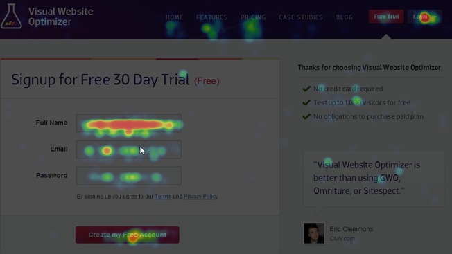
The key to asking the right questions is to not ask participants to complete specific tasks, but to solve problems they’re facing. For example, when testing Visual Website Optimizer, we wouldn’t say “Sign up for a trial.” Rather, the instruction would be “Start a test to optimize the headline on a client’s homepage” (prior permission obtained from the client, of course).
As you’ll see, the second instruction will involve a number of steps that will mean heavy usage of the tool. For us, this means that there’s much more to observe and learn from. The killer will be when, instead of diving in, she pauses and asks “But won’t that have negative SEO implications?” It’s a single question that smashes many of our assumptions and gives us far more insight into what goes on in the customer’s mind.
What to test?
Start out by clearly identifying the goals you want your website visitors to accomplish. These could be:
- Signing up for a free trial
- Signing up for a paid account
- Creating an account
- Making a purchase
- Signing up for a newsletter
- Completing a lead generation form
- Downloading a product
Next, think of customer problems that are solved by achieving one or more of these goals. Finally, ask test participants to solve the problems. Once you’ve got your problem sets down, you should look to generate clear quantitative data and qualitative insights from your test. Some of the usual ones are:
Quantitative
- Number of clicks to solve the problem
- Time taken to solve the problem
- Number of page loads to solve the problem
- Errors while attempting to solve the problem
- Number of goals completed while solving the problem
- Distractions that make participants leave the conversion funnel
Qualitative
- What catches the user’s attention in the first 5/10/15 seconds after the landing page has loaded
- How quickly the headline is able to communicate the business’s primary offering
- How the user searches for information
- How convinced the user is with and without trust signs/badges
- Questions that the user generates while attempting to solve the problem
- How pleasant the user finds the website
Based on these and the fact that the test participants are vocalizing their thoughts, you’ll understand a lot about what on your current website is working and what isn’t.
Important:
- Pay special attention to the words that test participants use to describe their experiences. These are the keywords you might want to try when A/B testing website copy.
- Keep a close look out for moments when the participant is confused, irritated, or spending too much time looking for a specific bit of information.
Create your new website
The insights generated from your first usability test will give you an excellent guide on which issues to address and which ones to replicate in your new website. The pain points can be marked for improvement or as inputs for an A/B test. The parts that are working for the user should be replicated or benchmarked against (for example, number of steps it takes to complete a goal).
Usability test the new website design
Get some proxy customers on your new design and understand exactly what’s happening. What are the roadblocks, what are the irritations, and where are they getting confused? After this, you’ll be left with a good list of elements for your A/B tests. That happens because some things just can’t be usability tested. No visitor will be able to tell you that she’s more likely to submit a form if the button is colored green instead of blue. Such elements are prime candidates for an A/B test.
Launch

By now, you should have no problem with launching your new design. You’ve ironed out whatever kinks were reported by all the testing and will almost certainly have a list of elements (button colors/placement, headline copy, trust badges, placement of links, etc.) that you want to A/B test. This is the time to go ahead and launch your new website.
Initially, regular visitors might react negatively or positively (negatively because you’ve changed their usual interaction flow or positively because they might find the change refreshing). Don’t panic or celebrate just yet. Wait for the initial reactions to settle down. Then, once visitors have learned their way across the changed UI (user interface), measure the difference in key conversion rates.
Start A/B testing
This is when you get out that list of elements you want to A/B test and go at them one by one. Depending on your traffic, it might take you a few weeks or months to go through the entire list; at the end of which, you should have a very high converting website.
The tools you’ll need
The market for usability testing tools abounds with both free and paid options.
Important do’s and don’ts
Some basic principles that need to be reiterated:
- Don’t ask the test participants to directly complete a goal. Instead, ask them to solve a problem your real users might face that involves completing the goal(s). For example, instead of the goal being “Sign up for the newsletter,” the goal should be “See how you can regularly keep up with all the interesting tips and tricks this website releases.” It’s quite likely that the user may start looking for your RSS feed button or head directly to your Twitter/Facebook profile.
- This one is fairly simple, but it still needs to be emphasized: let the test participant do all the talking.
- Ensure that participants understand and feel that it is the website being tested and not them. They should feel no pressure to display their prowess and/or their ability to get things done.
- Make sure the results and insights generated are clearly communicated to the Marketing, Market Research – Insights, and IT departments.
At the end of this comprehensive process, you should be left with a new website that’s a high converter, achieves your business goals, and can be proudly shown off to your bosses. It’s a newer, better design, and it converts well, too. All you need to do now is further tweak it to make it sing!
Useful links
- Usability 101: Introduction to Usability – useit.com
- Seven Common Usability Testing Mistakes – uie.com
- Usability Testing Demystified – alistapart.com
- Usability testing hints, tips and guidelines – uxforthemasses.com
- The Ultimate Guide to A/B Testing – smashingmagazine.com
- 234 Tips and Tricks for Recruiting Users as Participants in Usability Studies – nngroup.com
Image Credit:
- Bargain Hunting Mamas: Get Satisfaction
- Dilbert Comic Strip: Dilbert.com
- Website Success Benchmark: AFX Design
- Rocket Launch: [email protected]
About the Author: Siddharth Deswal works at Visual Website Optimizer, the world’s easiest A/B testing software. He’s been involved with web development for about eight years and actively looks to help online businesses discover the value of Conversion Rate Optimization. He tweets about A/B testing, landing pages, and effective marketing tips on @wingify
Comments (22)