What’s a good conversion rate?
Why do some landing pages work when others fail?
Those are tough questions to answer.
The reason is because there’s no single, correct answer for everyone.
It depends on a lot of different factors.
Anyone can build a landing page.
But how can you be sure it will actually convert?
The trick is to start by following the tactics that have been proven to work.
You can’t afford to blindly follow advice.
And you definitely don’t want to pay for traffic only to watch it all bounce without making a single sale.
I’m going to share with you my 7 favorite tactics to create landing pages that convert in this post.
They’re all important to one degree or another. But I’ve saved the best for last, so be sure to read until the end.
Here are the essential components to a landing page that out-converts the competition.
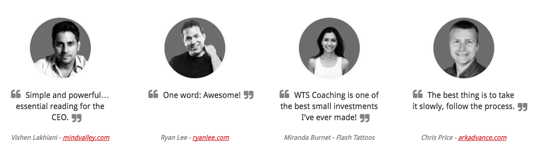
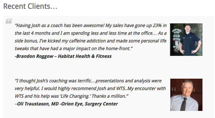
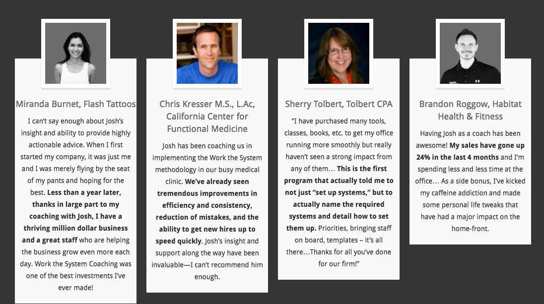
1. Use testimonials
You shouldn’t sell your products or services.
Your customers should be doing the selling for you.
92% of people read an online review before buying. 88% of those people trust peer reviews more than brand-sponsored messages.
Every company knows that testimonials are important. But many of them make the same exact mistake.
They lock them all up on a dedicated Testimonial page of their site that nobody visits.
People don’t go looking for testimonials. Instead, they want to see them when making a critical decision.
That means testimonials should be everywhere.
They should be one of the first things people see on your homepage.
They should be on your About or Team page.
And of course, they should be front-and-center on your landing pages, too.
WikiJob increased conversions 34% by simply adding testimonials to a landing page. That was the only change they made!
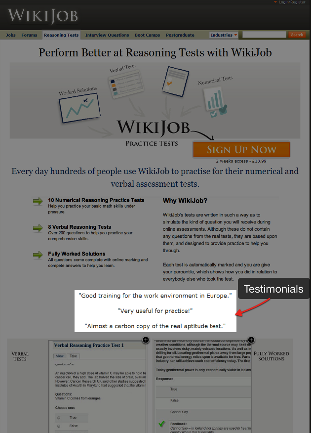
To be honest, there’s nothing special about the testimonials in the last example, either. They just used a few simple lines of text.
Some companies will take this to another level by transforming their entire landing page into a testimonial. They allow a trusted, credible third party to do all the selling for them.
Check out this perfect example from Fiverr.
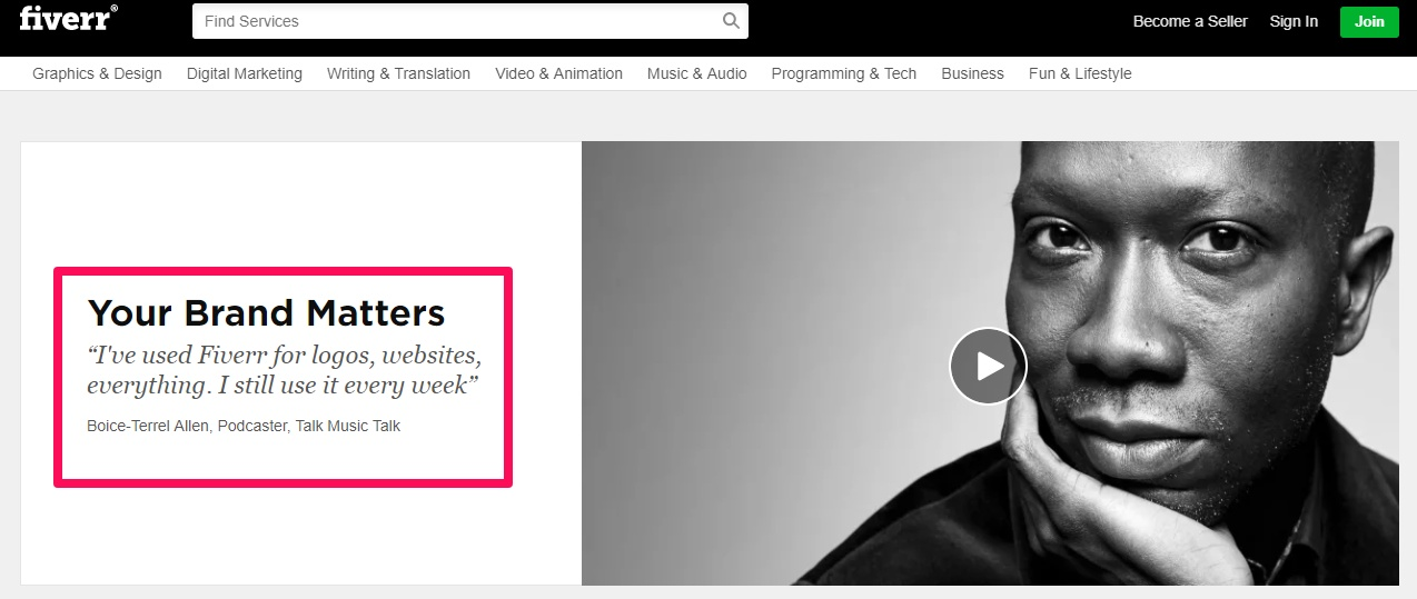
Fiverr’s example also uses a video. So each new visitor can hear about Boice-Terrel Allen’s experience in his own words.
Here’s another example from Unbounce that incorporates social proof.
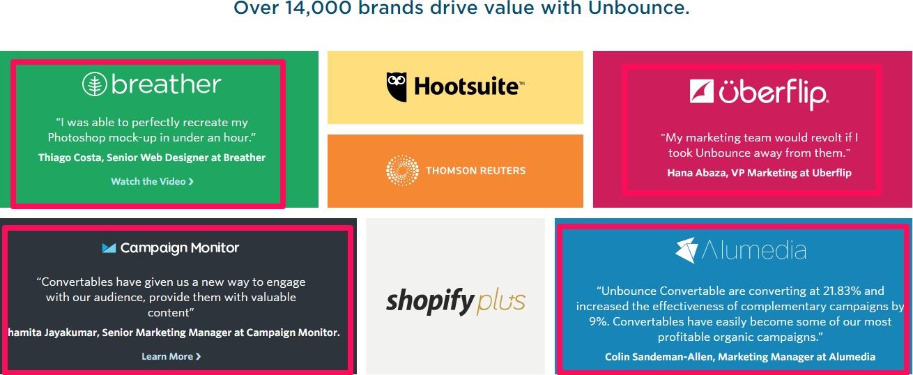
The logos on that example are all big-name clients. So just seeing the logos is already impressive to a certain degree.
But then you emotionally buy in when you see “over 14,000 brands.”
You might be skeptical that their tool can help you like they helped Hootsuite, for example.
The circumstances are completely different. You don’t have the same size, scale, or resources.
It’s hard to think you’ll turn out the same.
However, a little social proof showing that they’ve also worked with 14,000 other companies can help calm your fears long enough to give them a chance.
2. Use high-quality images
People are visual creatures.
The design of a website is what drives our first impression 94% of the time.
Why?
Because it only takes us fractions of a second to take it all in. We subconsciously decide whether we want to stick around or not in the blink of an eye.
Using high-quality images on your landing pages is one of the easiest ways to keep people stuck like glue.
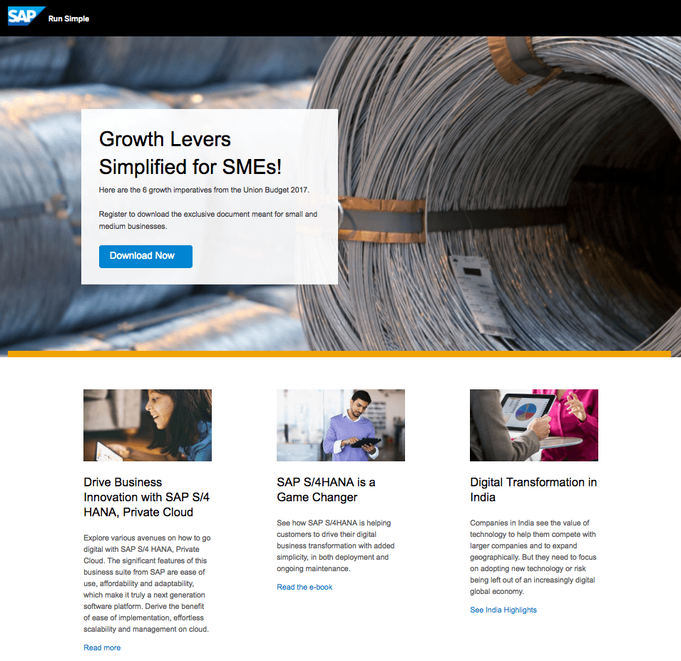
This example from SAP features an excellent background image at the top.
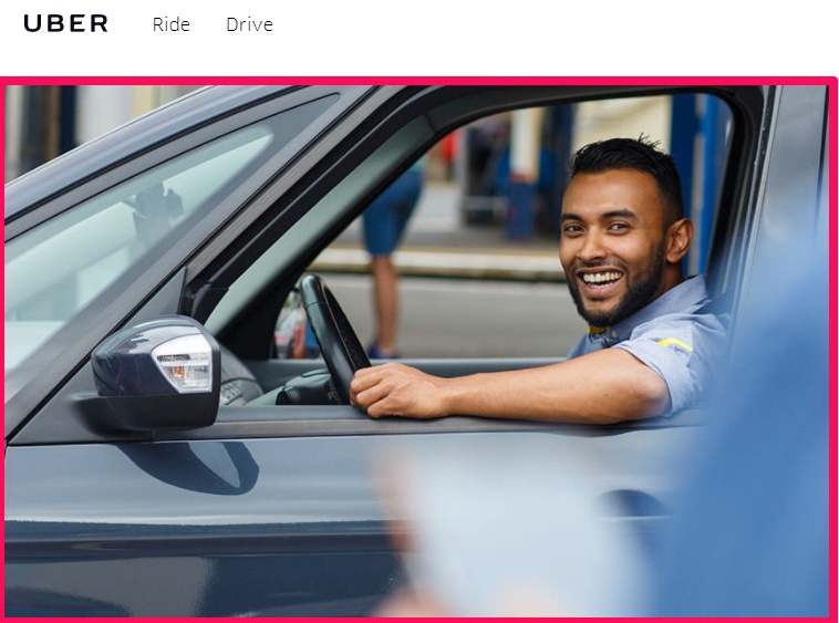
Here’s an example from Uber that does something similar. It showcases a happy, smiling driver the second you hit the site.
Apple has been doing it for years, too. They often use a stark, contrasting background color to keep your focus on what matters most: the products.
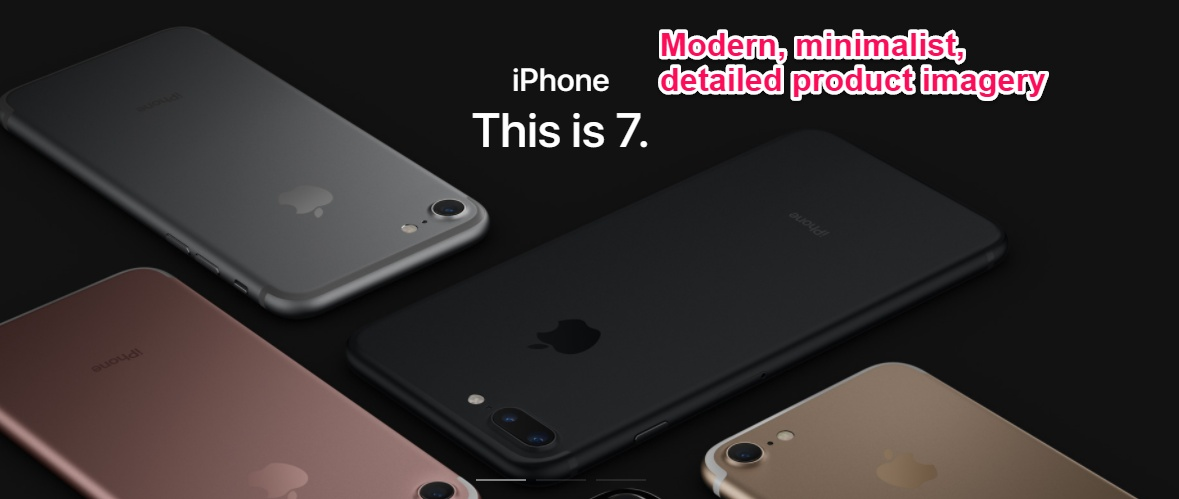
Notice that, while all of these images are staged, they’re not stock.
That’s a critical difference.
The single ingredient behind powerful visuals today is authenticity.
And conversion studies have shown that real images almost always outperform stock ones.
For example, Visual Website Optimizer ran one test that compared a fake, stock truck driver with a real one.
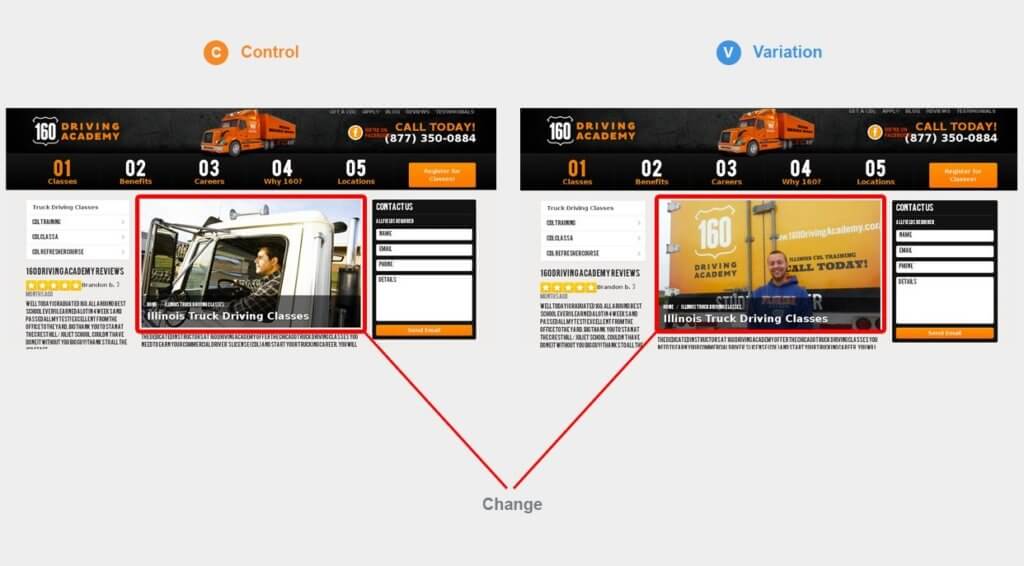
The landing page with a real person pulled in over 161% more clicks and a 38% registration increase.
3. Try to limit choices
Most people are stressed today.
They’re overworked and running from meeting to meeting.
Your landing page shouldn’t make their life any more difficult than it already is.
When in doubt, you should always keep your landing pages as simple as possible.
Limit the decisions someone has to make on a page, like in this Geico example.
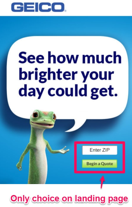
Here, GEICO takes minimalism to the extreme.
Many landing pages confuse visitors when they present multiple options. It becomes a case of information overload.
But GEICO goes in the opposite direction in this case. The only thing they allow visitors to do is to drop in a zip code.
There’s only one choice to make on this page.
This landing page also stands out because of the minimal, high-quality image of the iconic GEICO gecko. Once again, good landing page design saves the day.
Indeed.com combines simplicity and imagery with their landing page for Indeed Crowd.
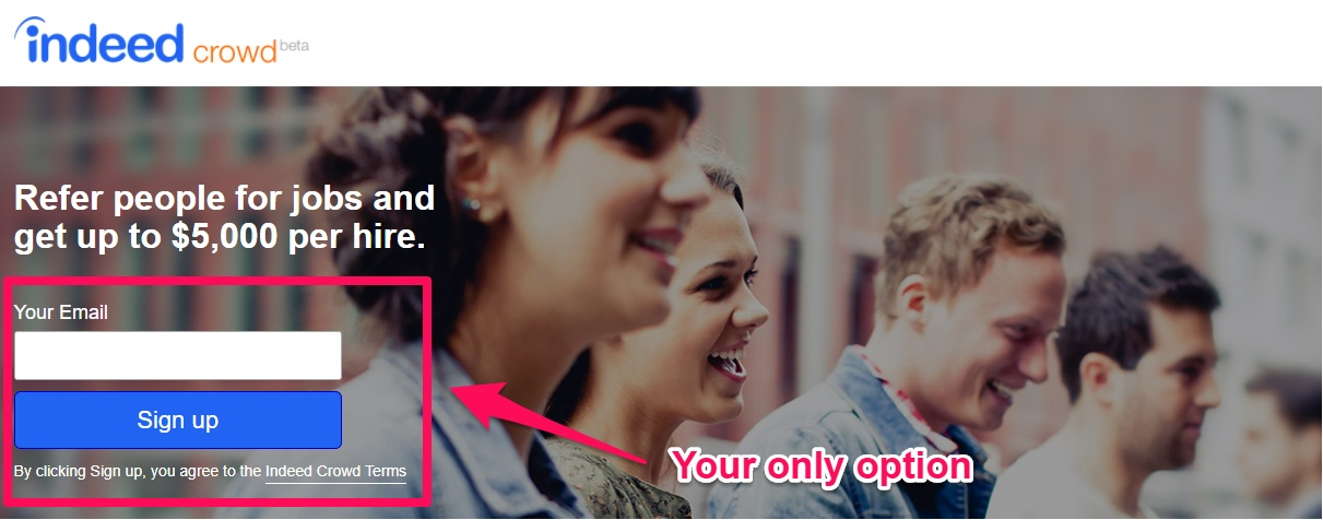
The only option is to enter an email address and sign up for the service.
Simplifying your landing pages will almost always increase conversions.
For example, I’m not a fan of carousel sliders.
They overload the visitor with too much information. There are conflicting CTAs shown to each visitor, so they don’t even know what to click anymore.
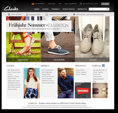
Clarks, the shoe company, ran a basic A/B test where they switched out a carousel slider in favor of a static banner.
The result was a 17.5% increase in conversions. The bounce rate even dropped 16% at the same time!
4. Limit scrolling length
Most website visitors are starting to scroll past the fold.
In fact, they often spend over 66% of their time scrolling down to see what lies underneath.
However, that doesn’t mean we should overload landing pages.
There are a time and a place for long-form sales pages. They can work extremely well in some cases.
For example, they convert really well when running paid campaigns to cold traffic.
But they can also backfire in others, depending on what you’re asking someone to do.
Here’s one example where a ConversionXL short page out-converted a longer one.
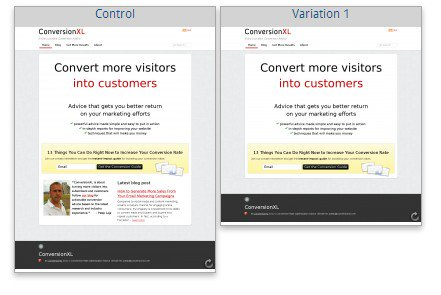
All they were asking for was a simple email address.
They went back to the last tip, focused on simplicity, and experienced better results.
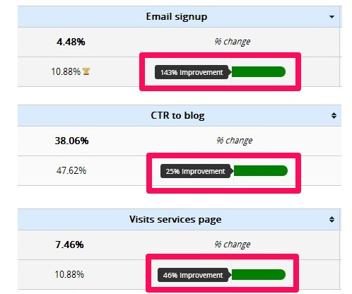
Another example showed that this minimal approach can pay off across the board.
For example, email signups, CTR to blog, and service-page visits all increased dramatically.
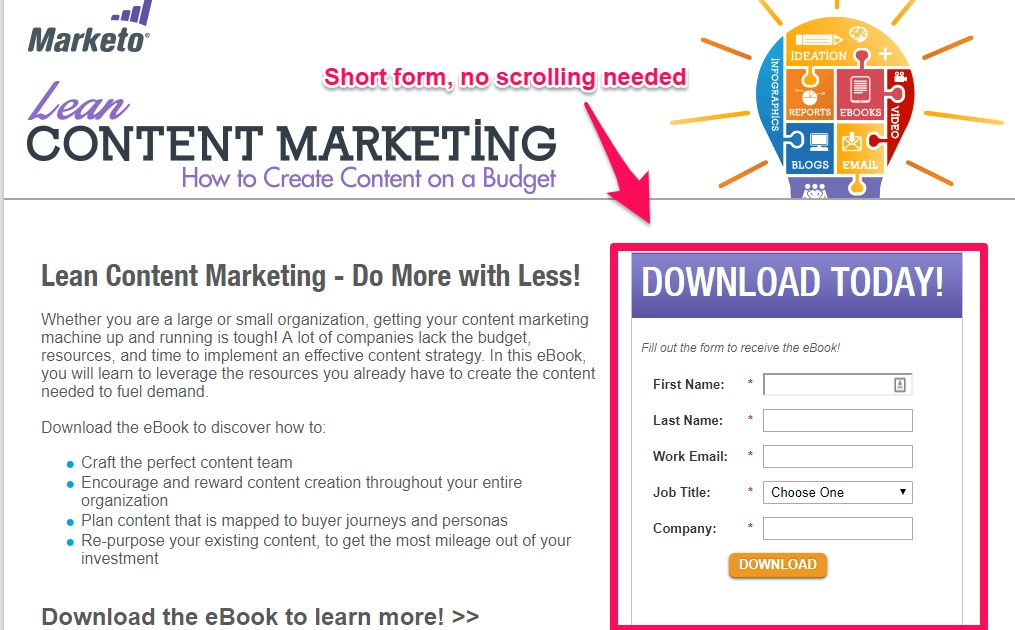
That’s why Marketo will often keep everything above the fold. There’s no scrolling or digging required.
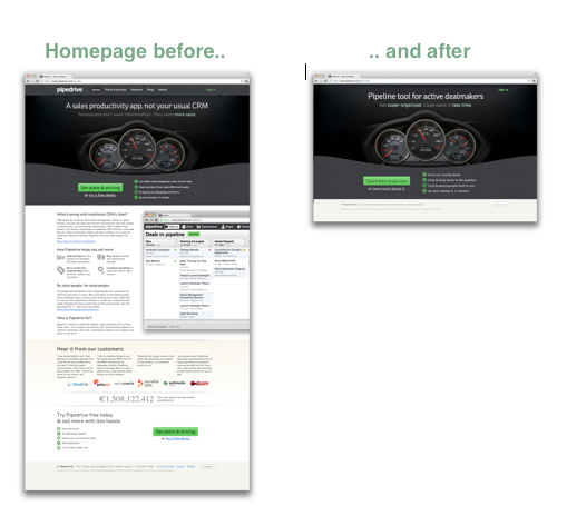
This movement led Pipedrive to get rid of 80% of their homepage content. That’s almost the entire thing!
And yet conversions skyrocketed 300% afterward.
You can go long and in-depth for paid campaigns.
Cold traffic might not already know who you are. They’ll want to fully understand what you’re selling before taking the plunge.
However, a short-and-sweet landing page version for a simple opt-in might be all it takes for returning visitors.
In fact, they probably prefer it.
5. Use shorter forms if possible
Do you see a theme developing here?
People want things nice and easy!
Obviously, it’s one thing if you’re selling a high-priced product or service. You’re going to need to ask for a lot of information.
Otherwise, shorter forms tend to get filled out more than long ones.
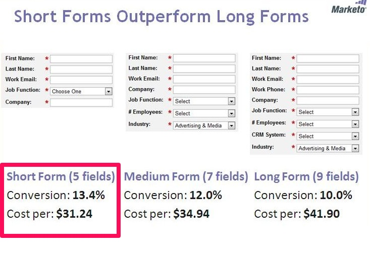
MarketingExperiments.com reported on a simple test from Marketo that backs this up.
They wanted to see what happened with conversions on three different forms.
One had nine fields, the other had seven, and the last one had five.
Unsurprisingly, the short form outperformed the others.
There are two rules of thumb when creating forms like this.
- Ask for only what you need. Less is better.
- The ‘ask’ should be appropriate for what you’re giving.
That means you’ll often have different form lengths for each offer.
For example, check out this Fitness Singles’ landing page.
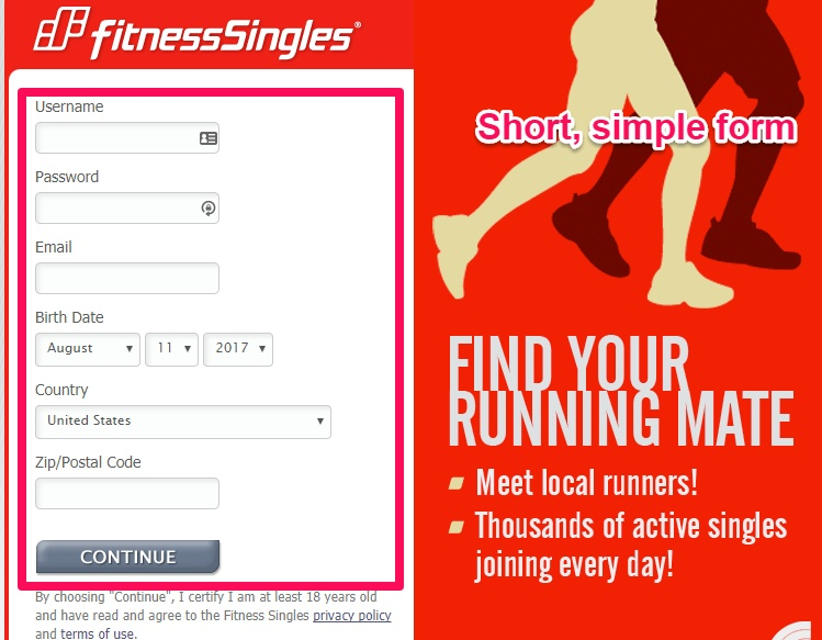
They’re asking for a few different pieces of information because they’re trying to drive new sign-ups.
One thing to test would be to remove some of these fields.
For example, they obviously need an email and password for a new account.
But why not combine a few of these fields? Or you can delay and only ask them when needed.
The username and country could be filled out afterward during the onboarding process.
However, many sites like this also have a strict age restriction. So asking for a birth date is a necessity to a certain degree.
Here’s another landing page from Fitness Singles with an even shorter form.
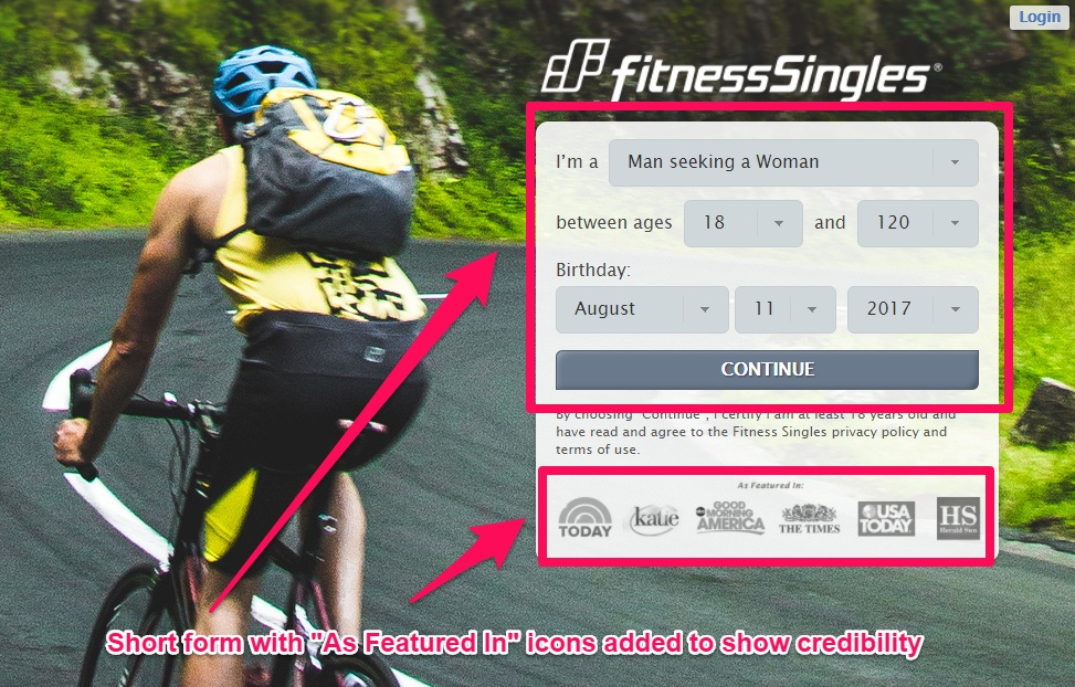
Also, notice that this last example features a few of the tips we’ve already seen.
They use high-quality images in the background.
And they also use social proof with the “As Featured In” logos on the bottom.
6. Add directional cues
This might sound like a trick question, but it’s not.
What do you want visitors to do on your landing page?
Where do you want them to convert or opt in?
Hopefully, it should be obvious when a page is simple enough.
Adding simple visual cues can also make this painfully obvious. It doesn’t have to be overly complex, either.
Check out this page from ResumeBaking.
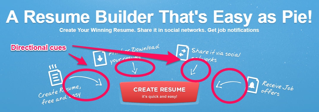
Here’s why this is a perfect example.
The button itself is action-oriented.
It uses language that explains what you’re going to get, instead of saying something generic, like “Sign Up” or “Create Account.”
Around the button is a sample of the features and benefits you’ll receive from using the service.
Then arrows are pointing from those benefits to the “Create Resume” button.
The implication is, “Do this, get that.”
You can also slim this down depending on your offer and page design.
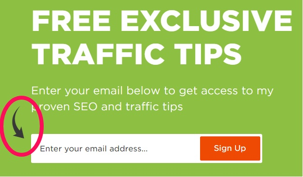
For example, Backlinko uses just a single arrow to point you in the right direction.
Arrows are a good starting point.
However, we’ve already discussed the power of visuals.
Most landing pages should feature real people when possible.
And you can use those people to help draw attention to your page CTA.
Chemistry.com gives direction by having the model in the picture look directly at the form.
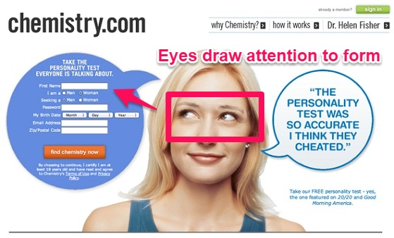
Her eye line helps dictate where you look.
She looks at the form, so you look at the form.
The same thing happens with Seth Godin. He looks to the right, so you look to the right.
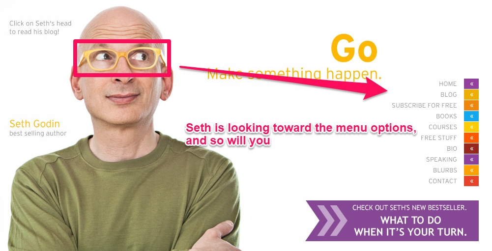
ConversionXL has run a few studies on directional cues.
Their research shows that both arrows and people looking at a page CTA can help direct user attention.
7. Make them an offer they can’t refuse
I saved the best for last.
All of these examples so far can help drive conversions.
They all can subtly contribute to getting people to do exactly what you want.
However, there’s one element above all that dictates conversions.
This is about the time that people bring up individual elements, like the CTA or headline.
Again, those are important.
But they’re not the most important.
WordStream ran a study on $3 billion in annual spend to verify this information.
They found that it wasn’t an individual element that had the biggest impact on your bottom line.
So you can get everything else on this list 100% correct. But if your offer doesn’t appeal to your audience, your results will suffer.
There are a few ways to craft an excellent offer.
Price is always at the top of that list.
For example, Amazon leads with an excellent deal on buying their new Echo.
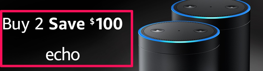
Here’s why this offer is so good, though.
You can buy multiple products and have them work together. You can use them in several rooms of the same home.
So in this case, Amazon is incentivizing you to purchase more with the $100 discount.
Buy only one and you miss out on a great deal.
Amazon, meanwhile, doesn’t actually come out of pocket on anything, either. They only take a little profit cut when you do buy.
But if that drawback eventually increases the number of total products sold? Then it’s a gamble worth taking.
They do something similar with their Prime Day deals.
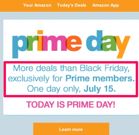
Black Friday might be known as the best day for deals. Amazon has flipped that notion on its head, creating their own day of the year to monetize.
You don’t always have to stoop to discounts, though.
Content and tools can be used to provide value that you can’t find anywhere else.
For example, let’s say you start running some Facebook Ads.
They’re not easy! There are a lot of different ingredients you need to organize before seeing ROI.
How are you supposed to know if you’re on the right path in the meantime?
How do you know if you’re overpaying? What if the competition is getting customers for less?
That’s where AdEspresso’s Facebook Ad Compass comes in handy.
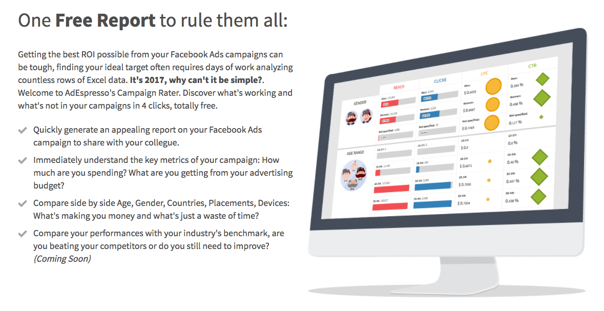
It’s a free report that includes data only AdEspresso has access to.
They’re able to look at proprietary information from all of their customers.
Then they can break this information down into different industries so that you can get an instant read on how your campaigns look.
A report like this can save you thousands of dollars. And they give it away for nothing.
PayScale is another perfect example.
They have data on how much money people make. And how much employers are willing to pay.
They’re able to leverage that insight into tons of compelling offers.
For example, they have a turnover calculator to help companies identify how much money is at stake with bad hires.
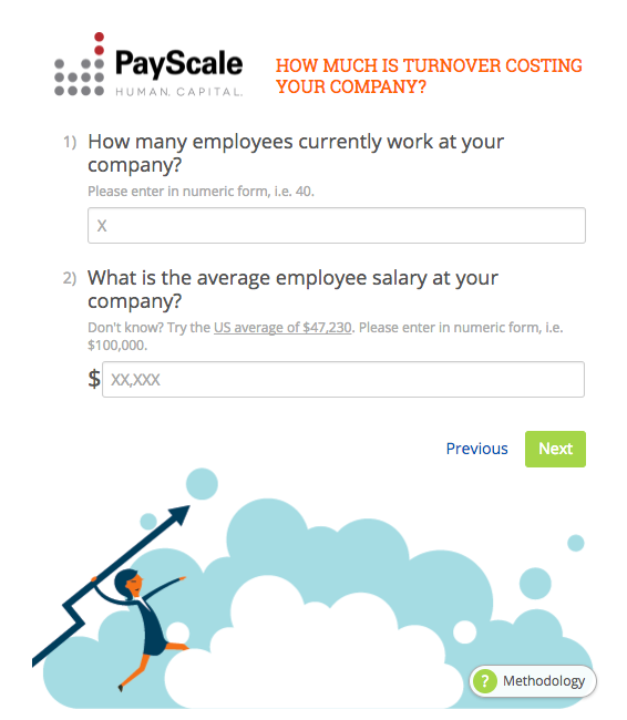
They’ve taken a static landing page and transformed it into an interactive content piece. You run through the calculation, identify the problem areas, and then opt in for the full report.
The visitor gets invaluable insight to help them hire and fire more effectively.
In return, PayScale gets a lead. But more importantly, they get a nurtured lead.
The visitor now realizes the problem they’re up against. They can now put a dollar amount next to that pain they feel.
All PayScale has to do is help them for less than that number and the visitor feels like they come out ahead.
This is a landing page. But it’s so much more.
The offer, at the end of the day, does everything from converting the lead to warming up the sales process.
And ultimately that’s the goal of your landing page.
Your goal isn’t a new lead. You want a new customer.
Conclusion
Creating high-performing landing pages is both an art and a science.
Some techniques might work well in one scenario. And then they might backfire in another.
There’s no single formula that will always work 100% of the time.
The good news is that there are a few foundational principles.
These are proven tactics that have worked for years, no matter which trends or changes have occurred.
For example, you can establish credibility with testimonials and high-quality images.
Whenever possible, try to limit customer choices. That includes eliminating friction.
But that can also apply to limiting the number of choices that you’re forcing people to make. Keep things nice and simple.
Directional cues can help visitors understand exactly what you want them to do on each page.
And if you can make them an offer they can’t refuse, your conversion rates should be on the rise in no time.
What’s the one landing page feature you’ve seen convert the most visitors?
Comments (6)