A website tells a lot about a business. It shows how much thought the business puts into its brand and whether it values having a website.
Unfortunately, far too many companies don’t really value their websites and don’t get the full benefit out of them. They neglect design, website copy, and other important essentials. They put the focus only on making sales.
This results in a really bad website and leaves visitors unsure if the company is the best one to do business with. This is why it’s so important to have a value proposition. A website needs to tell visitors in a couple of sentences or less why their business is the best choice for the visitor, instead of sending a bunch of different messages that won’t be received.
The path I’m proposing is not an easy one, because building a great website isn’t easy. It requires the coordination of a diverse team, each member adding their own input. There’s an endless amount of iterations and feedback to process. It’s a lot of work, but the payoff is worth it.
There are many issues that face businesses when building their websites. I believe the biggest one is making sure that there’s one overarching message. There are many different messages to broadcast, but I believe it should be the value proposition (VP).
It’s the job of a business’s website to deliver this VP, and it should be concise and clear. After a few minutes of being on your site, people should know the value you bring.
Let me pose this question to you:
If you could survey all the visitors who left your site, what would they have taken away? (What key message or trait would they know about your business?) If you don’t know or think there would be all types of different answers, you may want to reconsider the objective for your website.
This post will be about making sure you have one or two messages that really stick with visitors. We’ll be examining all the different factors that affect your website’s message. We’ll first get into copy and then design, and we’ll be including some examples along the way.
Copy
Website copy plays a key role in forming the message that visitors will take away. Consistent writing throughout the website will help reinforce the message you want users to notice.
The key is to restrict the number of VPs that you broadcast. If you try to broadcast too many, then your visitors aren’t going to focus on any of them. Keep to a limit of one or two VPs, and they’ll remember.
Above the fold VP
The first thing people read on your website is the value proposition. It’s the initial text or image that is meant to spark interest in visitors, leading them to view more of the website.
One of the messages TaskRabbit wants to broadcast on their website is their safety. Let’s take a look at how TaskRabbit emphasizes this.
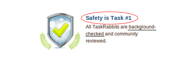
On the homepage VP, TaskRabbit mentions the safety of their taskrabbits:

Directly underneath their VP, they mention their safety, elaborating a little more this time:
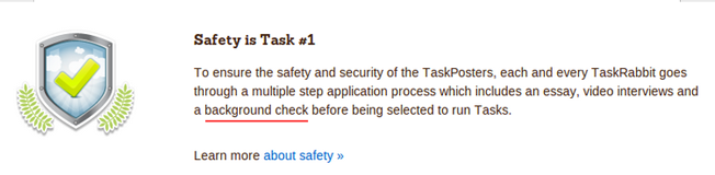
On the How it Works page, they use similar language to describe their taskrabbits:

Again on the How it Works page, they have a section about safety:
On the “Meet the Taskrabbits” page, they mention once again that “Safety is Task #1”:
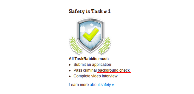
As you can see, their safety badge and methodology are posted on many of their popular pages. So when people spend a little bit of time on the TaskRabbit website, they become assured that it’s a safe company. Any previous concerns are alleviated, while trust is built as the visitors realize that the taskrabbits are background checked and trustworthy.
Rackspace is a company known for their support. It’s a message they want to get across right from the homepage. They display this badge on the homepage:

On every product page, they have a section about their support. Examples:
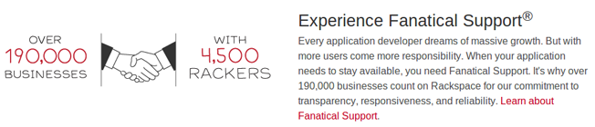
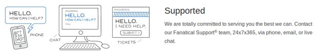
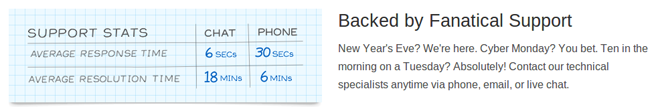

Visitors leave the site knowing that Rackspace places an emphasis on their support.
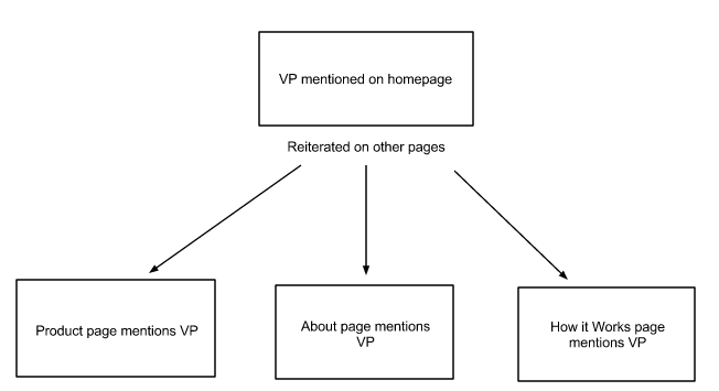
Both TaskRabbit and Rackspace are concentrating their efforts to get out a message. They both have their specific messages on their homepages and sprinkled throughout the websites.
For TaskRabbit the message is:
“We’re safe and our taskrabbits are background checked.”
For Rackspace the message is:
“We have a great support system, which you’ll remember as Fanatical Support.”
Here’s a graphic to illustrate the point:
What is your brand’s message? What is the VP you want visitors to recognize? We’ll talk about finding yours at the end of this blog post.
Let’s move on to another area that influences your message – design.
Design
Along with website copy, design gives the visitor an overall feel for the business. The website is a product of the business, and it reflects its work. If a website is slow, filled with errors, clunky, and ugly, most people will get a bad feeling about the business and not want to become a customer. But if the website is fast, has beautiful design, and is simple, then the business is increasing its odds of landing new customers.
Let’s look at some site designs and see how they influence our perception of the business.
This is what you’ll be presented with if you go to Square’s homepage:
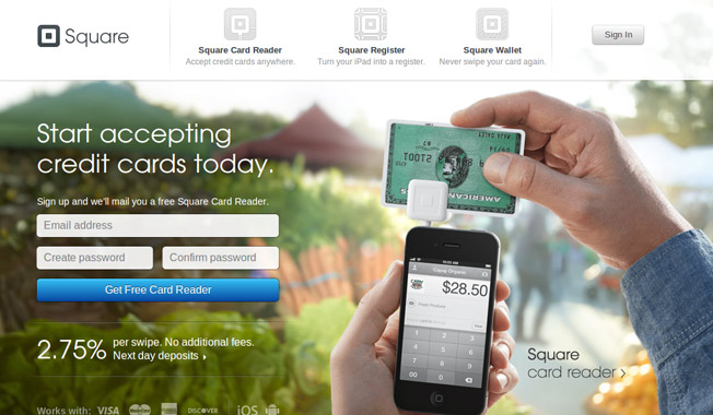
From this image, you can tell a number of things:
- You can accept payments via credit card with an iPhone.
- The simple design makes everything easy to read and allows the visitor to see everything on the homepage.
- The card reader is free, and Square takes 2.75% commission on all payments.
Does Square get their message across? Well, they tell what they do, how much it costs, and give an early impression of a simple product.
Let’s take a look at what visitors see when they go to the UserTesting homepage:
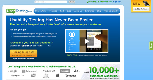
There’s a lot more information to take in than on Square’s, but here are some things I took away after viewing this page for a few seconds:
- They perform usability testing.
- It costs $39.
- They’ve had a lot of customers.
- There’s a money-back guarantee.
It would appear as though they get their main selling points across. I know what it is, how much it costs, and there’s a money-back guarantee. This is all the essential information that the visitor needs to know.
Let’s take a look at YourMechanic:
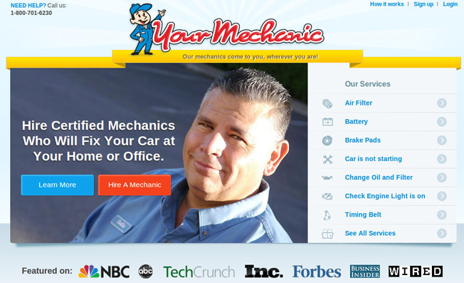
So does YourMechanic tell us what makes them unique? If you look at their homepage, they sure do:
- The mechanics are certified.
- The mechanics come to you.
- They offer a wide range of automobile services.
I understand the core of YourMechanic and what their VP is. Mechanics come to you to fix the car instead of you having to drive or tow a broken car over to them.
All three of the above are good examples of companies explaining what their businesses and VPs are.
Let’s take a look at some websites that don’t do a good job of getting their messages across.
Here’s a website called Ling’s Cars:
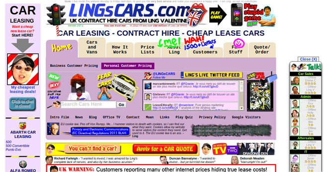
This is an extreme example. It takes effort for someone to create a site as confusing and bloated as this. It’s possible that it was made badly on purpose just to get attention. Either way, it doesn’t get the message across. All I learned from spending a few moments on this site was:
- They do car leasing.
- It looks a little untrustworthy. When a website has to say “You can trust me!” you know there’s something wrong.
I have no idea what the VP is. Total miss by Ling and her staff.
Digital Hollywood’s website has good intentions but fails to get its message across:
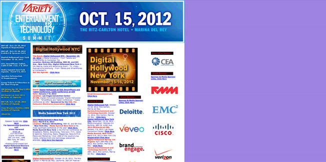
A few things I learned about it:
- It is a conference.
- There are a lot of logos that, when looked at, turn out to be sponsors of the conference.
- One third of the page is purple.
You can get the information you want with this homepage, but it’s bloated. They tried to fit too much information into it.
I simply don’t get the overall message. Who are the speakers? Why should I attend this conference? Who is it for? Instead, I’m left with these questions unanswered (unless I investigate). And it has actually brought an additional question to my mind:
Why is a third of the website colored purple?
Here is a website that flashes boxes at you at different speeds. Apparently, the user is supposed to click on one of the boxes:

The point is that it’s not just bad design; it doesn’t get the message across. I have no idea what this company does by viewing their homepage. It’s not bloated like the others, but it doesn’t explain what they do. I get no overall message about the business, other than the fact that they have a poor website. And because that’s all I know about them, it means that I am not judging their business favorably.
You’ve now seen both good and bad design and how it impacts the visitor’s opinion of the business. Some websites do a good job of broadcasting their message/VP, while others fail. Can you guess which ones took more time and effort? The ones that get their message across and take more time and effort clearly have better results.
Now let’s take a look at how you can find your VP.
Finding Your Message
Why did you start your business? What was missing in the marketplace before you entered? What major advantage does your business have over the others? All of these are questions you should be able to answer, and they will help you form your VP.
Here are some examples of VPs and the messages these brands get across:
- Wal-Mart: Lowest prices
- Duracell: Most dependable batteries
- Mint: Free online money management
- Verizon Wireless: Biggest 4G LTE Coverage
- Southwest Airlines: No bag fee
- Netflix: Stream movies instantly
- Discover Card: Get 5% cash back
These brands have messages that tell why they deserve your money over any of their competitors. It’s what they (in their own opinion) do best.
What do you do better than anyone else? Why do people use your services? Answer these questions, and you’ll have your VP and main message for your website.
Any questions or comments? Let us know in the comments!
About the Author: Zach Bulygo is a blogger, you can follow him on Twitter @zachcb1.
Comments (23)