The human brain processes visual data 60,000 times faster than text. And, there’s more: 65% of your audience are visual learners. So, what can you do to capture their attention?
A lot of people are using infographics as a visual way to reach their audience. Infographics let you share complex information with your audience in a simple, image-based format.
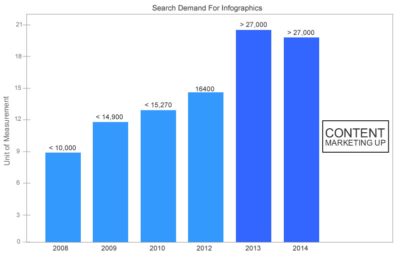
According to Content Marketing Institute, demand for infographics has increased drastically and is one of the top six types of content used by B2B marketers.
Copyblogger published an infographic in 2012 titled 15 Grammar Goofs. To date, that infographic alone has generated 6,500+ tweets, 60,300+ Facebook likes, 2,000+ LinkedIn shares, a gargantuan 194,600+ pins, and more than 500 comments. While the infographic is now several years old, it is still going strong and driving awareness to Copyblogger.
That example shows how powerful infographics can be. But, it’s not just about creating the infographic. To achieve success, you also have to make sure that the content is in sync with your business, and you must promote it massively so that you can get consistent quality traffic and inbound links. Otherwise, you are wasting time and money — and who wants to do that?
Don’t let that happen to you.
If you want to create infographics with the potential to send 60,000 plus qualified visitors to your site every year, you’ll want to read this post from start to finish. I will walk you through everything that you need to know for success. Here’s what I’ll cover:
- The elements of a good infographic
- How to come up with infographic topics that actually work
- How to create a useful and shareable infographic
- Getting the infographic designed
- Distributing your infographic
- Testing different types of infographics
The elements of a good infographic
Let’s face it. Not all infographics are created equal.
Some truly address users’ needs while others sink into well-deserved oblivion.
How do you make sure that you deliver the first kind? I’m going to let you in on a secret: the majority of the infographics that go viral on social media networks have three elements in common: a consistent method, a unique story, and trusted statistical data.
Pay attention to these as you create your own infographic, and you will be poised for success.
1. Method: I’m sure you’ll agree that the method you use to create your infographic can affect its perceived value. As with any other content marketing decision, the end user (prospective customer) is the person who matters most in your content marketing decisions.
Of course, you have a choice. You might decide to present the infographic by using sequential data, graphs, or flow charts. Whichever you choose, here are some points to follow so that your good idea doesn’t go bad. We have some warning signs of bad infographics.
Make sure that you also match your headline to your audience and topic. For example, if your audience likes “how to” blog posts, they will probably love “how to” infographics. If your business is tech-related, your infographic headlines have to suit your tech-driven users.
2. Unique story: The second most valuable element of a good infographic is a story that connects with your readers emotionally. One way to do this is with familiar images. In the screenshot below, the marketing infographic features characters in superhero outfits.
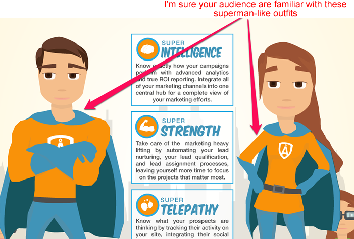
That reinforces the message of marketing intelligence, strength, and telepathy.
Even if your topic isn’t new, a unique story will spice it up and stir the emotions.
Here’s an example of the power of storytelling. Even though it’s not about an infographic, it makes a powerful point.
Some years back, Jon Morrow wrote a blog post at ProBlogger that changed the lives of virtually everyone who read it. It was centered around a story of how the author quit his job, moved to paradise, and got paid to change the world.
That post went viral and got close to 500 comments. Just like Jon Morrow, you can supercharge your infographic by infusing a story into it.
In fact, since the majority of the most engaging posts on Facebook are photo posts, telling a story in this graphic format makes it even better.
One option for your infographic is to tell the story of experiments that you have carried out and strategies that you used to achieve a result. But, there’s another option — using other people’s trusted research to create a new story. I’m talking about using statistical data.
3. Statistical data: Most of your target audience won’t be interested in an infographic that’s only based on your personal opinion without the data to back it up. If you want to establish trust, you need to communicate value with verifiable sources.
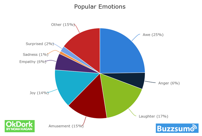
The truth is that with most topics, someone has already written about them. All you need to do is find and reference that data. If you look at infographics that really do well (like this), you will see that they each have multiple data points.
Using trusted statistical data tells potential readers that you’re not the only one who believes in a particular fact. Other industry experts can authenticate it, too.
For example, Mr. A and Mr. K are both fitness experts. Mr. A believes that if you purchase his new video training course, you’ll lose weight fast.
Mr. K has a different agenda: his sales pitch is focused on what his training courses have done for other people like you in the past 3 months.
So, he says to the prospects, “The training video will share 15 success stories of guys who have successfully lost up to 20 pounds in the past 3 months and the 3-step plan to get your own results.”
Which of these fitness experts are you more likely to buy from? I think Mr. K will definitely win because he understands that data, visuals, and proof are what his core audience wants. It’s the same with infographics.
How to come up with infographic topics that actually work
Your readers’ attention spans are evolving to become more selective every year, according to Prezi. That means that you need to deliver infographics that grab their emotions — and their attention. In this section, I’ll show you the best ways to come up with topics that inspire them to read further.
Basically, it’s all about the research — and here’s where you need to look:
1. Trending topics: What’s happening right now in your niche? Are there keywords you can target? Are people talking about the topic? If you answered yes to any or all of these questions, then you’ve got a worthwhile idea for an infographic. Use resources, like Google Trends, Alltop’s Viral! and others to find these.
2. Evergreen topics: Some topics never die. Year in and year out, you see them in forums, Facebook pages, Twitter streams, LinkedIn groups, and other platforms. Find one of these, and you’ll have a great topic for an infographic.
See if you can spot which of the ideas below is evergreen and which is a trend:
- How to Install WordPress in 5 Steps
- How To Customize Your Own Blog Design
If you said the first one, you’re right! That’s because while blog customization is not for everyone, anyone who wants to start blogging will want to read the installation tutorial.
Create infographics based on ideas that your readers and customers are familiar with and want to know more about.
3. Controversial topics: If people are debating a hot topic that you can find information on, that’s another good candidate for your infographic. Here are three examples:
- Why Not All American Youths Should Go To College
- How To Lose 20lbs of Fat in 30 Days Without Doing Any Exercise
- Affordable Businesses That You Can Start with Little or No Money
Why are these topics controversial?
First, they’re debatable. People who read these titles will be thinking:
- Isn’t college education the best path for young people?
- How on earth can someone lose 20lbs of fat in one month with no exercise — is it really possible?
- Can someone truly start a business with no money? I mean zero investment? Personally, I doubt it.
If they’re asking questions about your article title, they’re already hooked, which is why this is a good technique for deciding on infographic topics.
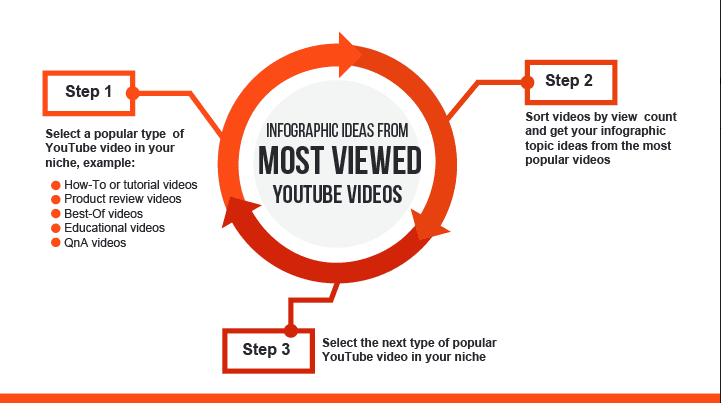
4. Most viewed content: Find out what content is doing well on other sites and use that data to come up with infographic ideas.
For example, you can check out the most viewed YouTube videos, as Leading Media did, and extract insights that help you to choose topics.
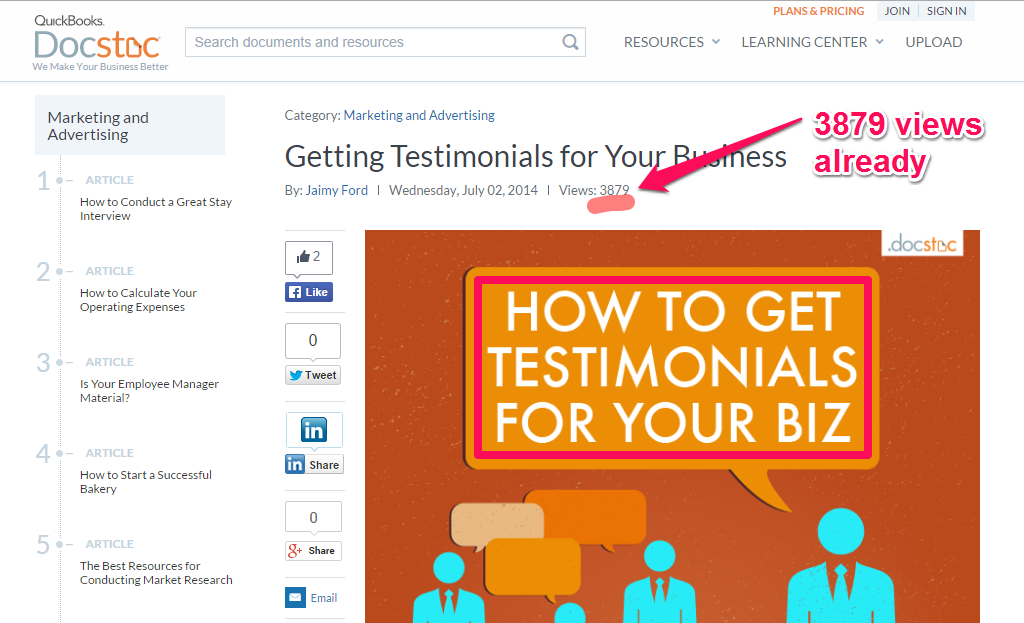
You can also visit document sharing sites to identify content that is doing well. There are thousands of trusted sites, but here’s how it would work with Wattpad.
Step #1 – Visit www.wattpad.com/
Step #2 – Check the homepage for featured content chosen by the editors. Alternatively, if you don’t find a topic that interests you, search the site, using your target keyword.
Step #3 – Check the results for the top content.
The screenshot below shows popular content in the marketing and advertising niche. Also, use the titles of popular content to inspire your own infographics titles.
Of course, the title alone is not enough. Promotion is key. I’ll discuss infographic promotion in a bit.
How to create a useful and shareable infographic
Once you have a topic, it’s time to create a useful and shareable infographic. Everyone has their own definition of useful content.
I think useful content is well-researched with actionable tips for the reader, like the post that you are reading now. For other people, useful content could mean short and simple steps required to achieve a particular goal. As I’ve said before, it’s all about what the reader wants.
Making it shareable is easier because there’s research that you can use to set benchmarks for infographic creation.
Studies have found that:
- including images increases the number of Facebook shares
- infographics are among the most shared content
- appealing to emotions results in more shares
- people share what they find useful
Keep this information in mind to help you create a shareable infographic.
Let’s get back to the question of emotions for a minute. People take action based on what they feel, so you have to get them to feel.
This image from Instapage shows smiling people wearing bright colors. Does it really matter that these people all look happy? Sure it does! The emotions your infographic evokes will help determine how much people want to share it.
Happiness, curiosity, or even playing on hidden fears like in this ad from the World Wildlife Federation … Make people feel and they will want to share that feeling — and your infographic!
Finding the data
As I’ve said before, the data is as important as the visuals when creating an infographic. So where can you find valuable, verifiable data? You don’t want to end up like the social psychologist accused of faking research results, do you? Don’t worry; depending on your industry, there are several data sources that you can trust.
- Hubspot marketing statistics
- The US National Library of Medicine
- Wikipedia (but only if the article has been verified by the editors)
- Marketingprofs Library
- Decision Analyst
Research from professional bodies can be helpful, too. Corporate blogs and spreadsheets, documents, and white papers from industry analysts are also good resources.
The data that you need to create useful and shareable infographic content will be scattered around multiple sources and materials. It’s your job to find them, collate them, and put them to good use.
How to structure and outline your infographic
When you have collected your data, read what you have out loud. Use your instincts to figure out if it seems useful or if you still need more information.
Knowing your purpose will also help you with structure. Ask yourself these two questions:
- Does the infographic provide actionable advice? Many infographics are about giving information that readers can use. One example is this web redesign guide from Quicksprout.
- Is the infographic for entertainment? Perhaps you’re tapping into the “laughter is the best medicine” vibe, grabbing people’s emotions by evoking humor and passion. Mashable’s infographic on the cost of being Iron Man 3 is a good example of an entertaining infographic.
When you’re clear about whether or not you have the right data to suit your purpose, it’s time to start structuring your infographic.
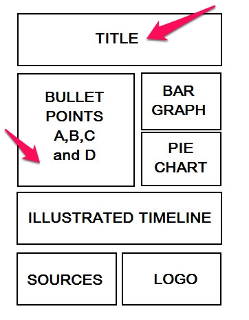
The image above, from Crazy Egg, shows the basic outline for an infographic. This is a good starting point, though it’s not set in stone. Be prepared to change the structure, if that would better suit your audience or your purpose.
Still need more?
Labs42 provides an outline that it says has produced great results. I’ve fleshed out that structure with my take on what each section should include.
- Header – This is where the infographic title or header will appear. This is where you’ll use the advice I gave above on finding topics and titles to write something that will hook the reader. You need to be creative. Hubspot’s Corey Eridon says that your title can either make or break the reach of the infographic.
- Subheader (optional) – The subheader is optional. But, if you use it, it is where you further explain the title. For example, if your title is “How To Monetize a Blog,” the subheading can be “A 5 Step Approach to Help You Make Money Today.”
- Section 1 Header/Key message – Your key message should be located in the first section of your infographic, right after the headline. This could be the main issue that people are struggling with relating to your topic.
- Section 1 Supporting Data Points – This is where you start using the data you have collected to support your claims and give your key message meaning. You can also use charts, icons, or images in this section.
- Section 2 Header/Key message – In this section, you want to maintain the flow. Using our blog monetization example, if section 1 highlights the major hurdle bloggers go through when trying to monetize their blogs, you could expand on the point.
- Section 2 Supporting Data Points – Support and validate every statement with charts and statistical data points. Don’t just tell people what to do, show them proven results.
- Section 3 Header/Key message – In this section, add another key message for your readers. Ideally, let the message flow from section 1 and 2.
- Section 3 Supporting Data Points – Support your key message with data points, charts, mascots, icons, and other visuals.
- Depending on your topic/idea, you can add more sections and back them up with data points.
- Key Takeaway/Call-to-Action – Sometimes, you can make an infographic clickable. But, the more common way to include a call-to-action is by adding your complete URL. For example: “for more information, visit: www.yoursite.com.”
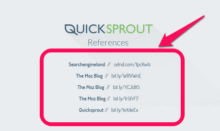
- Sources – List the websites where you got the data for the infographic. See the example below.
Understanding color psychology
You’re almost ready to design your infographic. But there’s one more issue to think about before you reach the design phase: choosing the right colors for your infographic.
Color choice can affect the impact of your message. Believe it or not, many content marketers and designers don’t understand the power of the color red. According to Color Wheel Pro, red is an intensely emotional color associated with power and action. That means you can use red on call-to-action buttons to increase conversion rates.
Check out the graphic below for more information on color psychology.
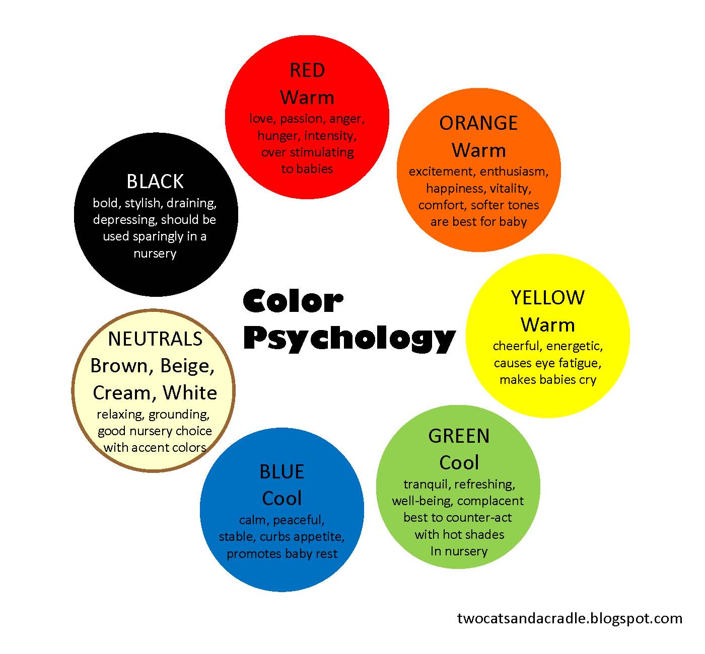
Read my guide on how colors affect conversion rates so that you can take charge of the colors that you use for headings, hyperlinks, and buttons.
Getting the Infographic Designed
Now you’re ready to design the infographic. There are two ways to go about it. You could either design it yourself or you could hire a professional.
I’ll assume that you’re not a professional infographic designer, so you will need to hire someone. Let me show you how to get a good designer without paying a fortune.
Hiring good designers is easier than ever thanks to the wide range of freelance marketplaces around. I’m going to show you how to find and hire great designers on Dribbble, Fiverr, and Upwork, but these tips will work for any place where designers hang out.
Hire a good designer at Dribbble: If you want amazing infographic designs, Dribbble is a great place to start. It’s not cheap, but you won’t regret it.
Step #1: Visit dribbble.com
Step #2: Sign up for a free trial and upgrade to their pro membership so that you can search the entire database and hire the best designers.
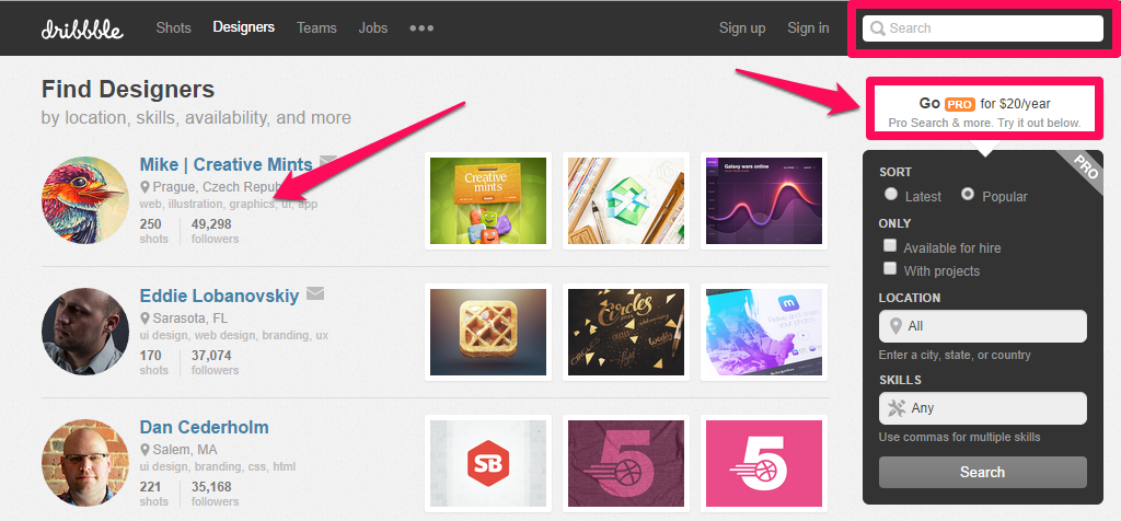
Step #3: Search using the filtering tools to find some suitable candidates.
Step #4: When you find designers that you like, see if they have done something similar to the design you want. To do that, click the name of any designer. Here’s what you’ll find:

Step #5: If the work looks good, click the “hire me” link. You will soon have a qualified designer to help you with your infographic design.
Hire a good designer at Fiverr: If you want to minimize costs, consider hiring your infographic designer from Fiverr.
Step #1: Visit Fiverr.com

Step #2: Type “infographic” in the search box and click “Search.”
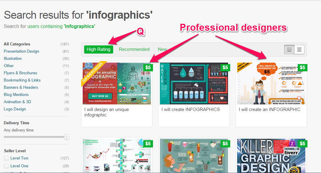
The highest rated designers are shown first.
Let’s assume that you decide to hire the first designer.
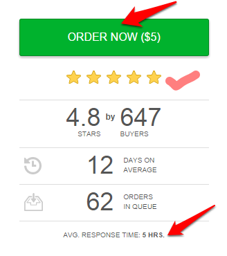
Step #3: Click the infographic placeholder to view the designer’s profile. Here’s the screenshot:
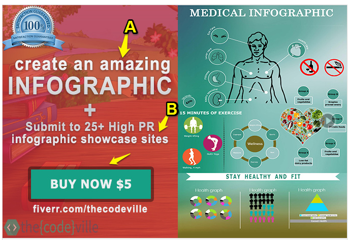
Let’s analyze this designer and what you stand to get if you choose to hire him/her:
- You get an amazing infographic. That’s what the designer claims, but do you know for sure? With so much competition, you need amazing content to stand out, so it’s important to assess this (perhaps by looking at other examples of the designer’s work).
- The designer submits your infographic to 25+ high PR websites. Many of these are more like directories because they accept infographics from virtually everyone. But, if your goal is to generate 60,000 plus visitors a year from your infographic, you can’t afford to ignore this bonus.
- You get the design for just $5. You might think that $5 is way too cheap. But, many of the highest rated designers are masters at what they do and have the right software, icons, and toolkits to design amazing work for you.
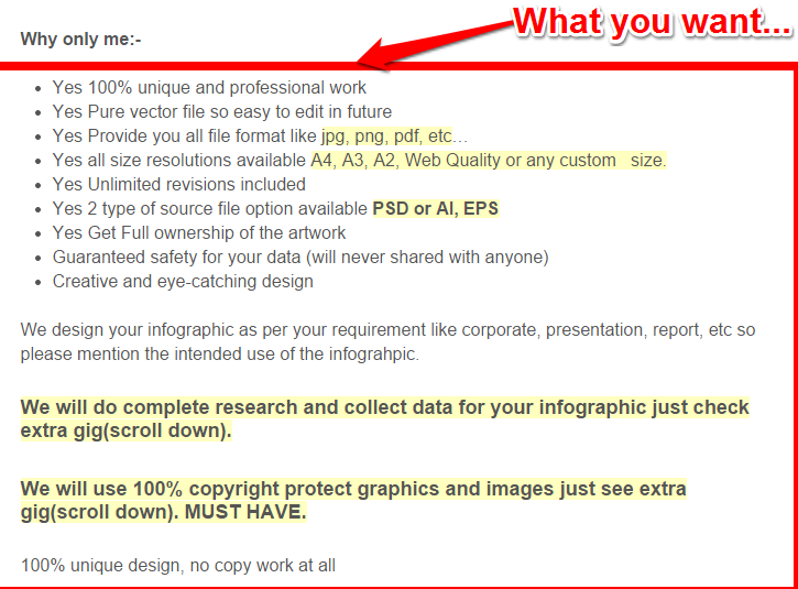
Step #4: Read the pitch so that you can get to know what the designer has in store for you. What kind of person are they? Scroll down the Fiverr profile page and you’ll find more details on the designer’s services:
Step #5: If you decide to hire the designer, look at the right side of the profile page and click “Continue.”
Step #6: You will be redirected to PayPal to complete the payment. Afterward, you’ll fill in the order form with your title, data points, and other information for the designer.
Hiring a good designer at Upwork: Upwork.com is a popular freelance job site where you can find highly qualified infographic designers. If you want several designers to apply, you must create your own job ad copy.

Step #1: Write your ad copy – If you’re not a copywriter, you could simply model someone’s ad copy and create a better version for yourself.
Here’s a template you could tweak:
We’re looking for a professional who can design a good-looking infographic. If you’re interested and can deliver within 3 days, we want to work with you. Please send samples of your past designs.Step #2: Post a job – On the homepage, click “Post a Job,” to begin the process of hiring a designer:

Note: You must be a member of Upwork before you can post a job. Sign up for free and you can then post your job.
Unlike Fiverr, where the rate begins at $5, you may have to pay industry rates at Upwork. Check out existing Upwork ads to see what businesses typically pay designers to create infographics.
When you have your ad copy, you can look beyond Upwork and post a job on any of these 11 freelance job sites to have more choice of designers.
How do you make your decision?
The first designer you see on Dribbble, Fiverr or Upwork may not necessarily be the best fit for you. Here’s what you need to think about:
- Does your designer have at least some of these top ten qualities?
- Does their design style fit with your brand? Check their previous designs to see. There’s nothing wrong with asking the designer to show you samples of past work.
- Is the designer passionate about discussing your vision and your brand? If not, look for someone else.
Once you choose a designer, get in touch. Each site has rules about the best way to communicate with service providers. Usually, this means communicating through the site. If you attempt to bypass this and get the designer’s email address, you could be banned.

If everything goes according to plan, you will soon have an infographic. The next step is to put it on your site.
How to format and publish an infographic on your site
In most cases, your designer won’t help you publish the infographic. That’s your job and it’s pretty easy.
There are two options. The first is to keep your infographic private and just upload the graphic to your site, the same way you add photos to your WordPress site. But, if your goal is more traffic, why would you want to do that?
Instead, you want to make it easy for people to share your infographic. According to Hubspot, the right social sharing techniques (more on this in the next section) can give your infographic consistent exposure.
To get those benefits and generate 60,000 plus visitors a year, you need some HTML embed code, so that people can put your infographic on their own sites with a link back to yours.
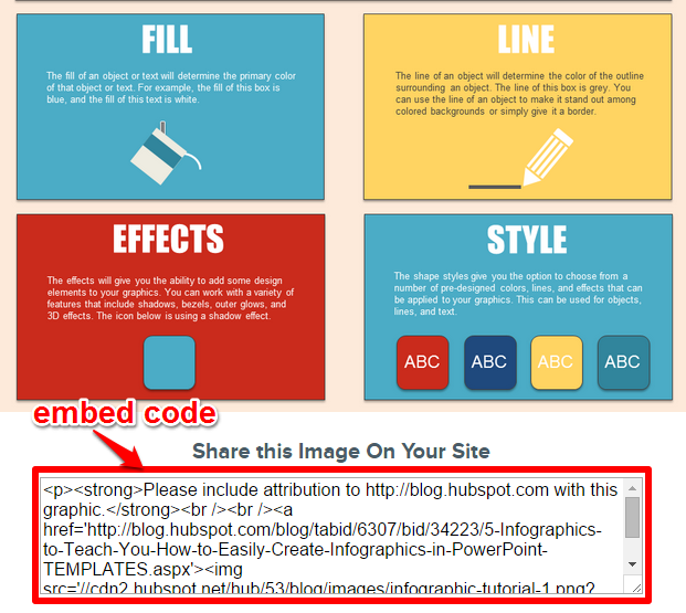
How to generate the embed code
Before you generate the embed code, upload the full resolution image of your infographic to your blog post or web page. This is the page people who share your infographic will link to. Resize the infographic to fit your web page or blog post and set it to open in a new browser window so that the reader can stay on your infographic page.
I’m going to show you how to use Siege Media’s online embed code generator to create your embed code:
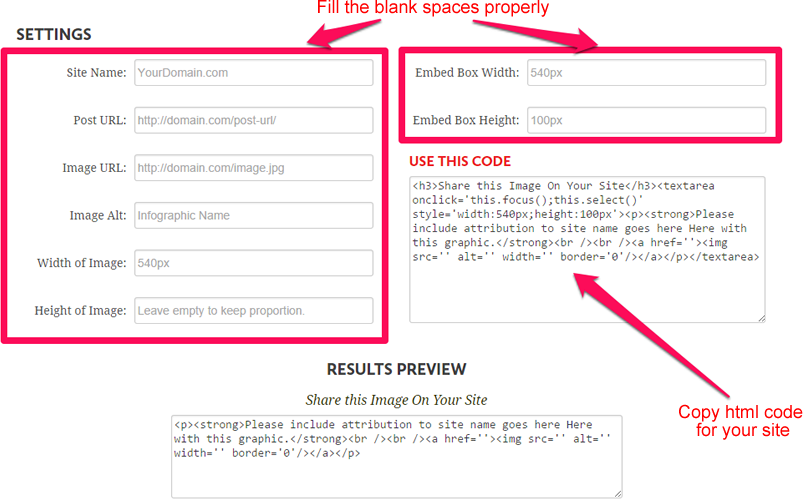
How do you fill the blank spaces in the screenshot above? I’ll show you.
- Site Name: This is your domain name (www.yourdomain.com). When people share your infographic post, they will need to attribute it. Fill in this box and your domain will appear at the top of your infographic. People may decide to delete this message, but it will still serve as a reminder that you need to be credited for your infographic. It’s not a public domain image.
- Post URL: This is simply the URL where your infographic is located. This is the page people will link to when they start to share your awesome design. Copy the exact post address from your browser and paste it here.
- Image URL: Go to the post, right-click on the infographic and click, “copy image URL.” Copy and paste the address here.
- Image Alt: This is important for SEO purposes. Simply type the name of your infographic e.g. How to increase your sales.
- Width of image: What size is your infographic? Input the width here. As a default, 650px will work for most blogs, but readers can also resize the image if they need to.
- Height of image: Don’t make your infographic too long, because it could reduce engagement. Leave the default as specified by Siege Media and it will automatically adjust to the right width.
- Embed box width: How wide do you want the infographic embed code to be on your blog page? You may decide to make this smaller than the infographic width. If the width of your infographic is 650px, you could make the embed code box 450px. It’s up to you.
- Embed box height: Leave this set to default and it will automatically adjust to the width that you specified above.
- Preview: The preview shows how your embed code will look on your blog post/web page.
When you’re done, copy the embed code generated and paste it into the HTML panel of your blog post/web page editor where you want the code to appear. Add it beneath your infographic to make copying and sharing easier. Include a call to action (like “share this image on your site”) above the embed code.
This is what it will look like.
You can find another HTML code generator at infographic journal. There are also several WordPress plugins that generate embed codes. And, you can also code the HTML manually (if you’re a WordPress code nerd) or learn how to generate the embed code in 5-steps at Hubspot.
Pro tip: It’s important that you let your readers view the infographic in its original size so they can follow it easily. To do this, grab the URL to the full image and add a link below the infographic that says: “click here to enlarge image.”
Distributing your infographic
Infographics are massive. That’s no exaggeration.
And distribution is essential for getting traffic benefits. Everyone loves a good infographic. But, how do you get people to see yours? Here are some strategies to try.
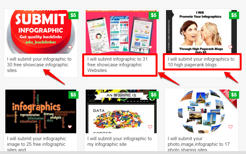
Hire someone from Fiverr to submit your infographic. Not all sites will accept it, but you will get a huge boost in traffic and inbound links. When I searched, there were some great choices:
Submit your infographic yourself, using these lists as a starting point: 100 sites where you can submit your infographic.
Don’t know how to submit to infographics directories? Quick Sprout has an easy guide that you can follow.
Upload your infographic to document sharing sites, like 4shared.com, scribd.com and killerinfographics.com for an extra traffic boost and inbound links.
You should also make WordPress sharing easier by using a social sharing plugin. Some of these make it easy for people to view a larger version of your graphic (and get more excited to share it).
Finally, you should use other promotion channels. You can get your infographic noticed through other methods, like blogger outreach, guest blogging, and press release distribution.
Testing different types of infographics
To get the traffic benefits of creating infographics, you need to know what works and what doesn’t. To find out, you need to test them.
The image below shows two infographic layouts. How do you determine which one is best for you?

Just create two different infographics on the same topic, using the same outline, but with different layouts. Promote them simultaneously and see which one is most successful to identify the best layout for your business.
If you want to split test using different fonts, then Template.net’s top 50 fonts for infographic designs will be helpful.
Also, it’s true that your infographic will generate web traffic, but hits are not the major way to measure business growth. Page views and comments matter for marketing, but your main focus should be on growing your email list, attracting paying clients/customers to your offers, and selling your products.
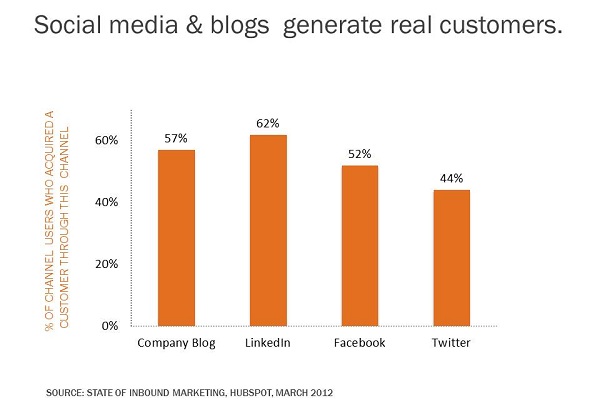
According to Aberdeen Group, businesses that have a strong sales and marketing alignment achieve 20% annual growth rate. On the other hand, businesses with poor sales and marketing alignment have a 4% revenue decline.
Use the infographic that you created to gain more qualified leads for your business, and always optimize for conversions. You must align the promotion of your infographic and other content forms to boost your sales.
Conclusion
Creating and distributing useful infographics is no longer optional; it’s a business necessity.
Piktochart provides a list of 8 types of infographics that you should probably create at some point in your marketing career. This is a good starting point.
If you’re on a tight budget, you can still design a decent-looking infographic for free. Try infogr.am, visual.ly, easel.ly, piktochart.com, venngage.com and get your tools ready.
Have you had any success creating and distributing valuable infographics for your business?
Comments (138)