Google Analytics provides hundreds of different metrics.
But that’s also part of the problem: There’s too many!
You’d need days or weeks to completely digest what’s inside. Most business owners I know can’t afford that kind of time.
There’s good news, though.
First, you can check out this video I made to maximize on-page SEO and a couple other important Google ranking factors.
Second, you don’t need to look at every single metric inside Google Analytics. In fact, you can ignore most of them.
The trick is to know what type of data you’re looking for and which report can give you that information the fastest.
Below, you’ll find eight of my favorite reports that I use all the time to find ‘hidden profit’ on my sites. Browsing each for a few minutes can help you spot easy revenue opportunities that you’re missing.
Here’s how to use each of them to find new ideas that make you look like a hero while also boosting your bottom line.
1. Site Search
People will tell you exactly what they’re looking for on your site if you let them.
Take a look over at my sidebar right now. What do you see about halfway down?
A little search box like this:

Having site search like this on your website kills two birds with one stone. Here’s why:
- To help people find more information about a topic they’re interested in.
- To see what topics people are interested in so I can create more about it!
You’ll first need to enable this function.
Go into Google Analytics and enable site search under the Admin section (under View Settings > Site Search).
Then, you’ll be able to log in and ‘spy’ on what customers are looking for so that you can create more blog posts, webinars, lead magnets, or even products and services that target the same topics.
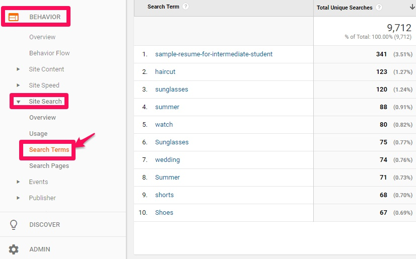
Once enabled, head over to the Behavior tab in the right-hand sidebar. Then look for Site Search and Search Terms.
One final caveat, though.
Notice anything about that example above?
You often see the same word multiple times (like “sunglasses” and “Sunglasses”). These results are case sensitive, which means you’ll need to apply a lowercase filter to consolidate your results. Otherwise, your data will be misleading.
For example, “haircut” is the second most popular search term listed above with 123 searches. But if you had a lowercase filter applied, you’d actually discover that “sunglasses” should be sitting firmly in the number two position with 195 combined searches.
2. Behavior Flow Report
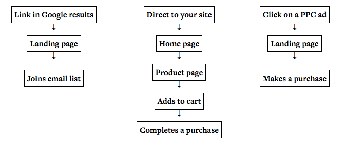
Most people don’t convert from the homepage. Instead, it’s commonly a jumping off point to other places on your website.
We should then turn our attention to how people are already navigating through our website to improve results (rather than obsess over jamming every single item onto the homepage).
Step #1. You can do this with the Behavior Flow report, under the Behavior tab in the left-hand sidebar.
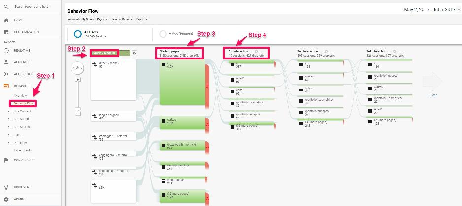
Look at the first column (marked Step #2) in the image above.
Here, you can toggle between ways to segment traffic. The view you’re looking at now segments by Source / Medium, so you can see how each unique traffic source behaves.
Step #3. Above is the Starting Page where each traffic source enters your site. The first forward slash result (“/”) is the homepage. The ones underneath are different page or post paths shown with the corresponding URL.
Each column after that (like Step #4.) shows the ‘next step’ someone takes on your site before either leaving or converting.
Viewing this report will show you that many times people might even bypass the homepage entirely, going from landing page to offer to confirmation page without clicking back to Home.
So first, start by helping people get from one page to the next by including more internal links or CTA’s along each step. You can also see where people are dropping off in chunks and improve those pages to keep people on course.
Try breaking your site down into these paths, tied back to the original traffic source or channel, with inbound funnel segmentation.
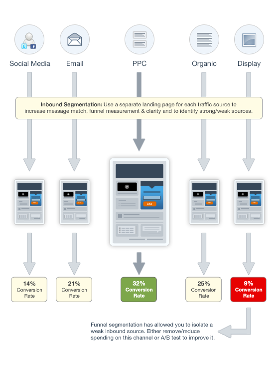
It takes a little extra work on the frontend, but you’ll be able to create a better experience for each user coming through the path because you know exactly where they came from and where they’re trying to go next.
3. Goal Reports
Traffic and pageviews are good. You need a growing site with engaged users to give yourself a fighting chance.
But at the end of the day, you need cold, hard conversions.
Setting up new Goals in Google Analytics can help you track conversions to see which marketing activities result in the newest leads, sales inquiries, or product sales.
Just looking at your website’s overall conversion rate isn’t that helpful. You don’t know what’s contributing to it and whether it’s hitting the potential or not.
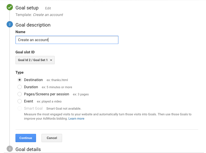
Start by creating a basic Goal inside Google Analytics. For example, if someone was signing up for a new free trial on your site, you could create a Destination goal with the URL of your Thank You page to record all new successful opt-ins.
Then you can go back to your Conversions report and look at Goal Completions by Source / Medium to determine which channels are sending you the most conversions. (And in turn, which of your marketing activities are contributing the best ROI.)
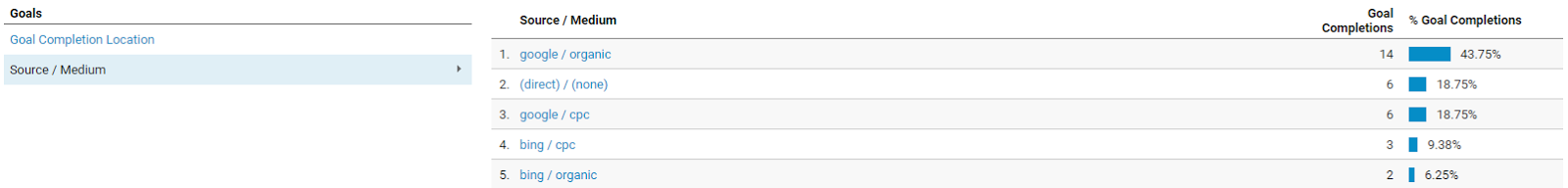
One tricky pitfall to watch out for is the conversions coming from (direct) / (none).
Technically, Direct traffic is when people type your website URL directly into their address bar. But in reality, ‘dark traffic’ is taking over your other sources of tracking and lumping them under Direct instead.
For example, Google is now forcing all webmasters to start adding secure search with an SSL certificate to their websites. In general, this is a good thing! It helps ‘lock down’ websites from someone maliciously snooping on your web session.
However, most analytics packages have trouble properly attributing redirected traffic (like if you’re sending people trying to hit your HTTP domain to the new, updated HTTPS version).
Even though those people may have come from Social or Email, the redirect killed the digital paper trail. Now, these conversions show up as Direct ones, instead of the real source they came from originally.
4. Social Acquisition Reporting
Getting 1,000+ Facebook likes on your post this morning?
That’s great! Seriously, you can expect a ton of new awareness and traffic.
But it’s always going to be hard justifying all the time and money you’re spending on it until you can link it back to conversions at the end of the day.
That’s where the Social Media Google Analytics Report comes into play.
You can use it to find not only how much traffic each social account is generating, but more importantly, how many of those people are transforming into new customers.
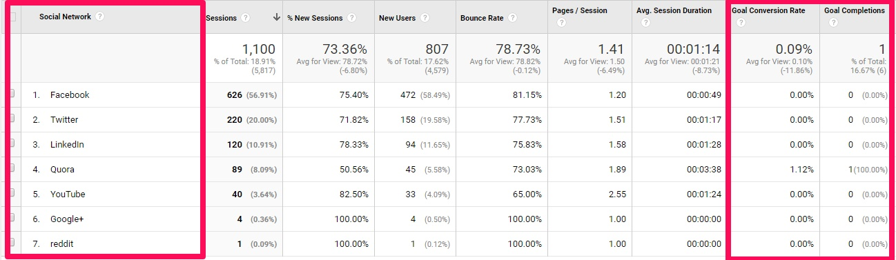
Typically these social channels often get organized under your Referral sources (so it’s tough to pull them out). It’s also common for them to get lumped under Direct, as we just spoke about in the last section.
This new, dedicated Social Media report helps you consolidate just these channels into an easy-to-find place so you can watch how trends change or evolve over time when your social activities increase, Facebook ad spend goes up, etc.
5. Mobile Conversions
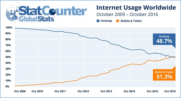
More people access the internet on their mobile devices than on desktop.
So most people know they get a lot of mobile traffic to their websites right now. However, not many understand just how much money their bad mobile website is costing them.
For example, mobile devices commonly have smaller screens than desktop computers. So a complex website design that looks beautiful on a large screen can often cause problems on one that only spans a few inches.
Processing power is another limitation of most mobile devices. So if your website uses large data files like high-resolution images, it can often load much slower on mobile.
The end result is that more people leave your site and your conversion rate tends to be much lower for mobile devices (as opposed to desktop). Here’s how you can discover if this is a problem on your own site.
Head over to the Audience tab, then click on Mobile and Overview.
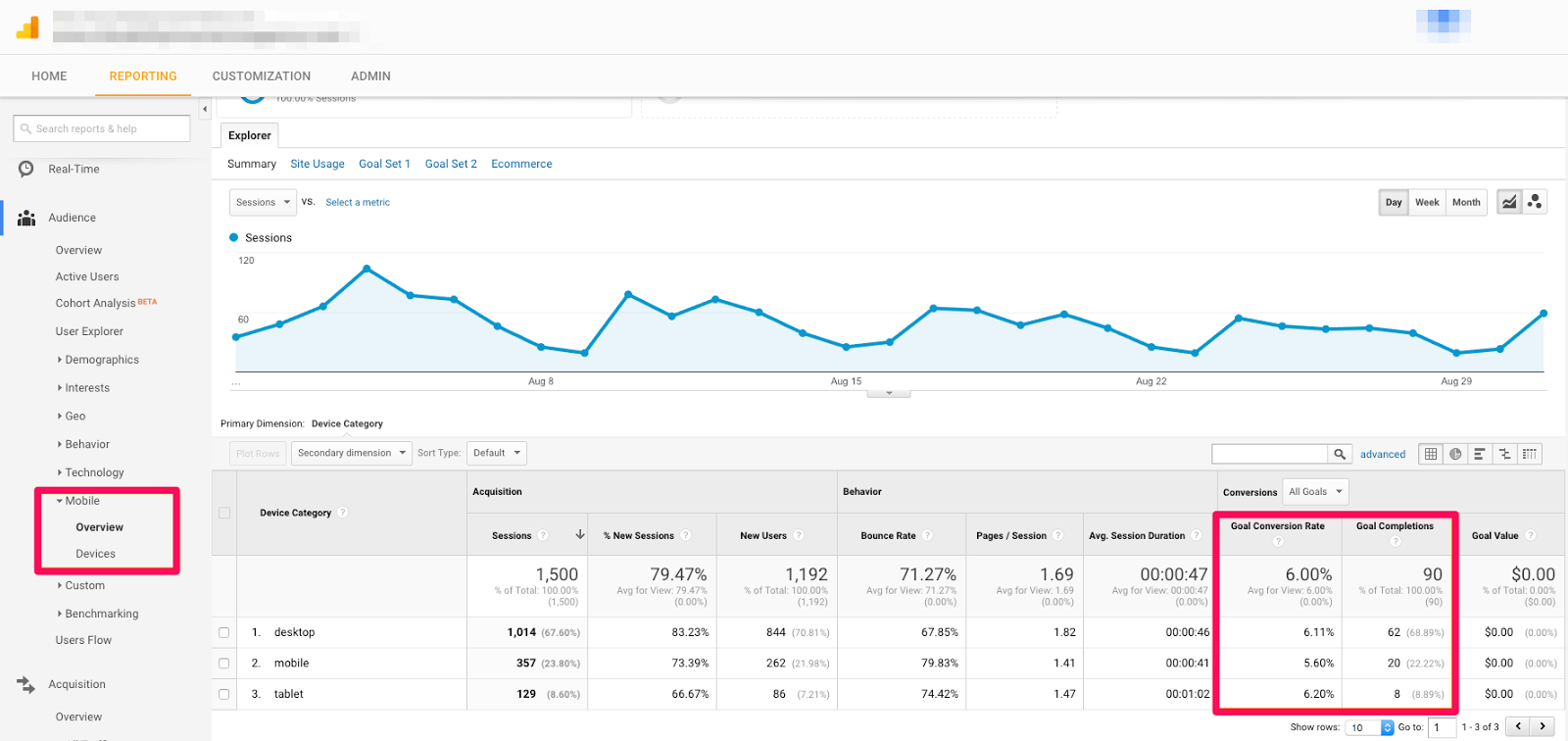
The big warning sign to look for is a drastic difference between your website’s conversion rates on each device.
For example, if your mobile one is significantly less than the desktop one, it means you’re losing out on sales that should have happened. You should be converting even more new customers, but a subpar mobile experience is holding you back.
Just multiply the number of conversions you’re seeing on each by your Average Order Value or Cost Per Customer and find the difference.
Let’s say:
- Desktop conversions are 10 at a 10% conversion rate.
- Mobile conversions are only 2 at a 2% conversion rate.
- The average value is $1,000 for each conversion.
Based on this basic math, you’re potentially losing out on $8,000 each month!
6. Top Converting Pages
Different pages on your site are good at different things.
Some posts might bring in tons of traffic from search engines. But those posts may not be your top converting pages.
Here’s how to find those top converters, instead.
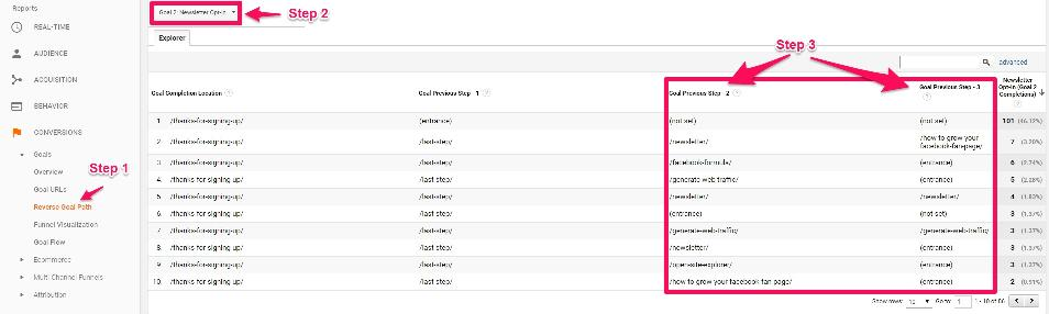
Step #1. Look for the Reverse Goal Path report under Conversions in the left-hand sidebar.
Step #2. Select which goal (or all goals) that you’d like to view. You’ll now be able to look at the individual pages people went through just prior to converting.
Step #3. These are the pages that resulted in the most conversion ‘assists,’ sending people along to the actual landing page or opt-in form that finally did the heavy lifting.
You’ll always need the goal-scoring landing pages. But there won’t be any goals to score if they don’t get help from other pages and posts racking up assists.
So now you can start to funnel your traffic from different points on your site to those assisting pages. These can help strike that happy medium between still bringing in tons of people, while also resulting in the most site-wide conversions, too.
7. Landing Page Report
Here’s another way to identify the best performing content on your website.
Instead of just conversions though, you’ll also be able to see which pages are the most popular in bringing in traffic, which content you should continue to create for customers, and how to benchmark your new marketing efforts against this historical performance.
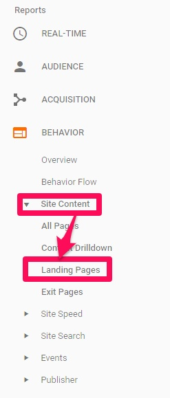
Start by heading over to Behavior, Site Content, and then Landing Pages.
You can now use the search bar to identify specific types of pages or posts. For example, if your blog is in a subdirectory of the site you should be able to simply search for “/blog/” to find all posts.
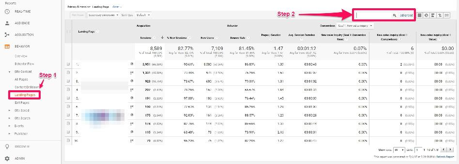
Many blogs will also have the post category in the URL string. So you can search by this, too, to see which posts have performed the best in that specific category.

Now you can easily see which posts get the most search traffic (so you can then add links to your top assisting pages you found earlier).
You should also be able to identify which topics or content types (text, video, infographics, etc.) are your top performers (so you can do more of them!).
One final caveat is to create an exclusion for any posts or pages that might receive a ton of paid content amplification (on top of your normal organic distribution). If you’re evenly promoting different posts, fine. But otherwise, if you don’t remove those paid sources of traffic, you risk looking at skewed data.
8. Lifetime Value Report
Goal conversions are extremely important. At a glance, they help you determine what’s working vs. what’s not.
However, they’re not foolproof.
Sometimes your raw conversion numbers can be misleading. For example, let’s say you have two paid campaigns running right now:
- Campaign A: 10 Leads at $100
- Campaign B: 5 Leads at $100
Initially, it looks like the first Campaign A is the better performer. Especially because you spent the same amount on each one. So you’ll naturally start prioritizing more time and money behind that one.
But not so fast, because it’s not telling you the full picture. First of all, those are just leads (not sales). So the actual conversion rates might look like this:
- Campaign A: 2 Paying Customers
- Campaign B: 5 Paying Customers
Now the story is completely different. Or it could look something like this:
- Campaign A: 2 Paying Customers at $100/each
- Campaign B: 2 Paying Customers at $500/each
See? You can easily be misled by only relying on goal completions.
You need a different metric to help see the additional context around what’s happening here. In that case, go under Google Analytics’ normal Reporting section, look for Audience and then Lifetime Value:
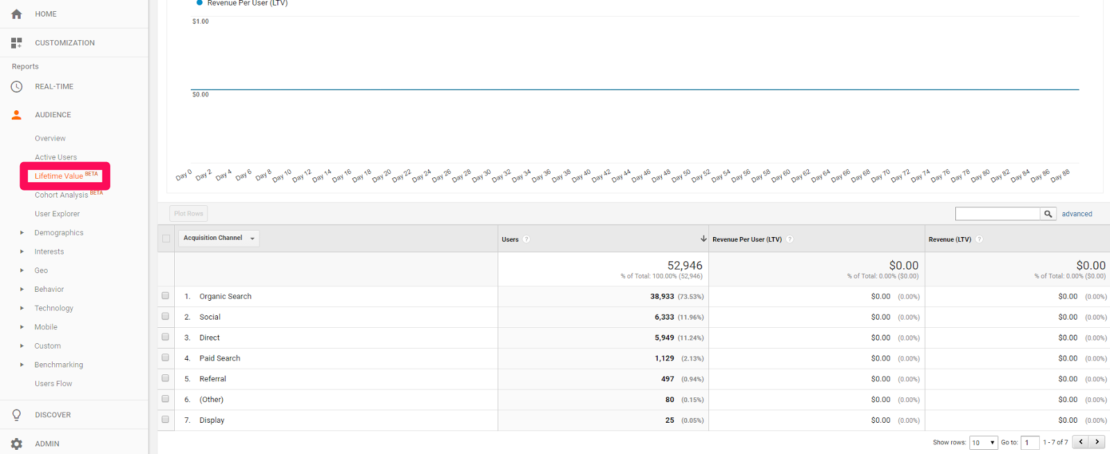
This lifetime value of each customer will give you a more accurate picture of which campaigns are churning out the best ROI.
Here’s how to use it.
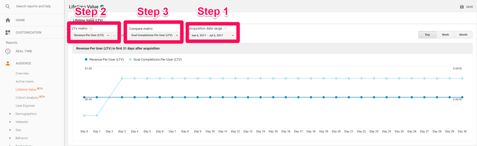
Step #1. Start by setting your acquisition date range on the far right-hand side. This range shows when the new conversion took place. So “May 2017” is going to pick up all conversions that happened in May.
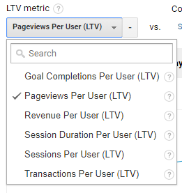
Step #2. Then select which LTV metric you’d like to start with. In most cases, you’ll want to just stick with the Revenue Per User (LTV), so you can measure the total results.
Step #3. Now pick a metric to compare your first LTV metric against.
Let’s say you ran a promotional campaign or online sale during the month of May. This graph will now show you site users acquired during the month of May and how their lifetime value changes based on the second metric you selected (like the page views and session duration metrics over the given time period).
Here’s how that would look:
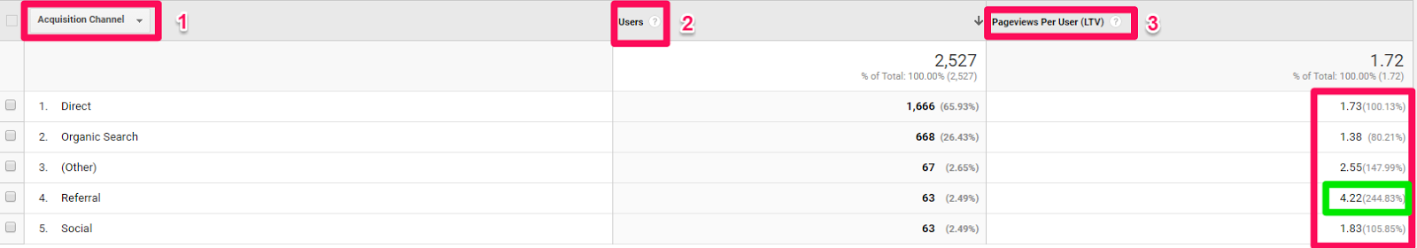
- The channel breakdown that sent the most users.
- The number of users in each channel for your selected acquisition date range.
- The lifetime value metric you’re analyzing (in this case, Pageviews Per User).
Pageviews Per User is an engagement metric, so you can also sort by Goal Completions, Revenue Per User, and Transactions Per User.
Conclusion
Google Analytics has hundreds of different variables to track.
That’s a mind-numbing amount of data. Simply logging in and staring at all of the information can quickly become overwhelming.
Thankfully, you don’t need to look at everything in there. You just need to know how to find the right data points that will give you the best bang for your buck.
The eight reports above can help you identify the ‘low hanging fruit’ that are literally just sitting there, waiting for you to spot.
And the best part is that you won’t have to waste hours reporting. Exporting data to Excel and then using complex modeling with Pivot tables to sort through everything. Once you know how to read them properly, you’ll be able to quickly fix and capitalize on them to rapidly bring in more new customers.
What are you own favorite reports inside Google Analytics? Are there any metrics you religiously follow?
Comments (10)