According to DigitalCommerce360, 51% of users prefer to conduct their shopping with online e-commerce shops.
While that number is increasing, it still leaves a gigantic portion of the world preferring to shop offline in real brick and mortar stores.
To see, feel, and try products before they spend their hard-earned money.
And that is one of the biggest e-commerce struggles:
Overcoming hesitation and roadblocks like the inability to try the product before buying it.
But thankfully, images allow us to capture the same sentiment. But it isn’t easy.
E-commerce images can make or break your conversions.
We’ve all come across sites where the images aren’t good. They don’t showcase the product, and they don’t make us want to buy the product.
In e-commerce, images are everything.
You need to know how to take the best product shots if you want better conversions.
Here’s how to take amazing product shots on a low budget and optimize them for better SEO and conversions today.
Why premium e-commerce photos are critical for driving better sales
We all love Amazon. It’s our saving grace, right?
And that’s not just a “saying” or an assumption. People are truly addicted to Amazon, including me.
According to Statista, the net revenue of sales for Amazon in 2017 was 177.87 billion dollars. Yes, that’s billion, not million.
Since 2012, Amazon Prime growth has virtually skyrocketed. I bet you could text five of your close friends and at least three of them would have Amazon Prime subscriptions.
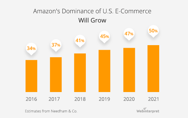
According to the latest studies, Amazon is slotted to account for nearly half of all e-commerce sales by 2021. And that’s just Amazon alone compared to all other e-commerce stores combined.
So, what’s behind their success?
Simplicity and ease of use. You can order products with a single click and have them delivered on the same day with Amazon Prime Now.
Free two-day shipping is a massive selling point for Amazon buying too:
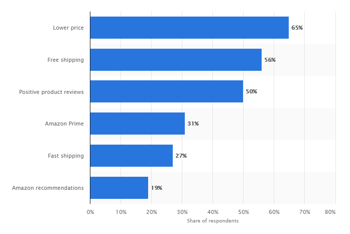
Amazon makes the buying experience enjoyable and easy. With hassle-free returns, free shipping, and often lower or price-matched products, it’s a no-brainer to buy from them.
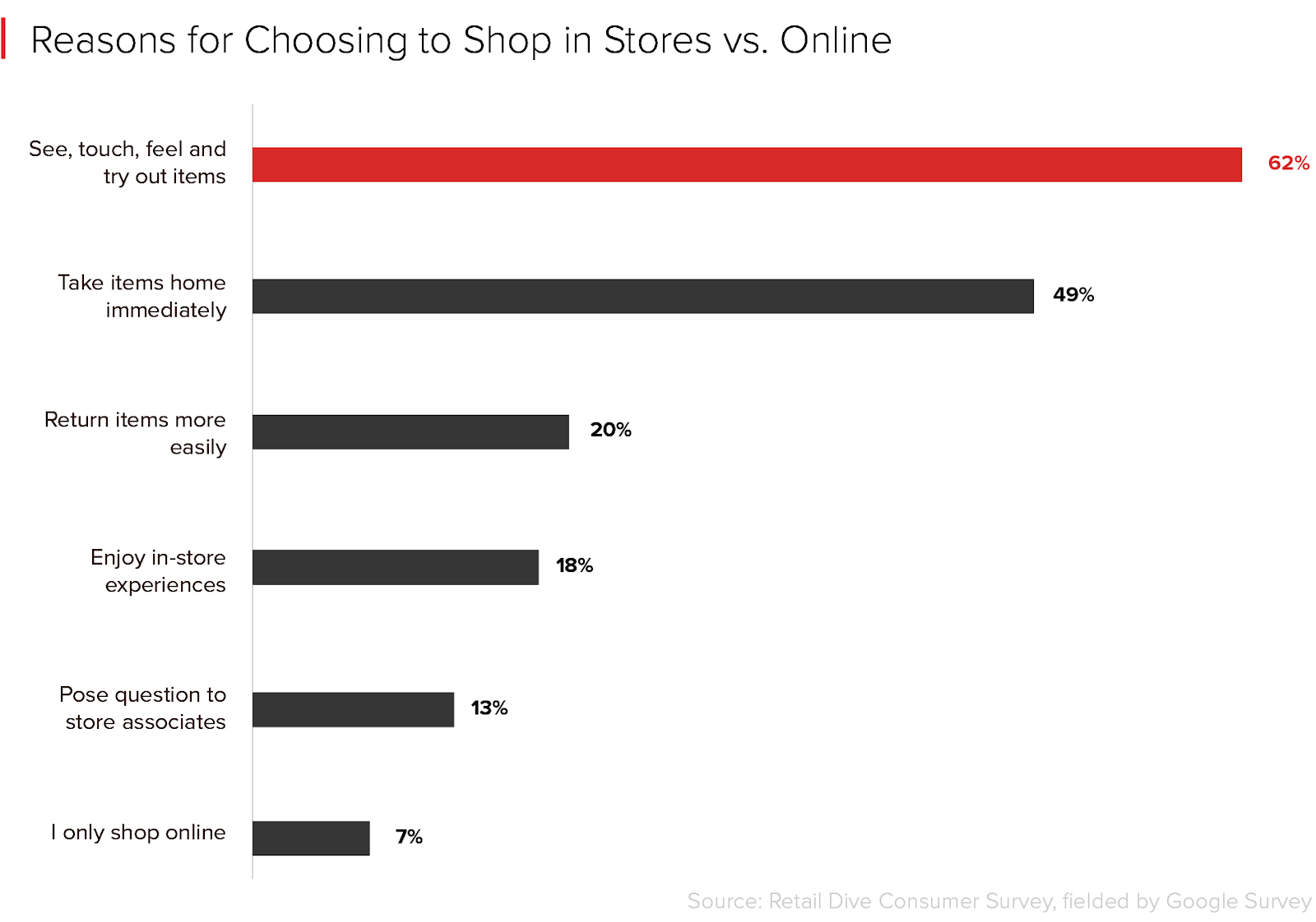
But even with all of this insane growth and value, a 2017 study by Retail Dive found some interesting results:
49% of consumers prefer retail stores to online shopping because they can “see, touch, feel, and try out items.”
People still love the traditional retail experience of going to stores to test items before buying.
And it makes sense.
You don’t want to wait for a product to be shipped and delivered only for it to be a bust and not fit or work.
That means another week for returns and another week for delivery.
It sets you back tons of time and effort that could have been solved by a simple drive to the brick and mortar store.
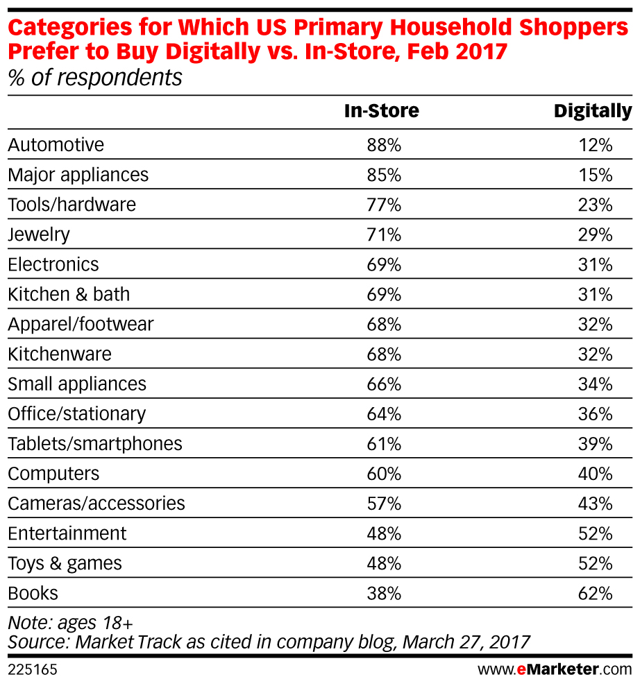
eMarketer found similar results to the Retail Dive study, finding that in almost every single industry, shoppers in the United States prefer to purchase in-store:
And these studies are very recent!
While it seems that online shopping is taking over, customers are still heading to their local shops to purchase items.
This presents a big problem and opportunity for online e-commerce shops:
Images are more important than ever.
You need to be able to communicate the same value and experience as touching, feeling and experience the product in a store.
You can’t simply slap a few images on your products and call it a day.
They need to be planned out and taken with intent. They need to communicate value and showcase how and why the product is going to work for the consumer.
Let me show you some examples of the best e-commerce sites right now and how they use images to drive online sales in a market that still loves offline buying.
What we can learn from the best e-commerce stores about product images
When it comes to good e-commerce product shots, you know one when you see it.
I bet you could think of at least five stores that have incredible product photos.
Maybe some that have even influenced you to buy or see that brand in a more favorable light.
Yes, good e-commerce photos are that powerful.
There is perhaps a no better example of amazing e-commerce photos as GoPro. They are the masters of getting you to buy through amazing visuals.
And it’s not just their amazing photos, but the strategy behind them.
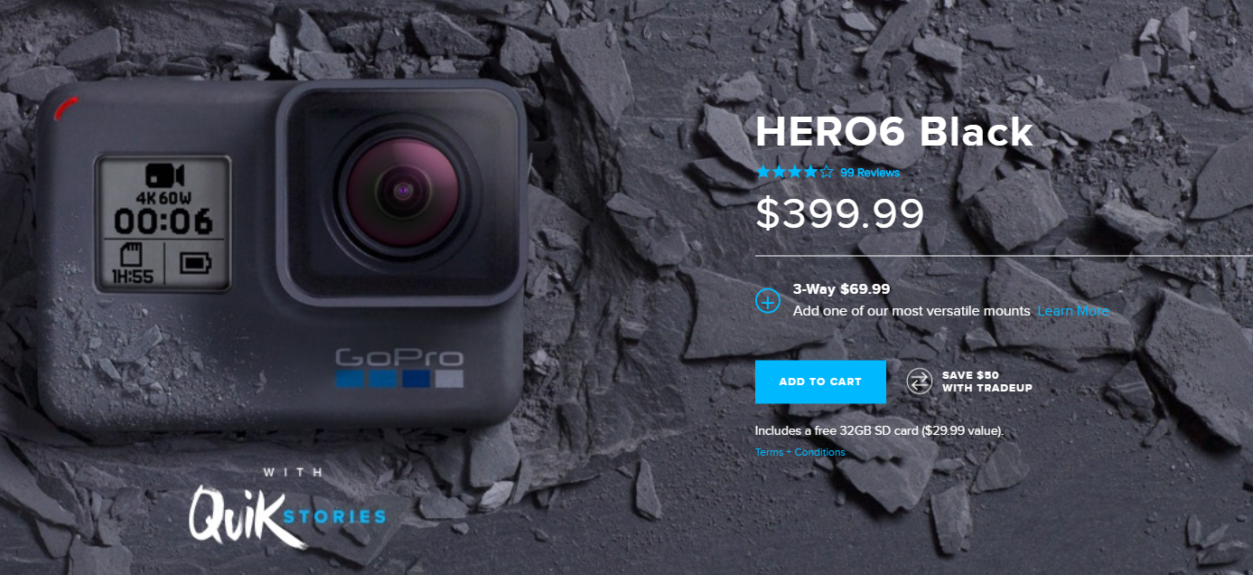
For example, when you first land on a product page, you are met with the standard product shot that you expect to see:
This is wonderful. It plays directly to their brand image while also giving a high-resolution photo for consumers to view.
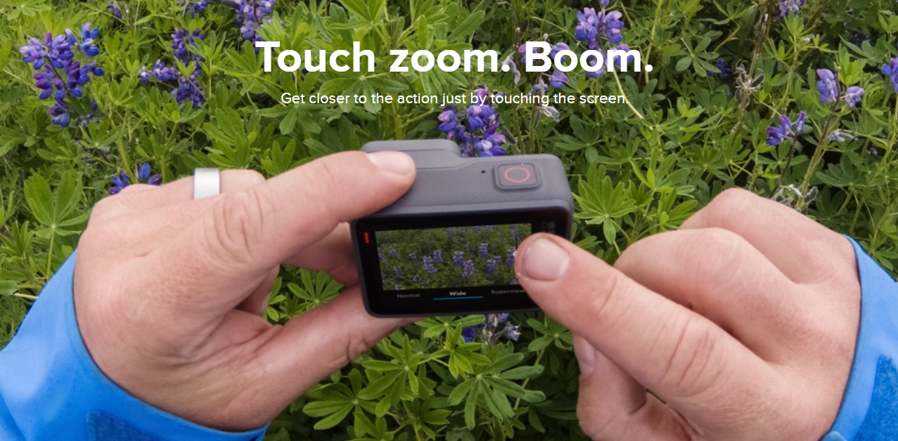
Scrolling down, you also see the product in its prime use case scenario:
With the product in actual use, consumers can visualize themselves using the product.
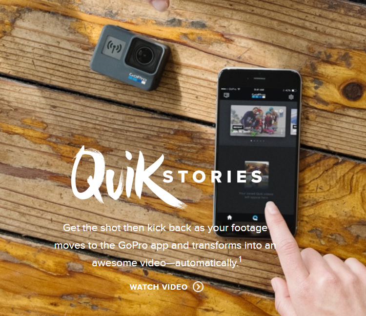
Scrolling even further, you see the GoPro on a table next to a smartphone:
This photo conveys a dual purpose:
- The product is super small and compact enough to carry with you anywhere you go.
- GoPro has a mobile app to connect your footage to your phone instantly.
Incredible.
All with a few simple photos, GoPro showcased the product design and features, consumers using the product and it’s compact design that appeals to its fanbase.
E-commerce photos are more than just product shots. They are visual representations of how your product is supposed to be used, and they also convey the spirit of your brand.
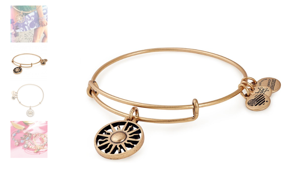
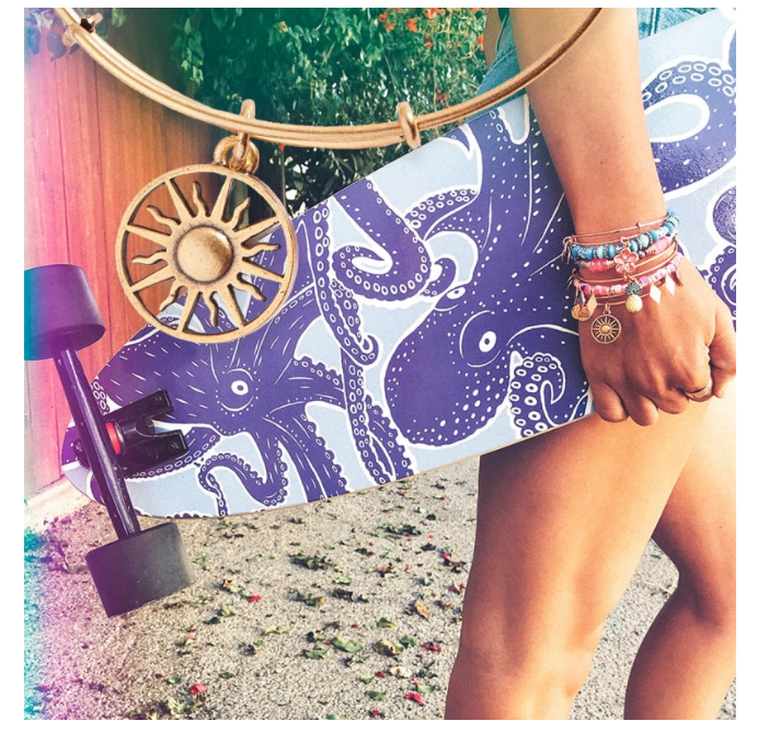
Another amazing company that dominates e-commerce images is Alex and Ani.
First, they showcase the product with up-close high-resolution photos, allowing users to see every small detail on their jewelry:
Next, just like GoPro, they display their bracelets in action to inspire style ideas in potential buyers and showcase what outfits and lifestyles match up well with that specific product:
These e-commerce product images are far from standard photos. They evoke emotion and promote the brand mission.
With these examples in mind, you should now have a clear idea of where your e-commerce product photos need to be.
Brainstorm more on how you can show your products in creative ways.
Can you show your product in action?
For example, being used as your customers normally would use it? Or even shown on a customer like Alex and Ani do?
Once you’ve nailed down a few creative ways to showcase your product, it’s time to learn how to take better e-commerce product images even if you don’t own expensive equipment.
How to take better e-commerce product images on a low budget
Hiring a professional photographer to take shots of your products is expensive.
Top-tier professionals charge anywhere from $250 to $500 an hour, or even up to $2,000 or more per image.
But the truth is:
You don’t need it. You can take amazing pictures with your smartphone or a standard digital camera.
Here are a few key tips for taking better e-commerce product images without blowing your budget on outside hires or expensive equipment.
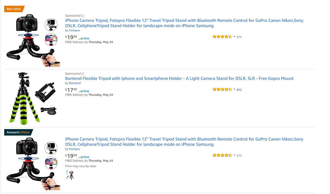
Tip #1: Invest in a flexible tripod to capture angles
One of the best items you can invest money in is a tripod. But not just any tripod.
For taking e-commerce shots, I recommend using a flexible tripod.
Flexible tripods allow you to capture amazing angles on your products with a consistent, non-blurry shot.
And the most significant benefit is that you can attach a flexible tripod to just about any surface, railing or piece of equipment.
Meaning you can take outside shots and great photos to showcase your product and branding.
Plus, they are often incredibly cheap.
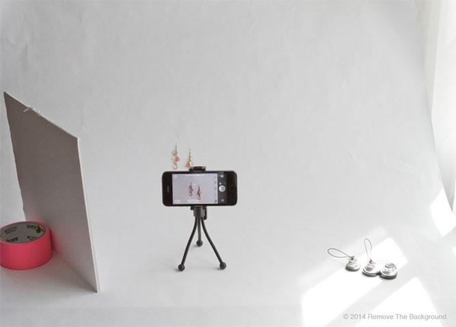
With just a smartphone and your flexible tripod, you can snap amazing photos of your products in minutes:
And that brings us to our next point:
Tip #2: perfect your lighting
Lighting is a critical factor in producing better e-commerce photos.
If you can’t get good lighting, your shots won’t look professionally done.
In fact, it’s often lighting that sets apart the best e-commerce product shots from amateur photos.
It’s incredibly easy to spot poorly done product images where the lighting creates shadows and unfavorable angles on the product itself.
Before messing around with lighting, you should know the differences between both natural and artificial light.
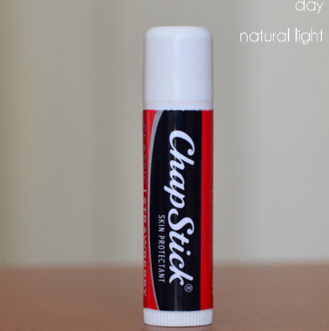
Natural light is merely light produced from the sun. You aren’t using any form of lamp or electric source to produce light.
Natural light is very vibrant, sharp and defined. You can see every bit of detail on the product above.
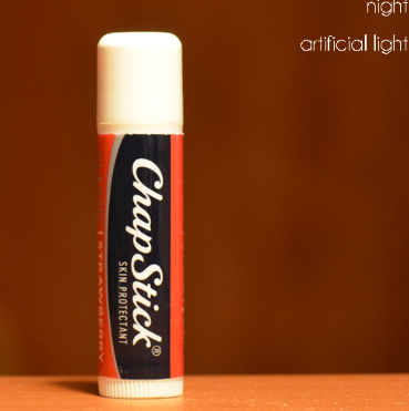
Now compare that to artificial light:
Artificial light is often tinted yellow depending on what light source you are using.
So, when should you use each?
Natural light is best when the product is showcased outside. For example, if your product is used outdoors, use natural light. Is your product worn on a person? Use natural light.
Artificial light is perfect for showcasing particular products like a watch or a wallet, where you want to showcase every single detail in the product.
Experiment with both light types, but be sure to keep it consistent with all of your products.
Tip #3: use a sweep to produce cleaner images
Have you ever heard of a sweep before? Maybe not, but you have likely seen it in action on your favorite e-commerce shops:
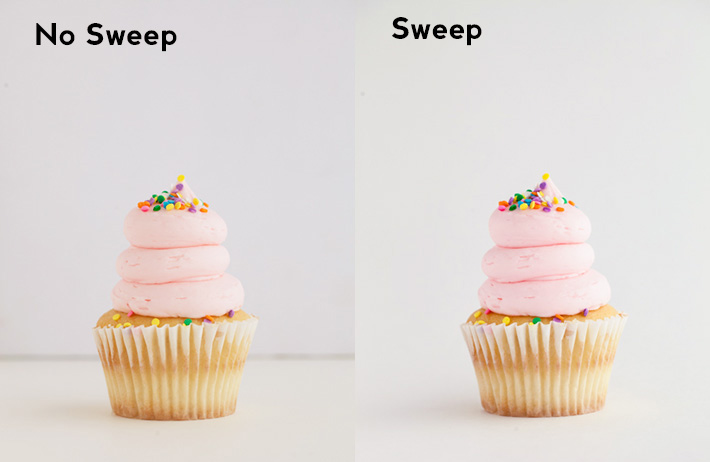
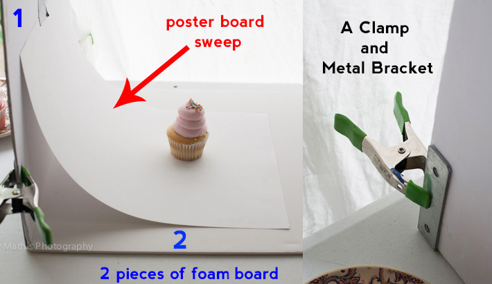
A photography sweep is an act of creating a ramp with posterboard paper that gives the effect of limitless white space behind your product.
For example, take a look at what your product looks like using a sweep compared to not using one:
Sweeps are great for producing consistent white space that isn’t impacted by shadows, creases or changes in backgrounds.
And they can be produced in your own home for pennies to the dollar with craft store equipment!
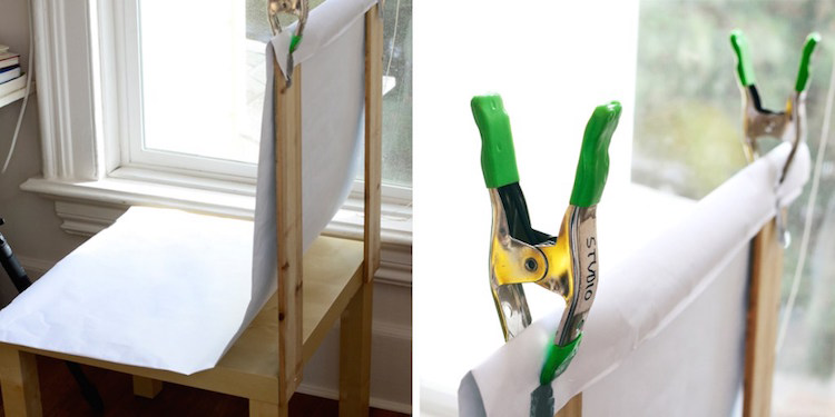
Fstoppers recommends using poster board as your sweep, held together with two pieces of foam and a metal clamp.
You can likely buy all of this for under $50, creating a small shooting studio that produces impressive pictures.
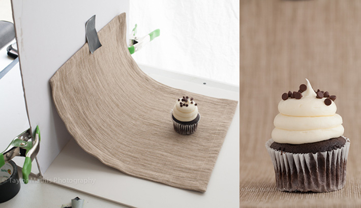
If you feel like switching up the background, you can simply tape new materials as your sweep instead of white poster board:
These dynamic setups are cheap and easy to create, and they produce photos that look professional.
Combine this with your preferred lighting and your flexible tripod and smartphone setup, and you’ll be taking high-quality photos for almost no investment.
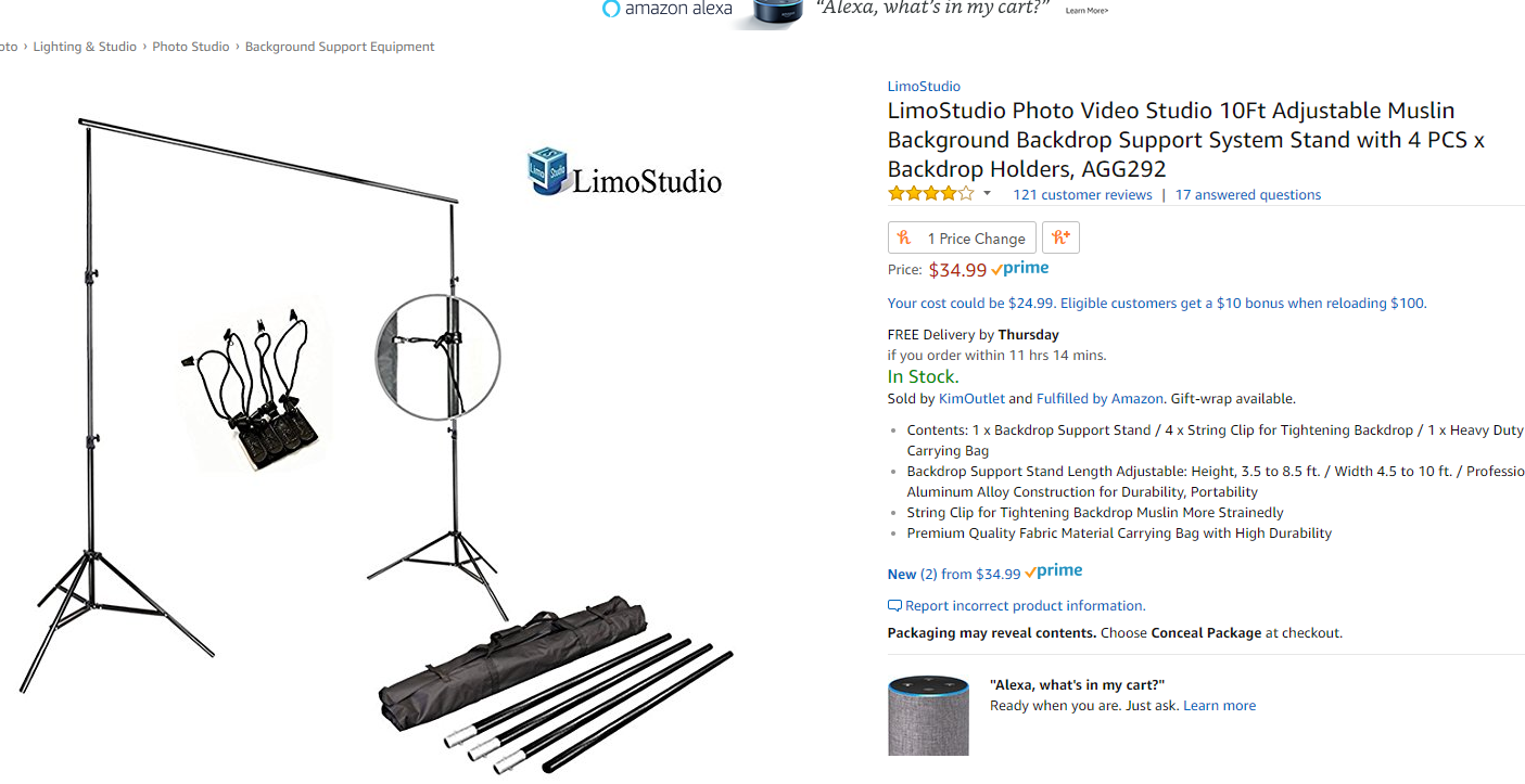
If you feel like buying the setup, Amazon sells high-quality backdrops that you can set up sweeps with:
These cheap studios can be highly useful for larger products like furniture:
Using the same technique of the sweep, you can clamp white posterboard paper to your system stand and take incredible product shots for cheap.
Now that you’ve mastered the basics of taking amazing product images for your online store, it’s time to optimize them for a better site experience and more organic traffic.
3 steps for optimizing your e-commerce images for organic search
Taking your e-commerce product shots is just the first step.
But optimizing them is a crucial piece of the pie that most often ignore.
But that’s dangerous because it can drastically impact your speed and organic traffic.
Follow these five steps, and your images will be optimized for search engines and real user experiences.
Step 1: Optimize for speed with compression tools
Speed is one of the most important aspects of keeping users around on your site.
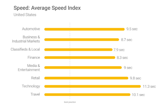
According to a recent Google study, the majority of websites take at least eight seconds to load:
The current best practice for load time is just three seconds, though.
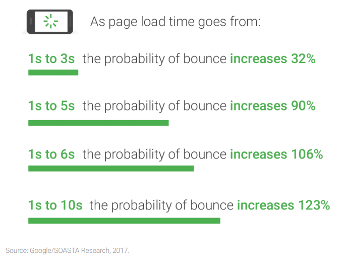
Most websites are too slow and that causes massively high bounce rates that can impact your sales:
Even just a few seconds can increase your bounce rate by over 100%.
And when you’ve worked hard to generate traffic, you literally can’t afford for them to leave without buying from you.
Especially if you are paying for the traffic using PPC ads.
Product images are often very high quality due to their high resolutions. This is wonderful for users to engage with, but also creates a slower site that can negatively impact the user experience.
It’s a double-edged sword.
BBC News found that consumers won’t wait more than three seconds for an e-commerce site to fully load its pages.
So, how do you reduce your image size without destroying the quality you worked so hard to achieve?
By using the right compression tools and file types. One of my favorite, simple tools is JPEGmini:
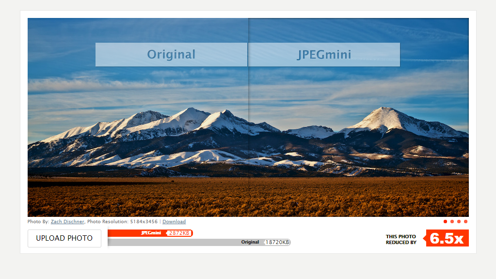
Using this tool, you can reduce your file sizes by a ton without dramatically decreasing your quality.
This example above showcases a 6.5x reduction in file size with comparable quality.
Test a bunch of different products like this and find a software that you love.
Always run your product images through a compressor before uploading to your store to preserve your site speed and keep users coming back for more.
Step 2: Keyword optimize your file names and alt text
When taking dozens of product photos, it’s tempting to leave their file names alone.
“image_12”
But Google crawls your alt text and image names to pull data on relevancy for search engines.
Without this data, Google has no idea what your image contains because Google doesn’t scan images, they scan your metadata.
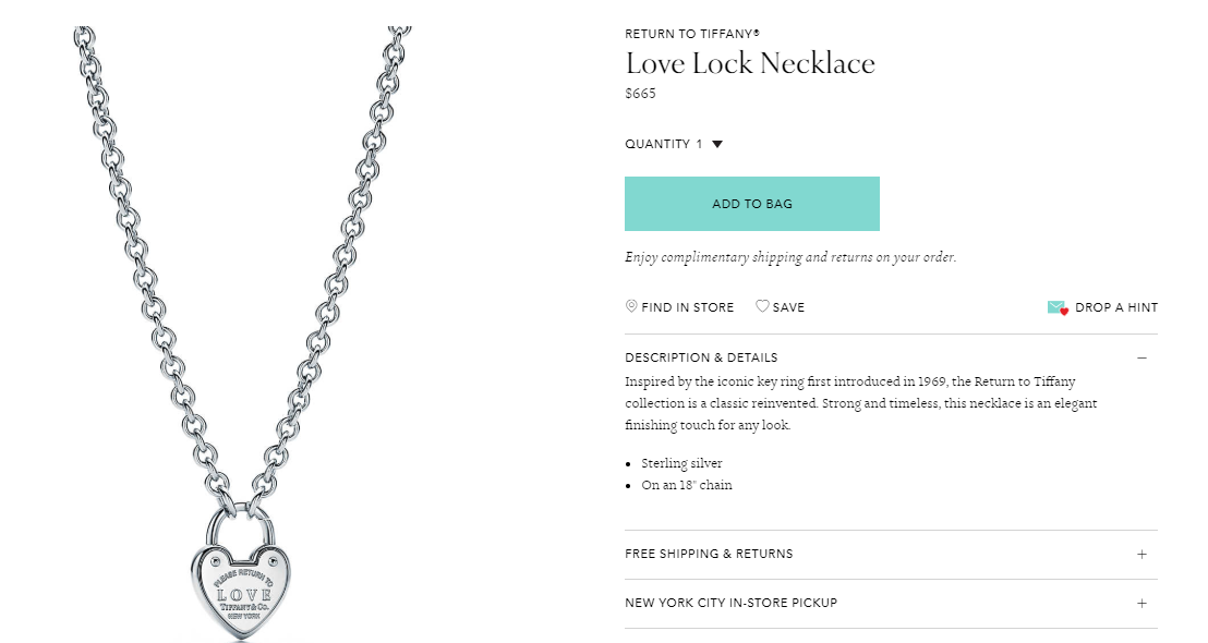
For instance, if you are uploading a new e-commerce product image of your necklace, you would want to give that necklace the product name as its file name:
That product should be named: “Tiffany Love Lock Necklace.”
It’s simple yet perfectly describes what the product is.
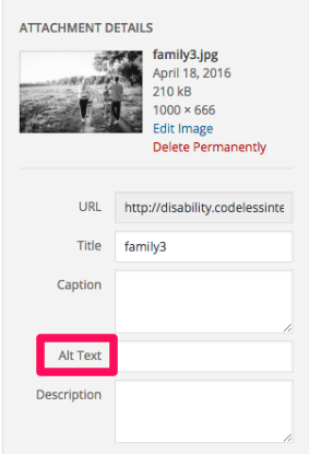
After giving your photos clear and proper file names, you should always edit the alternative text of your images.
According to Moz, “Alt tags provide better image context/descriptions to search engine crawlers, helping them to index an image properly.”
They are critical for sending the right data and signals to Google and should be present on every single image you upload to your site.
Here is a code sample of what alt text looks like in your source code:
Alt text helps both with accessibility for users who can’t see and image SEO.
So, how do you write them? What do you include or exclude? What about keywords?
The trap that most people fall into with alt text is keyword stuffing.
Keyword stuffing should always be avoided. Don’t simply spam keywords into your alt text to describe your image.
The key with alt text is genuinely describing what is contained in your image and why it’s on the page.
For instance, if you are showing a product picture of a briefcase you sell, your alt text could look like this: “man holding brown leather briefcase in office.”
This both describes the picture, the product and the function of it.
Step 3: Continually A/B test your photos
Image optimization requires continual testing and interactions of your photos.
Unfortunately, we can’t just set and forget photos and expect them to drive interest forever.
Consumer behavior shifts. People change. Opinions are always advancing.
Testing is the name of the game for e-commerce product shots. If you notice that your product isn’t selling despite having tons of relevant traffic, it could be that your images aren’t producing enough desire.
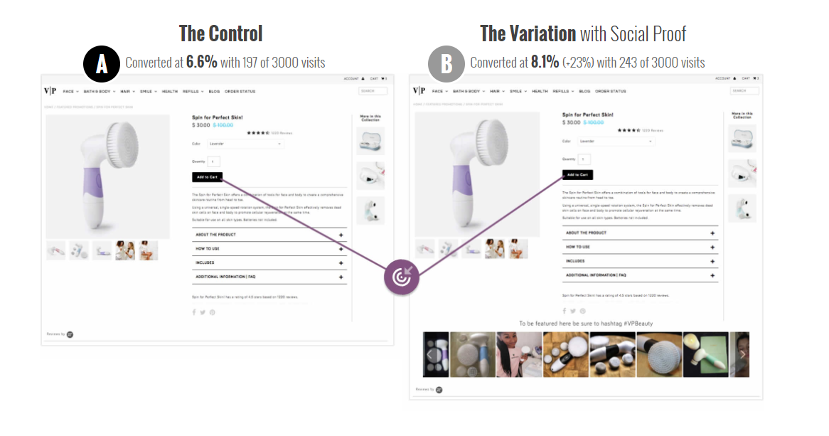
For example, one company found that its photos were struggling to do just that. They weren’t selling despite being high quality.
To combat this, they introduced user-generated content:
By adding photos from real users of the product, they increased sales by 23%.
Why? Social proof and creating more trust by showing the actual product used by real customers.
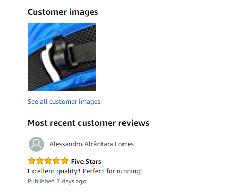
This is a tactic that Amazon nails on every single product. Scrolling to the reviews section, you can see photos from verified buyers:
These photos help to build trust and provide you another way to include photos of your products.
Try asking people in your follow-up emails if they can send pictures of the product or reviews to enhance your product pages.
Need some ideas for A/B testing your product shots? Here are a few to try out in your next test:
- Try testing your product shots in different lighting: natural vs. artificial
- Test how many product shots you offer to see if you include too many or too little
- Test your product shots: are they showcasing your brand favorably or are they simply shots that people skip over to see the next?
Try recording live-user behavior or click reporting tools that can help you analyze what elements people love and which ones they ignore.
This can be great as they allow you to find what works and what doesn’t, meaning you only have to test once to realize that specific product shots, angles, and lighting aren’t working.
Conclusion
E-commerce is a growing industry that is on pace to dominate shopping.
But currently, people still love to shop in stores.
According to eMarketer, in almost every industry people love to shop in-store.
Why?
Because they can touch, feel and experience the product before throwing down money.
And that’s the one flaw of e-commerce: you can’t test before you buy. You roll the dice and hope it fits or hope the product looks good.
And if it doesn’t, you are met with a hassle unlike any other: returning and re-shipping your order until it works.
To combat this fear and improve your e-commerce conversions, focus on producing better images that convey more value and help users make decisions.
This can be anything from showcasing your product in use or using 360-degree photos and videos.
Showcase every usage scenario that you can think of to blow past roadblocks and remove hesitancy from the process.
Take the best product shots you can, and always be sure to SEO optimize them for speed and organic search.
E-commerce product photos are critical to success.
What are some of the best e-commerce product photos you’ve seen before that influenced your buying decisions?






Comments (32)