
Let’s face it: All infographics are not necessarily created equal.
In the digital space, the only way to measure the effectiveness of any piece of content is in the number of shares, comments, inbound links and views generated.
Even with cute cat pictures, the engagement generated is the quickest way to know that people truly care about the topic at hand.
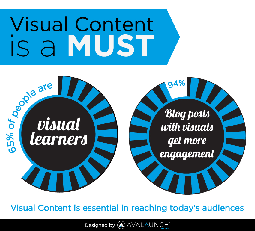
All things being equal, infographics really do work well, possibly because 65% of people are visual learners.
I started releasing infographics on my blogs before 2014. However, I took it a step further, as the years went by and the results were amazing.
Until recently, I published one useful infographic each week, on average. I’ve since cut back on that rate, but I can say with conviction that infographic publishing has been one of my most powerful social media marketing strategies.
For example, when we started publishing infographics on the KISSmetrics blog in 2010, it helped us generate 2,512,596 visitors and 41,142 backlinks.
You can create infographics that go viral, if you understand the psychology behind viral content.
But, you need actionable tips, not outdated theories, if you want to build a successful online business.
So, instead of giving you a handful of quick tips for creating infographics, I’m going to show you 4 specific infographics that generated thousands of social media shares. I’ll explain why they were shared so widely and how you can model them to create your own viral infographics and other content.
Note: Infographics from all types of different niches go viral. But, our focus is content marketing.
Let’s take a look.
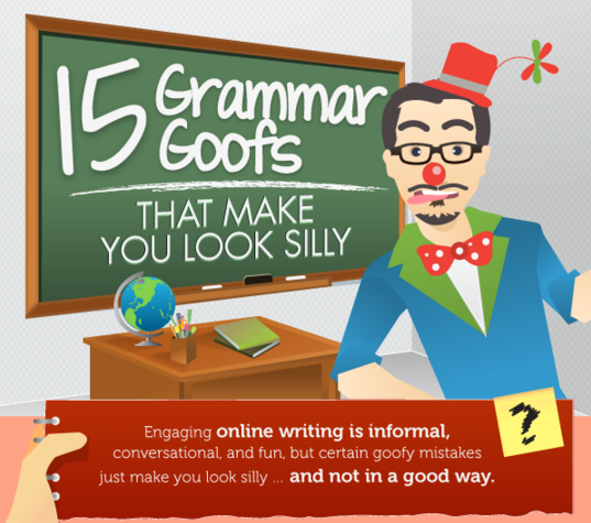
1). 15 Grammar Goofs That Make You Look Silly
Number of shares: 263,100
Copyblogger has long been one of my go-to, content marketing blogs.
No matter what type of content that I’m creating, I know that I can find answers to my questions on Brian Clark’s authority blog.
Copyblogger understands how to do content marketing well. It’s no wonder it evolved from a straightforward blog to a multimillion dollar digital media company.
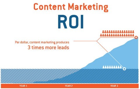
If you can embrace content marketing wholeheartedly, like Copyblogger, your results will be outstanding – a recent study found that, “per dollar, content marketing produces 3 times more leads.”
To become successful at content marketing, you must consistently work to create content around a known topic, while still offering something new and valuable.
Add more value to it, so that when your prospects read it, they’ll have a different experience altogether. That’s exactly what Copyblogger did with this great infographic.
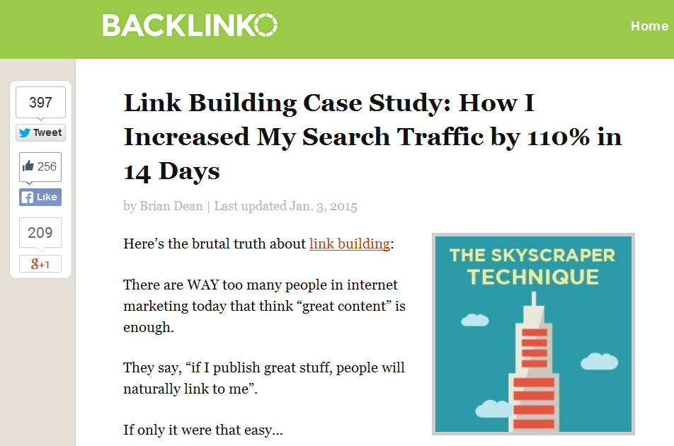
This is similar to what is now popularly referred to as the Skyscraper Technique – a proven content marketing technique that increased Brian Dean’s organic traffic by 110% in 14 days.
Let’s get back to Copyblogger’s infographic.
The title alone is captivating: “15 Grammar Goofs That Make You Look Silly.”
One of the things that surprised me was the topic.
Grammatical errors are such a common thing. Many writers, authors, and English teachers have done their best to help people create impeccable content by correcting grammatical errors.
Copyblogger was smart. Instead of creating another blog post, they decided to create a professional and highly valuable infographic.
Here’s an excerpt from the infographic:
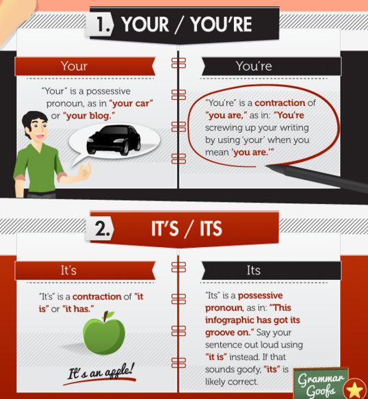
Side note: This infographic generated over 263,000 social shares, because of the authority and popularity of Copyblogger.
The blog’s been around for a long time, ever since the days when few people knew what content marketing was all about. But this uses graphic design, not text copy.
However, there’s more behind this infographic’s popularity than just a popular brand.
i). Off-site promotion: Back when he was building his audience, Brian Clark contributed valuable posts to some high-end blogs.
He leveraged other people’s blogs (OPB) to drive engagement to his invaluable infographic resource.

No matter how popular your blog is, you’ll be limited if you only promote your infographic or other content types there.
You’ve got to go offsite: get on other people’s podcasts, get interviewed, write guest posts and promote your infographic on sites other than your own blog post. As Pat Flynn said,
ii). Social media promotion: The infographic design was promoted massively on Pinterest and elsewhere.
The more shares that you get on Facebook, LinkedIn, Twitter, Pinterest and so forth, the greater your chances of improving your rankings in Google.
Social shares may not impact search performance directly, but those social signals are telling Google something: your content is useful. Otherwise, why would people bother sharing it?
So, when you publish your infographic (or any content, really), use social media to amplify reach to your target audience.
iii). Word of mouth: WOM is the best marketing strategy around, because it brings the best customers for your business. It drives today’s purchase decisions. Look at the facts:
When people like a piece of content – in this case, an infographic – they tell others about it. I actually told a lot of people who were struggling with grammar to study Copyblogger’s infographic.
Was I asked to do so? No. But the value inside the infographic compelled me to offer it up as the best resource for that topic. It just happened to be an infographic design resource.
iv). Value of the infographic: I’ve said this several times already, but it’s worth repeating: Fill your infographic with value.
Double-check your statistics. Make sure you answer the biggest questions on your topic.
That’s the easiest way to get massive social shares.
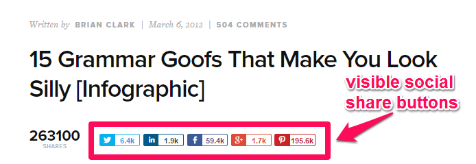
v). Ease of sharing: All of the factors above hinge on this. If your infographic is valuable, but sharing is difficult, your loyal fans will leave the page without sharing.
Make sure that your social share buttons are visible, easy to access and inviting. Check out Copyblogger’s:
2). The Psychology Behind Why We Like, Share and Comment on Facebook
Number of shares: 12,000
Recently, I created a post titled “What it Takes to Get Massive Social Shares.” My readers loved it.

Knowing why people share content on social media is critical to your success. Of course, if you don’t know, it doesn’t necessarily mean that you’ll fail. But, knowing the answer gives you a significant advantage over your competitors.
I created the infographic above. But, I didn’t get much traction for it on my blog. Then, I decided to republish it on Entrepreneur.com, an authority site where I contribute regularly.
The result was amazing. Through a combined effort, the infographic that digs deeper into “The Psychology Behind Why We Like, Share and Comment on Facebook” generated over 12,000 social shares.
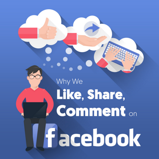
The infographic had a professional design (I spend $1,000 get it done) and was timely.
The lessons that I learned from the experience of creating, publishing, republishing and promoting this infographic include:
i). Audience shift: What do I mean by “audience shift?” Well, sometimes, the content you thought your audience would find so useful might not really resonate with them.
But don’t give up. Believe that there is an audience that will fall in love with your infographic elsewhere. Find that audience and share your content with them.
In my case, I shifted focus and republished the infographic on Entrepreneur.com. I tapped into that high-traffic site and got thousands of social media shares.
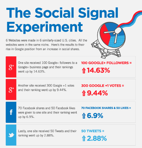
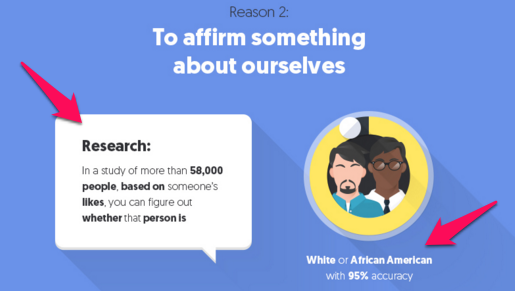
ii). Use data: Data-driven blog posts are usually successful and generate massive shares. In the same vein, when you add statistics, case studies, and data to your infographic, more people will share it. See the example below:
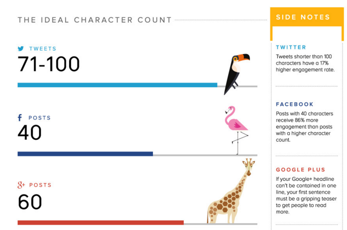
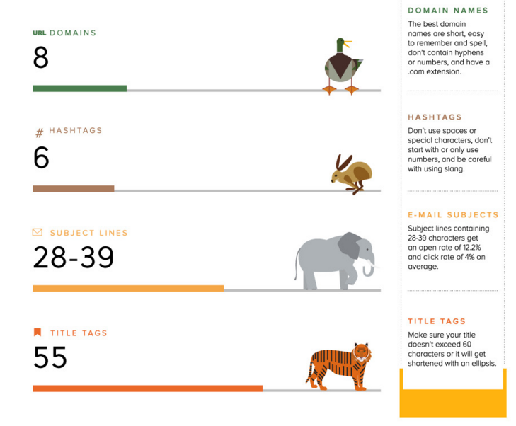
3). What Is the Ideal Length of Everything Online?
Number of social shares: 5,900+
SocialMediaToday.com has been a pioneer in the social media marketing niche. One hallmark of their content culture is creating in-depth content with a focus on social media trends and big data.
Their infographic entitled “What is the Ideal Length of Everything Online?” is truly useful.
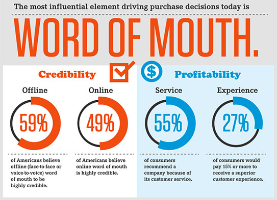
It’s useful, not just because of the topic, but also because of how the designer structured the data and made it fun to read. The infographic likens the internet to a zoo. Take a look at the first part of the design:
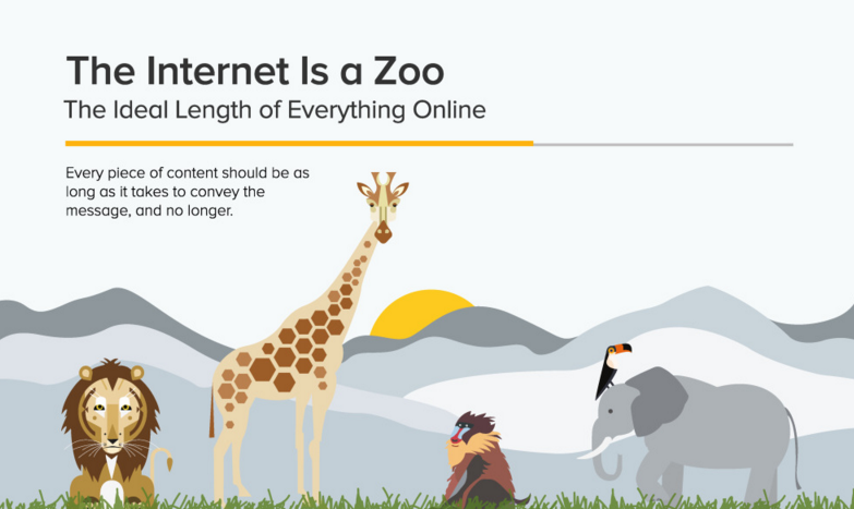
Using an analogy to create any type of content generally captivates and resonates with potential customers.
As content marketers, we’re always fascinated by long-form content. We believe, and have proven through several experiments, that long-form content generates the most engagement.
I can show you a bar graph to prove it, but instead here is a sleek infographic design.
But, we can’t forget that there’s a yardstick for measuring long-form content: Value.
In other words, if your post is long (up to 2,000 words), but you didn’t provide any actionable tips or strategies, readers will be dissatisfied. When that happens, they won’t share your content.
With that in mind, Social Media Today created this infographic to answer the question of content length – not just for blog posts, but for everything online. This is an actual bar chart using infographic design in a clever way.
Here are a few things that made the infographic generate over 5,000 social shares:
i). Timely content: The content of this infographic bar chart was timely, since people are always asking questions about the subject — what the ideal length of tweets, blog posts, hashtags, URL domains, email subject lines and more, should be.
This infographic provides the answers in a visually appealing, memorable and cohesive way.
ii). User satisfaction: The first time I saw this infographic, I was happy to see it, since my own questions on ideal content length were so succinctly answered in “data visualization.”
When users are that satisfied with your infographic (especially when you answer their questions in a fun and memorable way), they’ll feel compelled to share it with their own audiences and friends, often your target audience.
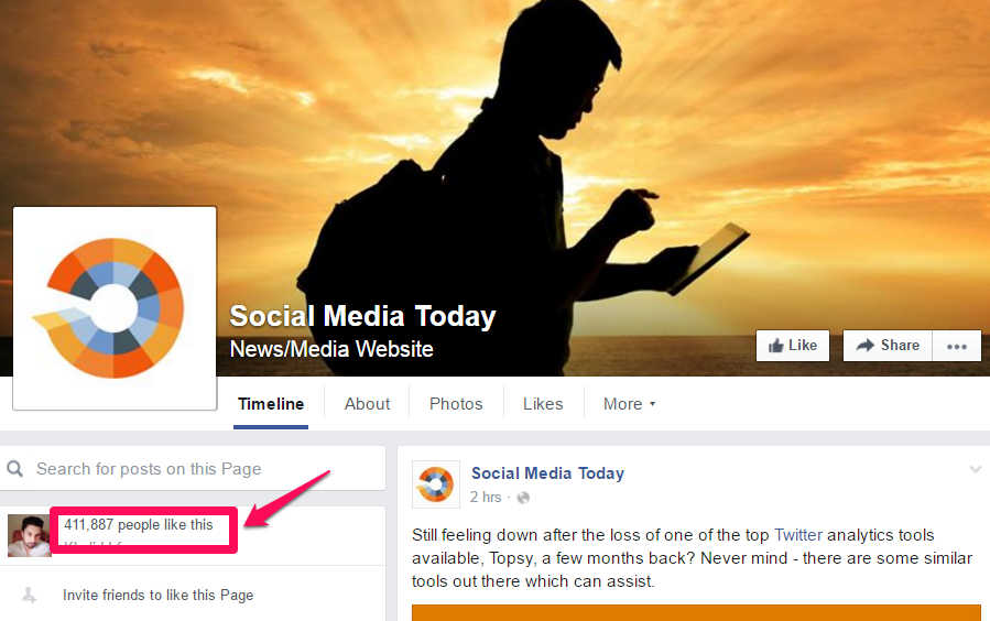
iii). Social media promotion: Socialmediatoday.com is primarily a social media marketing company, with over 400,000 Facebook fans and an active user community. So, this infographic was already in good hands.
Infographic design matters a lot. This design is fun and relatively easy to read. Yet, I strongly believe that if this infographic had a more professional design, it’d inspire more people to share it. At 5,000+ shares, it could increase to 10k or more.
That’s also an important lesson for you. Before you embark on massive infographic promotion, make sure that your design is the best that it can be.
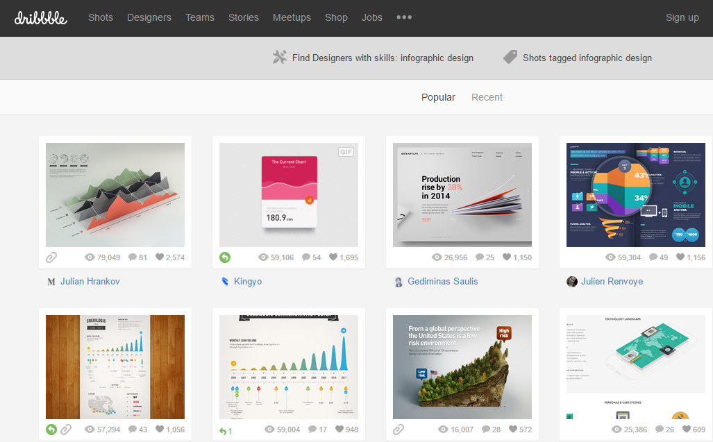
You can hire creative and professional infographic designers at Dribbble, or — if you have the budget — you can outsource the project to Visual.ly.
4). The Complete Social Media Image Size Guide: With Awesome Design Tips
Number of social shares: 11,400
Canva, a simple tool that enables everyone to become a designer through its drag-and-drop features, is huge.
Currently, Canva has over 9 million users, and it’s been used to create more than 65 million designs.
Canva understands that people might be concerned about the ideal size of images.
Millions of people want to create a Facebook header image, a Twitter header image and more. At the Canva Design School, these essential questions are answered in the form of written content.
However, when it concerns image sizes, written content just won’t suffice. How would a photographer prove that his shots are crisp, well-composed and memorable, if he doesn’t show samples of photographs that he’s taken in the past?
In the same way, when you’ve got a topic that requires visual aids, don’t try to write a post or article on it. Create visual content instead.
Which is exactly what Canva did. They created a useful infographic on “The Complete Social Media Image Size Guide”:
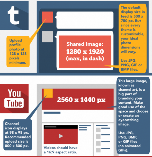
So, why do you think this infographic generated over 10,000 social shares?
The obvious reason is that Canva discovered a question its users were asking often. As they go about creating images and graphics for their social media promotion, people needed a solution.
Canva provided the answers.
So, naturally, people were all too happy to share the post. And, that’s an all-important lesson for you. Okay, let’s make it two lessons:
i). Find out what your audience is struggling with: Once you can pinpoint the exact question, you can always provide the most appropriate answer. And, consequently, you’ll get massive social shares.
ii). Tell users about it: Most marketers have the right solution, but they fail because those who need it didn’t get it at the right time.
After Canva created this infographic, they actually notified their users through their email list.
That was how they gained initial traction. And, from there, the post gained organic traffic and started ranking for several long-tail keywords and editorial links flowed in as well.
In a nutshell, build your email list first. Build a loyal audience that’s ready to ask you questions and respond to them while you gather great ideas for content.
Conclusion
Social shares.
That’s what most content marketers and bloggers want to accomplish. But, how many people achieve this goal?
If you’re sick and tired of creating infographics that your target audience doesn’t care about, I’m confident that this in-depth article has changed all of that.
Now, you can take your social share count from 0 to 500. How?
Take one of the lessons from these viral infographics and implement it today. I’m sure you’ll have a different story after 60 days (yes, give it time).
My infographics were not always successful. In fact, some of them didn’t even get 500 social shares.
But, I changed my strategy, and started promoting them on other authoritative blogs.
Have you created an infographic before?
Which strategies do you use to generate massive social shares for your infographics?
Comments (46)